Chrish066
New Member
BLUF (or TL;DR for non-military) -
This is the process I am going through for making the Cap Stash from the Fallout series. I want it to be as close to game / world accurate as possible. Not sure if it's my ADHD or just my personality but I almost obsess with accuracy of my props.
.jpg")
.jpg")

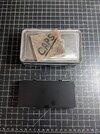
I make video game props for fun, then sell them online. I made a version of the Cap Stash last year but was never totally satisfied with the accuracy of it. The size and proportions of the tin I used before were off.
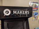
Game Reference (Sizing in-game vs real-life) -
.jpg")
.jpg")
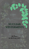
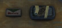
I took some photos in game and others I found online and in RPF to see the proportions and general sizing. Before you start typing, YES, I am VERY aware that Bethesda's in-game sizing is a total crap-shoot. Mentats appear to be the size of a family-sized box of cereal, a bottle of RAD-X is like a 5-Gallon bucket and these Cap Stashes appear to be the size of carry-on luggage. I know the game designers make things larger so players can see them, so my goal was to make something that had the right in-game proportions in real-life, while keeping the right sizing "feel" for the item. (Rant: I cannot STAND having to figure things out by "feel". I want clear cut data and properly sized items, or at least the same wonky proportions for all items.)
I did some looking around online to see if I could find what the game designer used as their reference. (Who knows, maybe I can get lucky and find exactly what they modeled it from and buy that. EASY day) .....No such luck. The closest tin I found was this style tobacco tin.


.jpg")
The problem with it is that it's WAY too small when compared to the Mentats. These tobacco tins are 3.75 x 2.25 x 1 inches (so about the size of an Altoids tin). I choose to believe Mentats are about the size of an Altoids tin, which, going off the size difference between the 2 in that pic, would make the Cap Stash more than 7.5 x 4.35 x ~3. Which....is pretty big. Why on earth would you have a tin box that size filled with (according to Fallout Wiki) "between 14-23 bottlecaps"? That seems to me like a COLOSSAL waste of space. So I decided to size down a bit more and split the difference of the small tobacco tin and the ginormous size compared to the Mentats and try and find something around 5.5 x 3 x 1.75. This would still be in proportion to the Mentats/Altoids sized tin without being ridiculously huge.
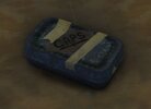
Best real life option -
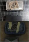
Not gonna lie....this part took AGES. I am fairly certain I searched the ENTIRE internet and looked at EVERY single tin box being sold on the planet. But after more hours searching than I'm willing to tally, I finally found this: a 5.5 x 3 x 1.75 survival kit tin made by Coleman.

.jpg")

It is as close to the right proportions as I have found and the exact size I was wanting. But....(because there is always a "but") they no longer make them. So finding them is becoming much harder, much faster. I found 4 on Ebay that I bought up quick. I again searched the ENTIRE internet and found a couple companies that have some residual stock left over. Nothing much, like 25-50 boxes total. Which seems ok for a VERY limited run of me selling them. So my plan now is to see if I can make a Cap Stash that lives up to my ridiculously high expectations using the 4 survival tins I bought from Ebay. If I can, then buy as many as I can get my hands on online before they are gone forever.
Process -
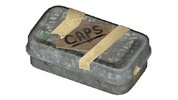
Remove logo -
First thing I need to do is remove the Coleman logo. I read online that you can remove logos from metal using acetone and light scrubbing with steel wool.
.jpeg")
So, I set aside a couple hours for me to try this way, and when that failed (because of course no plan survives first contact with implementation) I could try several different techniques to remove it completely. Except, this one worked ridiculously well. The logo came off so easy, I had to collect myself because I wasn't expecting to work as well as it did with so little effort.
.jpeg")
.jpeg")
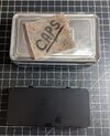
Debossing - (Recreating the indentation around the border)

This is the part of the job that I honestly thought I was going to have to try and let go because I didn't think I would ever get it the way I wanted. I had grand plans of getting a piece of wood cut down to fit in the tin lid and press down to form the shape, or create a 3D model of a die and have that printed to use as a die. On a whim, I took a clay tool (that looks very similar to some embossing/debossing tools I saw online) and just tried manually pressing down the edge around the border. AND IT TOTALLY WORKED. I had so many reasons I came up with on why it wouldn't work. The tin would be too thin and would just bend in half, the lid would warp and wouldn't close anymore, but it was totally fine. It worked SURPRISINGLY well. I just put some pressure against the border.
.jpeg")
.jpeg")
This is where I'm at the process. Below are the rest of the things I need to do to get it done. I'll be working on it and keep you updated as I complete things.
Designing the logo -
Hopping on the computer. I am going to use the game texture to design a better / more realistic / lore-friendly logo to put on it.
Adding digital aging to logo-
Ink transfer logo to tin-
Sealing tin-
Physical aging of tin (this thing is 200+ years old) -
CAPS logo -
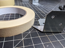
Aging Tape -
Caps Process -
Damage Process -
Destroy Plastic seal -
FIRE (melt plastic seal) -
Smash caps (they have been pulled off a Nuka Cola bottle then used as currency, they're gonna be bent up) -
Sand edges to pull paint off -
Rust solution -
This is the process I am going through for making the Cap Stash from the Fallout series. I want it to be as close to game / world accurate as possible. Not sure if it's my ADHD or just my personality but I almost obsess with accuracy of my props.
I make video game props for fun, then sell them online. I made a version of the Cap Stash last year but was never totally satisfied with the accuracy of it. The size and proportions of the tin I used before were off.
Game Reference (Sizing in-game vs real-life) -
I took some photos in game and others I found online and in RPF to see the proportions and general sizing. Before you start typing, YES, I am VERY aware that Bethesda's in-game sizing is a total crap-shoot. Mentats appear to be the size of a family-sized box of cereal, a bottle of RAD-X is like a 5-Gallon bucket and these Cap Stashes appear to be the size of carry-on luggage. I know the game designers make things larger so players can see them, so my goal was to make something that had the right in-game proportions in real-life, while keeping the right sizing "feel" for the item. (Rant: I cannot STAND having to figure things out by "feel". I want clear cut data and properly sized items, or at least the same wonky proportions for all items.)
I did some looking around online to see if I could find what the game designer used as their reference. (Who knows, maybe I can get lucky and find exactly what they modeled it from and buy that. EASY day) .....No such luck. The closest tin I found was this style tobacco tin.
The problem with it is that it's WAY too small when compared to the Mentats. These tobacco tins are 3.75 x 2.25 x 1 inches (so about the size of an Altoids tin). I choose to believe Mentats are about the size of an Altoids tin, which, going off the size difference between the 2 in that pic, would make the Cap Stash more than 7.5 x 4.35 x ~3. Which....is pretty big. Why on earth would you have a tin box that size filled with (according to Fallout Wiki) "between 14-23 bottlecaps"? That seems to me like a COLOSSAL waste of space. So I decided to size down a bit more and split the difference of the small tobacco tin and the ginormous size compared to the Mentats and try and find something around 5.5 x 3 x 1.75. This would still be in proportion to the Mentats/Altoids sized tin without being ridiculously huge.
Best real life option -
Not gonna lie....this part took AGES. I am fairly certain I searched the ENTIRE internet and looked at EVERY single tin box being sold on the planet. But after more hours searching than I'm willing to tally, I finally found this: a 5.5 x 3 x 1.75 survival kit tin made by Coleman.
It is as close to the right proportions as I have found and the exact size I was wanting. But....(because there is always a "but") they no longer make them. So finding them is becoming much harder, much faster. I found 4 on Ebay that I bought up quick. I again searched the ENTIRE internet and found a couple companies that have some residual stock left over. Nothing much, like 25-50 boxes total. Which seems ok for a VERY limited run of me selling them. So my plan now is to see if I can make a Cap Stash that lives up to my ridiculously high expectations using the 4 survival tins I bought from Ebay. If I can, then buy as many as I can get my hands on online before they are gone forever.
Process -
Remove logo -
First thing I need to do is remove the Coleman logo. I read online that you can remove logos from metal using acetone and light scrubbing with steel wool.
So, I set aside a couple hours for me to try this way, and when that failed (because of course no plan survives first contact with implementation) I could try several different techniques to remove it completely. Except, this one worked ridiculously well. The logo came off so easy, I had to collect myself because I wasn't expecting to work as well as it did with so little effort.
Debossing - (Recreating the indentation around the border)
This is the part of the job that I honestly thought I was going to have to try and let go because I didn't think I would ever get it the way I wanted. I had grand plans of getting a piece of wood cut down to fit in the tin lid and press down to form the shape, or create a 3D model of a die and have that printed to use as a die. On a whim, I took a clay tool (that looks very similar to some embossing/debossing tools I saw online) and just tried manually pressing down the edge around the border. AND IT TOTALLY WORKED. I had so many reasons I came up with on why it wouldn't work. The tin would be too thin and would just bend in half, the lid would warp and wouldn't close anymore, but it was totally fine. It worked SURPRISINGLY well. I just put some pressure against the border.
This is where I'm at the process. Below are the rest of the things I need to do to get it done. I'll be working on it and keep you updated as I complete things.
Designing the logo -
Hopping on the computer. I am going to use the game texture to design a better / more realistic / lore-friendly logo to put on it.
Adding digital aging to logo-
Ink transfer logo to tin-
Sealing tin-
Physical aging of tin (this thing is 200+ years old) -
CAPS logo -
Aging Tape -
Caps Process -
Damage Process -
Destroy Plastic seal -
FIRE (melt plastic seal) -
Smash caps (they have been pulled off a Nuka Cola bottle then used as currency, they're gonna be bent up) -
Sand edges to pull paint off -
Rust solution -
Attachments
Last edited:

")