Chrish066
New Member
BLUF (TL;DR) -
This is the process I am going through for making Mentats and Fixer from the Fallout series. (That's the Fixer addiction pills from Fallout New Vegas, not the weird long rifle from Fallout 76) Like with my other builds, I want these to be as close to game while still being "real" world accurate as possible. It's a hard balance to find, especially when game designers have to do funky stuff with sizing to make them visible.


*NOTE*
I apparently get really wordy and like to add lots of pics. Don't like it...you have the ENTIRE rest of the internet to go to. You have been warned.
Origin Story -
The beginning of this started in the middle of my other project, the Realistic Fallout Cap Stash Build. I was running into some issues getting the Cap Stash logo right on the tin and decided these 2 project were close enough I could test out techniques for the Cap Stash on the Mentats/Fixer.
Game Reference (Sizing in-game vs real-life) -


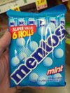
Same as last time, finding "real world" size for these is somewhat a guessing game. But, I had done most of it for these 2 while working on the Cap Stash.
.jpg")

Since I decided the Cap Stash is about 5.5 x 3 x 1.75, That puts a Mentats/Fixer tin converted size of 5 x 2.5. I looked all over the internet again (my job was pretty boring at the time, so I had nothing better to do, haha) and found these.

I can work with these tins being 5 x 2.29 x 0.8. Not perfect, but close enough for my overly picky brain to be ok with.
Label -


1st things 1st, I gotta redesign the label. I need to polish it up, but also I need to make it mine. If you are following the Cap Stash, you know I really enjoy taking the basic game texture and adding real world aspects that you would really find on the product. If you pick up any product in our world, there are certain things you expect to be there. The products name, a slogan, manufacturer, ingredients (depending on what it is), etc. And it would look...wrong if they weren't there. So, I gotta take the main design aspects of these 2, and add the things that I feel are missing.
Front -


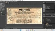
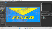
I dropped the game texture into my free Photoshop clone GIMP and resized it to the size of my tin. As you can see below, I kept basically all of the design elements there, but added what I felt was missing. The little things that make it "real", like a slogan under the name and the quantity in the bottom right. I did also change the style and location of "MED TEK" on the Fixer. On Fixer it was lower on the triangle....and also said "MED TEX" for some reason. Both of which didn't look good, so I changed it to match the "MED TEK" on the Mentats.

Back -
The back was a bit more tricky. I wanted the back to have the look and feel of a real medication. I used a lot of retro medication labels from the 1920s to the 1950s as reference and matched how they looked. Mix in a little modern and retrofuturistic flare and this is what we got.


Name, Description, Distribution Location, Warning and Dosage -
This is all pretty standard stuff you find on the back of most real world products. I wanted to add the specific locations that line up with the Fallout games they are from. Mentats have 3 different distribution locations (DC, Boston and WV), and Fixer is from Vegas. The warning label "MIGHT" be habit forming, I thought was funny because in game, MED TEK apparently knew EXACTLY how addictive it was, and even went as far as introducing it into areas like college campuses to get people hooked. The dosage I also wanted to make have some funny or game specific tie in. I remembered the book "The Dark Fields/Limitless" and took some inspiration from that. "In case of persistent intellect, consult a physician or increase dosage and decipher the solution."
Ingredients List (and also Dune) -
Mentats -
I wanted the active ingredients list to match how the game said you create them, so I went to the Mentats and Fixer Wiki pages to get more info. Crafting Mentats (in Fallout 4) needed the materials Brain fungus (2), Abraxo cleaner (1) and Lead (1). *Side note* The name Mentats is a reference to Frank Herbert's novel Dune, where humans that are turned into supercomputers are called "Mentats". Given that, I wanted an Easter egg back to him/his book. I made up the ingredients "66 mg Herberticillin, an extract of F. herbert "Brain" Fungus" (a play on penicillin and Frank Herbert and also .... "Brain Fungus" didn't sound very scientific), 42 mg Sodium Borate (just the fancy name for Borax cleaner, which I figured was the games version of Abraxo, also which...pretty sure would kill you if ingested it), 34 mg Lead (which would 100% kill you if ingested, haha). The person working with me on this project is a doctor, so I defaulted to her for a majority of this part to make sure it all looked right. All the rest of the stuff in it I pulled from a list of common nootropic (improve cognitive functions) ingredients. I added some doses for each and called it done.
Fixer -
I wanted Fixer to have a tie in like Mentats did, since they seemed so similar. Melange is the "Spice" in Dune and we liked how it sounded. The ingredient "Melangatonin" was what we created. Also I wanted to make the ingredients to have a bit of fantasy to make it work in game. The rest of the ingredients in Fixer are basically every real world addiction treatment we could fit in the space.
*DOCS NOTE* The Doc helping with this has pointed out 2 things.
1. Each of these pills would be the size of a Nerf football.
2. The dosages we have would 100% absolutely kill ANYONE that took them. Multiple times over. "So much death". Hahaha.
Barcode / QR -
I also tried again to put a funny QR code, but the original idea didn't work. I did change up the QR later and it MIGHT be working now.
Painting the Tins -
Once we had the designs for it, then we have to get them the right color. I started off thinking Mentats was manufactured as bright white and had gotten discolored through the 200+ years of sitting. After some back and forth I decided that I don't know it was white for certain...and that trying to manually age a color that looks right is gonna be a MAJOR PAIN. So I decided to match the color best I could. After several test colors I landed on Almond for Mentats and Maui Blue for Fixer.

These blues didn't make the cut.
Vinyl....again.....
The 1st thing we tried for the labels was vinyl. I had been working with vinyl with the Cap Stash with.....mixed results. Doc is pleased with vinyl. I am....less so. But, I tried it anyways.


The look was almost perfect! But (because there is always a "but"), the vinyl covered the weathering on the tin and made it look like a black ink smear. It also didn't have the right texture. When you ran your finger over the tin, it felt....wrong. You could hardly feel the vinyl so I don't really know how else to explain it other than...it just didn't feel like what my brain expected it to feel like. I guess a good comparison is have you ever held counterfeit money? It looks right in your hand but your brain just....knows that's not what it is supposed to feel like.
So.....were trying a few other techniques to get it to work.
Frickin Laser Beams -
The Maker Space I'm a member of has 2 laser cutters I have access to. I am going to use tape to mask the tin, then use the laser to perfectly cut the designs I want on the tape, remove the lasered parts (weeding), then paint the tins the color I want them. Using GIMP I designed SVG files to drop into the laser software we have LightBurn.

I masked the tin up and threw it in the laser. Then I cut out the design.

I take them out and peel out (weed) the part I want to paint.


Now comes the paint.


I think it turned out pretty good so far. (Don't mind the blue, I was still finding the perfect color at this point) The look was right and it even had the right texture. You could feel the raised part of the paint, which is part of what my brain was wanting with the vinyl and not getting.
Working with a high powered laser there are plenty of places to go horribly wrong. I have been attempting to be safe and not destroy too many of my tins unnecessarily. (See my experiment with the sand blaster in the Cap Stash build) So, we have done a LOT of tests to see what settings on the laser is the best to use. There are a LOT of setting to mess with though. Power %, laser speed, DPI, etc. I decided to sacrifice a few of the tins to testing.


The one really big thing about testing.... To be REALLY effective....you need to actually DOCUMENT your findings. Which for some reason....I did not. Got excited. Anyways. So after sacrificing those tins to testing, I still didn't know what settings were gonna work best.
I started working on lasering the back and found out that the settings I THOUGHT were right...were in fact... not even close.

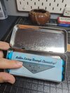
This is the best one out of the batch I did that night....and I'm not sure if you can see it or not in the pic....but the alignment might have been JUST A TOUCH off. This is when the QR code still wasn't working. I have updated it since. Also, I added black acrylic paint to this to make it stand out a bit more.

Much better and with a redesigned QR code that actually worked OFF THE TIN...but the laser was too hot. (Most likely because I didn't write down my earlier settings...) You can see how it looks blurry from the heat. I need to turn it way down next time to get the crisp look I had with the other one. (Also I paid a BIT more attention to the alignment, haha)
Fixer Back -
The Fixer tin was kinda a pain because the game texture has Fixer as a blue lid, but silver bottom. This is kinda a problem because I'm using the laser to scorch the paint. But if there is NO paint...... You might remember such problems from Realistic Fallout Cap Stash Build where the back of the Cap Stash has black text on a silver tin. I decided to try out an interesting technique to get it done and had some pretty surprising results. The tin I got comes black. I reversed the image in LightBurn and burned off the black EXCEPT for the text. It didn't work perfectly, but good enough that I think with some tweaking, I should be able to do it for Fixer AND the Cap Stash. (I would just spray paint black before I laser)


You can see how it looks after I laser it but before I cleaned the black (now) powder off.
Current Plan -
So this is where I am. I need to tweak the Fixer texture in GIMP to make it a bit more bold. I need to get back to the maker space and laser a bunch more tins to get the power settings right. But that's about it. Pretty close to done. Hopefully my next update will show off a final product.
Stay tuned!!
This is the process I am going through for making Mentats and Fixer from the Fallout series. (That's the Fixer addiction pills from Fallout New Vegas, not the weird long rifle from Fallout 76) Like with my other builds, I want these to be as close to game while still being "real" world accurate as possible. It's a hard balance to find, especially when game designers have to do funky stuff with sizing to make them visible.
*NOTE*
I apparently get really wordy and like to add lots of pics. Don't like it...you have the ENTIRE rest of the internet to go to. You have been warned.
Origin Story -
The beginning of this started in the middle of my other project, the Realistic Fallout Cap Stash Build. I was running into some issues getting the Cap Stash logo right on the tin and decided these 2 project were close enough I could test out techniques for the Cap Stash on the Mentats/Fixer.
Game Reference (Sizing in-game vs real-life) -
Same as last time, finding "real world" size for these is somewhat a guessing game. But, I had done most of it for these 2 while working on the Cap Stash.
Since I decided the Cap Stash is about 5.5 x 3 x 1.75, That puts a Mentats/Fixer tin converted size of 5 x 2.5. I looked all over the internet again (my job was pretty boring at the time, so I had nothing better to do, haha) and found these.
I can work with these tins being 5 x 2.29 x 0.8. Not perfect, but close enough for my overly picky brain to be ok with.
Label -
1st things 1st, I gotta redesign the label. I need to polish it up, but also I need to make it mine. If you are following the Cap Stash, you know I really enjoy taking the basic game texture and adding real world aspects that you would really find on the product. If you pick up any product in our world, there are certain things you expect to be there. The products name, a slogan, manufacturer, ingredients (depending on what it is), etc. And it would look...wrong if they weren't there. So, I gotta take the main design aspects of these 2, and add the things that I feel are missing.
Front -
I dropped the game texture into my free Photoshop clone GIMP and resized it to the size of my tin. As you can see below, I kept basically all of the design elements there, but added what I felt was missing. The little things that make it "real", like a slogan under the name and the quantity in the bottom right. I did also change the style and location of "MED TEK" on the Fixer. On Fixer it was lower on the triangle....and also said "MED TEX" for some reason. Both of which didn't look good, so I changed it to match the "MED TEK" on the Mentats.
Back -
The back was a bit more tricky. I wanted the back to have the look and feel of a real medication. I used a lot of retro medication labels from the 1920s to the 1950s as reference and matched how they looked. Mix in a little modern and retrofuturistic flare and this is what we got.
Name, Description, Distribution Location, Warning and Dosage -
This is all pretty standard stuff you find on the back of most real world products. I wanted to add the specific locations that line up with the Fallout games they are from. Mentats have 3 different distribution locations (DC, Boston and WV), and Fixer is from Vegas. The warning label "MIGHT" be habit forming, I thought was funny because in game, MED TEK apparently knew EXACTLY how addictive it was, and even went as far as introducing it into areas like college campuses to get people hooked. The dosage I also wanted to make have some funny or game specific tie in. I remembered the book "The Dark Fields/Limitless" and took some inspiration from that. "In case of persistent intellect, consult a physician or increase dosage and decipher the solution."
Ingredients List (and also Dune) -
Mentats -
I wanted the active ingredients list to match how the game said you create them, so I went to the Mentats and Fixer Wiki pages to get more info. Crafting Mentats (in Fallout 4) needed the materials Brain fungus (2), Abraxo cleaner (1) and Lead (1). *Side note* The name Mentats is a reference to Frank Herbert's novel Dune, where humans that are turned into supercomputers are called "Mentats". Given that, I wanted an Easter egg back to him/his book. I made up the ingredients "66 mg Herberticillin, an extract of F. herbert "Brain" Fungus" (a play on penicillin and Frank Herbert and also .... "Brain Fungus" didn't sound very scientific), 42 mg Sodium Borate (just the fancy name for Borax cleaner, which I figured was the games version of Abraxo, also which...pretty sure would kill you if ingested it), 34 mg Lead (which would 100% kill you if ingested, haha). The person working with me on this project is a doctor, so I defaulted to her for a majority of this part to make sure it all looked right. All the rest of the stuff in it I pulled from a list of common nootropic (improve cognitive functions) ingredients. I added some doses for each and called it done.
Fixer -
I wanted Fixer to have a tie in like Mentats did, since they seemed so similar. Melange is the "Spice" in Dune and we liked how it sounded. The ingredient "Melangatonin" was what we created. Also I wanted to make the ingredients to have a bit of fantasy to make it work in game. The rest of the ingredients in Fixer are basically every real world addiction treatment we could fit in the space.
*DOCS NOTE* The Doc helping with this has pointed out 2 things.
1. Each of these pills would be the size of a Nerf football.
2. The dosages we have would 100% absolutely kill ANYONE that took them. Multiple times over. "So much death". Hahaha.
Barcode / QR -
I also tried again to put a funny QR code, but the original idea didn't work. I did change up the QR later and it MIGHT be working now.
Painting the Tins -
Once we had the designs for it, then we have to get them the right color. I started off thinking Mentats was manufactured as bright white and had gotten discolored through the 200+ years of sitting. After some back and forth I decided that I don't know it was white for certain...and that trying to manually age a color that looks right is gonna be a MAJOR PAIN. So I decided to match the color best I could. After several test colors I landed on Almond for Mentats and Maui Blue for Fixer.
These blues didn't make the cut.
Vinyl....again.....
The 1st thing we tried for the labels was vinyl. I had been working with vinyl with the Cap Stash with.....mixed results. Doc is pleased with vinyl. I am....less so. But, I tried it anyways.
The look was almost perfect! But (because there is always a "but"), the vinyl covered the weathering on the tin and made it look like a black ink smear. It also didn't have the right texture. When you ran your finger over the tin, it felt....wrong. You could hardly feel the vinyl so I don't really know how else to explain it other than...it just didn't feel like what my brain expected it to feel like. I guess a good comparison is have you ever held counterfeit money? It looks right in your hand but your brain just....knows that's not what it is supposed to feel like.
So.....were trying a few other techniques to get it to work.
Frickin Laser Beams -
The Maker Space I'm a member of has 2 laser cutters I have access to. I am going to use tape to mask the tin, then use the laser to perfectly cut the designs I want on the tape, remove the lasered parts (weeding), then paint the tins the color I want them. Using GIMP I designed SVG files to drop into the laser software we have LightBurn.
I masked the tin up and threw it in the laser. Then I cut out the design.
I take them out and peel out (weed) the part I want to paint.
Now comes the paint.
I think it turned out pretty good so far. (Don't mind the blue, I was still finding the perfect color at this point) The look was right and it even had the right texture. You could feel the raised part of the paint, which is part of what my brain was wanting with the vinyl and not getting.
Working with a high powered laser there are plenty of places to go horribly wrong. I have been attempting to be safe and not destroy too many of my tins unnecessarily. (See my experiment with the sand blaster in the Cap Stash build) So, we have done a LOT of tests to see what settings on the laser is the best to use. There are a LOT of setting to mess with though. Power %, laser speed, DPI, etc. I decided to sacrifice a few of the tins to testing.
The one really big thing about testing.... To be REALLY effective....you need to actually DOCUMENT your findings. Which for some reason....I did not. Got excited. Anyways. So after sacrificing those tins to testing, I still didn't know what settings were gonna work best.
I started working on lasering the back and found out that the settings I THOUGHT were right...were in fact... not even close.
This is the best one out of the batch I did that night....and I'm not sure if you can see it or not in the pic....but the alignment might have been JUST A TOUCH off. This is when the QR code still wasn't working. I have updated it since. Also, I added black acrylic paint to this to make it stand out a bit more.
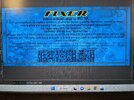
Much better and with a redesigned QR code that actually worked OFF THE TIN...but the laser was too hot. (Most likely because I didn't write down my earlier settings...) You can see how it looks blurry from the heat. I need to turn it way down next time to get the crisp look I had with the other one. (Also I paid a BIT more attention to the alignment, haha)
Fixer Back -
The Fixer tin was kinda a pain because the game texture has Fixer as a blue lid, but silver bottom. This is kinda a problem because I'm using the laser to scorch the paint. But if there is NO paint...... You might remember such problems from Realistic Fallout Cap Stash Build where the back of the Cap Stash has black text on a silver tin. I decided to try out an interesting technique to get it done and had some pretty surprising results. The tin I got comes black. I reversed the image in LightBurn and burned off the black EXCEPT for the text. It didn't work perfectly, but good enough that I think with some tweaking, I should be able to do it for Fixer AND the Cap Stash. (I would just spray paint black before I laser)
You can see how it looks after I laser it but before I cleaned the black (now) powder off.
Current Plan -
So this is where I am. I need to tweak the Fixer texture in GIMP to make it a bit more bold. I need to get back to the maker space and laser a bunch more tins to get the power settings right. But that's about it. Pretty close to done. Hopefully my next update will show off a final product.
Stay tuned!!
Attachments
Last edited:
") I am keen to see how you make out with the stamp/embossed tin tests
I am keen to see how you make out with the stamp/embossed tin tests