Dieseldog1
New Member
Wow, I thought it would be good but that's exceptional.
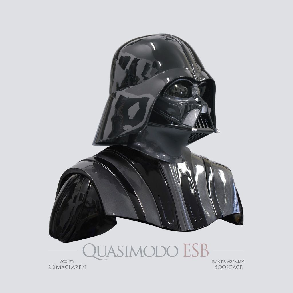
Now, onto some comps (comparisons).
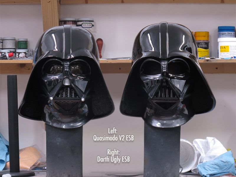
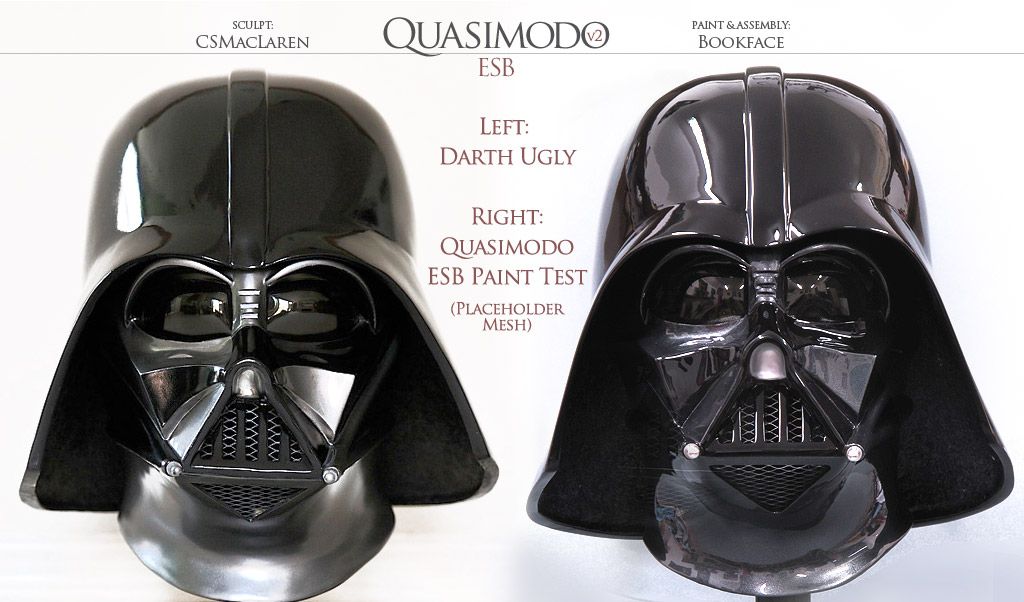
First is Darth Ugly vs. Quasimodo V2 ESB:
http://i18.photobucket.com/albums/b...esb-vs-quasimodo-v2-esb-vader_zps79476489.jpg
Darth Ugly on the left is done very well and serves as a respectable, economical Vader as a starting point to collecting.
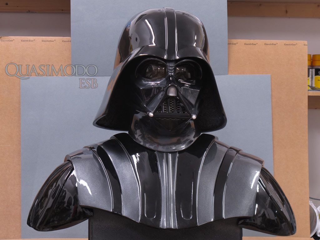
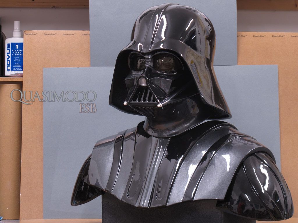
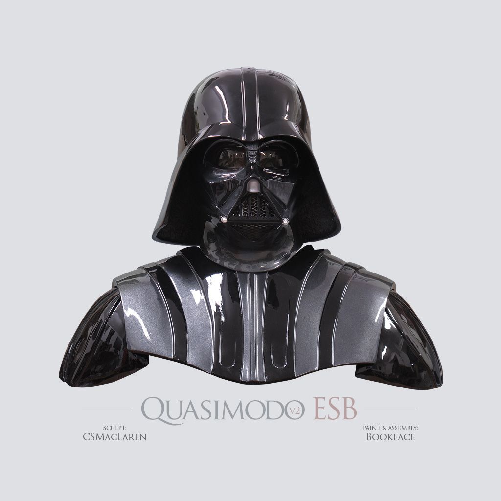
Quasimodo, on the other hand, looks almost like I took a screen capture, cropped only the helmet and pasted it in Photoshop it into the image, but it's not - you can see details of bookface's shop in the reflection of the ESB helmet. This was simply a shop shot, taken on his wooden bench with card paper behind it. Not bad for not being a studio shot - all thanks to bookface's paint work. He has made the Quasimodo helmets evoke the character and presence of Vader better than with any of my projects in the past, and in a way I had always wanted in a helmet.
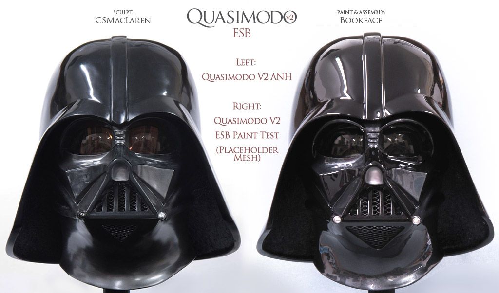
Next, ANH vs ESB:
http://i18.photobucket.com/albums/b...B/quasimodo-vader-anh-and-esb_zps5af30974.jpg
Once again, bookface is very much a part of the artistic process. Even as I'm sculpting and sharing progress shots with him, we were discussing the paint for ESB to capture the essence of the character. I view Vader as going through a development arc from ANH to ESB to ROTJ, so beyond just capturing the prop's look or mimicking paint schemes, features and so forth, I wanted these helmets to emanate a sense of his rise of importance from the front lines to being in command of his own personal flagship (as Vader may or may not have commanded the Star Destroyer that captured the Tantive IV, but regardless the Star Destroyer is a pea next to the Executor!)
I'm very proud of how both of these turned out. For each, Bookface has created the "stepped off the screen" look (and, once again, I know that is highly subjective, but you can tell I'm chuffed!) and all that work pays off with strong presence of character!
EDIT: The last photo, the left was mislabeled "Darth Ugly" in the image. It's now properly labeled Quasimodo V2 ANH.

I have a question for CS, based on the pics posted, pardon if its a n00b question. In the ANH helmet and the ESB Ugly, the ridge on the upper "cheek" is a downward curve, while the right side is more of an S shape, ending in an upward curve. On the ESB quasimodo, both sides look to have that S shape curved up. I know you weren't going for total accuracy, just wondering why you made the choice to do it like that? It doesn't take away from the look of the helmet in the slightest, its gorgeous, was just looking at it and noticed it.

