You are using an out of date browser. It may not display this or other websites correctly.
You should upgrade or use an alternative browser.
You should upgrade or use an alternative browser.
Building The Death Star - PRODUCTION
- Thread starter PHArchivist
- Start date
feek61
Sr Member
maybe it's just me, but it looks like there was no background color in the stenciled areas on the original
just the speckled spray (but just on some of them)
but looking tight PH:thumbsup
I kind of agree, it looks like either that or the base color for the cityscape portions was much closer to the body color then what you are using. Still, it looks great.
Will
PHArchivist
Master Member
The original's dots look more 'pixelated' for lack of a better term. It's like the dots are not as random as yours are. I can see where some dots follow a straight line up. I don't know if that is random or not.
That's waht I was seeing that was driving me towards a printed pattern. But when you examine the entire surface of the original, its not as "pixelated" as it first seems. There is a degree of variation.
And I agree - I think the density of the speckles on the original is a bit higher; say 10%-20% more dense. But this is as close as I'm gonna get with out really effing it up, and once taking it in as a whole, and from more than three feet away, the difference in granularity and density falls away.
Last edited:
PHArchivist
Master Member
I kind of agree, it looks like either that or the base color for the cityscape portions was much closer to the body color then what you are using. Still, it looks great.
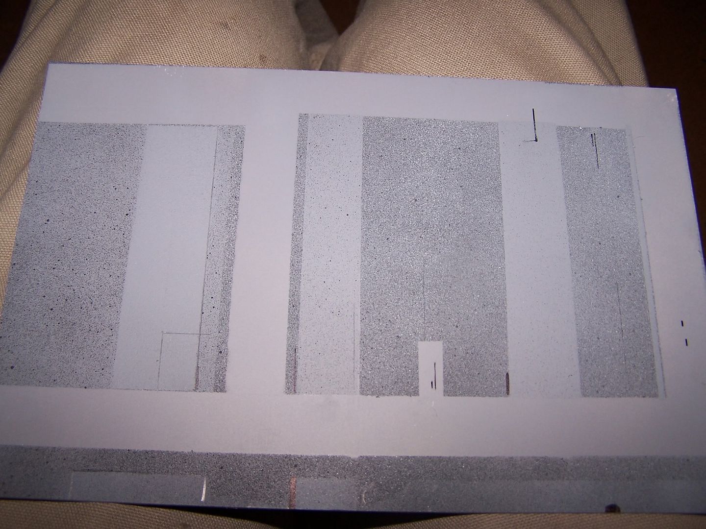
For insight to why I went to a base coat, look at the small little bit of the column to the upper left of the full block in this image.
That is what I view as no base coat. It is distinctly lighter and closer to the base coat than the panels in the first row.

PHArchivist
Master Member
Here's a better look. See how much lighter this colum is compared to the one below it? Where there are no black spots, it virtually melts right into the base coat.
The block below it (the first on I've completed) has a much more clear perimeter. Albeit, mine may be too dark, or too rich. I'm just convincing myself the original has faded!

The block below it (the first on I've completed) has a much more clear perimeter. Albeit, mine may be too dark, or too rich. I'm just convincing myself the original has faded!
Last edited by a moderator:
-... . .- --..
Sr Member
Seems to me like the original spatter is noticeably finer than what you can manage with a rattle can, which seems pretty coarse.
Have you played around with any airbrush stippling techniques, like this one:
http://www.ehow.com/video_4946223_airbrush-effects-stippling.html
?
Have you played around with any airbrush stippling techniques, like this one:
http://www.ehow.com/video_4946223_airbrush-effects-stippling.html
?
Davy Jones
Sr Member
I think its looking great!
I have been following this thread with awe for some time. You are really devoted to this monster!
However, I must join with the ones who say "no darker base color for the panels"
Even on the darker panels I see them fading into the main grey where there isnt as much speckle. I also think that if you do use a darker base color, it should not be as dark. A good compromise would be if you kept doing what you are doing now but also misted some of the main grey on the panels.
Sorry if that sounds like I am picking on your work. It really is top notch! I just wonder if its possible to knock it up another notch. Bam! :cool
Last edited:
vaderdarth
Master Member
just play with more black and white. If it you see the basecoat and more fading into that basecoat, just go lighter on the black and white.
vaderdarth
Master Member
I don't think the modelers would have gone thru and painted a darker basecoat prior to adding the speckling, because you can achieve the same effect by altering the blacks and whites................they didn't have time to get all fancy, they did it quick and dirty. ")
I swear my parents kitchen tile had that same speckle pattern when I was a kid in the late 70s.
Fantastic job Rob.
Fantastic job Rob.
feek61
Sr Member
Rob,
I just hate to nick-pick because you are doing such a fabulous job. I see where you are coming from. Are you planning you using the same base coat for all of the cityscapes? It might be worth a try to use a variation of the base coat on the cityscapes between what you are using and something closer to the body color. I too am in awe of what you are doing and I don't mean to sound critical at all; just trying to help.
Will
PHArchivist
Master Member
I think its looking great!
I have been following this thread with awe for some time. You are really devoted to this monster!
However, I must join with the ones who say "no darker base color for the panels"
Even on the darker panels I see them fading into the main grey where there isnt as much speckle. I also think that if you do use a darker base color, it should not be as dark. A good compromise would be if you kept doing what you are doing now but also misted some of the main grey on the panels.
Sorry if that sounds like I am picking on your work. It really is top notch! I just wonder if its possible to knock it up another notch. Bam! :cool
"No preliminary base coat says ye... Properly explain this, says I!"
Seriously, thanks for the comps, and I respect your feed back.
The section I'm working on now may have been base-coated, or just had heavier application of darker colors hard to say. But I'm pretty sure they laid down a base coat on at least some areas of the model.


Last edited:
I swear my parents kitchen tile had that same speckle pattern when I was a kid in the late 70s.
Fantastic job Rob.
Or maybe you lived on the Death Star and just didn't kow it! :lol
PHArchivist
Master Member
Rob,
I just hate to nick-pick because you are doing such a fabulous job. I see where you are coming from. Are you planning you using the same base coat for all of the cityscapes? It might be worth a try to use a variation of the base coat on the cityscapes between what you are using and something closer to the body color. I too am in awe of what you are doing and I don't mean to sound critical at all; just trying to help.
Will
Nope - absolutely not. I'm very much looking forward to varying the base here and there (per the reference).
For instance, in the images in my last post, the area on the left will be base coated; the area on the right will have no base coat at all.
Davy Jones
Sr Member
Here is a quick paint test I did just now.
There is no darker paint for the panels here. Just masked and misted black, white, and basecoat to get it kinda even. Consistancy is extremely hard to achieve and if I actually spent time trying to get it even, I dont know if I could.
I dont envy you.
There is no darker paint for the panels here. Just masked and misted black, white, and basecoat to get it kinda even. Consistancy is extremely hard to achieve and if I actually spent time trying to get it even, I dont know if I could.
I dont envy you.
Similar threads
- Replies
- 7
- Views
- 1,059
- Replies
- 14
- Views
- 1,573
- Replies
- 41
- Views
- 6,711