xcelsior
Well-Known Member
Mac OS X 10.8.3, Safari 6.04.
Got an interesting error when trying to use the Add to the Conversation posting feature:
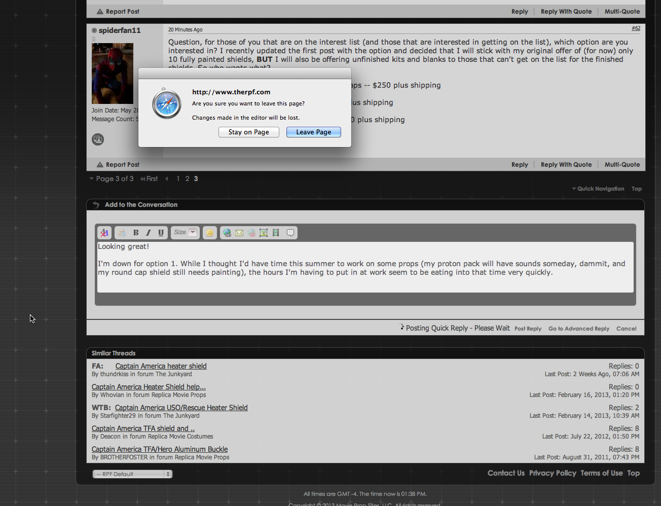
Got an error message that was a bit confusing, in that the page refresh triggered the browser's built-in warning about leaving the page and losing any content I'd entered into the form. Canceling it returned me to the page, but upon subsequent confirmation of "Post Reply" and approving the leaving of the page, it appeared to double-quote my reply:
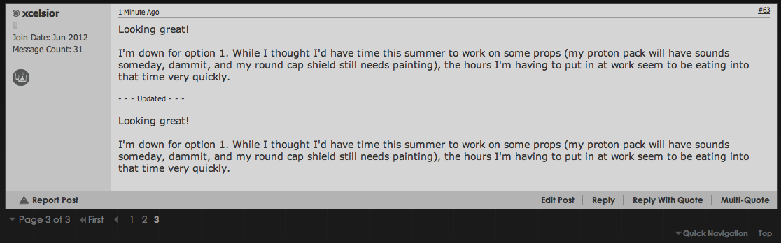
Edit: Which didn't appear to happen when I posted to this thread so might have been just a one-time glitch. I'll try some other browsers during my posting today to see if it repeats.
Got an interesting error when trying to use the Add to the Conversation posting feature:
Got an error message that was a bit confusing, in that the page refresh triggered the browser's built-in warning about leaving the page and losing any content I'd entered into the form. Canceling it returned me to the page, but upon subsequent confirmation of "Post Reply" and approving the leaving of the page, it appeared to double-quote my reply:
Edit: Which didn't appear to happen when I posted to this thread so might have been just a one-time glitch. I'll try some other browsers during my posting today to see if it repeats.
