You are using an out of date browser. It may not display this or other websites correctly.
You should upgrade or use an alternative browser.
You should upgrade or use an alternative browser.
New RPF Sites Issues - CLOSED (please search for or start a thread for new issues)
- Thread starter Art Andrews
- Start date
- Status
- Not open for further replies.
Dracosfire83
Well-Known Member
Something wrong with the user is online button.

Since about 2:30pm PST, you shouldn't be experiencing these issues. If you still are, please let us know.
Except for the double-quote, this has happened to me as well.
Also, the time it takes to post, whether it's a new reply or an edit to a previous post, varies greatly--sometimes it takes only a moment, other times it takes up to 20-30 seconds.
Another intermittent problem occurs when I click on "Post Reply" or "Save Changes"; my browser freezes, and when I try to click on either function a second time I get an error message that states, "therpf.com is not responding" and I have to reload the page.
BTW, those all happened while browsing using Internet Explorer 9. I'm currently using Mozilla Firefox 20.0.1 and none of the above have happened yet; we'll see what happens when I try to post this.
You shouldn't.
Let me check it.
Let me check it.
Art, should I still be getting an ad banner at the bottom of every forum page?
-Rylo
Could just be a phone issue, but I've noticed whenever I go to select a page number, I get a "go to page" box pop up. So basically I have to select the page twice every time I want to change pages.
Page numbers are another thing I hope the colours will be altered on. I find it near impossible to distinguish between what page I'm on and what pages I'm not.
Page numbers are another thing I hope the colours will be altered on. I find it near impossible to distinguish between what page I'm on and what pages I'm not.
epilepticsquirl
Sr Member
Thanks for changing the "Share your Fandom" button. It looks a lot better. :thumbsup
ThatPhoenixGuy
Active Member
Thank you for making it "post new thread" now. I think it'll clearify things a lot! ")
"Could just be a phone issue, but I've noticed whenever I go to select a page number, I get a "go to page" box pop up. So basically I have to select the page twice every time I want to change pages.
Page numbers are another thing I hope the colours will be altered on. I find it near impossible to distinguish between what page I'm on and what pages I'm not."
I am using my iPhone and I have the same issue, I need to click everything twice for it to open.
Page numbers are another thing I hope the colours will be altered on. I find it near impossible to distinguish between what page I'm on and what pages I'm not."
I am using my iPhone and I have the same issue, I need to click everything twice for it to open.
Not sure if its because I use tapatalk. Every thread starts with 2 empty posts before the initial first post. Sorry if its already been said
Sent from my GT-N7100 using Tapatalk 2
Will definitely check this out!
Well, here it is... 4am... again. End of the second full day of us fixing bugs and reworking colors. I think we have made some major breakthroughs today that should have the colors at a MUCH more readable contrast. We are also slowly working through a number of other issues. My goal is to have things squared away by next Monday.
We actually have a big edit coming tomorrow that I think most of you will appreciate... so stay tuned! We are listening and we are responding to your concerns!
We actually have a big edit coming tomorrow that I think most of you will appreciate... so stay tuned! We are listening and we are responding to your concerns!
I definitely had premium before the upgrade, now it says nothing in that spot? I only really noticed it was missing because of all the ads LOL.
Elro, your Premium Membership expired in Dec of 2012. You are more than welcome to start it back up!
BlobVanDam
Sr Member
I'm sorry if this has been answered already (although I have been keeping up with this thread as much as possible), but will the "go to first new post" button be added back to the "New Posts" list as it was before? The subscriptions page has it, the regular thread page has it, but not the New Posts page.
I never go to sub-forums individually, all of my browsing is entirely through the New Posts page (or my subscriptions page, once I've added them), so it's getting annoying to not be able to pick up exactly where I left off, or even know where I was up to in the thread. Just because I'm browsing the most recent posts, doesn't mean I only want to read the most recent post, if that makes sense.
I never go to sub-forums individually, all of my browsing is entirely through the New Posts page (or my subscriptions page, once I've added them), so it's getting annoying to not be able to pick up exactly where I left off, or even know where I was up to in the thread. Just because I'm browsing the most recent posts, doesn't mean I only want to read the most recent post, if that makes sense.
booksandcorsets
Sr Member
Haven't read all 21 pages here, but I think I've found a bug so am posting!
There are some members with a dash ("-") in their user names. However the page that you use to look up a member name reads a dash as a space. So, for instance, I'm trying to find "Fake-RPF-Member" but the profile it loads is "Fake RPF Member" instead. I noticed this when I tried to click on a profile of someone who used a dash in their user name.
There are some members with a dash ("-") in their user names. However the page that you use to look up a member name reads a dash as a space. So, for instance, I'm trying to find "Fake-RPF-Member" but the profile it loads is "Fake RPF Member" instead. I noticed this when I tried to click on a profile of someone who used a dash in their user name.
Rebelscum
Sr Member
We could always pile up a massive amount of stuff on both sides of the page...
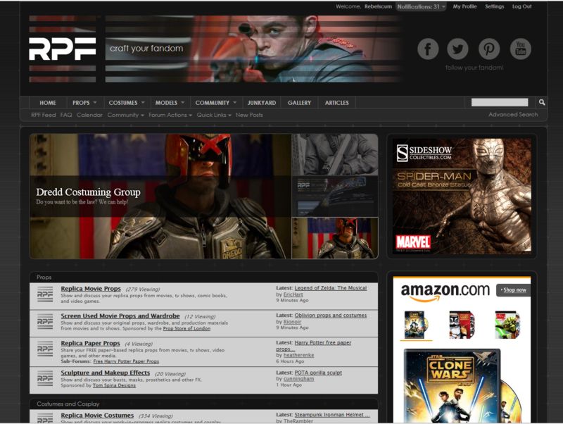
Or just pile it on one side, like you have already done. Screen below.
Few people will ever agree that having content start 800+ pixels below the top is reasonable. People will always rather the content is high up and the ads and other information be out on the periphery. It's incredibly unusual for it to take a 1080 pixel tall screen to see any content on a page. Also, the main display standard today is 16:9, so unless you have a 1920 x 1080 screen, you will not see any content without scrolling down. If you designed with 1280 x 1024, you picked an aspect ratio that is not common, and have fooled yourself thinking 1280 and 1028 are related, they are not. 1280 x 800 is 3x times more used than 1280 x 1024. This design has the tells of a designer that never uses screens of smaller pixel count. An easy habit to get into, but a bad practice.
I realize it's not up to me, but these parameters aren't mine, they are common practice in web page design.
JD
Master Member
The replies in the article Art posted don't match the rest of the forum. Arguably, some folks might find that scheme much more "reader friendly."
FWIW, as Art's mentioned I was given early access to try and work out some of the bugs with the site along with Alan Castillo and Serentiy - and the color scheme was tweaked quite a bit during that time. I've had a minor problem with the site's background (not the post background) since the start as it gives me a kind-of 'optical illusion' type effect that bugs my eyes a little (that "effect" fades the longer I'm on the site). Art has tweaked and tweaked the site quite a deal and it's made huge strides and becoming better and hopefully more readable with each little fix.
FWIW, as Art's mentioned I was given early access to try and work out some of the bugs with the site along with Alan Castillo and Serentiy - and the color scheme was tweaked quite a bit during that time. I've had a minor problem with the site's background (not the post background) since the start as it gives me a kind-of 'optical illusion' type effect that bugs my eyes a little (that "effect" fades the longer I'm on the site). Art has tweaked and tweaked the site quite a deal and it's made huge strides and becoming better and hopefully more readable with each little fix.
Last edited:
Philip, I am not sure of the point you are trying to make. At 1280X800, the site shows exactly the content ATF that we intended without cutting anything off. Now, that isn't true if we post a Notice, like we did the first day, but I mispoke earlier by implying we designed for 1280X1024. The site is designed to accommodate a 1280 width instead of 1024 and it was designed with a 16:9 ratio in mind as you will notice, the featured area isn't cut at 1280X800. This approach was inspired by sites like Craveonline, Superherohype and Ign.com, all of which sport a very similar layout. With that in mind, we are looking at some different options in the threads as we speak since a number of members believe carrying the featured area into the threads themselves is a bit much.
Beyond that, for the forum home and thread listing pages, all of our ads are on the right side, as is common practice among most sites. The exception to this is in the threads themselves where we have done away with the sidebar all together in favor of a wider content area.
Again, there are of course a plethora of opinions on such things, but while some might not agree with the content we placed ATF, I don't' consider it a bad practice as it very specifically does what we intended for it to do.... except at 1024X768...
- Status
- Not open for further replies.
Similar threads
- Replies
- 200
- Views
- 23,776
- Replies
- 41
- Views
- 5,049