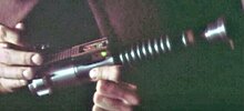
Help. I’ve contracted MoMM (Magic of Myth Madness)…

shawnmeunier

New Member
Greetings exulted ones!

So - I’m obsessing over the paint job on my MoM build. In a few days, I’ll have my completed saber returned to me (for a second time) from a local installer friend. He did a fabulous job, and has been very patient with my requests (to say the least). After completing the build (the first time) in December - I had sent it back to him to make some final adjustments: switchboard recoding, blade shortening and a repaint. I had asked him to repaint the neck and top rails because I wasn’t happy with the first go-around. It was too dark. He agreed, desiring to make me a happy customer - but I fear my quest in making this thing “perfect” is causing me (us) some grief.

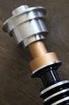
Here is what the first attempt looked like:
C14A96C2-83B8-410E-AB7F-1637F76FBAF8.jpeg

Looked awesome - but too dark. So I visited his shop, and attempted to find a colour closer to what the screen used prop featured. Keep in mind, we can’t get Ace Antique Gold in Canada, so we attempted to find something that produced a similar tone. Here is the new paint I decided on…

0E4A0719-6427-48A0-A140-9153385CD4A6.jpeg


Now I’m worried I didn’t go coppery or dark enough? That said, many of the images of the prop I’ve seen - the neck looks brown, muddy, and in some shots almost caramel. My hope (from the get go) was to create a an accurate version of the hilt that felt new with mild distressing. I don’t want it too aged or banged up. Thoughts on what I should do? Leave it, embrace the new paint job, be happy and just enjoy it? Or - should I give the neck and rails a wash to darken them a bit? How do you recommend I do that? What should I use? I’m not a professional prop builder - and from here on out, I’m on my own. I promised my installer that the most recent changes he made would be it. So if I’m to make any further adjustments to it’s appearance, I’m going to have to do it myself.

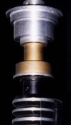
Here’s the Ace Antique Gold vs what I chose…

1A096A26-28BD-4870-A9E1-8883773092BA.jpeg


Tell me I’m nuts and/or what I should do!

Thanks and May the Force be with you.
 
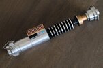
Here's mine Revell Gold 94 Enamel very lightly weathered just with brown/black mixed and diluted ink and dry-brush technique:

LukeROTJHero02.JPG


With a large brush dip in the mixed ink ... get rid off all the excess paint by means of a kitchen tissue until there's hardly any ink left on the brush then brush lightly over your golden paint layer by layer until you are content ... best to try this technique out on a gold painted test piece before applying to your precious lightsaber ;)

Close-up :

BrassNeck01.JPG


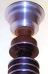
That said I noticed that you forgot to paint the emitter shroud from beneath, here are some pictures of the original to show you what I mean :

LukeROTJHero06.JPG


LukeROTJMOM01.JPG


BrassNeck-01_zps518b0663.JPG


Chaim
 
Last edited:
Thanks for chiming everyone. I really appreciate the support. It sounds like hand painting the underside of the emitter, may be trickier than I originally thought - because the neck and control box rails were airbrushed. Thankfully, my installer friend agreed to accommodate these final adjustments for me (for a fee of course). Our plan is to airbrush the underside of the emitter (so that is accurate) - plus - darken the neck and rails to get the shade closer to the og hero prop. I'm kinda relieved, cuz I wasn't looking forward to buying an airbrush myself and messing with it - the dry brushing technique (that was suggested) may have been okay - but it would have likely made it look splotchy, or overly aged/weathered, which really isn't the look I am going for.

Keeping in mind we're trying to replicate the colour that the prop was prior to being colour corrected for film - or taken on a point and shoot camera with irregular lighting 40 years ago - the colour I'm hoping to achieve should probably be lighter in tone than the images we see in the photos below...


1625879766042.png


2019-05-24.jpeg
2019-05-24-1.jpg
LukeROTJHero08.jpg


My theory is that the colour we should be aiming for is a lighter colour that replicates the Ace Antique Gold a bit more. We'll likely end up using a transparent brown colour of some sort and give it a light wash/coat.

We're essentially trying to go from this:


323742339_523262576260122_7466798038229694992_n.jpg
Xtreme Metal Brass Paint AK Interactive AKI 475

To this:


IMG_1145.jpg
Ace Metallic Antique Gold

Before I go over to his shop, to help select the paint - I'm curious if any of you have suggestions - or - can recommend anything that may help get us closer to the correct tone.

Here are some options we come up with so far:

15.jpg
ALC-123 Exhaust Manifold

Screenshot 2023-01-07 at 5.58.15 PM.png
Mr. Color Clear BrownGX109

Thanks everyone! The madness continues... MTFBWY.


Attachments

  • 323699468_6472961332732132_7609805436023458879_n.jpg
    323699468_6472961332732132_7609805436023458879_n.jpg
    40.3 KB · Views: 70
  • 324066442_1104099810266066_5566394998745936303_n-1.jpg
    324066442_1104099810266066_5566394998745936303_n-1.jpg
    173.4 KB · Views: 69
  • LukeROTJHero09.jpg
    LukeROTJHero09.jpg
    7.3 KB · Views: 66
  • Screenshot 2023-01-07 at 4.48.41 PM.png
    Screenshot 2023-01-07 at 4.48.41 PM.png
    72.7 KB · Views: 80
  • CaveSceneShot.jpeg
    CaveSceneShot.jpeg
    573.8 KB · Views: 60
  • Screenshot 2023-01-07 at 4.48.41 PM.png
    Screenshot 2023-01-07 at 4.48.41 PM.png
    72.7 KB · Views: 74
It looks like the GX-109 is just a shade darker than what you have now. The ALC-123 is just brown. I don't think that's what you want.
 
I think your current paint looks great and with a little weathering will get you where you need to be! That said, if you want it a bit darker or more coppery or whatever, that'd look good too.

Color matching is tricky business when you don't know the details of camera/lighting, post processing or color grading, and the accuracy of whatever you're viewing the image on. Ace metallic gold looks the part, but it's not what they used, it's just one of the easily accessible options in the US.
Thanks MrWax! Ya, we’re not completely repainting - just planning to darken/bronze it up a little to get it closer to the warmth I see in the Ace Antique Gold. I figured a diluted/transparent light coat would blend in nicely… guess I’ll have to try a couple of them on a piece of aluminum first to see.
 
I may have some insight that will help you

First of all, this build looks wonderful as it is. If you want to re-correct the color to see how accurate you can get it, I say go for it. It's good enough as it is though

i mulled over this for years during my early time on the RPF (I joined when I noticed the V2 and Yuma were different in the same scene) and a few monumental moments changed how I view this paint. First off, the famous image in the Visual Dictionary is heavily edited.
6269358a123e11e6963bf23c910800e5.jpeg


Look at the red and green arrows. Those are supposed to be tinted plastic electronic components. It's not the best source for close color matching. Hell, even tonight I see the hand-cut crop job leaves a bit to be desired....

Anyway, at this point we weren't even at a consensus on copper or gold. Granted, it's a dirty prop, which makes matters more complicated. They actually used gold for this post-filming resin cast
resinROTJ.jpg


and today I believe this is the closest we're going to get to seeing it in person when it comes to color accuracy
MOM identities 2017 4.jpg


My thoughts on the matter:
We need a gold paint that has more coppery or red undertones than silver. Almost every metallic gold I see at the hardware store has silver undertones. I'm not sure why. Rub n Buff had the closest thing until AnakinStarkiller found the Ace Metallic that was a great gold color. As long as your gold is yellow-y I think you're okay. The silvery/gray golds will look weird.

I don't have a paint sprayer so they may have literally used a model paint, or mixed one. I haven't found any Tamiya spray cans that match.
 
The paint on Hero props today does not have a shiny finish anymore and the area covered by the paint spray is very thin. Of course you still need to weather the antique gold color to darken it.
After decades of years, the neck is covered with dust .......:rolleyes:

View attachment 1655825
View attachment 1655826
Do you think the original finish had more shine / was glossy? What airbrushing colour would you try to get it closer to the the suspected shade?
 
Here's mine Revell Gold 94 Enamel very lightly weathered just with brown/black mixed and diluted ink and dry-brush technique:

View attachment 1655516

With a large brush dip in the mixed ink ... get rid off all the excess paint by means of a kitchen tissue until there's hardly any ink left on the brush then brush lightly over your golden paint layer by layer until you are content ... best to try this technique out on a gold painted test piece before applying to your precious lightsaber ;)

Close-up :

View attachment 1655532

That said I noticed that you forgot to paint the emitter shroud from beneath, here are some pictures of the original to show you what I mean :

View attachment 1655517

View attachment 1655519

View attachment 1655533

Chaim
The underside of the emitter has now been painted. :)

IMG_1192.JPG.jpeg

Thanks again for the tip!
 
Yesss I forgot to say it’s been repainted multiple times. The props original paint….
D817775E-FE0F-4925-8C45-8E4F120AE2E8.jpeg
A541D109-EB71-4E46-B98F-D287322B3150.jpeg


And then the hero seemed to have a dull golden rod.. which has been scratched since then
 
Back
Top