Design the Spring 2012 RPF Shirt - Win $300!

I absolutely love the old "RPF Machinist" logo. I know it is looking backward, but I felt putting a new spin on it might be cool.

On the back, an updated image shows the Machinest has completed the item. (After all these years, you'd think the guy would finally be done, so here is the proof :lol!

And the original artwork and my new spin on it:

a.jpg


b.jpg


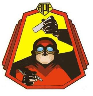
I should add, I do not know who made the original image, but credit goes to him or her.
 
Last edited:
Chaim...buddy

I'd appreciate it if you didn't just use my front. This contest, as it were is already becoming hazy as people are building upon others unique ideas in their entries. While it may give us interesting shirts I can't help but think its unfair to the original contributors as there is only one award.

Wait what there is a reward? :lol ... it's all yours buddy, don't worry, okay! I'm not in it for the reward. :)

TheRPF_T.jpg


collabor8 (= 8 in dremel electric coard), create (= dremel) and collect (=dremel bits)

-Chaim
 
Last edited:
Another variation on the mold, though I thought I'd turn the "mold" positive way around and change the front text. Fabricate seems like a better description of all the processes in making props. It's a little odd to make a design without feedback from a client, so I feel like I'm making stabs in the dark as to what the admins want.

10267-rpf-tshirt-calufrax-fabricating.jpg
 
Had a discussion with Gordon gekko and we decided to team up

idea3.png


Of course there could be variations on this including the Dremel guy switching with the logo, variations of wording underneath on the back including his original RPF font idea. Or even moving the collaborate, create, collect to the front. We can make those as requested.

I think we have a winner :)
So far.... This one is the strongest on both front and back !!
 
Wow! That is a pretty strong design in my opinion!

It has a bit of new... it has a bit of old.. it is interesting... I am liking it!

Had a discussion with Gordon gekko and we decided to team up

idea3.png


Of course there could be variations on this including the Dremel guy switching with the logo, variations of wording underneath on the back including his original RPF font idea. Or even moving the collaborate, create, collect to the front. We can make those as requested.

I agree - this one is very good.

I would definitely buy one of these.
 
Thanks for giving this a shot. I am not sure it is reading as clearly as I had hoped, but I do like the idea!

Well, since no one did the molding idea, I'll give it a shot
10265-rpf-tshirt-calufrax-molding-future.jpg


I suppose I could make the 'positive' large on the front and put the 'mold' on the back as well if you like.

10266-rpf-tshirt-calufrax-molding-future-alt.jpg
 
An updated version of dremel guy.

Black2.jpg


Trying to go for a more "collaborate, create, collect" guy. A Pulp Fiction, "whats in the case?" kinda feel.:confused

Or a touch of JJ Abrams!

Black2a.jpg
 
Last edited:
Thanks for giving this a shot. I am not sure it is reading as clearly as I had hoped, but I do like the idea!

Yeah, probably not as iconic and pleasing as the Dremel guy image. I read back through the thread after I did all these and saw the message "You may not warp the logo" and I thought "NOW I notice that", but it was the only way to make it look like it was 3D. So sorry about that.

Perhaps someone else wants to tackle the 3D idea still? I could do just the letters and started to a few times like the drawing of the idea, but I don't know how integral you think the rounded-edge square-line around the letters are. Sometimes the person who created a logo is probably doing a slow-burn watching their work being stretched and squashed like watching one of their kids getting abused by a stranger so I kept it all intact. It's a really nice logo.

All you have to do is change the mold part to bright pink or baby blue and you're golden.:lol
 
All you have to do is change the mold part to bright pink or baby blue and you're golden.:lol

Yeah, I sort of was thinking the logo was so metallic it needed to look stamped out of metal rather than a resin mold. Actually I think a really good slogan might make the shirt too, which is half of what I was wracking my brain to come up with. If anyone wants to use any part or all of one of my slogans in their award winning shirt, just buy me one of those $20 set of thin metal/plastic Dremel cut-off disks and I'll be happy. ;)
 
Last edited:
It was mentioned to me that the other logos in my design werent as distinct for those not in the know, so I made them a bit smaller and spread them out to be more visible.

The off topic is missing the word bubble because I had to recreate it, and didn't need the full logo originally...I'll change that eventually

albumview-1.jpg


So now you have the new Dremel guy and new front as variations on our collaboration
 
Back
Top