Design the Spring 2012 RPF Shirt - Win $300!

attachment.php

I like this front but it might work better and look less like two images "spliced together" if the logo was completely in cool colors. Try making the dremel
Guy in blues as well and let's see how that looks.
 
I'm still trying to come up with a modified logo personally. Mods, is there any way we can have this topic stuck at the top? I keep losing it when I go looking for it :lol
 
shirtidea2.png


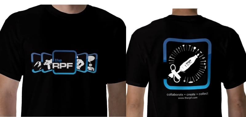
my earlier simpler design.
I kept the logo big for branding purposes...when someones behind you you want them to see the logo. and visit the site
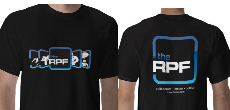

I really like this design a lot. Looks really cool. The others are pretty good as well, but something about this one really stands out for me.
 

See... now that I really like because it merges the dremel guy into our existing look.

I would love to see some more people play with a concept similar to this and work more on updating the look of the dremel guy himself.

This is great stuff!!
 
The only other suggestion I would have is that there is no need to reuse the RPF logo font for the url on the back. Simple Arial bold in a straight line under the dremel guy logo would be fine.
 
With all the viruses hitting via the banner ads, someone should find a way to incorporate that into the shirt. Perhaps a zombie logo?
 
I'm glad that this was Stuck. I had not noticed it before today. Some great designs so far. I really like some of the ones with the dremel guy.

I've got an idea for a design but won't be able to work on it for a few days.

Looking forward to seeing some more ideas that people come up with.
 
Hi there,

Mixing new (protokev) and old (dremel from dremelguy) together :

shirtidea3.jpg


collabor8 (= 8 in dremel electric coard), create (= dremel) and collect (=dremel bits) :lol

:)

-Chaim
 
Chaim...buddy

I'd appreciate it if you didn't just use my front. This contest, as it were is already becoming hazy as people are building upon others unique ideas in their entries. While it may give us interesting shirts I can't help but think its unfair to the original contributors as there is only one award.
 
Well, since no one did the molding idea, I'll give it a shot
10265-rpf-tshirt-calufrax-molding-future.jpg


I suppose I could make the 'positive' large on the front and put the 'mold' on the back as well if you like.

10266-rpf-tshirt-calufrax-molding-future-alt.jpg
 
Back
Top