You are using an out of date browser. It may not display this or other websites correctly.
You should upgrade or use an alternative browser.
You should upgrade or use an alternative browser.
WandaVision
- Thread starter dorianfaust
- Start date

Caplan
Sr Member
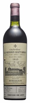
I asked the opinion of a friend who owns a vineyard by showing him your capture, for him it is the good model (a derivative of the appellation Croix de Bordeaux) visible on some bottles, your model and the one preview on the catch and certainly rarer but seen from time to time. in conclusion (and personally) I will retain this model.
Caplan
Caplan

dorianfaust
Active Member
It's awesome so far! Just needs the subtle connecting diamonds, and then I think it would be perfect!

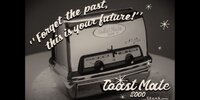
I picked up a vintage GE toaster on Ebay. The only modifications for the show are the "Toast Mate 2000" and the "Stark Industries" graphics. I'm going to try to find a designer to reproduce the design so I can run off some metallic stickers--at least until I can figure out a 3D approach. It's a pretty great toaster, very unique shape for the era.
Attachments
Last edited:
Caplan
Sr Member
It's almost perfect, now you have to link them together (and it forms a kind of "diamond") and the label will be almost accurate.View attachment 1414982
I tweaked it a bit, and added the Crosses.
Check it out and tell me if this is good.")
the color of symbols is ( lie de vins ) not black and white or grey.
Caplan
ScreenFashions
Active Member
I cropped this image from an eBay auction for anyone who wants to try making the TV Guide.
It's almost perfect, now you have to link them together (and it forms a kind of "diamond") and the label will be almost accurate.
the color of symbols is ( lie de vins ) not black and white or grey.
Caplan

Since they are Knights Templar crosses, I can capture the red color from my previous K-T post.
Okay, I see what you mean, now, not diamonds, just a Cross of Crosses. That's going to take tweaking the entire label to make that turn out right. If you look, the crosses are already close in my pic to the capture. Which means the position of my objects (text and house) is slightly different than screen used, which then throws off the cross alignment of the crosses.
(and fix the missing Tail on the bottom of that "G" it's not the exact font, just close)
Caplan
Sr Member
It seems to me to be better and better, (you are picky with your props) which is also my case (if it is not precise I do not do) the M of Amblard is also different from yours the D also in fact the font is different but it will be difficult to find it exactly ... but by looking on sites there is a possibility of finding it.
Caplan
Caplan
Celeste Conway
Well-Known Member
Cmdr.Kerner
Master Member
Hi guys,
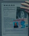
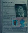
by using the picture on the left I have redrawn the S.W.O.R.D. logo. The font in the outer circle is not 100% correct, so if anyone has got a better idea which font was used, please don't hesitate to post it.
Dietrich
by using the picture on the left I have redrawn the S.W.O.R.D. logo. The font in the outer circle is not 100% correct, so if anyone has got a better idea which font was used, please don't hesitate to post it.
Dietrich
Attachments

Cmdr.Kerner
Master Member
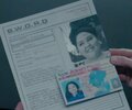
Thanks Riceball. English is only my second language so what does "Mepris" mean?I think the label looks pretty good but I think that the outline around Mepris and the cameo of the house are a touch too think, they look thinner by ~25% to me. But good job otherwise.
Cmdr.Kerner
Master Member
Riceball
Master Member
Sorry, I was talking about the wine label, not your SWORD logo, I should have been more specific.Thanks Riceball. English is only my second language so what does "Mepris" mean?
Similar threads
- Replies
- 3
- Views
- 461
- Replies
- 1
- Views
- 865
- Replies
- 1
- Views
- 1,327