dorianfaust
Active Member
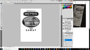
In the newest trailer for WandaVision there is a label for a bottle of wine that has been causing quite a stir. It translates into "House of Contempt," but if you just take the first letter of that word then it becomes "House of M!" My question is, has anyone made this wine label yet?


.png")
.png")


")


