V For VENDETTA: The movie props

One thing I would like to see done with a "V" mask is if someone were to make a combination of the movie and the comic-book versioins. I don't know why, but I really like the eyes on the comic version:

0930289528.01._SCLZZZZZZZ_.jpg
 
So is anyone else going to try this?


Originally posted by cookiemongoloid@Apr 14 2006, 08:49 PM
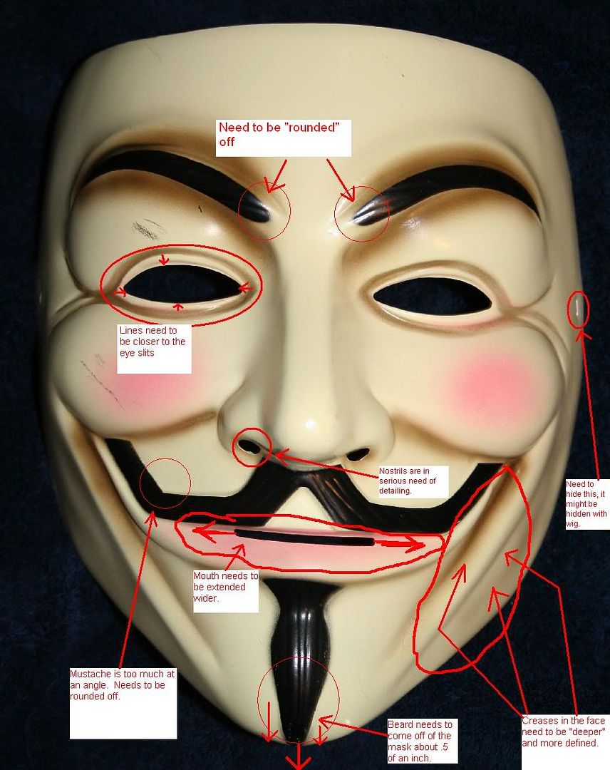
I considered doing the same thing to my COMIC-CON mask, making modifications and all.  I am not sure if ALL of these have been mentioned in the previous replys, but I'll repeat them anyway.  These are the obvious differenves between the Rubies, and Movie mask that I am planning to modify on my rubies; 

-The slit in the mouth is way too short on the Rubies
-The eyebrows are rounded off on the movie mask at the front, but the rubies are straight.
-The mustache on the Rubies is more "squared" or "angled" where the movie used one is more "rounded."
-The beard comes off of the mask about .5 -inch on the movie one, but not the Rubies.
-The nostrils are more detailed on the movie used mask.
-As for the paint, the eyeliner, needs to be closer to the eye slits on the rubies, it is WAY to spread apart.
-The creases in the face, caused by Guy's Grin need to be deeper cuts in the Rubies mask, they are to shallow and undefined.
-The overall width of the Rubies seems to be too wide. 
-The side string attatchements need to be hidden and concealed.

Rubiesmodified2.jpg

DCdirectedit.jpg

Vedit.jpg


I'm sure there are more things I didn't catch, I know there are more obvious things with the paint job, but I'm not going to mention all of them.  And I am sure that most of the things I mentioned above have been noted already on this thread...well...too bad. 

Oh and by the way, whoever shared these pictures, thanks.  I hope you don't mind that I am using them, it's for a good cause.  And to the owner of the Rubies mask, I am not picking on you, I have a Rubies V mask myself.
[snapback]1226789[/snapback]​
 
I dont think many people are willing to fork over $80 for it on ebay
but if I had one Id do it. just dremel out teh nostrils and bondo the details in, do teh same for the chin
 
In addition to the list posted above, the actual front of the nose itself is much more square on the rubies than in the film version. The slope into the cheeps needs to be steepened as well.
Ill try to take more detailed pics of those and other modifications I made on mine, unfortunatley, weather lately has not permitted it. (horrible light inside, see above pics)
-Nick
 
just saw the movie again tonight, noticed a few things:

-the scrambler, its definetly not black, maybe a charcoal gray, and the chrome piece is left chrome, and it opens quite faster than they do, so i dont know if they cleaned or replaced the gears inside.

-the ID card, the back was white, nothing on it, and when V used it it was not a swipe like a credit card, he just waved it in front of the reader like there is achip inside or something. And the closeup shot of it almost made it look wrinkled, like it was laminated cardboard or something and had creased.
 
Everything here's looking great, folks, good job.

About the "Unity" poster...I'm glad someone got the font right...it's amazing what a difference a tiny thing can make. Both posters look great, though.

I remember, back when I used to work at Kinko's, they used to have an oversized photocopier that could do fairly clean, BIG posters via enlargments. I haven't seen them in a Kinko's for years, especially since large-format printers came out, but I'm guessing that some Reprographics and Blueprint copying services would still have systems like this. If you could get at least a clean (laser printed) 11X17" print, then the blowup, if done right, could look almost just like the movie posters.

The problem with ordering prints is that the printing process is so different than how these would be printed in "real life", and I think it affects the prop...besides, the size of your standard print these days isn't very big, and that's a big poster.

Basically, any process that puts ink "on top" of the paper, like many color copiers do, looks funny compared to an ink-jet or web print on non-coated stock. Hopefully I'm making sense here...regular printing allows the ink to soak into the paper, whereas a lot of modern digital printing has ink that stays on top, and is usually shiny, whether or not it's on coated stock.

If I still had my old press connections, I'd do a run of these in the proper size...anyone else around here have any printer connections?

-E
 
Originally posted by cookiemongoloid+Apr 18 2006, 05:24 AM--><div class='quotetop'>QUOTE(cookiemongoloid @ Apr 18 2006, 05:24 AM)</div>
<!--QuoteBegin-Hauntmaster9
@Apr 17 2006, 07:35 PM
vqjh8z.jpg

vqjhit.jpg

vqjhuw.jpg

Sculpt I finished up a couple days ago.
[snapback]1228139[/snapback]​

Did you make that sculpt yourself, or did you modify an already made mask?
[snapback]1228204[/snapback]​
[/b]
Sculpted myself. Here's an earlier sculpt pic
vrsfgw.jpg
 
nice work hauntmaster
i am still working on mine
other stuff and work cuts into the time i have to spend on it
 
Hauntmaster, that looks fantastic. Wonderful work.

I just shot a gloss coat on mine, here's a pic of it hanging to dry:


maskdry.jpg
 
<div class='quotetop'>QUOTE(nickthsaberman @ Apr 18 2006, 05:39 PM) [snapback]1228730[/snapback]</div>
Hauntmaster, that looks fantastic. Wonderful work.

I just shot a gloss coat on mine, here's a pic of it hanging to dry:


maskdry.jpg

[/b]

Wow. Looking fancy.
 
"Good news. DCD will be releases V's daggers later this year."

here's hoping the daggers are more accurate than the constantine shotgun...and more sturdy than the begins batarangs...sadly though...given the precedent of those items...the daggers will likely be mounted to a plaque....skott
 
Back
Top