CSMacLaren
Sr Member
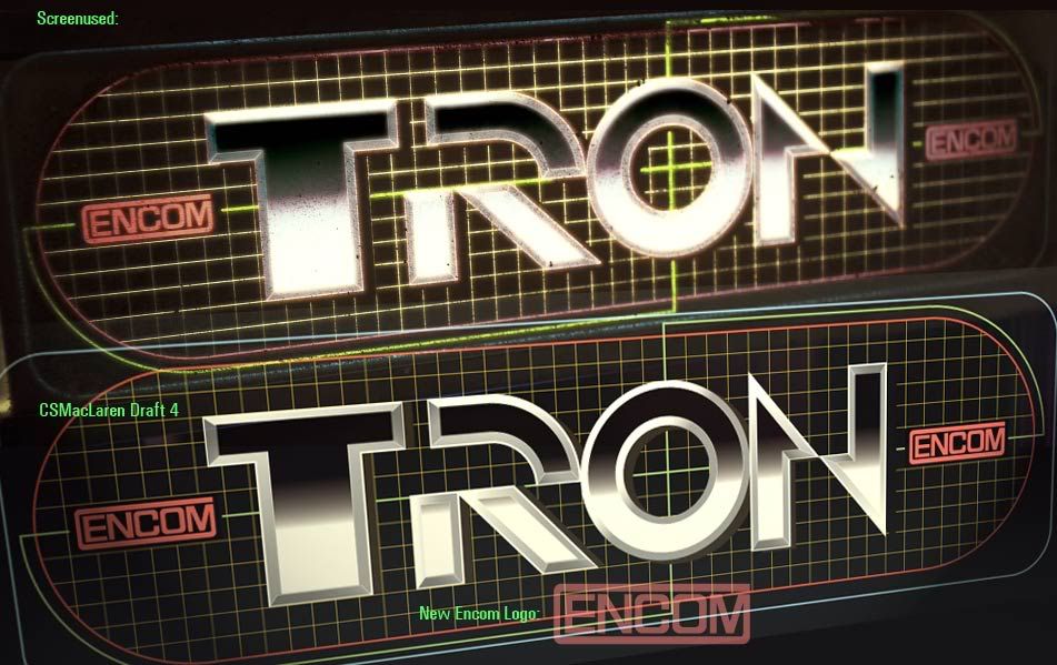
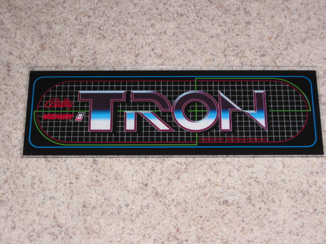
I was greatly inspired by the marquee of the coin-op game cabinet at Flynn's as seen in the trailer for TRON: LEGACY.
This is how it appeared.

So, firing up Adobe Illustrator, this is what I've come up with:
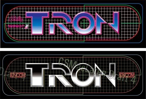
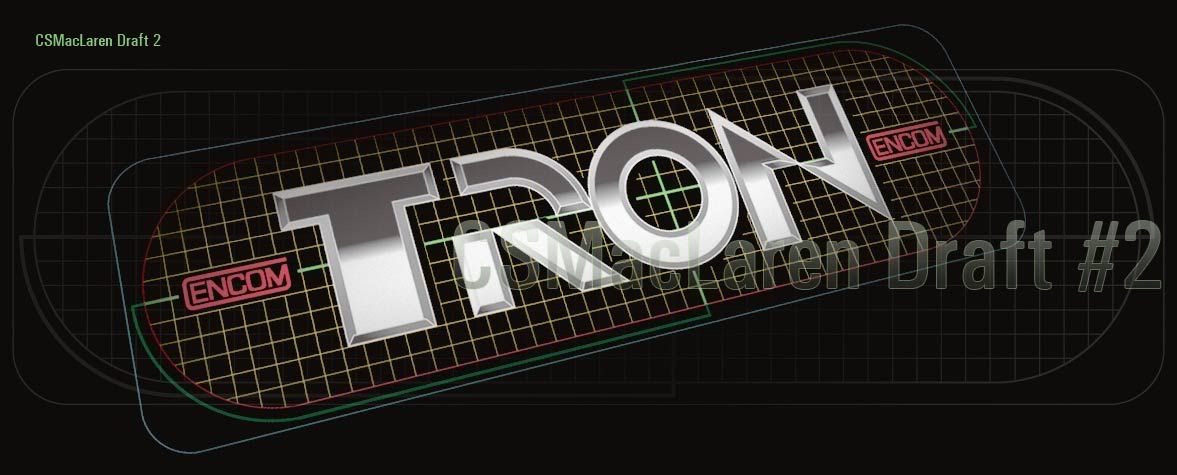
SECOND DRAFT:
FIRST DRAFT:
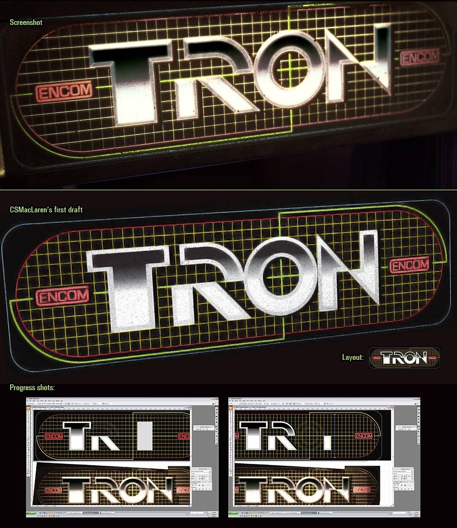
This is how it appeared.
So, firing up Adobe Illustrator, this is what I've come up with:
SECOND DRAFT:
FIRST DRAFT:
Last edited:

")