Mr Mold Maker
Master Member
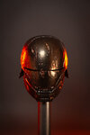
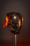
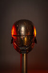
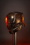
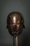
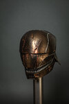
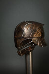
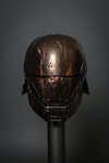
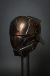
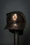
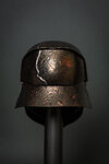
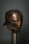
Hey folks. I just painted the “Stranger” helmet from The Acolyte and couldn’t find an appropriate thread to post it in.
It was made from PewPewCraft files and painted by myself with Imperial Surface Alumaluster and Candy2O. It is an incredibly weird finish, one really must see it in person because my photos don’t capture it well. In the light it reads as a bronze/copper color, but in shadow it falls to black. It is an incredibly interesting paint job and I had fun doing my take on it. Hope you enjoy. If you want to see my other paint work on Star Wars stuff check out my Instagram at: Instagram.com/JackRupert133
I’ve added the photos as thumbnails below because they open very large.

As for the future of this thread, if anyone else wants to share their research or work on Smilo Ren here please feel free!
It was made from PewPewCraft files and painted by myself with Imperial Surface Alumaluster and Candy2O. It is an incredibly weird finish, one really must see it in person because my photos don’t capture it well. In the light it reads as a bronze/copper color, but in shadow it falls to black. It is an incredibly interesting paint job and I had fun doing my take on it. Hope you enjoy. If you want to see my other paint work on Star Wars stuff check out my Instagram at: Instagram.com/JackRupert133
I’ve added the photos as thumbnails below because they open very large.


As for the future of this thread, if anyone else wants to share their research or work on Smilo Ren here please feel free!
