Pannaus Props
Sr Member
defintely like it! the old starwars banner did its time! Nice job, simple, stylish, elegant, sober! New Logo and style for the win ")
It's because this forum was a comfy place for me to visit kinda like that old pair of underwear that looks like garbage but feels perfect. (nasty image I know!)
Given what you have said, it sound like your reservations are more about change in general than about the specific changes we made.
Despite all comments to the contrary, change is good.
Changing your underwear for example... :cool
// ==UserScript==
// @name              theRPF Link Changer
// @namespace     http://www.therpf.com
// @description      Change the Links

// @include            http://www.therpf.com/*
// @include    http://therpf.com/*
// @include    http://www.moviepropsites.com/*
// @include    http://moviepropsites.com/*

// @exclude    http://www.therpf.com/newreply.php*
// @exclude     http://therpf.com/newreply.php*
// @exclude    http://moviepropsites.com/newreply.php*
// @exclude     http:/www.moviepropsites.com/newreply.php*

// @exclude    http://www.therpf.com/newthread.php*
// @exclude     http://therpf.com/newrthread.php*
// @exclude    http://moviepropsites.com/newthread.php*
// @exclude     http:/www.moviepropsites.com/newthread.php*

// @exclude    http://www.therpf.com/members/*
// @exclude     http://therpf.com/members/*
// @exclude    http://moviepropsites.com/members/*
// @exclude     http:/www.moviepropsites.com/members/*

// @exclude    http://www.therpf.com/private.php*
// @exclude     http://therpf.com/private.php*
// @exclude    http://moviepropsites.com/private.php*
// @exclude     http:/www.moviepropsites.com/private.php*

// ==/UserScript==

(function () {
    GM_addStyle("body  a:visited {color:#A0B0E0 !important; TEXT-DECORATION: underline !important;}");
    GM_addStyle("body  a:link {TEXT-DECORATION: underline !important;}");
})();(function () {
GM_addStyle("body a:visited {color:#A0B0E0 !important;}");
})();// ==UserScript==
// @name theRPF Expander
// @namespace http://www.therpf.com
// @description Expand theRPF to fit your screen
// @include http://www.therpf.com/*
// @include http://therpf.com/*
// @include http://www.moviepropsites.com/*
// @include http://moviepropsites.com/*
// @exclude http://www.therpf.com/newreply.php*
// @exclude http://therpf.com/newreply.php*
// @exclude http://moviepropsites.com/newreply.php*
// @exclude http:/www.moviepropsites.com/newreply.php*
// @exclude http://www.therpf.com/newthread.php*
// @exclude http://therpf.com/newrthread.php*
// @exclude http://moviepropsites.com/newthread.php*
// @exclude http:/www.moviepropsites.com/newthread.php*
// @exclude http://www.therpf.com/members/*
// @exclude http://therpf.com/members/*
// @exclude http://moviepropsites.com/members/*
// @exclude http:/www.moviepropsites.com/members/*
// @exclude http://www.therpf.com/private.php*
// @exclude http://therpf.com/private.php*
// @exclude http://moviepropsites.com/private.php*
// @exclude http:/www.moviepropsites.com/private.php*
// ==/UserScript==
(function () {
GM_addStyle("body a:visited {color:#A0B0E0 !important; TEXT-DECORATION: underline !important;}");
GM_addStyle("body a:link {TEXT-DECORATION: underline !important;}");
})();
var els = document.getElementsByTagName("div");
for(var i = 0, l = els.length; i < l; i++) {
var el = els[i];
el.innerHTML = el.innerHTML.replace(/970px/gi, '95%');
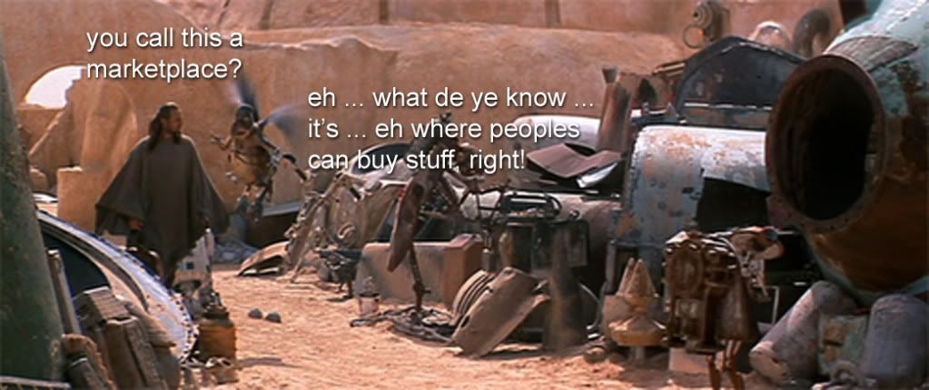
}Well whaddaya know, I finally contributed something useful!Now we know what to retitle the Marketplace for April Fool's Day! :lol