Making the Lost Room bus ticket

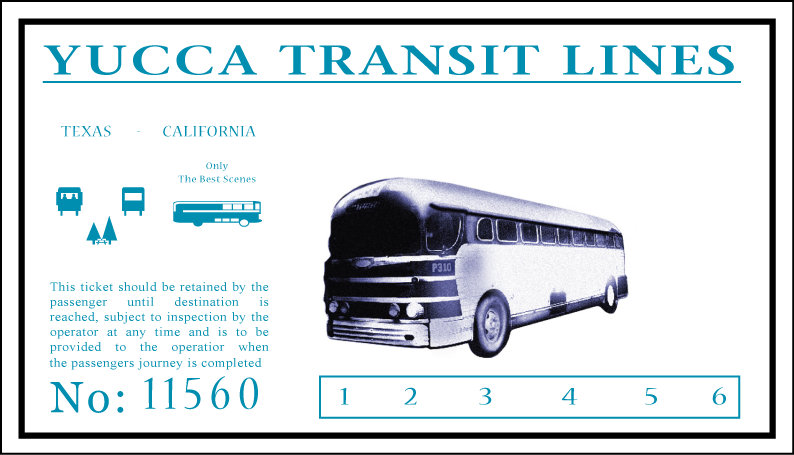
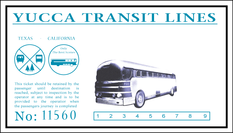
Here's a newer version based on the correct bus.

You should merge the 2 threads..

I'd go with a darker color blue than the one your using. Also, are you sure the dimensions are correct? It looks like the height is a little short.

bus2zo1.jpg


FB
 
Progress report (thanks for Franz Bolo):
I definately need to thin up that 1,2,3,4,5,6 box on the front and shrink the font on those numbers... and I think there is more than 6, but how many?
lastfront-1.png

lastback.png
 
Wow, great work so far.

Just don't get too accurate or you'll find yourself zapped to a distant highway in Gallup, New Mexico. :D
 
<div class='quotetop'>QUOTE(franz bolo @ Jan 14 2007, 03:59 PM) [snapback]1397219[/snapback]</div>
Here's what it could look like once it's weathered and darkened:

bus3as6.jpg


FB
[/b]

Nice. Is that printed out? Did you age it on your PC? If you did, will you age the look of my ticket for me when I get it done?

BTW, anyone who wants to use my images is free to do so, as long as you don't try to sell them. Is there still a person hosting free paper props? I'll donate the files once they are finished.

Here's the latest:
Busticketfront.png
 
Great work so far, but the symbol in the lower quarter of the left circle looks more like 2 people than 2 trees ;)

busticket.jpg
 
<div class='quotetop'>QUOTE(F-N-S @ Jan 14 2007, 04:12 PM) [snapback]1397225[/snapback]</div>
Great work so far, but the symbol in the lower quarter of the left circle looks more like 2 people than 2 trees ;)

busticket.jpg

[/b]

Good eye... I thought it was two trees with a picnic table, but your pic shows two people more clearly than a picnic table.
 
<div class='quotetop'>QUOTE(Sulla @ Jan 14 2007, 03:03 PM) [snapback]1397222[/snapback]</div>
Is that printed out? Did you age it on your PC?
[/b]

It's just some Photoshop trickery. Juno has a great paper aging tutorial on here site:

http://www.curiousgood.com/aged.htm

Also, try to match the font a little better if you can. The font on the ticket has long ascenders and short descenders on all the letters and it has a retro kind of feel to it.

FB
 
Now, what's the text at the top of that circle... ? (And I need to put a dress on the figure to the left.)
Busticket439.png
 
Sorry, can't help you with the text in the circle. It's too small and too blurred to read.

But one thing i can help you with: there's a typo in the second operator :D
And i'm sure i see a comma after time and a period at the end ...
 
<div class='quotetop'>QUOTE(F-N-S @ Jan 14 2007, 04:38 PM) [snapback]1397250[/snapback]</div>
Sorry, can't help you with the text in the circle. It's too small and too blurred to read.

But one thing i can help you with: there's a typo in the second operator :D
And i'm sure i see a comma after time and a period at the end ...
[/b]
Thanks. :$ typo's have been corrected. I may just make up the text in the circle for now.
 
Is it me or does the bus image look like its a different piece of paper glued on to the ticket face. Maybe a sticker? Unless it is printed in white ink which I doubt.

Also, in the Screen cap you can make out a thumb print right above the #1 down by the punch box. I'm thinking that the large dark smudge right over th bus is a finger print as well.
 
<div class='quotetop'>QUOTE(Jmtwo @ Jan 14 2007, 11:11 PM) [snapback]1397469[/snapback]</div>
Wow.. This thread really took off. Nice work Sulla. :thumbsup
[/b]

Thanks. I got the thing done last night and when I went to save it t my second hard drive, the program crashed and i lost the ai file :(

I have the front and back saved as a png, but the detail words in the top of that quartered circle had not been added. I got one completed ticket printed off on card stock before I lost the file, and I scanned it back in and will re-creat it soon. Anyone who wants a copy of the scan just PM me and I can e-mail the scans and the png files to you.

*edited to correct spelling (hopefully all of it - me edjumicated gud)*
 
It looks great so far, but I agree with franz bolo - the font of the paragraph and, well, everything but "Yucca Transit Line" doesn't look quite retro enough. I think it could make a huge difference to change that up a bit.

Is it possible that the "text" in the upper quarter of the circle is not actually text at all, but just a long horizontal line above a shorter horizontal line? I don't know what exactly that would mean, but looking at the super-close-up from the credits, it looks awfully solid to me, so if it was text it would have to be very bold and close-together to blend like that.

Also, the phrase "Only the best scenes" in the other circle doesn't make a whole lot of sense to me...maybe "Only to bus service" or something like that? I think "service" is probably the last word, and "bus service" is a good assumption to make.
 
<div class='quotetop'>QUOTE(Patattack @ Jan 15 2007, 11:53 AM) [snapback]1397731[/snapback]</div>
...the phrase "Only the best scenes" in the other circle doesn't make a whole lot of sense to me...maybe "Only to bus service" or something like that? I think "service" is probably the last word, and "bus service" is a good assumption to make.
[/b]
I agree... it looks like the words read "Only To Best Service", but that doesn't make much sense. It would make perfect sense if it read "Only The Best Service", but the second word clearly looks like "To", and too short to read "The". The third word definitely looks like "Best", and not "Bus".

Oh yeah... not that this helps much, but I managed to find this image cached on my system from the Sci-Fi channel's web site contest:

Lost_Room_Bus_Ticket_Sci-Fi_Contest.jpg


This is the main image I used to print mine up back when the show was first airing -- the quarter was real though. ;)
 
<div class='quotetop'>QUOTE(Ripstick @ Jan 15 2007, 11:26 AM) [snapback]1397746[/snapback]</div>
<div class='quotetop'>QUOTE(Patattack @ Jan 15 2007, 11:53 AM) [snapback]1397731[/snapback]
...the phrase "Only the best scenes" in the other circle doesn't make a whole lot of sense to me...maybe "Only to bus service" or something like that? I think "service" is probably the last word, and "bus service" is a good assumption to make.
[/b]
I agree... it looks like the words read "Only To Best Service", but that doesn't make much sense. It would make perfect sense if it read "Only The Best Service", but the second word clearly looks like "To", and too short to read "The". The third word definitely looks like "Best", and not "Bus".
[/b][/quote]

I just finished going frame-by-frame through all three nights intros and I tend to agree that it should read "Only The Best Service". Right when the ticket starts to fade in, it looks as though "The" is there rather than "To".
I also think it is written in an italicized script of some sort that blends the T and h together making it appear to be "To".


I'm pretty sure the top of the other circle has words in bold and not lines, but I'll be darned if they will ever be read from screencaps.

I went ahead and reworked it with Dragonfly as the font.

dfly6ae9.jpg


While it's still not the correct font, it has alot of the elements and hopefully jogs someones memory.
2 cents
 
<div class='quotetop'>QUOTE(Ripstick @ Jan 15 2007, 01:26 PM) [snapback]1397746[/snapback]</div>
Oh yeah... not that this helps much, but I managed to find this image cached on my system from the Sci-Fi channel's web site contest:

Lost_Room_Bus_Ticket_Sci-Fi_Contest.jpg


This is the main image I used to print mine up back when the show was first airing -- the quarter was real though. ;)
[/b]

Is that supposedly a screen-used ticket? It definitely shows text in the upper quarter of the circle (unlike lines, as I'd thought).

Jmtwo, the reworked ticket looks better than ever. I'm looking through various font sites to see if I can find something closer, but what you've picked is a darn fine fascimile. :D

Oh - I do think that you need to rotate the bus picture a tiny bit clockwise, at least based on Ripstick's ticket...

Oooh ooh. I think I've found a pretty close font...Here's a link to the page to download it, with some sample text from the ticket previewed.

http://www.dafont.com/font.php?file=packar...mp;classt=alpha
 
Good call on the font. I'll play around with it when I recreat the file of my ticket. I'll use my printed ticket for my RPG and keep working on this. :)
 
Back
Top