You are using an out of date browser. It may not display this or other websites correctly.
You should upgrade or use an alternative browser.
You should upgrade or use an alternative browser.
Indiana Jones and the Raiders of the Lost Ark
- Thread starter Jedifyfe
- Start date
Onkelpsycho
Sr Member
Looks good, but the spelling mistakes in the second telegram are quiet funny...
its more like a pole of ra than the staff of ra... If someone want to make a good translation, let me know, I can help you, if you want...")
its more like a pole of ra than the staff of ra... If someone want to make a good translation, let me know, I can help you, if you want...
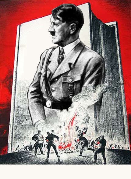
I am very curious were they got the top half of the Nazi propaganda poster. I have looked ever since the book came out and found nothing. I believe it is a composite of 2 posters; one being an American propaganda poster and the other a portrait of Hitler.
You're right about this being a composite image. The bottom half:

The top:

Link to larger version: http://web.utah.edu/news/news_images/nazi_olympische_1936.jpg
I couldn't find a larger version of the book burning poster, so after making the composite, I added a half-tone affect to the finished image to mask the low-resolution of the original.
Kind regards,
Magnoli
DBCooper
Sr Member
WOW! That is great. Thank you so much. I wasn't sure if you had anything to do with this entry in the book or not so I just through it out there as a general statement.
I am going to see about making one of these myself. Thank you for the info and the links.
Best,
DBCooper
I just found this image of the poster:
http://www.ushmm.org/museum/press/kits/download.php?content=fighting_the_fires_of_hate&image=n08438
Or this one:
http://www.flickr.com/photos/boston_public_library/2351907969/
Might be better to work with?
Last edited:
Great find! I wish I had that image when I was designing the original.
Kind regards,
Magnoli
Kind regards,
Magnoli
Brigandia36
Sr Member
Any updates on that bible page? Just curious if anyone was able to find the bottom half to the illustration posted earlier?
My scan is too small to make a good job ... but I have the page.
DBCooper
Sr Member
It is all personal preference. I use bron craft paper. Virgin paper, not recycled. The virgin is smoother and lighter in color. The map shows up better on it. The craft paper also ages very well and holds up.
I print mine out on two sheets of 11 x 17 inch paper. I believe most use standard 8 1/2 x 11 but I like mine a little larger.
Here is a pic of my Goonies map on the same paper. I can't find a pic of my Fertility Idol map at the moment.
Best,
DBCooper
I print mine out on two sheets of 11 x 17 inch paper. I believe most use standard 8 1/2 x 11 but I like mine a little larger.
Here is a pic of my Goonies map on the same paper. I can't find a pic of my Fertility Idol map at the moment.
Best,
DBCooper
I'm not sure about that font as it was added in after the artwork by the publisher.
As for the Raiders Map, I too use plain brown paper. The original prop is said to be made from this paper... perhaps with nothing on it but aging.
Kind regards,
Magnoli
As for the Raiders Map, I too use plain brown paper. The original prop is said to be made from this paper... perhaps with nothing on it but aging.
Kind regards,
Magnoli
DBCooper
Sr Member
Here is what I came up with. I am still figuring out Photoshop. It can be difficult. I wasn't able to blend Hitler into the smoke to my satisfaction.
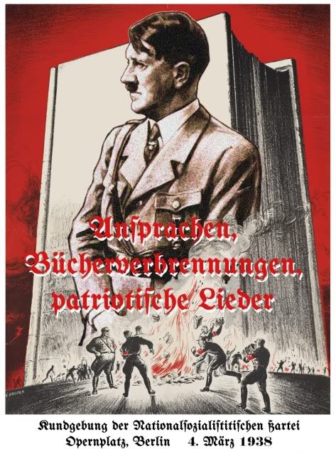
http://i270.photobucket.com/albums/jj87/dbcooper2/NaziPropagandaPoster.jpg
The font I used is "Bertholdr Mainzer Fraktur" :
http://www.dafont.com/theme.php?cat...text=Ansprachen,&nb_ppp=50&psize=m&classt=pop
Look a third of the way down.
Hope you like it.
Best,
DBCooper
http://i270.photobucket.com/albums/jj87/dbcooper2/NaziPropagandaPoster.jpg
The font I used is "Bertholdr Mainzer Fraktur" :
http://www.dafont.com/theme.php?cat...text=Ansprachen,&nb_ppp=50&psize=m&classt=pop
Look a third of the way down.
Hope you like it.
Best,
DBCooper
To fade Hitler more, use the eraser tool.
Once you select eraser, up in the brush size, select the brush that looks like it has faded edges. It almost looks like airbrush. Once you select that, set the brush size even higher, like 400 or higher if you want to. Then pass the eraser under Hitler, not even touching him. You will see his image fade away with each pass. Since the brush is set so large, it won't do a clean erase, it will just fade. But make sure you do it down and away from his image so it is only fading. Once you get the feeling for the tool, you will be more comfortable knowing how much distance to use. Just remember, you can always step back if you take off too much.
Once you select eraser, up in the brush size, select the brush that looks like it has faded edges. It almost looks like airbrush. Once you select that, set the brush size even higher, like 400 or higher if you want to. Then pass the eraser under Hitler, not even touching him. You will see his image fade away with each pass. Since the brush is set so large, it won't do a clean erase, it will just fade. But make sure you do it down and away from his image so it is only fading. Once you get the feeling for the tool, you will be more comfortable knowing how much distance to use. Just remember, you can always step back if you take off too much.
Looking good! Here is my original image before the text was added:
Kind regards,
Magnoli
Kind regards,
Magnoli
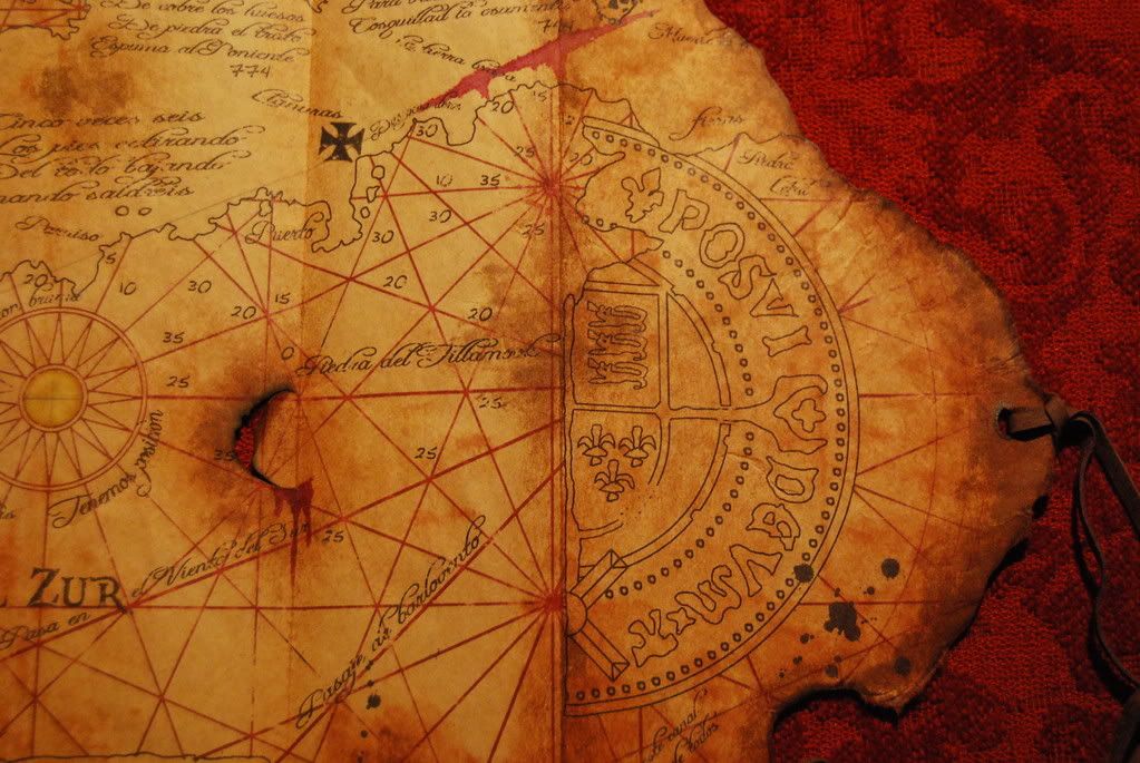
DARTH SABER's Map to the Chachapoyan Temple (Original and Alternate Versions)
View attachment 21279
View attachment 24349
View attachment 24350
View attachment 24705
View attachment 24706
Ralph McQuarrie's Bible Artwork
View attachment 21280
Jack Daniel's "Belle of Lincoln" Whiskey Labels (Newer and Worn Versions)
View attachment 21281
View attachment 21282
NOTE: I'm not currently aware of who did the whisky labels. If someone knows, please tell me and I will credit them appropriately.
Anybody have the bottom half of the page for the Bible picture? Someone promised to email it months ago to me, but never followed through. Thanks
Adam C.
Sr Member
Anybody have the bottom half of the page for the Bible picture?
Do you mean this one? I'd like to see it too if anyone out there has it.
View attachment 26199
View attachment 26200
mrsmartypants
Well-Known Member
To fade Hitler more, use the eraser tool.
Once you select eraser, up in the brush size, select the brush that looks like it has faded edges. It almost looks like airbrush. Once you select that, set the brush size even higher, like 400 or higher if you want to. Then pass the eraser under Hitler, not even touching him. You will see his image fade away with each pass. Since the brush is set so large, it won't do a clean erase, it will just fade. But make sure you do it down and away from his image so it is only fading. Once you get the feeling for the tool, you will be more comfortable knowing how much distance to use. Just remember, you can always step back if you take off too much.
That is definitely one way to do it! :thumbsup
However, I would do it on a layer mask instead of using the eraser. Just use a paintbrush in place of eraser. That way you can paint back anything you want if you don't like the result, take too much off, etc.
With the eraser tool, you will be limited to the length of your history panel and eventually, you will run out of states to revert back to (or if you close the image, they are gone for good). Using a layer mask and painting away the detail you don't want allows for endless corrections while the original image remains untouched (just hidden behind the layer mask). You can also open and close the image endless times and still be able to paint away or paint back on any details you originally hid.
Do you mean this one? I'd like to see it too if anyone out there has it.
View attachment 26199
View attachment 26200
Yes that is the one. Brigandia36 said he would email it, but he realized the size was too small for a quality print. So if anyone has the bottom half, I already have the top. Also the size. Thanks
DB81
Active Member
The last few days I worked on my interpretation of the Dutch Bible Pages.
Both pages are not SA, the dutch text may contain alot of mistakes (I only translate it online) but maybe there is someone who will enjoy it :lol
For a bigger (2700x3500) and unsigned version, just pm me.
Both pages are not SA, the dutch text may contain alot of mistakes (I only translate it online) but maybe there is someone who will enjoy it :lol
For a bigger (2700x3500) and unsigned version, just pm me.
Similar threads
- Replies
- 3
- Views
- 524
- Replies
- 7
- Views
- 927
- Replies
- 1
- Views
- 1,295
- Replies
- 1
- Views
- 1,681