HP Font Database

Hey,

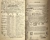
I appeal to the Fonts's Masters and Finders (decat, LorduDesign & cie), I'm looking for most of the fonts used in Dumbledore's last will and testament.

I have a recollection that they were once given away, but I can't remember where.

Thank you very much, in advance.
 
hello i want to creat an advance potion book but i dont know witch font is used in the note writen in the book if someone knows them hope u can help me thenx ^^
 

Attachments

  • 8f665dc0191f882f4d1c272b6906fb38.jpg
    8f665dc0191f882f4d1c272b6906fb38.jpg
    215.1 KB · Views: 58
hello i want to creat an advance potion book but i dont know witch font is used in the note writen in the book if someone knows them hope u can help me thenx ^^
It was handwritten. However if you want a version that was used in the VFX transition shot (coming into Hogsmeade), it was I believe Lamar Pen. That being said it was done in post and no copies of the actual prop used a font for Snape's handwriting.
 
Last edited:
Hey, I'm looking for the font used on IT'S A ROLLOVER! If someone can help. thanks in advance!

rollover.png
It would really help to identify the font if we knew what movie the prop was in. MinaLima used Archive Grotesque Shaded and Archive Antiqua Extra Condensed quite a lot in tOotP & tHBP and I think they had just discovered Walden Font collections so it could be Eldon WF. The apostrophe and exclamation point aren't quite right... however, it could be an intentionally bad xerox copy of the font... a combination of several or a cut and paste from a newspaper.
 
Last edited:
View attachment 1296195
It would really help to identify the font if we knew what movie the prop was in. MinaLima used Archive Grotesque Shaded and Archive Antiqua Extra Condensed quite a lot in tOotP & tHBP and I think they had just discovered Walden Font collections so it could be Eldon WF. The apostrophe and exclamation point aren't quite right... however, it could be an intentionally bad xerox copy of the font... a combination of several or a cut and paste from a newspaper.
It's not any of the Walden Font types. It's a free font from Dafont that I can't remember off the top of my head. They didn't use any Walden Font stuff until HP7 from what I know.
 
Good call LorduDesign! FindMyFont didn't recognize it UNTIL I typed it in all lowercase. The UPPERCASE letters are much more grungy. It is only FREE for personal use. If you plan to use it for commercial purposes it should be licensed. I just wrote to S. John Ross of Cumberland Fontworks and he verified it.

FindMyFont also suggested Gothic 13 by Linotype which is a much cleaner version with a full font set, wonder if S. John used it as a base and roughed it up some?
 
Hi! I'd like to know some fonts:
  • The font used on the body text of "Hogwarts: A History", (I'm almost sure that the font of the header is Archive Type Lightface Extended) and if the crosses patern under the header are glyphs of any font (or where I can find those exact glyphs as images).
  • The font used on "Magical Theory". (If someone has photos of the inside pages of this book I would appreciate them).
Thank you!
 

Attachments

  • ETzbtkIXkAEeeox.jpg
    ETzbtkIXkAEeeox.jpg
    279.4 KB · Views: 92
  • ETzbtkIXYAEwHre.jpg
    ETzbtkIXYAEwHre.jpg
    310.8 KB · Views: 91
  • 1599333587202.png
    1599333587202.png
    1.2 MB · Views: 92
Hi! I'd like to know some fonts:
  • The font used on the body text of "Hogwarts: A History", (I'm almost sure that the font of the header is Archive Type Lightface Extended) and if the crosses patern under the header are glyphs of any font (or where I can find those exact glyphs as images).
  • The font used on "Magical Theory". (If someone has photos of the inside pages of this book I would appreciate them).
Thank you!
Hey,
The text font in the Hogwarts: A History book looks to me like Archive Modern II font. And yes, you are right about the header font. As for the symbols, they aren't a font.

The type on that cover is unfortunately not a font but rather a scanned type. A lot of the first film's artwork was in general that, as a large portion of it was done without the use of computer. As for the inside pages, they are visible in the film when you watch the first three films carefully. They used pages from an old book inside rather than create a new design.

Thank you! I wonder which book they used for the inner pages? Just for curiousity.

Sadly, all Archive Type fonts are paid. I've found an alternative font for Archive Roundface Script, used in the titles of Life and Lies of Albus Dumbledore. It's Gf Script No 5, but it's also a commercial font. By the way, other font that I'm struggling to identify is the one used for the body text of that book.
 

Attachments

  • 1599532322628.png
    1599532322628.png
    1.6 MB · Views: 52
The wide majority of fonts they used are commercial and there's usually no alternative. I generally try to use the original fonts. As for the text font, hmm... I'm not sure as I never really researched this book but it looks like some sort of Bodoni-type font.
 
Hi! I'm in the process of building a wand box and I'm curious if anybody happens to know what font or fonts were used for the numbers on the side labels? Thanks!authentic-ollivander-wand-box_1_e64c54cbaea80985dc5ea017f0465096.jpg
 
Hi! I'm in the process of building a wand box and I'm curious if anybody happens to know what font or fonts were used for the numbers on the side labels? Thanks!View attachment 1365296
Just like many other people have noted here, MinaLima don't always use fonts, so there is a chance that the same happens in this case. These numbers, however, were used by them also in the Gilderoy Lockhart's exam, and even though they might or might not be a font, they are definitely based on the old Bodoni fonts, Bodoni Classic Pro by Wiescher Design contains a very similar set that might be helpful to you.
 

Your message may be considered spam for the following reasons:

If you wish to reply despite these issues, check the box below before replying.
Be aware that malicious compliance may result in more severe penalties.
Back
Top