DBOYSLADE
Well-Known Member
I really wish I had entered. Just never really had time to sit down and work on my idea.
Do you plan on doing any future contests like this?
Pretty sure it'll happen again.
I really wish I had entered. Just never really had time to sit down and work on my idea.
Do you plan on doing any future contests like this?
Some of my design that were submitted. Enjoy!


Some really nice designs there but shouldn't these ones say "DEDICATED TO" rather than "DEDICATE TO"? I especially like a the "Hack & Recast" ones. They wouldn't be good for me but they look great.
This.Woo-hoo! replicas (albeit parody) of design classics!

Woo-hoo! replicas (albeit parody) of design classics!
The edit makes it even more perfect... add a black shirt and I'm in. (Ok, maybe just a tad smaller than seen here).Great ideas everyone!
I really love that ESB style shirt...:love
It looks pretty much perfect as is on the front, but maybe the small RPF logo could go on the back up near the neck instead? That would perfect it IMO.
Nice idea Superkrates! I hope you don't mind but I attached a slightly edited version to show better what I mean.
-Carson
Great ideas everyone!
... I attached a slightly edited version to show better what I mean.
-Carson
DBOYSLADE has some really amazing designs, too... I'm loving the hack & cast design.
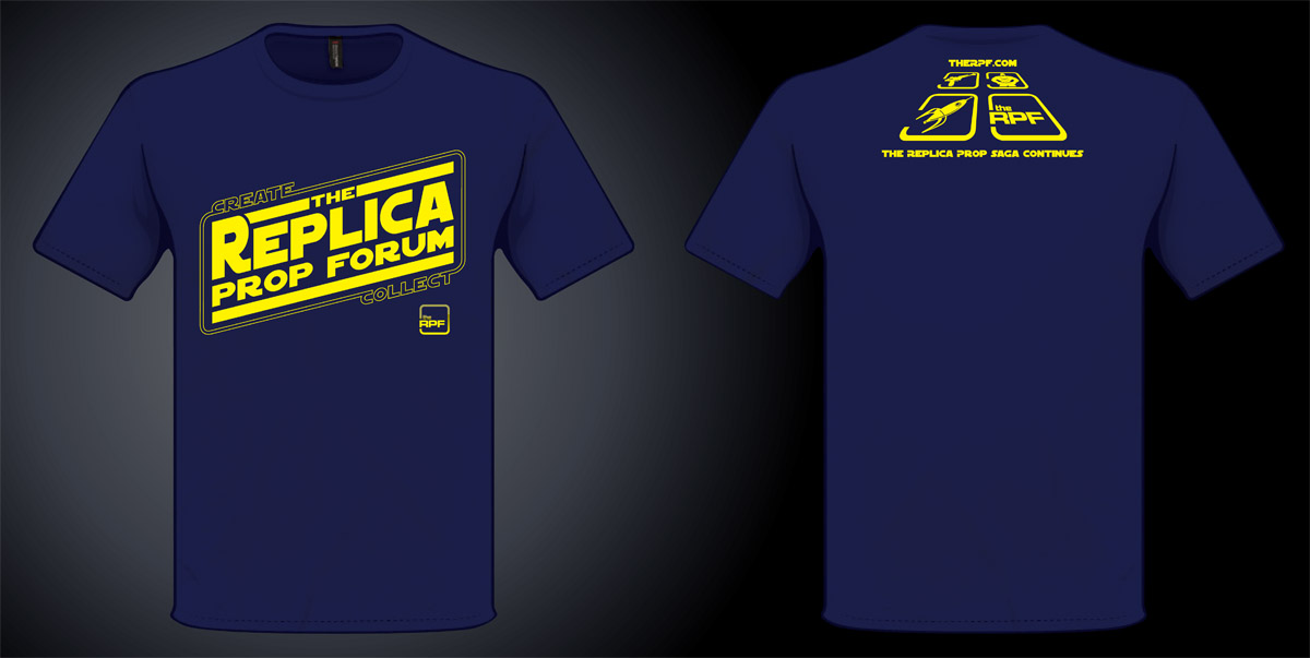
This can't be an easy decision. But, if I were a betting man - I'd guess they're not going to go with the ESB design.
It seems that the diversity here (ie non-star wars) is much more in focus.I hate to say it but I think your right. Recently this forum has proven that even tough we all have different tastes we can all come together behind one common element THE RPF. And that is what this Shirt should depict. It should be about this forum and about all of our interests in Creativity, Construction, and Collecting. This is why my money is on AKluthe's design.
It seems that the diversity here (ie non-star wars) is much more in focus.
That said, the ESB design is still my top choice!!
thumbsupI'm just curious: It seems like over the last year+ there has been a lot of discussion about the re-branding of the RPF. Moving away from it's Star Wars roots and even reducing the use of "The Replica Prop Forum" in favor of "The RPF". Then the shirt chosen, is basically screaming "Star Wars" and using elements that were being phased out.
Really, I'm not sour grapes here, but this shirt just seems to be a complete 180 from what you have been talking about for some time now.