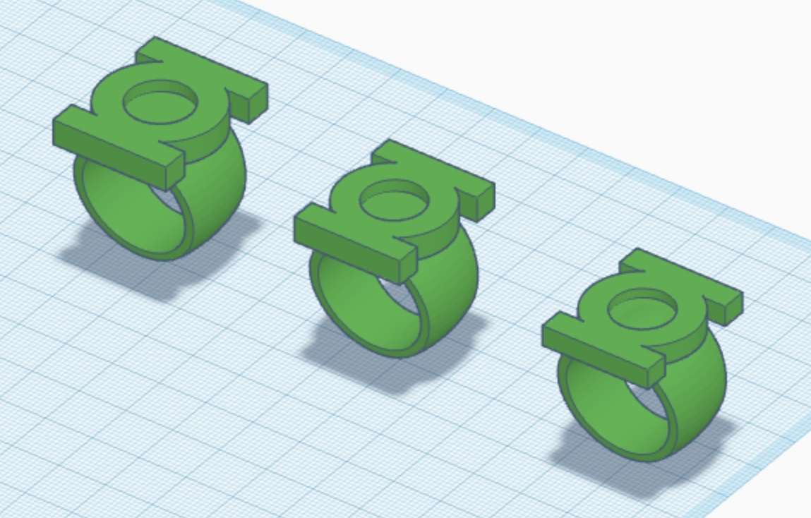
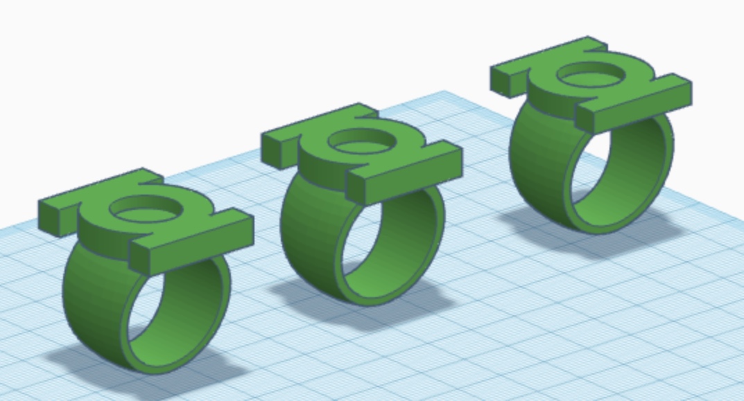
Defined Green Lantern Comic Rings

More V2 tweaks. Created another variant (seen on the right) with a thinner, lower-profile symbol-piece. Probably gonna have to print a few of these variants. Now, it’s all about tweaking the ring-band size/taper, and the length/height/thickness of the symbol piece. Lot of variance in the reference. I’ve noted that Joe Staton was fairly inconsistent during the run of GREEN LANTERN CORPS. Ofttimes, the rings would bounce from V2 to V3-ish, sometimes within the same issue. There even appear to be some hybrid variants, with the front/rear of the symbol-piece blending into the band and wrapping around the wearer’s finger, but with the sides still being separate from the band.

4803D01A-88AB-414F-A3B5-3FC99E679456.jpeg
583B1A1F-81D7-421F-89EE-77A71C16985B.jpeg
 
Last edited:
Been taking a bit of a break. What with the holiday season gearing up, I’m gonna have to hold off on purchasing a better modeling program.

However, I have been tweaking the existing models, here and there. In this case, I created a V1 variant with a tapered band akin to the current version of the V2. The Gil Kane reference tends to show a curvier band, but I’m not entirely sure that would be so aesthetically-pleasing.

DEAEC8C2-5A8B-4F67-A47E-0F222F68A2BD.jpeg
831632E0-1AB5-41DA-ABAB-539627BC39E4.jpeg
BAFD6FA7-DB45-4357-B1B8-1D4252D38B49.jpeg
155B563B-F3EA-40C0-BCFB-B50D24BCA767.jpeg
63B9F53E-258B-4DC5-965D-22C758B7716F.jpeg
 
After some more tweaks, I put in a new Shapeways order—Guy Gardner, V1, large V2, smaller V2, and V3. Until I get a new modeling program, these will likely be my final test prints.

C096EF7E-566B-4C23-B3DC-9DAFC5D0C3F8.jpeg
8BAFD3FF-C186-49FB-BA56-266A4D018E84.jpeg
 
The latest test prints should be arriving, soon.

Meanwhile, my massive GREEN LANTERN read-though continues. I’m currently in 1982 (the “Hal Jordan exiled in space” era), and stumbled across a piece of lore I’d forgotten:

In an attempt to explain the changes in both the uniforms and the ring designs, the book’s creators during the early 80s came up with with a rank structure. Thus, new Corps members (such as Arisia of Graxos IV, Dalor of Timron, and the young Hal Jordan) wore the original, Gil Kane-style uniforms (without the green shoulder “epaulettes”/extensions) and used the circular, V1 rings, whereas experienced Corps members wore the revised uniforms and V2/V3 rings.

Of course, this idea was forgotten rather quickly (DC’s never been a stickler for continuity, after all), and it doesn’t track particularly well, anyway, since the early GL stories showed ALL Lanterns (including veterans like Abin Sur and Tomar-Re) wearing the early uniforms and rings. More logical to assume that the Corps’ uniforms and equipment simply undergo periodic updates, I think.
 
Received the test prints. As noted, this’ll be the final round...for now. Probably gonna wait until time and finances permit—after the holidays— to invest in a new modeling program. I’ll use the time to study (and wear) the prints I have.

Gotta say that I really do like the smaller V2. 2mm shorter than the previous versions, with a 1mm thinner symbol-piece. It’s the same length as the current V3. Not a HUGE difference, but enough to affect the overall look and fit.

The reference goes both ways—chunkier or sleeker—but, of course, most of that art uses the slimmer, taller, alternate version of the GL symbol, which is a better fit over one’s finger, proportionately.

Bigger:

578AC525-C55E-4291-AC14-F24C286FE4E2.jpeg


Smaller:

BB92CC8D-28AE-41D6-AD3D-A1D31876EF00.jpeg

45FCD193-6247-4A00-BC26-7AF0C67A5D8B.jpeg
 
Yeah, I’m VERY pleased with these prints. I daresay that The V1 design is now essentially complete. The V3 is also pretty much where I want it. The Guy Gardner ring is much improved, with the flatter and wider disc section.

And I think the smaller V2 might just be The One. About the only uncertainty I have is whether or not to go a little thicker with the symbol-piece. Other than that, it seems to be just about right, proportionately. And the ring-band isn’t too tapered or too wide.

I also majorly shaved down some larger, 15mm gems, rather than the 13mm gems I’ve been using. When fit into the symbol holes on the V2 and V3, they have more of the low-dome/flatter look I’ve been seeking. Of course, sanding down acrylic is not the same as actual glass gems, so we’ll see how it all goes.

I think the next step will be to order a few non-dyed prints and get them painted up in a nice, metallic green, as a proof- of-concept for the overall look and styling of the rings. After that, I’ll hopefully get a new modeling program, and can begin reconstructing these designs in higher quality (and in a format suitable for machining).
 
Yeah, I think the smaller V2 is finally THE ONE. The look, height, and proportions are all spot-on. And the low-dome gem looks great.


CD6F7421-C331-4BC7-8BE7-E1185453B38A.jpeg


And I’m also very pleased with the revised Gardner ring:

08F01D4C-684B-4F24-A9EC-5641714FCAEF.jpeg
 
Well, after a long breather, I’m gearing back up. Been spending the past few weeks wearing various test rings and thinking about additional tweaks. I think most of the key designs are pretty well locked down, now.

The primary issue at this point is my going back and forth on whether to go with straight bands or curved/flaired bands on both the V1 and V2.

As previously noted, there was a lot of variation in the ring design during Gil Kane’s classic run, be it due to artistic tinkering, artistic laziness, or perhaps the differing styles of various inkers (primarily Joe Giella and Sid Greene). The straight band ring appears consistently in the first 30 or so issues of GREEN LANTERN. After that, the straight band still appears often, but the curved band tends to pop up in closeup/“hero” panels.

81CBA34C-FA92-4708-A734-4BED31366627.jpeg
16042EA6-399A-43EC-A87C-443D0A3D9037.jpeg


Also, for what it’s worth, Gil Kane’s final work on the character, drawn just prior to his death, in LEGENDS OF THE DC UNIVERSE # 28-29 (published in the year 2000, inked by Klaus Janson) features the curved-band ring. I suppose this could be considered Kane’s final statement on the design.

7FA8E887-628F-45B9-ADDA-2ECC60B24030.jpeg
74CF85A0-BC56-4472-8251-2B5D82B67010.jpeg


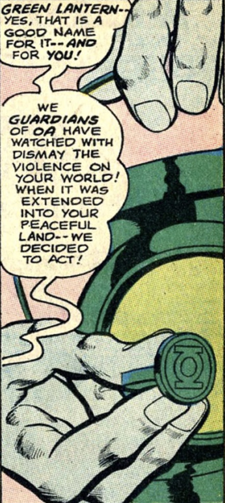
Meanwhile, the very first appearance of a Green Lantern ring, chrologically speaking, features the straight band. The backup story in GREEN LANTERN # 67 (drawn solely by Sid Green) features the tale of Rori Dag, the very first being recruited by the Guardians of the Universe. Of course, as these things tend to go, both the GL symbol and Dag’s uniform (the GL uniform itself being revealed as based on Dag’s civilian clothes, with the addition of the chest symbol) are anachronistically depicted as the then-current versions (with the simplified/iconic GL symbol and the pointed shoulder extensions on the uniform), rather than, say, something more akin to Abin Sur’s appearance in SHOWCASE # 22.

5332AAA2-BD4F-4BEC-9969-76EEDD385423.jpeg


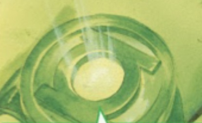
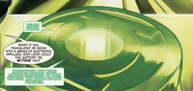
I also find myself going back and forth on the symbol itself. More often than not, the comics depict the V1’s symbol-disc as a “bowl” with a raised edge and a shallower inner area containing the symbol, but the symbol itself is not usually drawn to indicate any dimensionality to it. The way I’ve been modeling it (and as some artists, like Alex Ross, have depicted it), it’s more like a signet ring, with a raised, circular lip surrounding a shallower, circular area, and then a raised GL symbol sitting flush with (or just slightly below) that outer lip/ring.
85F1161D-9403-47EF-AE0B-F662EBB6F838.jpeg
59CF4505-01AA-466D-9D74-F4A7DA425B49.jpeg


However, much of the reference art could also be seen as depicting a GL symbol that it is NOT raised, but rather merely the outline of the symbol etched into the inside of the “bowl”. Or, when taking the two-tone versions or the ring into account, perhaps a darker green GL symbol surrounded by the lighter, lime green color (or even white, on some occasions). In other words, a symbol depicted only by an outline or a color difference rather than being a raised feature.

968CD6B7-67C5-4CAE-A9D9-D2E9C0A54433.jpeg
8B7D3FDA-43A8-4071-82B9-A647B97EF63B.jpeg


Also, while I’m a big fan of Joe Staton, his inconsistency with the V2 design has been driving me a bit nuts. I’m currently reading his GREEN LANTERN CORPS run, and the rings seem to veer back and forth from V2 to V3 and straight band to flaired band, sometimes within the same issue.

That being said, Staton seemed to favor the flaired band in “hero” panels...

C96150A7-9CD0-4FB2-9E37-96628D2A2B71.jpeg
A9325C8C-0D4F-4249-94B9-E5DE9E2F3576.jpeg
84450DBF-63C3-46CE-B444-EFA4F164A3A3.jpeg


...but not always.

9F86BA13-4D47-4B21-9504-73C422806DCF.jpeg
 
Last edited:
...I’ve also been thinking about the gem problem.

The V2 and V3 aren’t too bad to deal with, what with their domed gems. However, the Emerald Dawn and Rebirth rings have their GL symbols sitting atop the flat, circular, lime-green gem sections, which would require custom parts and/or a lot of careful cutting and gluing.

More and more, I’m wondering if I couldn’t just mix up some translucent, lime green resin to carefully fill in the recessed areas around the symbols on those designs. And for that, matter, why not design and 3D print V2 and V3 gems with the correct size and shape, mold them, then cast them in the same resin? This would elimate the problem of having to find and/or cut real gems to the proper specifications, or hinder the ring designs by adhering to specific, “found” gem dimensions.

That way, there would be gem consistency across all of the rings, as well as no need to compromise on gem shape/size for the domed versions. I’m also thinking that some glow powder could be mixed in, as well, to replicate the glow-in-the-dark effect that I’ve employed on my plastic test rings.
 
Well, after some deliberation, I think I’m gonna give Shapr3D a shot, since it can export files in both STL (for 3D printing) and STEP (for CNC machining). The downside is that it requires an Apple Pencil for tablet modeling, and my iPad is one generation too old to work with the Pencil. Fortunately, I’ve found an off-brand stylus which is compatible with the generation I have.

Anyway, with the Pro version of the Shapr3D program, I could import my existing STL ring files in from TinkerCad for tweaking, too. Alternatively, I could also recreate from scratch and refine the designs using the existing TinkerCad models and data as a basis. All these months of wearing the test rings and thinking about how to refine them should greatly pay off. Once I order a stylus, I’ll start familiarizing myself with the program.
 
Been doing some more tinkering with the modern-style ring. Reduced the width of the band and added more of a flat bevel to the edges.

I also created a variant with much deeper negative space around the GL symbol (the bottom ring seen in the image below). I think I’m gonna have another test print made, smooth, prime and paint it metallic green, and then test my lime green resin “gem” idea by filling that negative space with resin.

01E8E8FE-5899-466F-886C-D20731E6CE32.jpeg
 
More tweaks on the V2 and V3. Also modeled proper low-dome gems for both designs. Looks way better than the medium-dome gems I’ve been using on the test prints.

Once printed in plastic, I can then mold and cast the gems in lime green resin. No more worries about finding exactly the right size and shape of glass gem, although it would still be nice to have actual glass. I’ve never done resin casting, so this is a good excuse to learn yet another new skill.

For the moment, I’m continuing to tweak the existing ring designs in TinkerCad. Once I get into Shapr3D, I’ll see how feasible it is to import them. Otherwise, I’ll at least have the dimensions of the TinkerCad designs as a template for recreating and perfecting them in Shapr3D.

24BB7079-0E5A-4D2A-AD0C-1909FF064198.jpeg
 
Why not print the gems as well using glow in the dark material?

Firstly, I don't have a printer of my own, and would therefore have to rely upon a service like Shapeways. Second, I don't even know if such services offer printing with glow-powder material. Third, a printed gem would have things like print lines to deal with, as opposed to a resin cast from a cleaned-up and smoothed master. Fourth, I'd like to do some experiments. The tests I've been doing use existing green craft gems (with the mirrored backing sanded off) with a coat of glow paint on the undersides. This allows for a shiny, lime green dome backed with the underglow when charged.

I need to see what effect (if any) that glow powder would have on the look of a resin (or printed) green gem. The aesthetic/color of the gem is more important to me than the glow effect, which would be a bonus.
 
Playing around with the yellow Guy Gardner ring. Created a proper low-dome gem for it, as with the GL V2 and V3. The last test print of the ring came out great, and my only real disappointment was the high-dome craft gem that I stuck into it.

Also playing around with the diameter of the disc atop the band. Joe Staton’s artwork is quite inconsistent. Sometimes the disc is tiny (as in GUY GARDNER REBORN), and in some issues of Guy’s solo series, it’s huge, akin to the Gil Kane V1 GL ring. Of course, the bigger it is, the more awkward it looks when seen in a front-view, what with the big gaps between the disc and the band on either side.

At least the band seems to be pretty consistently a standard (parallel sides) ring, as opposed to the tapered/flaired look. And, as previously noted, that stylized “G” insignia appears only very rarely, but I really like it.


If and when I get this one locked down, I’ll likely have it printed in brass (or gold-plated brass), then do the clear resin gem trick I’ve dreamed up. My only real concern at the moment (and one of the reasons I’m switching to a new modeling program) are those raised gridlines on TinkerCad shapes, particularly on rounded surfaces. I’m not sure if Shapeways’ polishing would sufficiently remove them, and they could still potentially be visible even under gold plating. Plain brass could be sanded and polished smooth, but that would be a lot of extra work.


F71B8AB1-F813-4A64-8BA3-C261EA163471.jpeg
 
Last edited:
Came back to the post-REBIRTH ring Jordan crafted out of...uh...pure willpower, I guess. As I’ve noted, this whole era is a total blindspot for me. However, the design is both unusual and interesting, since the inset GL symbol follows the curvature of the ring band, and the negative space around the symbol is actually cut out entirely.


44219BA3-28EA-4BBB-A558-64A719EB7CE1.jpeg
40E8746B-E387-42EE-A8E2-FDE735CFADE2.jpeg
B69E93D8-64C6-400A-B084-401322DDD6B6.jpeg
0D4CEFE6-9D51-4574-A4E3-1694606D15C0.jpeg
8D2267E5-E41C-46A6-B5F7-260D5CD5B085.jpeg
2A294AA1-2791-44C3-9112-91B0C2F39759.jpeg
81EA0E8D-C1A0-4479-977B-CE66F9B4E6E8.jpeg
 
I have no knowledge of (or particular affinity for) this design, but it IS neat. I think it would be cool to get it printed in translucent plastic and then dyed green, or perhaps cast in clear green resin, to represent a ring made from pure green willpower energy.
 
Last edited:
A little experiment—

As a general rule, I’ve been using something close to the official DC version of the GL symbol. I say “something close” because the sidebars do seem a bit thicker than the VERY thin ones seen in the 1982 DC Style Guide and on merchandise:

31C40C79-5C99-4C66-9244-7116411E5C08.jpeg


Note the thinness of the sidebars and central ring section, and the considerable gaps between the ring and the sidebars where they join together.


And this variant, also used for licensing, seems to have thicker components, perhaps because the black outline of the Style Guide symbol has been colored green along with the interior space of the symbol. This is essentially the version of the symbol I’ve been using.

ECB7EB1F-4832-4E01-BEFB-AAFB11B2FD19.jpeg


As previously noted upthread, there’s also the variant with much thicker sidebars, which was often used in the 80s and 90s, and served as the basis for my Dave Gibbons ring, since the proportions are very similar to his iteration. The colored version shown below appears to be thicker due to the symbol’s black outline and its interior space both being colored green.

F203B1A0-9E96-453E-A78C-4BADC513BDA7.jpeg
161735A9-C3AA-46C6-914F-92819E199D66.jpeg


And there’s also the version created for the GREEN LANTERN CORPS cover title logo in 1986, with slanted sides adding a dimensional effect. As with the Style Guide version, this one has very thin sidebars and central ring, but the sidebars don’t jut out quite so severely as on the Style Guide symbol, due to where they attach to the central ring section.

4E5088B6-8F2E-445F-8D27-C4A91DD8909A.jpeg


36502CBF-14E3-4D25-9BBA-1E88DBBE4711.jpeg


Anyway, as an experiment, I wanted to see how close I could get to a proper Joe Staton-style V2, with the thicker sidebars and much thinner central ring surrounding the gem. The preliminary results are encouraging, with a slightly blockier and sleeker shape (despite being slightly longer, overall), and a ring band that’s a bit less radically tapered than my current V2 design. It’s subtly different, but nice. I’m not a big fan of overly thin sidebars jutting out and away from the central body of the symbol, as with the Style Guide version. I prefer something a bit more compact, blocky, and rectangular in overall shape, as with Staton’s version. As I have noted before, the general rule for the symbol tends to be that the sidebars and the central ring are the same thickness, and, while Staton usually went with sidebars much thicker than the central ring, I really do like the look.


CB1E8813-894F-465D-A3E9-D46B0E2D6063.jpeg
FD663945-FCA7-46D7-999B-AC686EAFA829.jpeg


Staton seemed to be going with something inspired by some of the Gil Kane iterations from the 60s:


C6D68B7E-FCAF-460E-87D4-23E68C6C7B75.jpeg
500A7B7C-487D-4DE7-BCB4-357E56F848FE.jpeg


Current V2 on left, new Staton-inspired version on right.


B44676B8-430D-4B13-9B81-1AA76CA6C625.jpeg
F2E9B6C8-DB4C-4EB6-A167-4A7028649858.jpeg


I really need to make some key decisions for the final rings in regards to the symbol. Do I standardize everything with the official DC version of the GL symbol (or one of the variants...or even my own customized version, made to suit my aesthetic preference)? Do I tweak each ring to be reflective of what the GL symbol actual looked like during the particular era when each design was prominent in use, as a tribute to the various artists who have drawn Green Lantern over the years?
 
Last edited:
More tinkering. From left to right; Official GL symbol V2, Joe Staton variant, Dave Gibbons variant.

Yes, I am aware that obsessing over the size and shape of a simple symbol consisting of two bars and a ring is a bit much, but this is a project about the details. I’ve spent a lot of time playing around with the size and proportions of these rings to get them both comic-accurate AND wearable. Sometimes, even a millimeter or two in one direction or another can make a big difference in look and feel.

3F5BE83A-EA47-4141-A88E-B49B4AF9CD03.jpeg
48B98628-571D-4C26-A94A-E61C7CA9C654.jpeg
 

Your message may be considered spam for the following reasons:

If you wish to reply despite these issues, check the box below before replying.
Be aware that malicious compliance may result in more severe penalties.
Back
Top