You are using an out of date browser. It may not display this or other websites correctly.
You should upgrade or use an alternative browser.
You should upgrade or use an alternative browser.
Defined Green Lantern Comic Rings
- Thread starter Gregatron
- Start date
...snag! The stylus arrived, but it doesn’t work with Shapr3D. Upon closer study, it appears that the Apple Pencil is the only real choice to work with the program.
And my tablet is the last generation before the Pencil was introduced, which means it won’t work with one. Which means that I’d have to buy a new table and an Apple Pencil, OR a keyboard/trackpad for my current tablet, OR use the keyboard and mouse on my PC for modeling.
None of which are pleasant options. I may just have to pony up and fork out the cash. We’ll see.
Created a few more variations—larger and smaller—of the Staton design (center column). On either side of it are the same- sized V2 and Gibbons designs I’ve been using, for comparison.
The thing about Staton’s design is that it basically follows the lines of the wearer’s finger—that is, its rectangular shape keeps the sidebars from overhanging/overlapping with the fingers on either side of the ring finger, but also without the central ring section being so small in diameter as to show off much of the actual ring band in the gaps between the inner sidebars and the central ring. It’s a tricky look to get right. If the central ring/gem section was wide enough to obscure the top of the ring-band, then the overall symbol would be HUGE, and the sidebars majorly overlapping the wearer’s fingers on either side of their ring finger. As it is, the top variant is just over 31mm long, but you can still see the ring band on either side of the symbol.
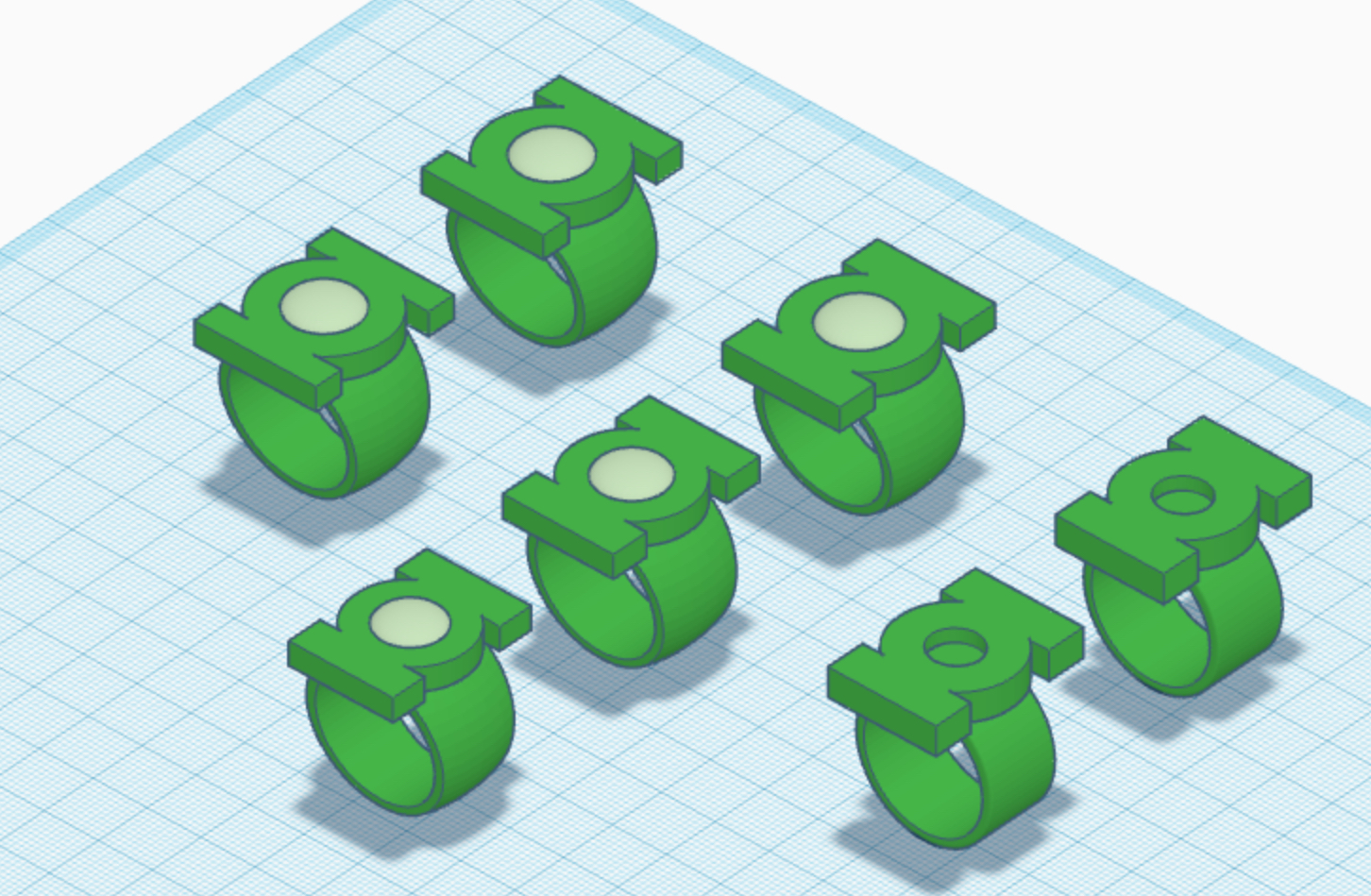
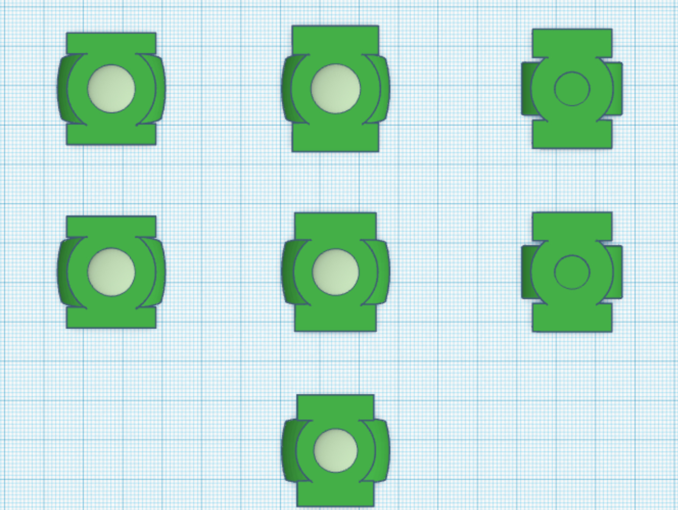
The thing about Staton’s design is that it basically follows the lines of the wearer’s finger—that is, its rectangular shape keeps the sidebars from overhanging/overlapping with the fingers on either side of the ring finger, but also without the central ring section being so small in diameter as to show off much of the actual ring band in the gaps between the inner sidebars and the central ring. It’s a tricky look to get right. If the central ring/gem section was wide enough to obscure the top of the ring-band, then the overall symbol would be HUGE, and the sidebars majorly overlapping the wearer’s fingers on either side of their ring finger. As it is, the top variant is just over 31mm long, but you can still see the ring band on either side of the symbol.
As fate would have it, I found a iPad Gen 7 on clearance for $200 while grocery shopping, today. And, after a quick trip to another store, I got a Gen 1 Apple Pencil.
I am now in business with Shapr3D, and it’s amazing. Gonna be a bit of a learning curve, but this should be much, much easier to work with than TinkerCad in terms of difficult curves (I’m looking at you, EMERALD DAWN ring) and other tidbits. I’m probably gonna upgrade to the Pro version so I can import images (such as the official GL symbols) to work with, as well as my TinkerCad models, although I’m inclined to start modeling from scratch, using the TinkerCad models and their dimensions as reference.
VERY excited, here!
First things first—I imported the modern version of the official GL symbol and traced over the line art to create my own 3D model to work with. There’s quite a learning curve with this program. Gonna take some time to work it all out. There are many, many more tools and features than I’m used to working with.
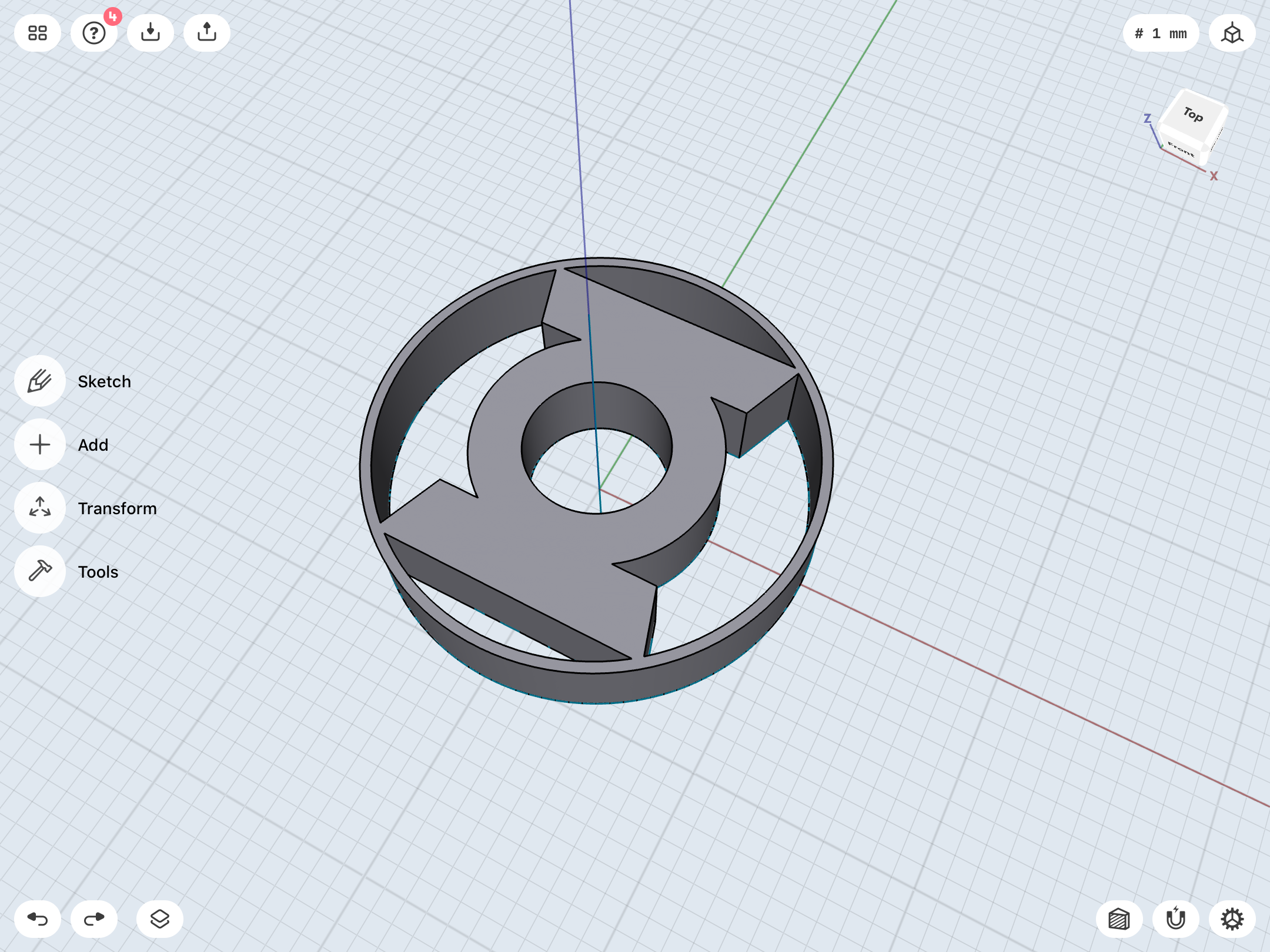
...yeah, this is gonna take some time. LOT of toys to play with.
Taking a step back, here. Back to Square One, and the design of the classic symbol itself. Now we’re REALLY getting into the nitty-gritty, people.
First, I found a nice version of the symbol online, and proceeded to trace the top half of it in Shapr3D.

I then mirrored it to create a mathematically perfect, symmetrical version. Interestingly—and this is something I’d noticed in my previous modeling work—the symbol is NOT symmetrical. The left edges of the sidebars both slightly overhang the central ring section when compared to the right, and the bottom sidebar has a slightly lower connection point to the central ring compared to the top sidebar. This, of course, is surely a result of the licensing version of the symbol being hand-drawn, back in the day. I chose to mirror the top sidebar to give the finished symbol an ever-so-slightly squatter look. Note how much higher the bottom sidebar in my symmetrical sketch sits in the overlay with the source image.
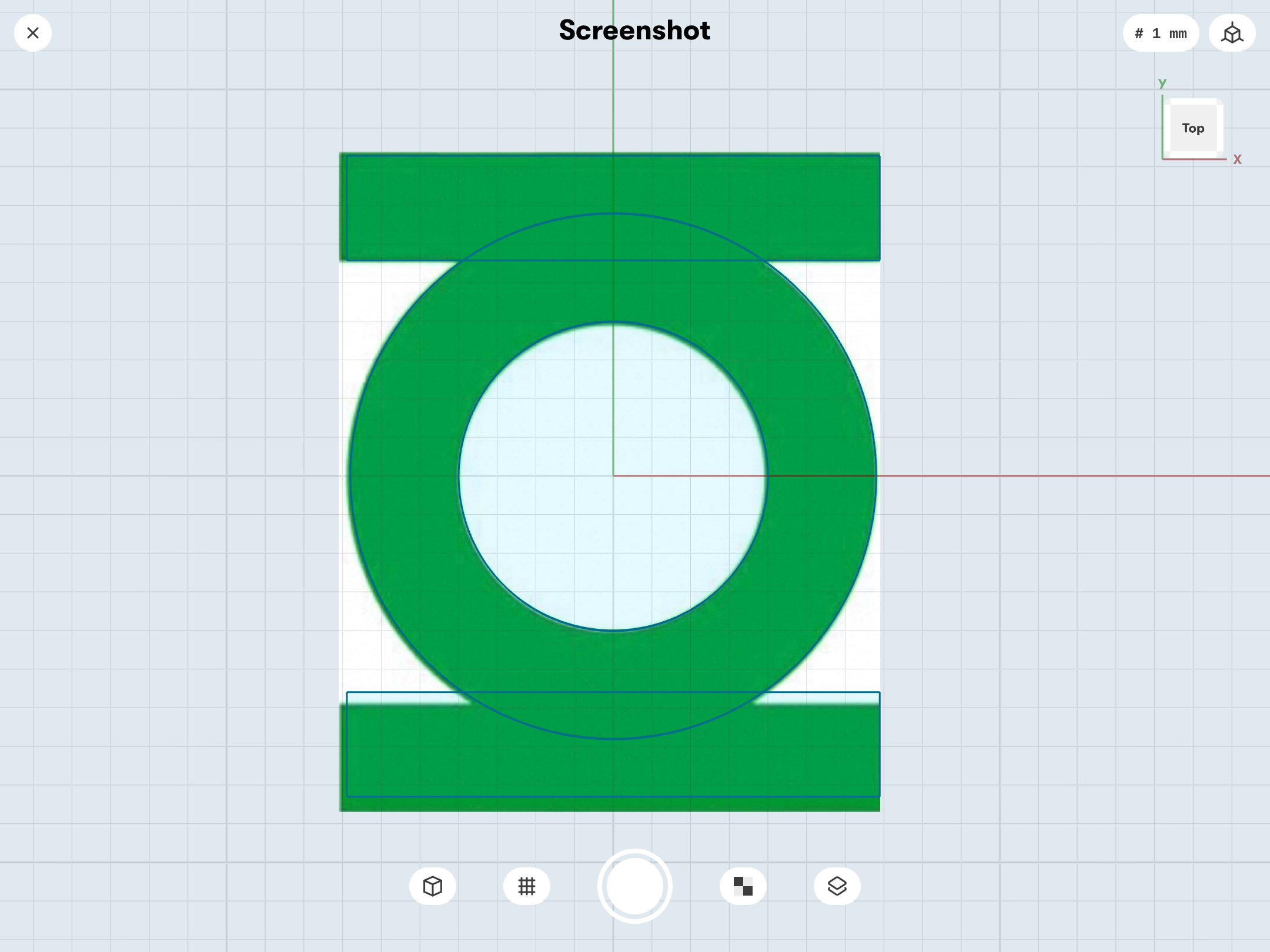
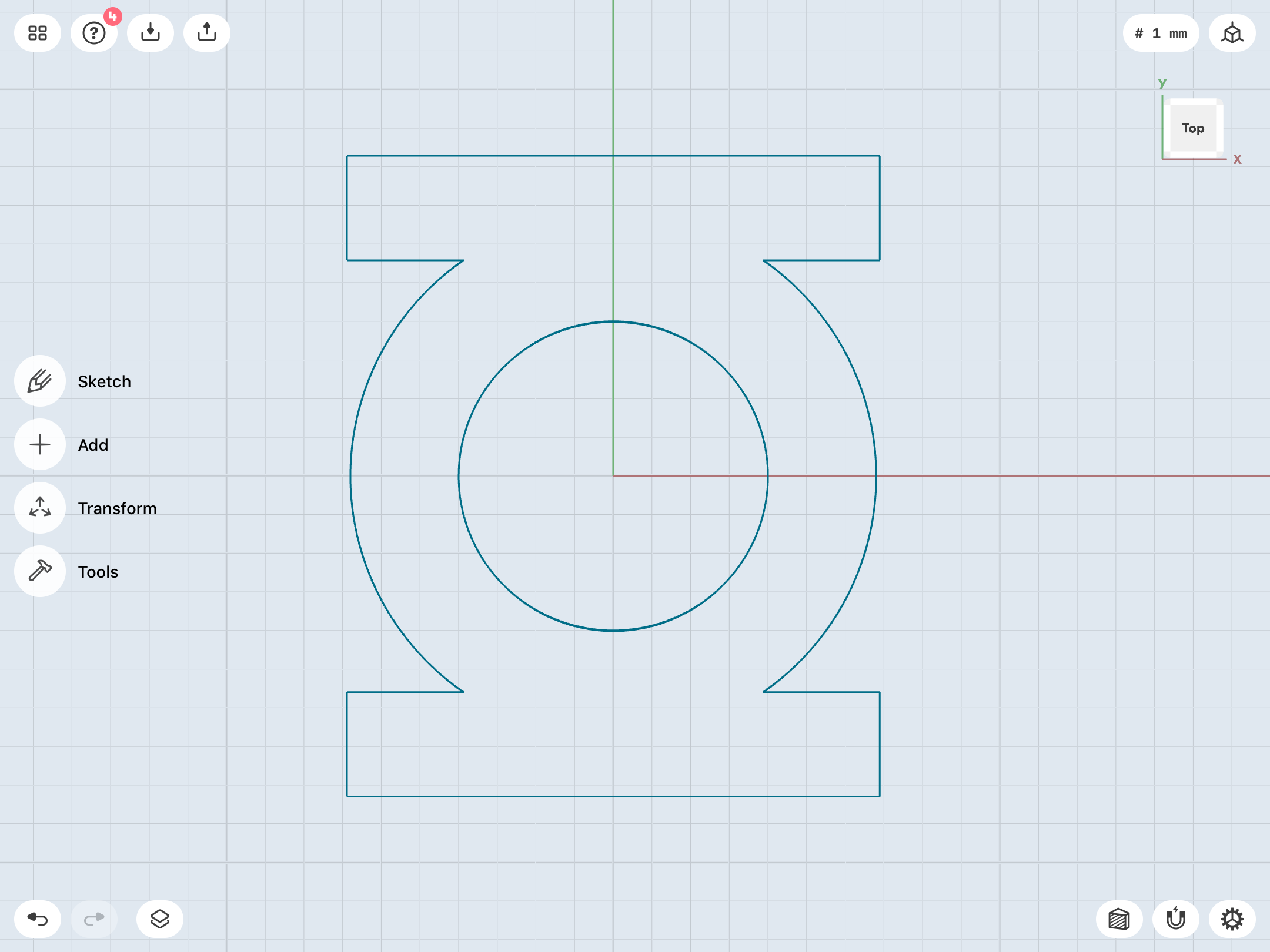
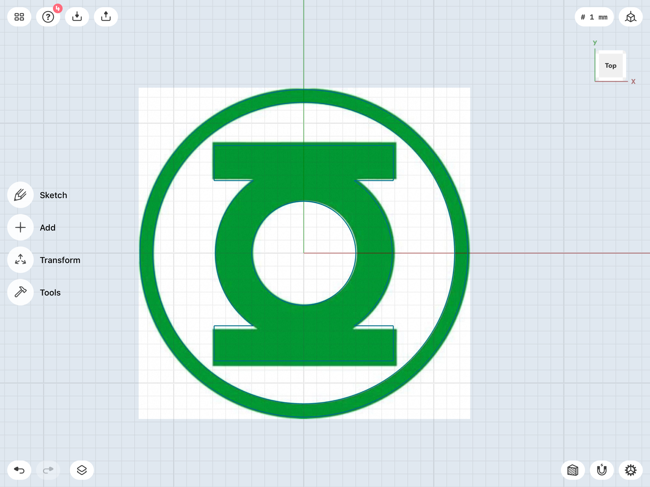
I then proceeded to trace the outer ring. The resulting sketch is nice and symmetrical.
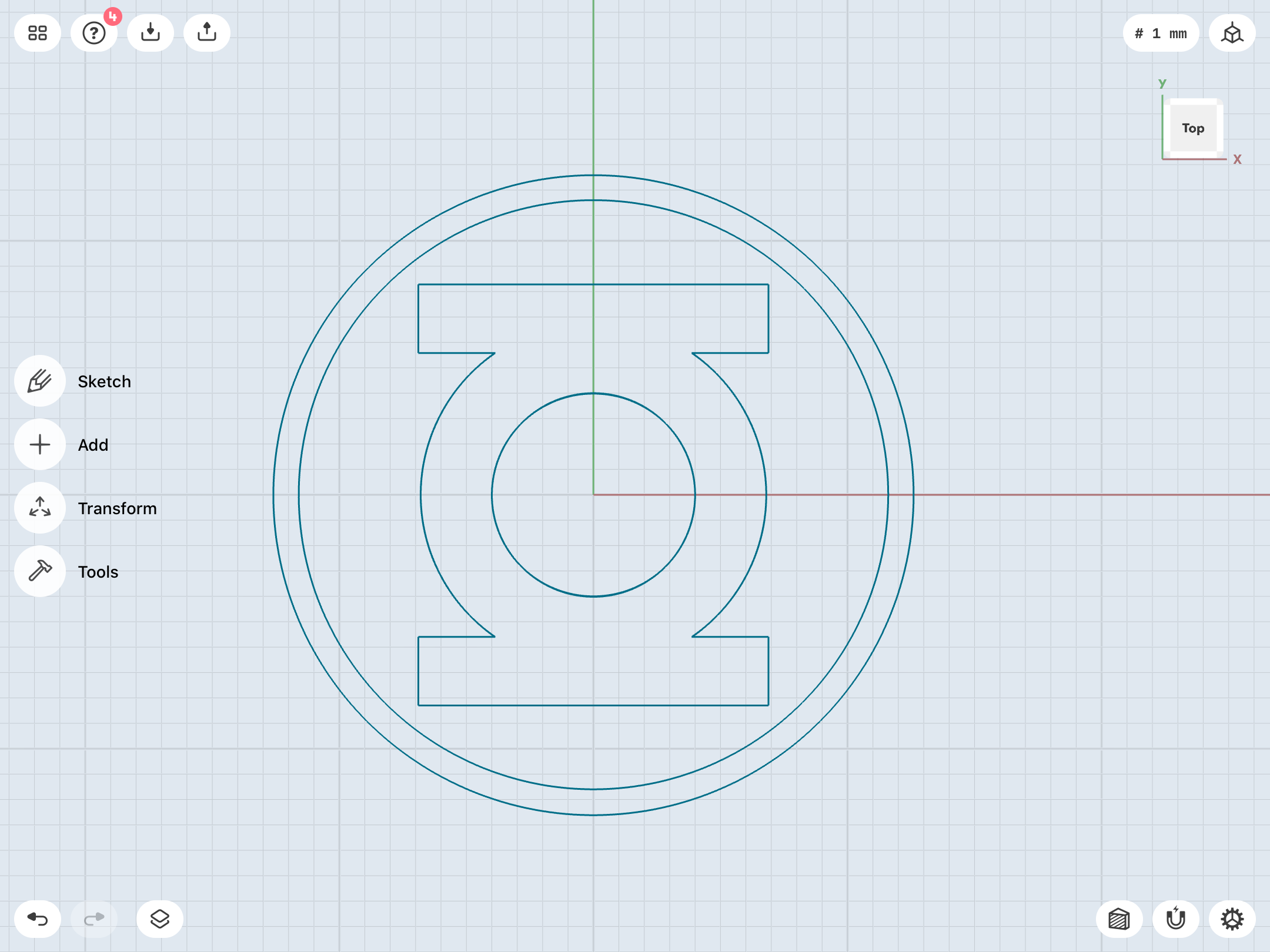
After that, I compared the sketch with a few other online images of licensed products, just to verify that the image I’d started with was indeed based on that official version. Getting the scaling right for the source was tricky, but I got close enough to the ballpark, I think.
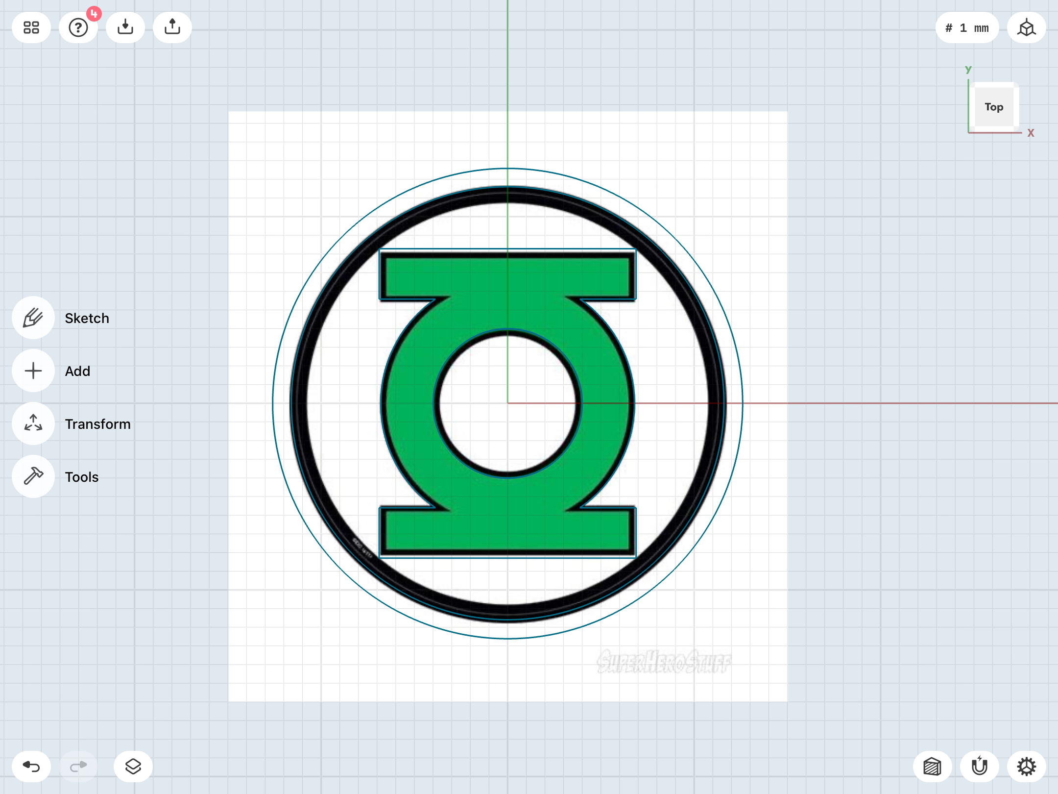
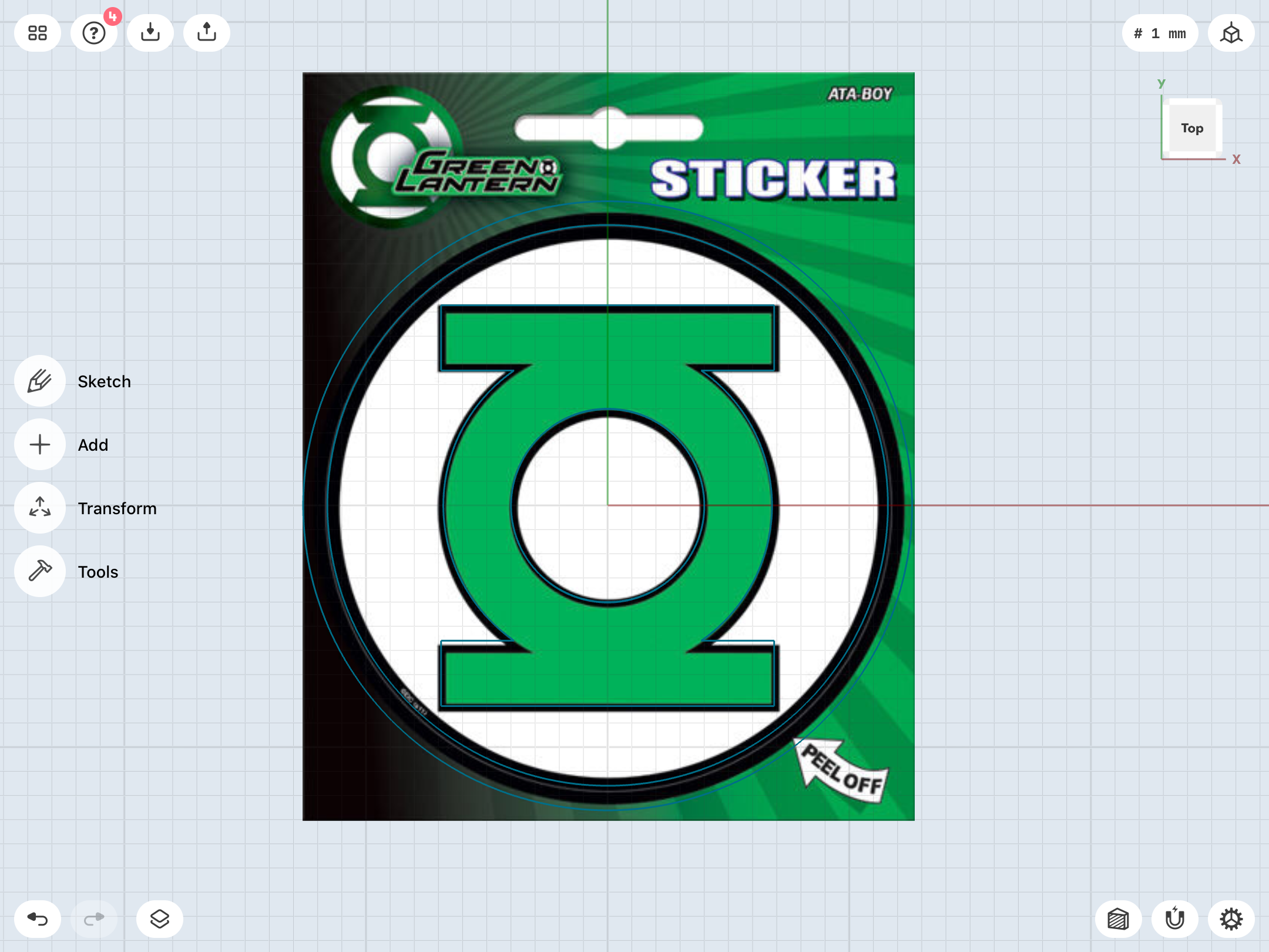
Finally, I compared it with a scan of the 1982 DC Style Guide art, which has the skinniest sidebars of any version of the symbol (something I’m not a fan of). I suspect that, along the way, the thick black outlines of this version were themselves outlined (and were “absorbed” into the open-for-color body of the symbol itself, so to speak), giving the symbol the additional thickness seen on various licensed products.
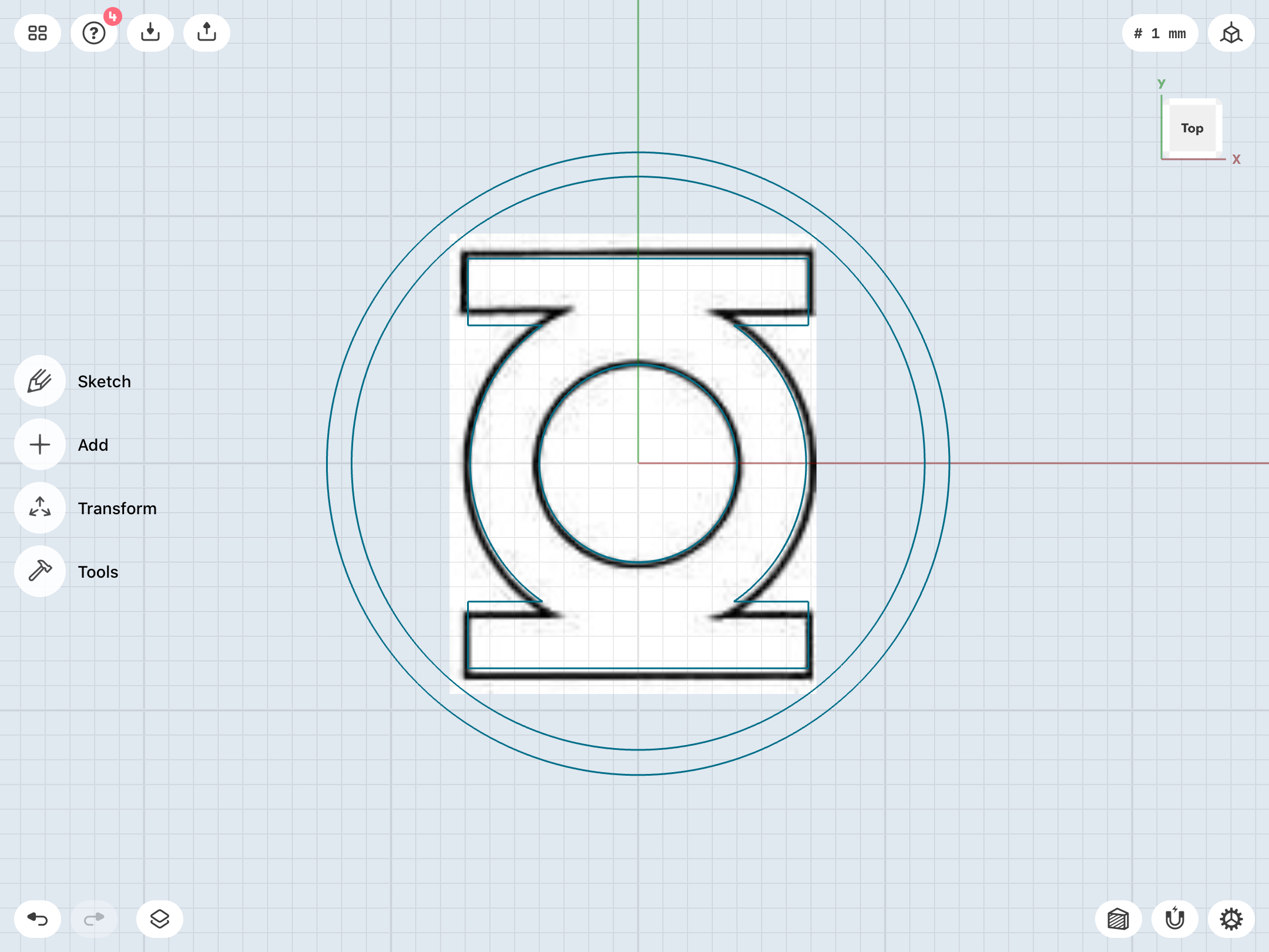
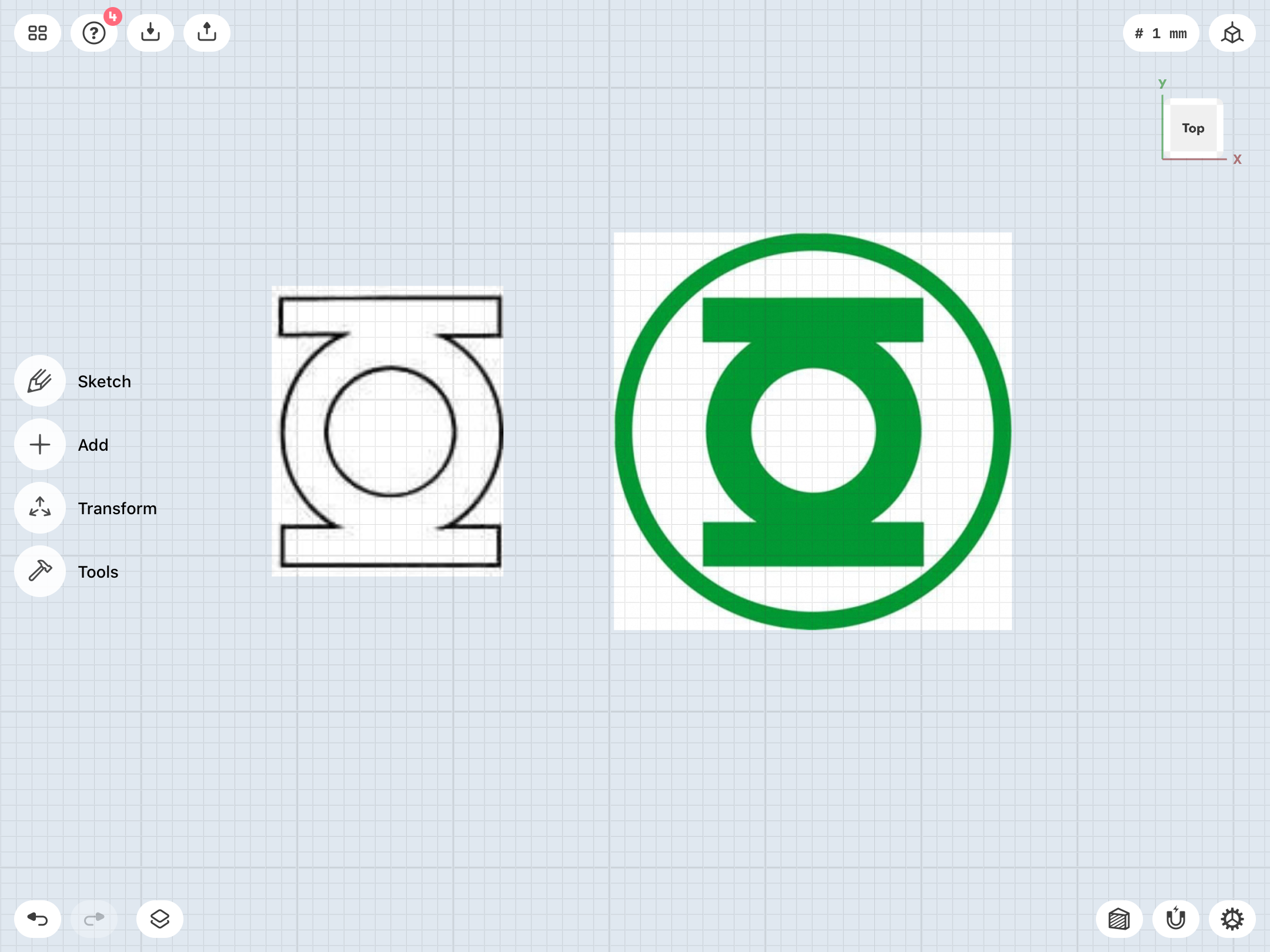
There’s more tinkering to be done, but this is a good start. I’ll be doing the same with some of the other variants. I’m doing this in part to familiarize myself with the workings of Shapr3D.
Taking a step back, here. Back to Square One, and the design of the classic symbol itself. Now we’re REALLY getting into the nitty-gritty, people.
First, I found a nice version of the symbol online, and proceeded to trace the top half of it in Shapr3D.
I then mirrored it to create a mathematically perfect, symmetrical version. Interestingly—and this is something I’d noticed in my previous modeling work—the symbol is NOT symmetrical. The left edges of the sidebars both slightly overhang the central ring section when compared to the right, and the bottom sidebar has a slightly lower connection point to the central ring compared to the top sidebar. This, of course, is surely a result of the licensing version of the symbol being hand-drawn, back in the day. I chose to mirror the top sidebar to give the finished symbol an ever-so-slightly squatter look. Note how much higher the bottom sidebar in my symmetrical sketch sits in the overlay with the source image.
I then proceeded to trace the outer ring. The resulting sketch is nice and symmetrical.
After that, I compared the sketch with a few other online images of licensed products, just to verify that the image I’d started with was indeed based on that official version. Getting the scaling right for the source was tricky, but I got close enough to the ballpark, I think.
Finally, I compared it with a scan of the 1982 DC Style Guide art, which has the skinniest sidebars of any version of the symbol (something I’m not a fan of). I suspect that, along the way, the thick black outlines of this version were themselves outlined (and were “absorbed” into the open-for-color body of the symbol itself, so to speak), giving the symbol the additional thickness seen on various licensed products.
There’s more tinkering to be done, but this is a good start. I’ll be doing the same with some of the other variants. I’m doing this in part to familiarize myself with the workings of Shapr3D.
Last edited:
Yeah, this program is very involved. Gonna be quite some time before I’m handy with it.
That being said, I’m getting a feel for it. I decided to experiment with the simplest of the designs: The straight-band V1 ring. This one didn’t take too long to recreate, and the finer control over things like fillets in this program will prove very useful.
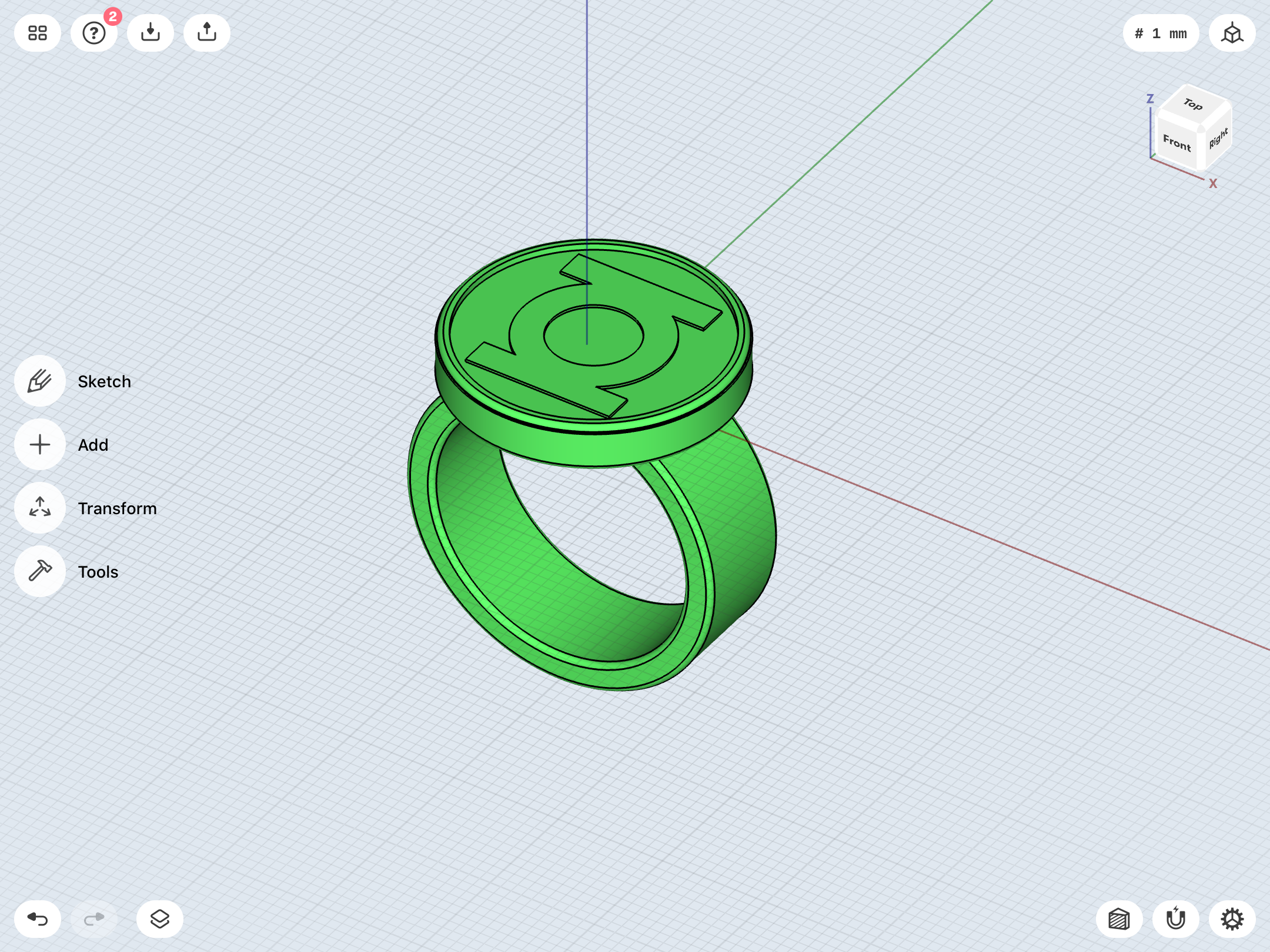
That being said, I’m getting a feel for it. I decided to experiment with the simplest of the designs: The straight-band V1 ring. This one didn’t take too long to recreate, and the finer control over things like fillets in this program will prove very useful.
Been getting deep into the weeds for the past two days. Decided to try building the Guy Gardner/Sinestro ring, which is reasonably complex.
Starting to get a feel for Shapr3D. I used my Tinkercad model as a reference, and carefully reconstructed it...with a few tweaks (such as a more accurate “G” symbol, a bevel on the bottom portion of the disc, and some slight filleting on the inner edge of the band). After a few more tweaks, I’ll get this one test printed, along with the low-dome gem piece, so I can begin experimenting with molding and casting.
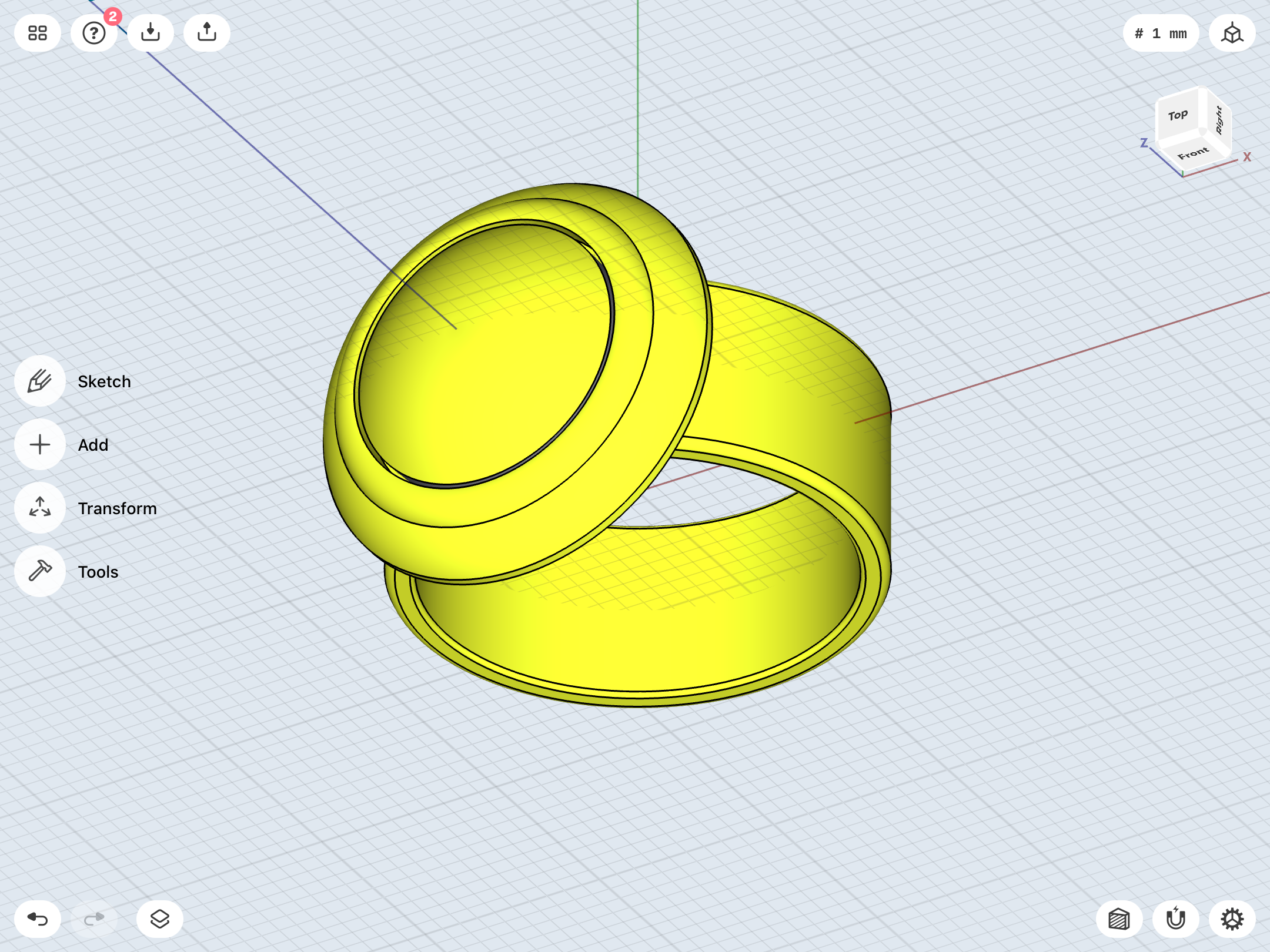
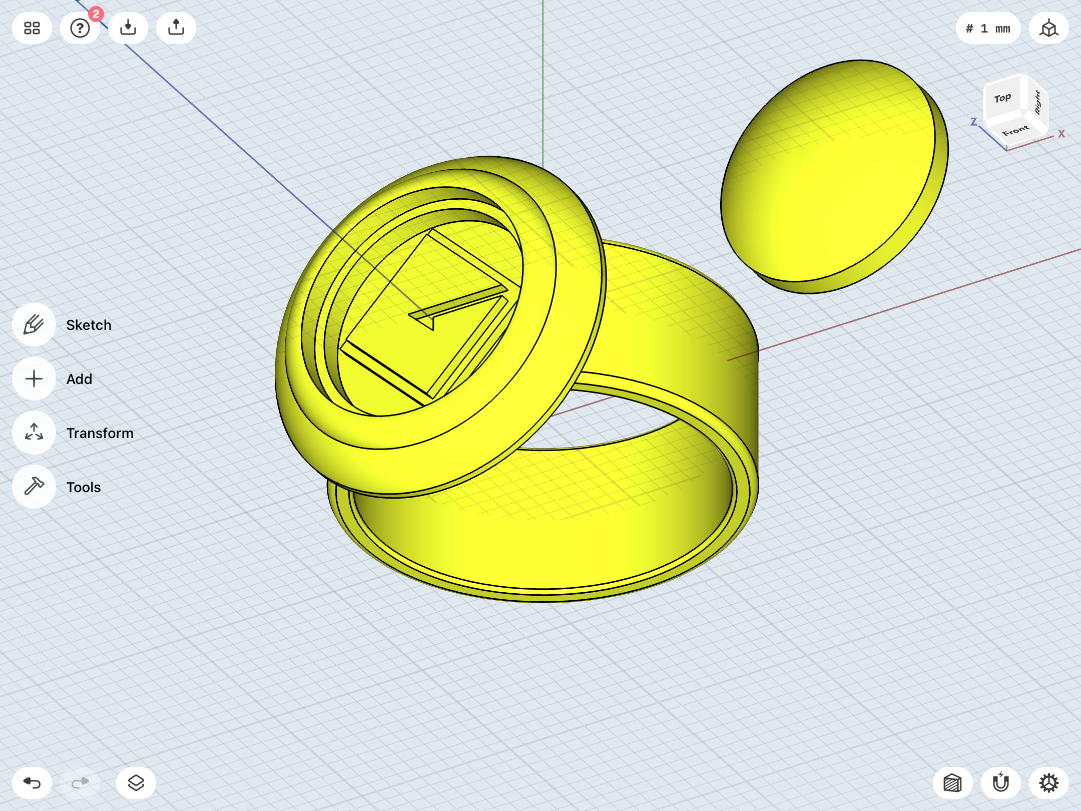
Starting to get a feel for Shapr3D. I used my Tinkercad model as a reference, and carefully reconstructed it...with a few tweaks (such as a more accurate “G” symbol, a bevel on the bottom portion of the disc, and some slight filleting on the inner edge of the band). After a few more tweaks, I’ll get this one test printed, along with the low-dome gem piece, so I can begin experimenting with molding and casting.
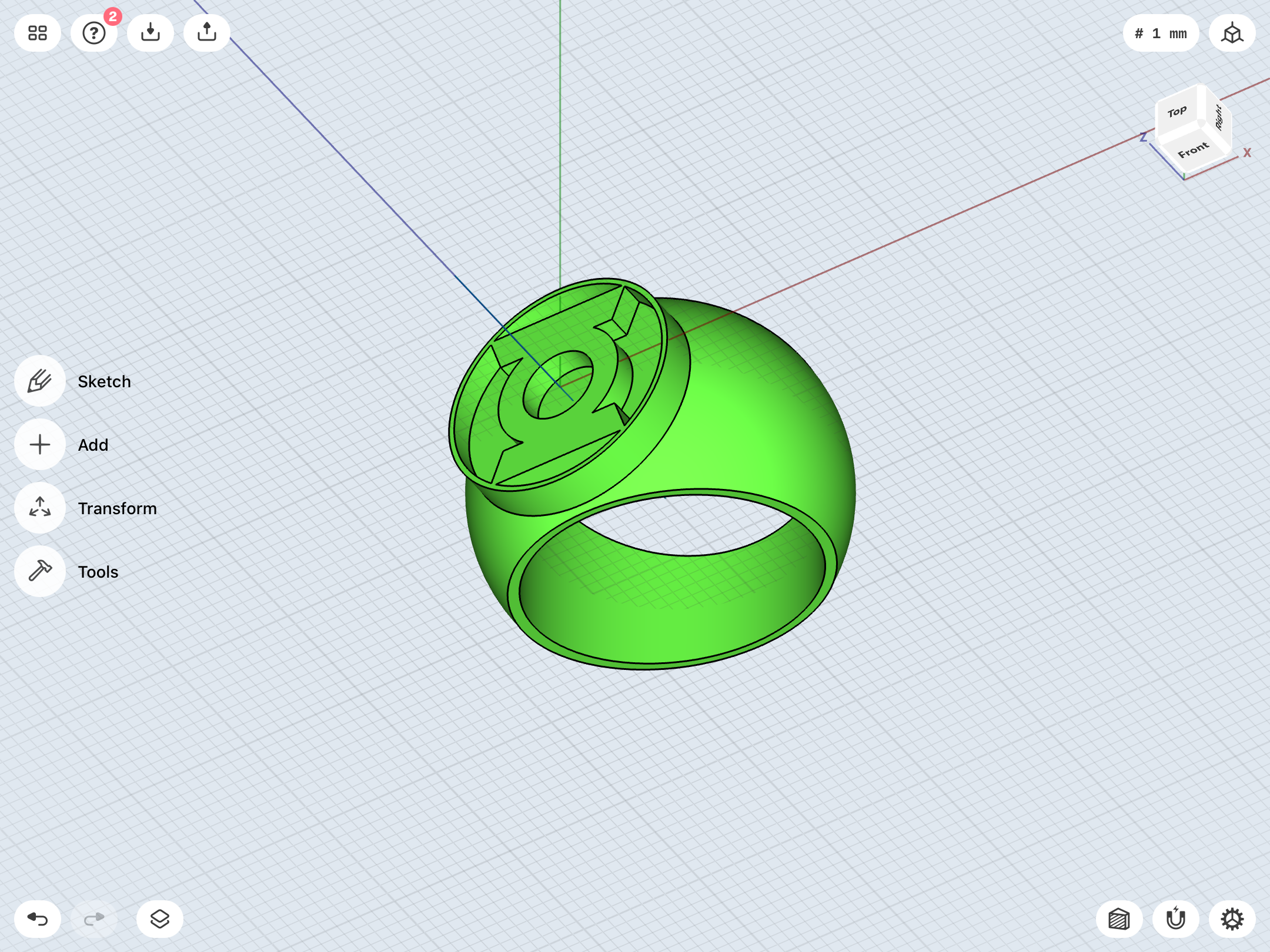
First attempt at the modern ring, with the deeper negative space around the symbol to accommodate clear green resin. I’m slowly learning the various tools and their functions. This is more about experimentation rather than creating a finished design. Once I have a better feel for things, I’ll probably go back to square one and rebuild from scratch.
Last edited:
First attempt at the curved-band V1. As previously noted, my goal is to have none of the ring-band peeking out from the sides when the symbol disc is viewed from the top, since that’s how Gil Kane drew it. You could only see the huge symbol-disc from head-on.
This one is rather tricky, since, unlike Tinkercad, Shapr3D doesn’t allow one to distort a shape like a sphere, which is how I’d previous increased the height of the sphere which the band was cut from. The result was a more elliptical shape rather than a proper sphere with identical dimensions.
For this test, I slightly scaled up the diameter of the symbol-disc to obscure the band, which isn’t ideal.
Coming along, though.
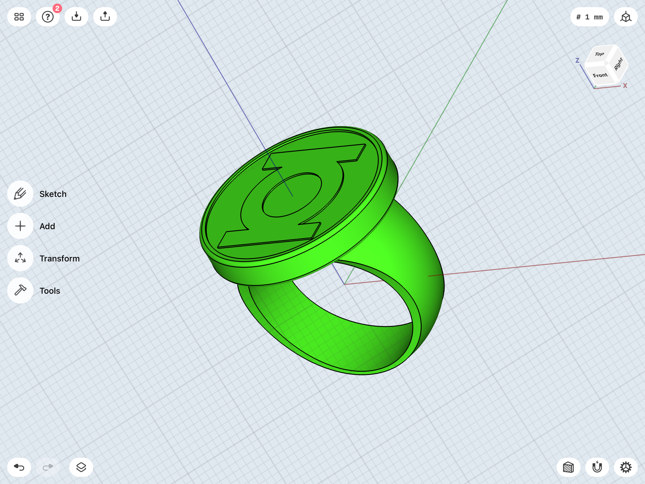
More V1 work. The thing that’s vexing me is getting a consistent bevel around the finger hole, as seen in the front view. As it is, the sides of the bevel are much thicker than the top/bottom, and that is due to the fact that I can’t distort the shape of the sphere serving as the basis for the ring-band. Getting the curvature of the band isn’t too tough, but the bevel certainly is. This current iteration just has a wee bit of the ring-band peeking out from behind the symbol-disc in the top view.
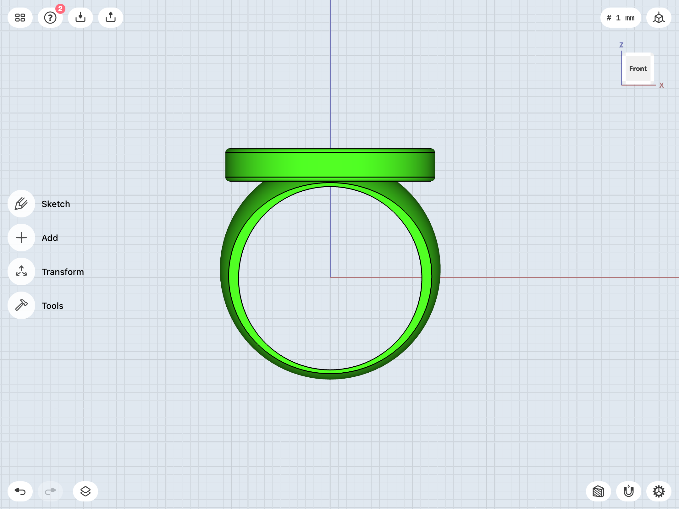
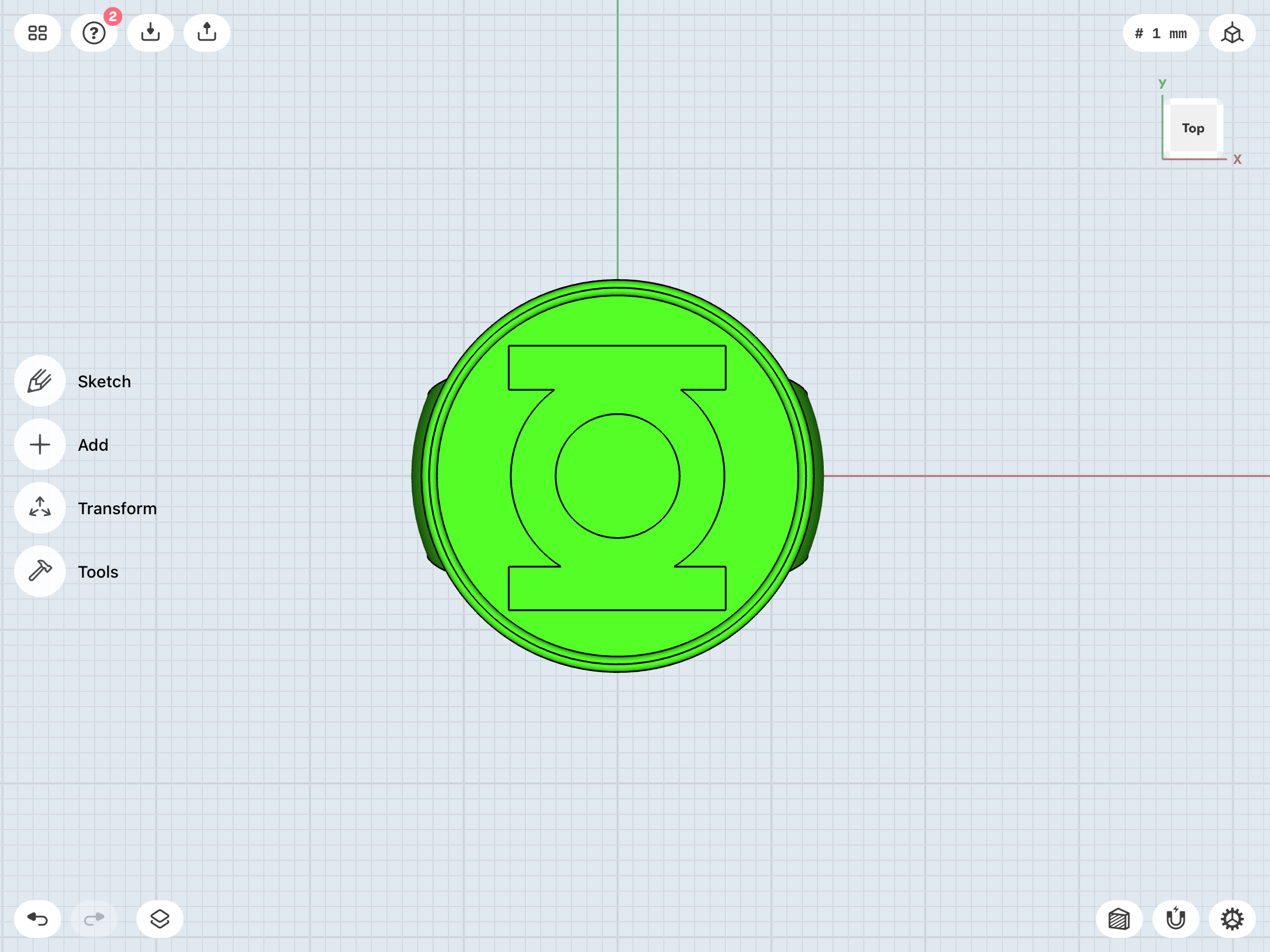
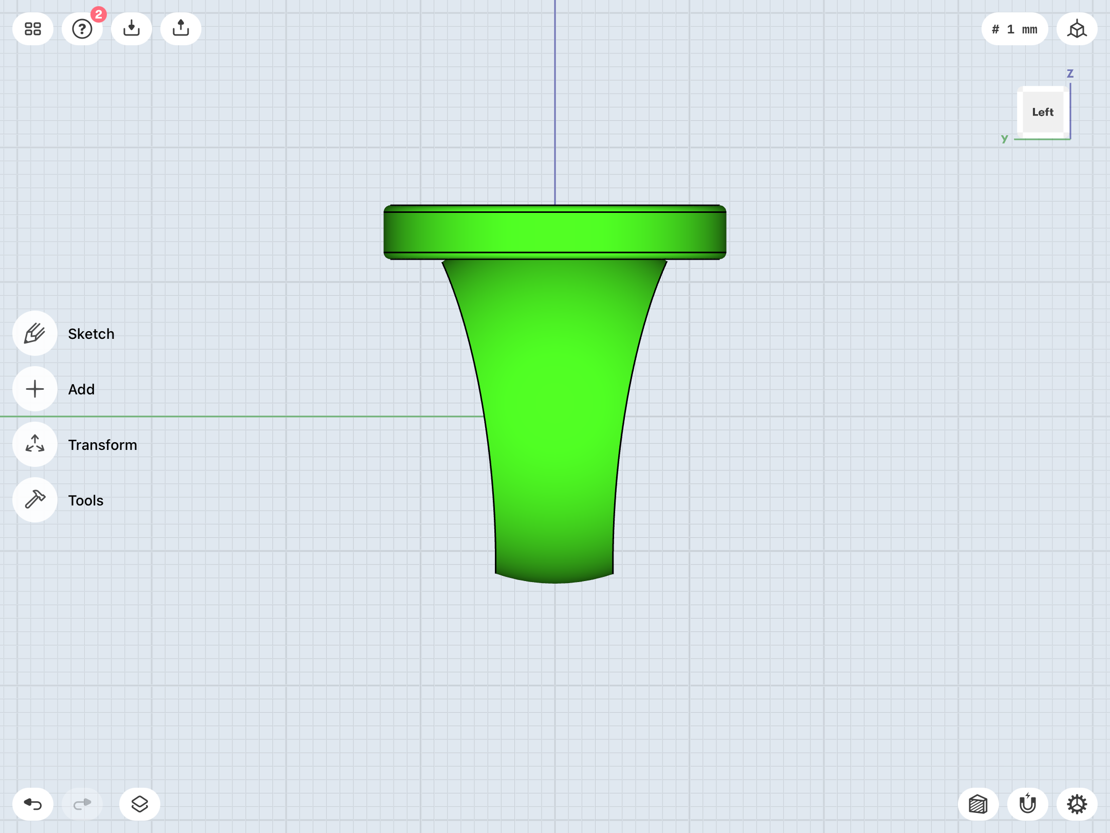
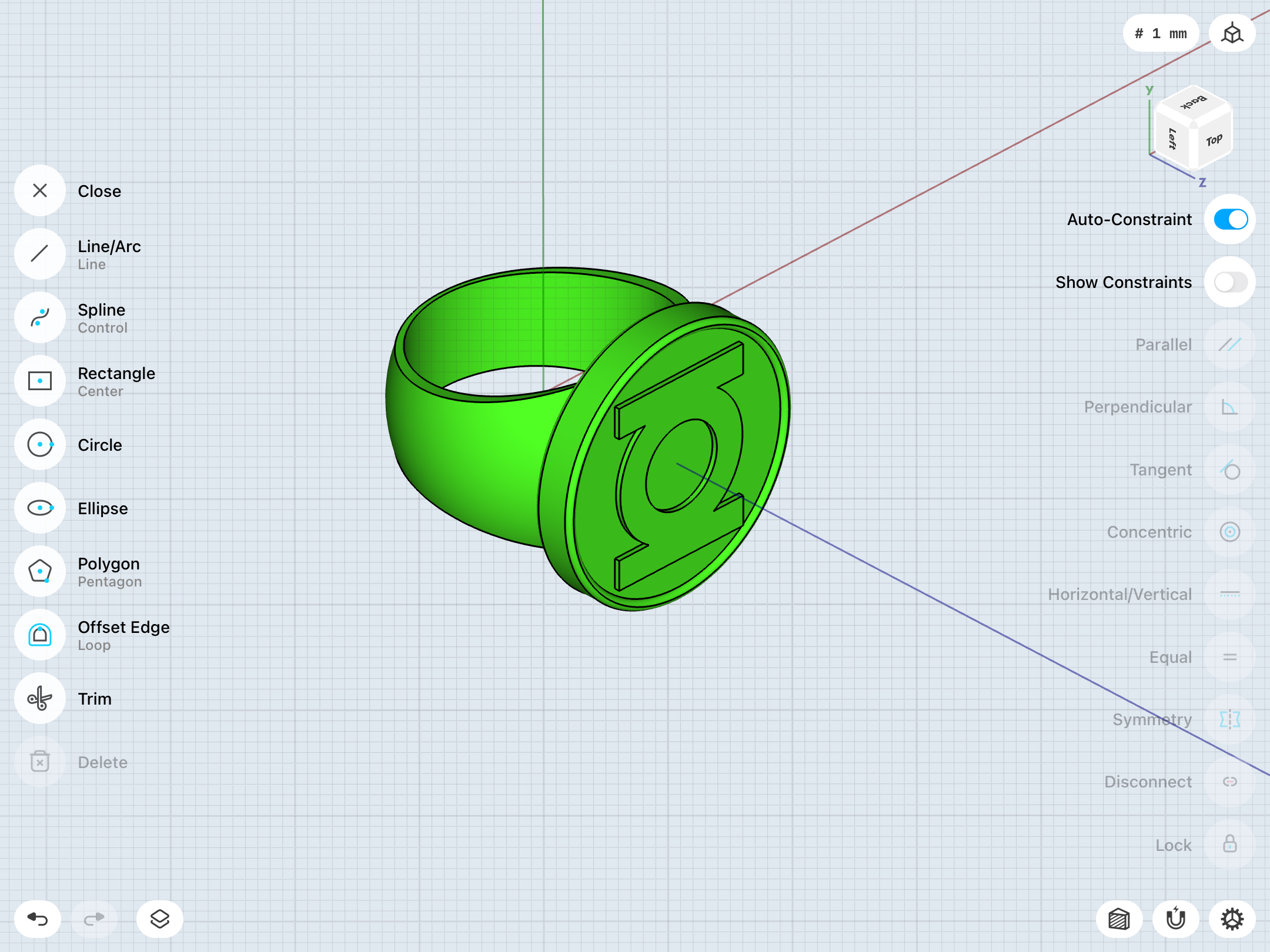
Getting closer. I finally figured out how to create a distorted sphere—by using the ellipse tool instead of the circle tool, then inputting differing dimensions for width and height.
Things are going much more smoothly, now. It’s just a matter of balancing the right curvature in profile for the band with a good looking fillet for the finger hole. I’m not entirely happy with either, but I’m getting closer.
New on left, old on right.
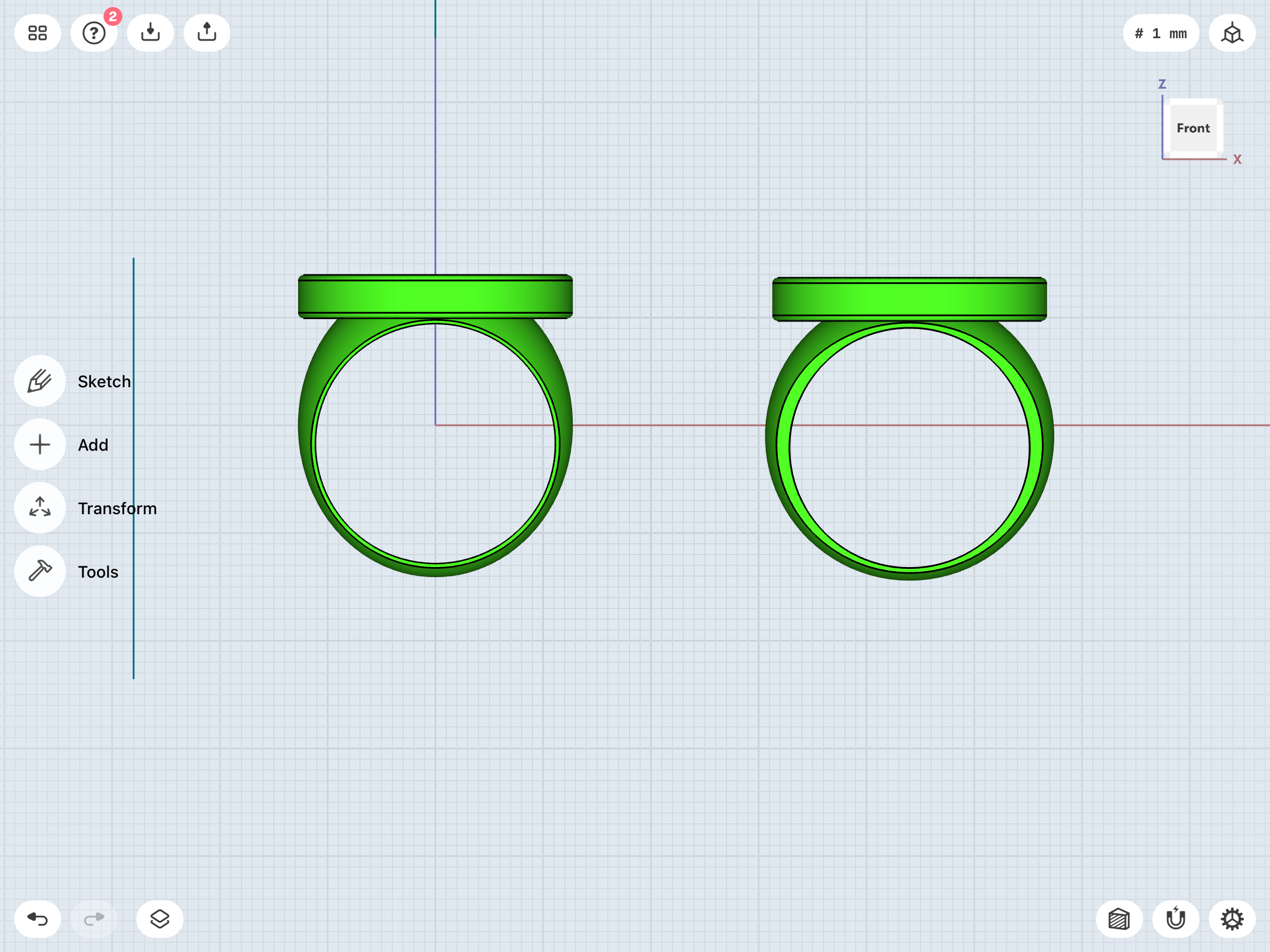
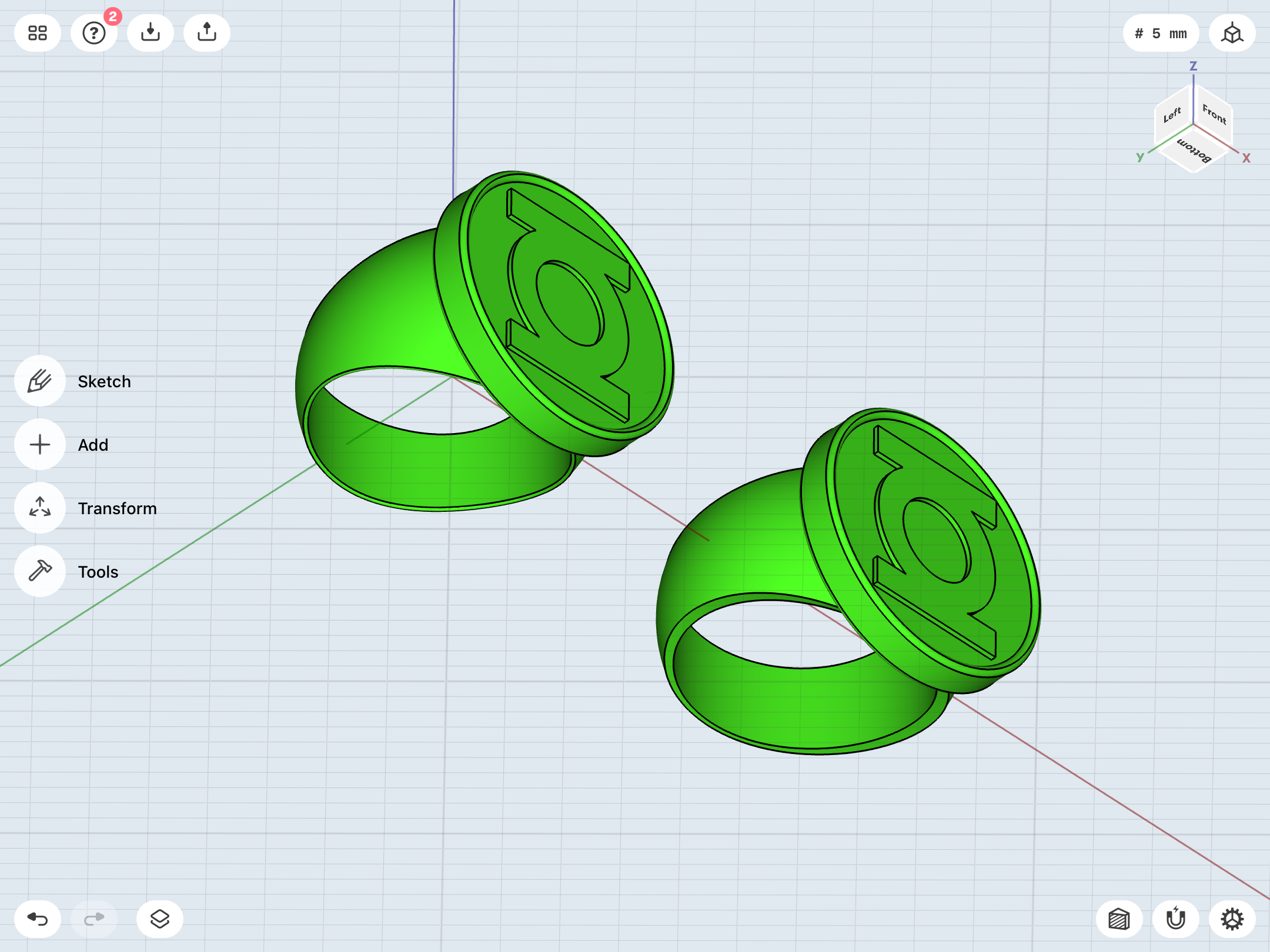
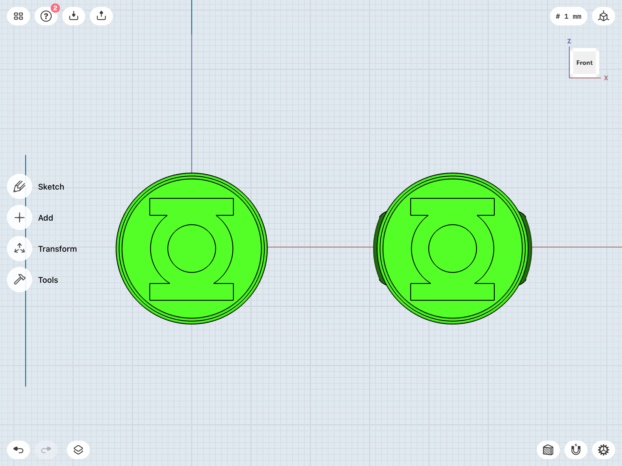
Things are going much more smoothly, now. It’s just a matter of balancing the right curvature in profile for the band with a good looking fillet for the finger hole. I’m not entirely happy with either, but I’m getting closer.
New on left, old on right.
Okay. After doing some V2 work, I came back to the V1. I think I finally have it locked down pretty much where I want it. The flat bevel on the band looks just about right, and the sweep/curves is just about right. It’s been very nitpicky work, but this has been a nitpicky project, and Shapr3D has given me the tools to really refine and rethink these designs. All of these months of fiddling in Tinkercad and making test prints has served me well.
I also made a straight-band variant using the same dimensions as the Guy Gardner ring. As before, the edges are slightly chamfered for both comfort and looks. I’ve dabbled with chamfering the flat bevel on the curved band, but it detracts from the look, and doesn’t match the reference. I have a feeling that the proper polishing of an aluminum ring would take down any potentially sharp edges, anyway. We’ll see how the test prints turn out once I order them.
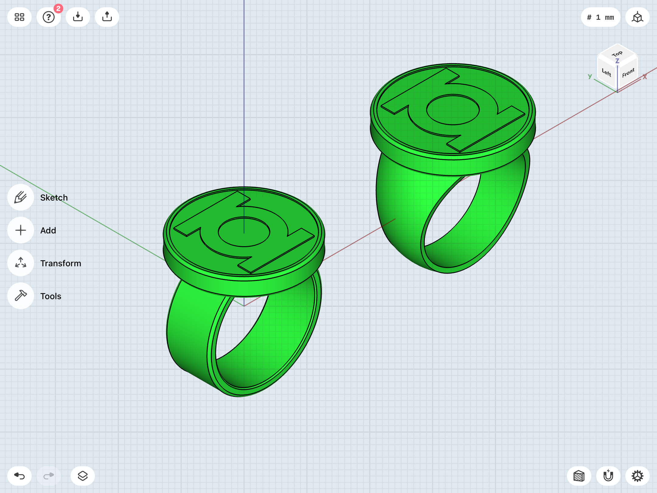
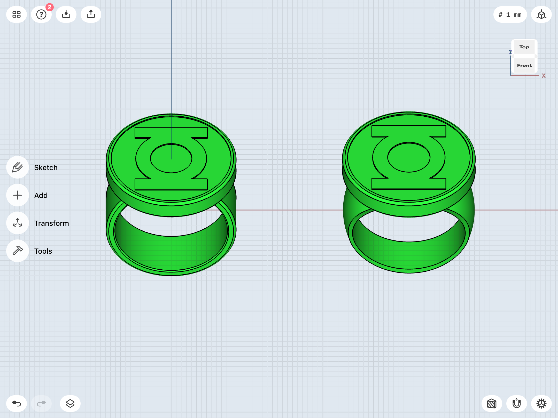
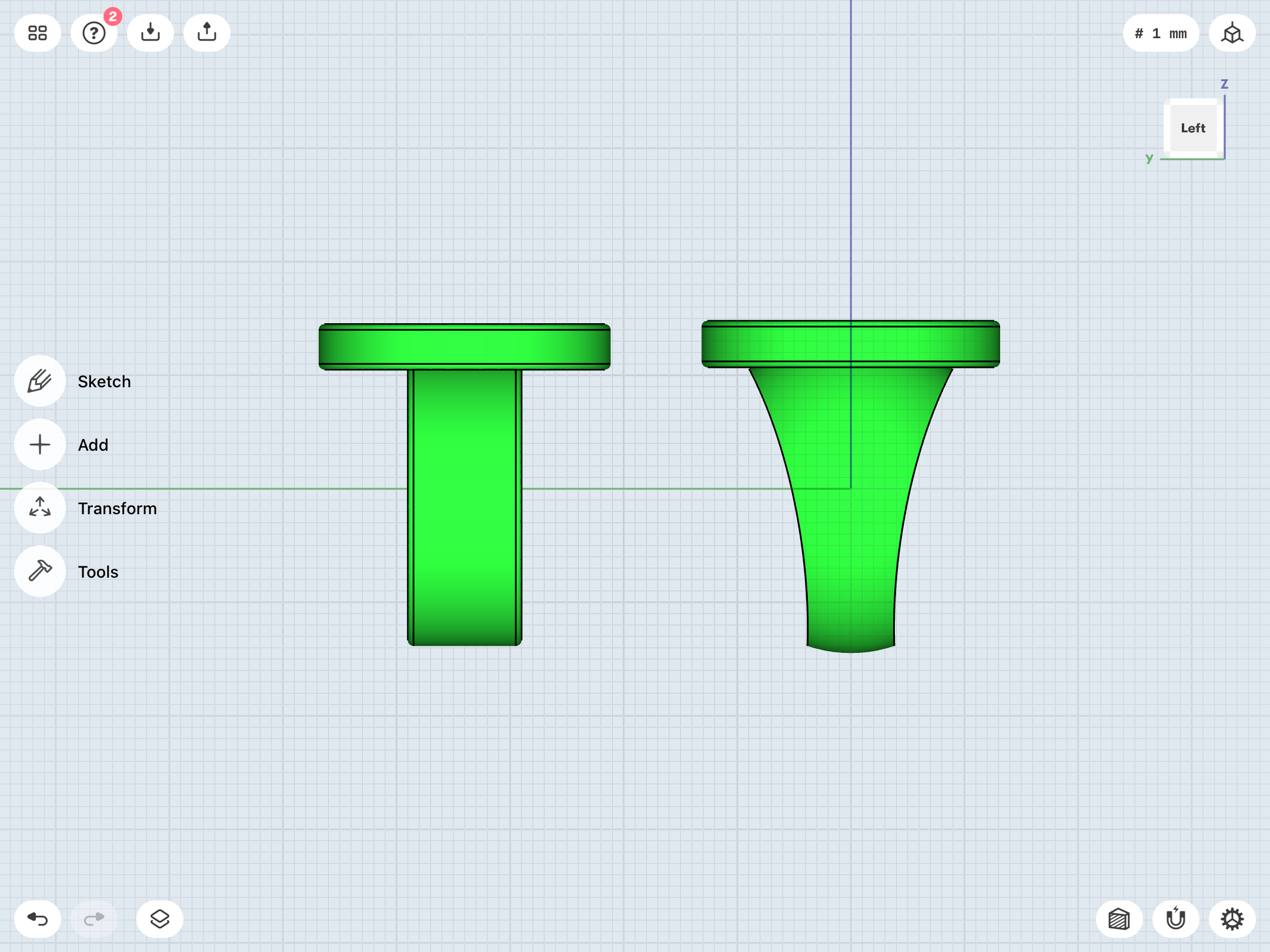
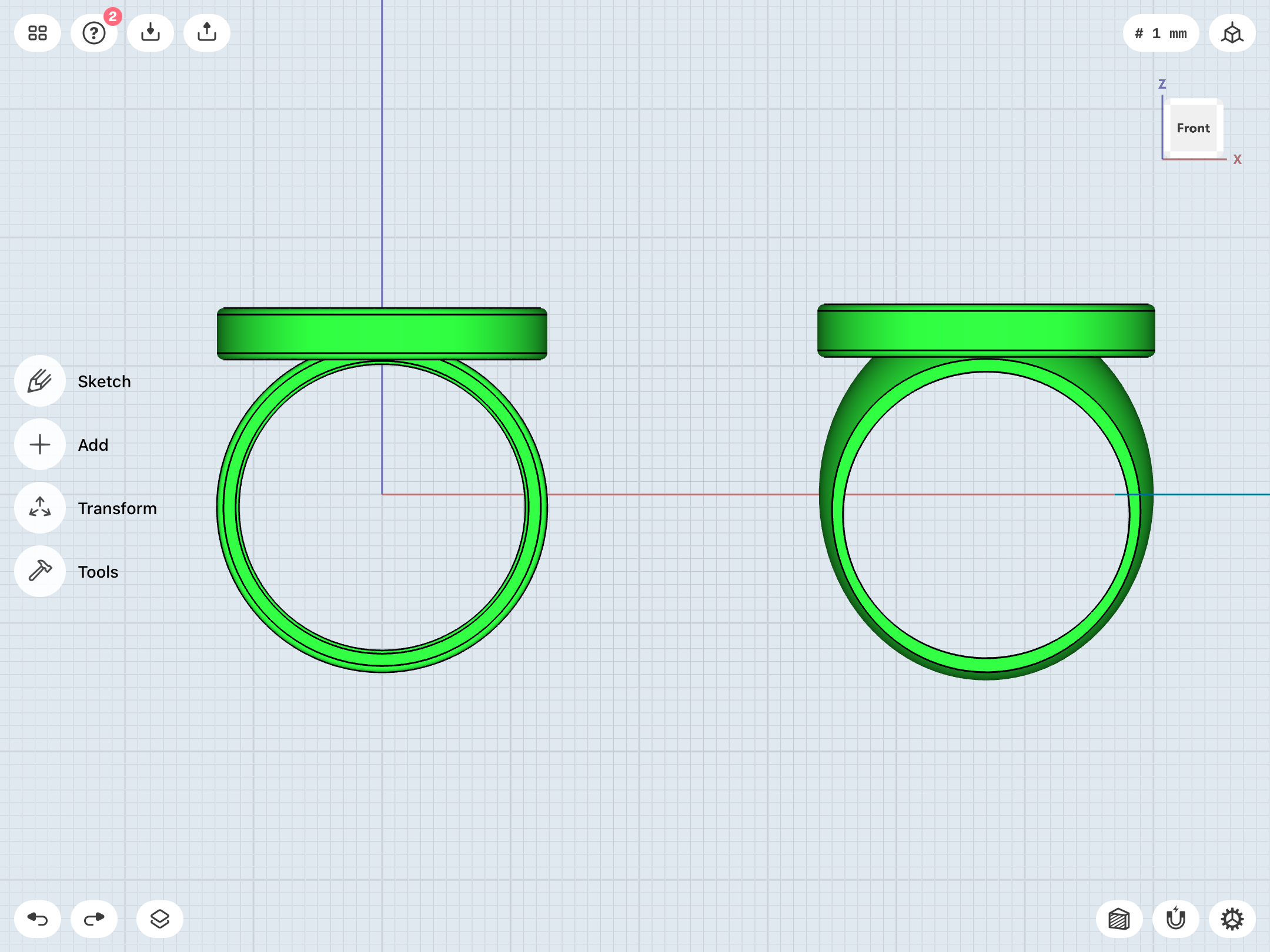
I also made a straight-band variant using the same dimensions as the Guy Gardner ring. As before, the edges are slightly chamfered for both comfort and looks. I’ve dabbled with chamfering the flat bevel on the curved band, but it detracts from the look, and doesn’t match the reference. I have a feeling that the proper polishing of an aluminum ring would take down any potentially sharp edges, anyway. We’ll see how the test prints turn out once I order them.
...after going back and rethinking and rebuilding the preliminary V2, I now have a very solid model. I did very slightly chamfer the edges of the finger hole on this one. And, more importantly, I chamfered the edges of the symbol-piece, which was something I could not do in Tinkercad. The edges on my test print rings are indeed a wee bit sharp, and actually did give me a light scratch or two, occasionally. Blunting the edges makes things easier!
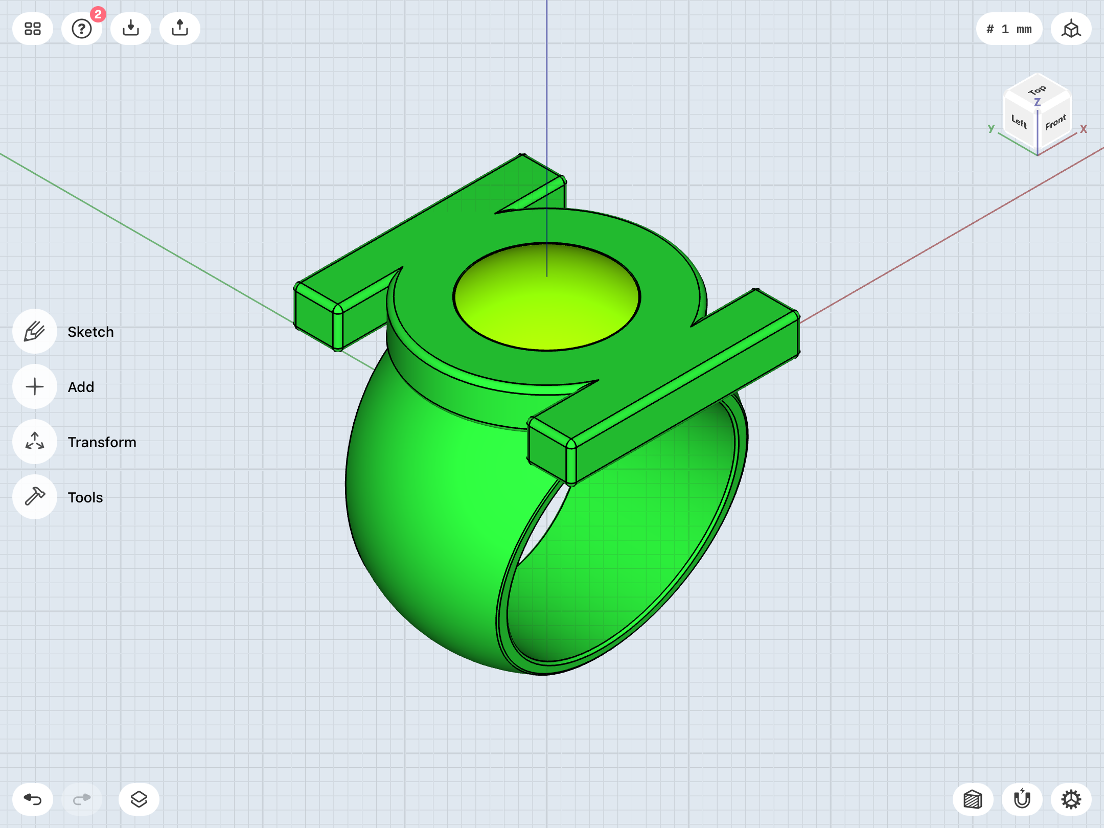
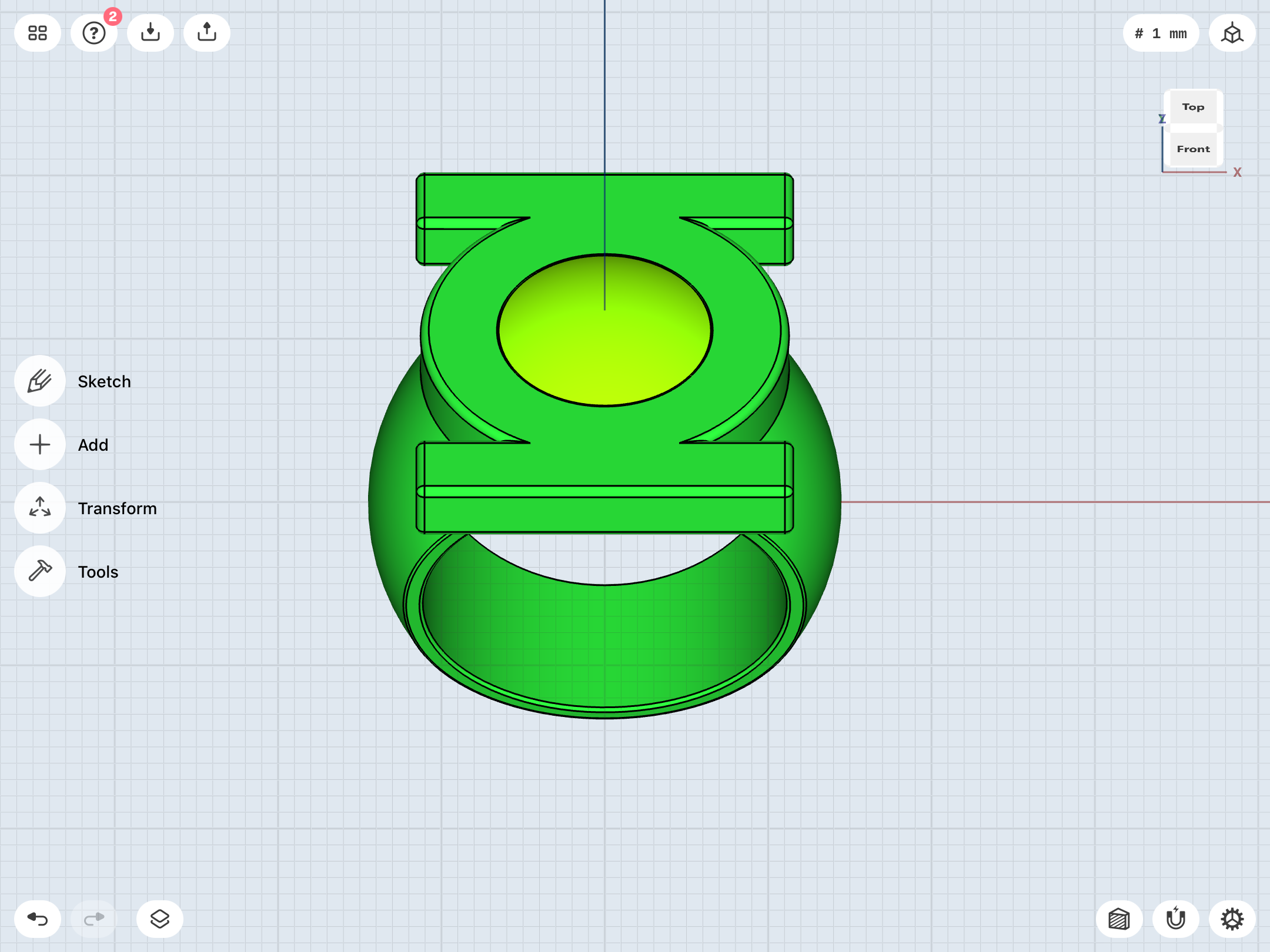
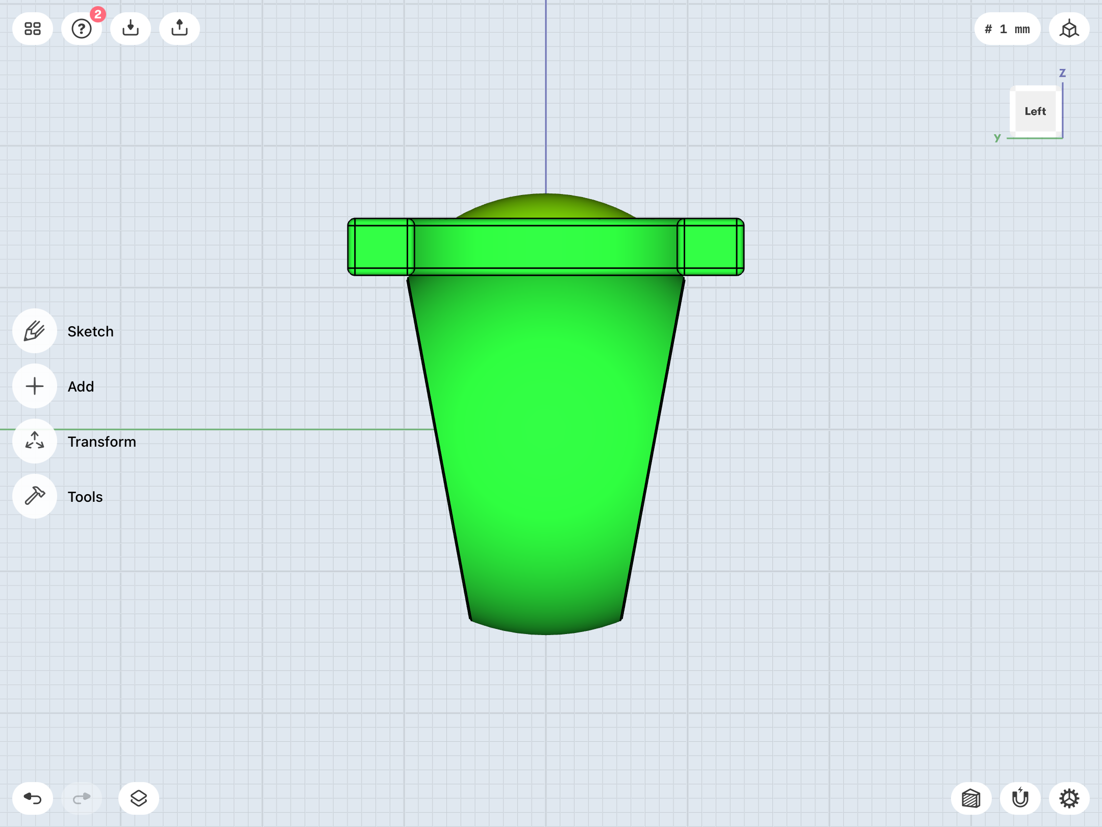
First attempt at that ever-so-tricky EMERALD DAWN/GL Vol. 3 ring.
Fortunately, modeling the complex curves and intersections of this design are a lot easier. Thanks to the chamfer/fillet option, I’ve heavily rounded the front edges of the (tapered) band to create that very smooth, organic shape Mark Bright drew, with the band blending into the symbol-disc.
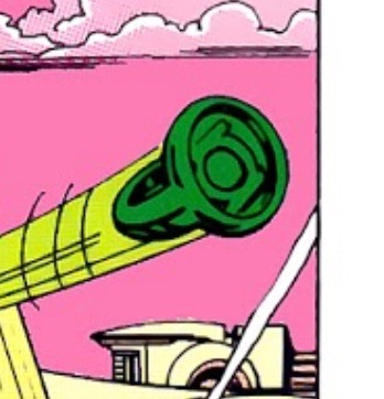
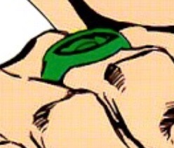
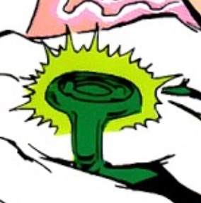
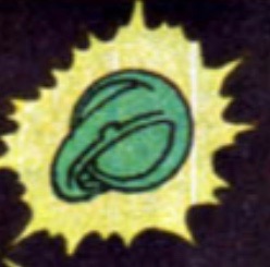
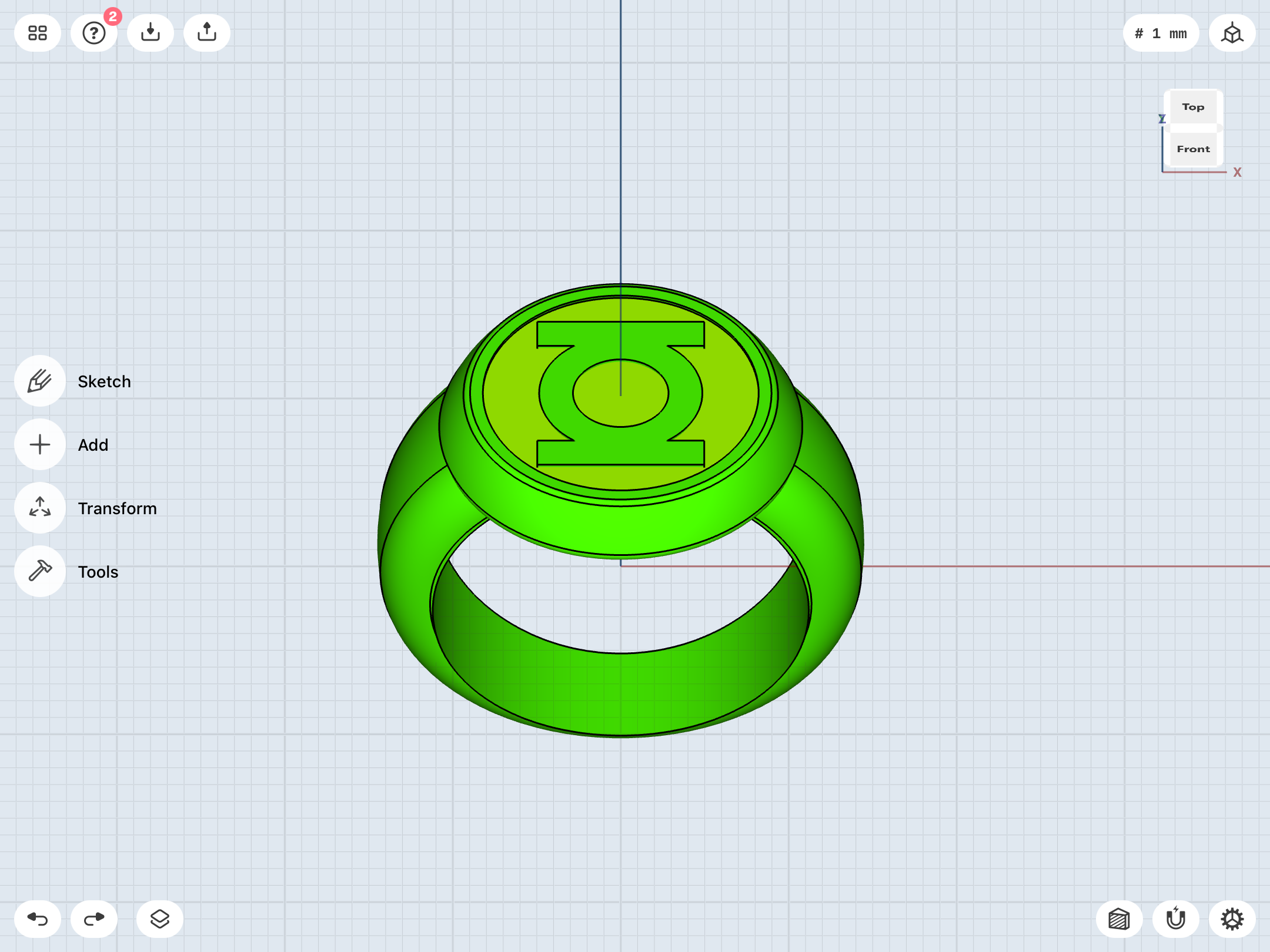
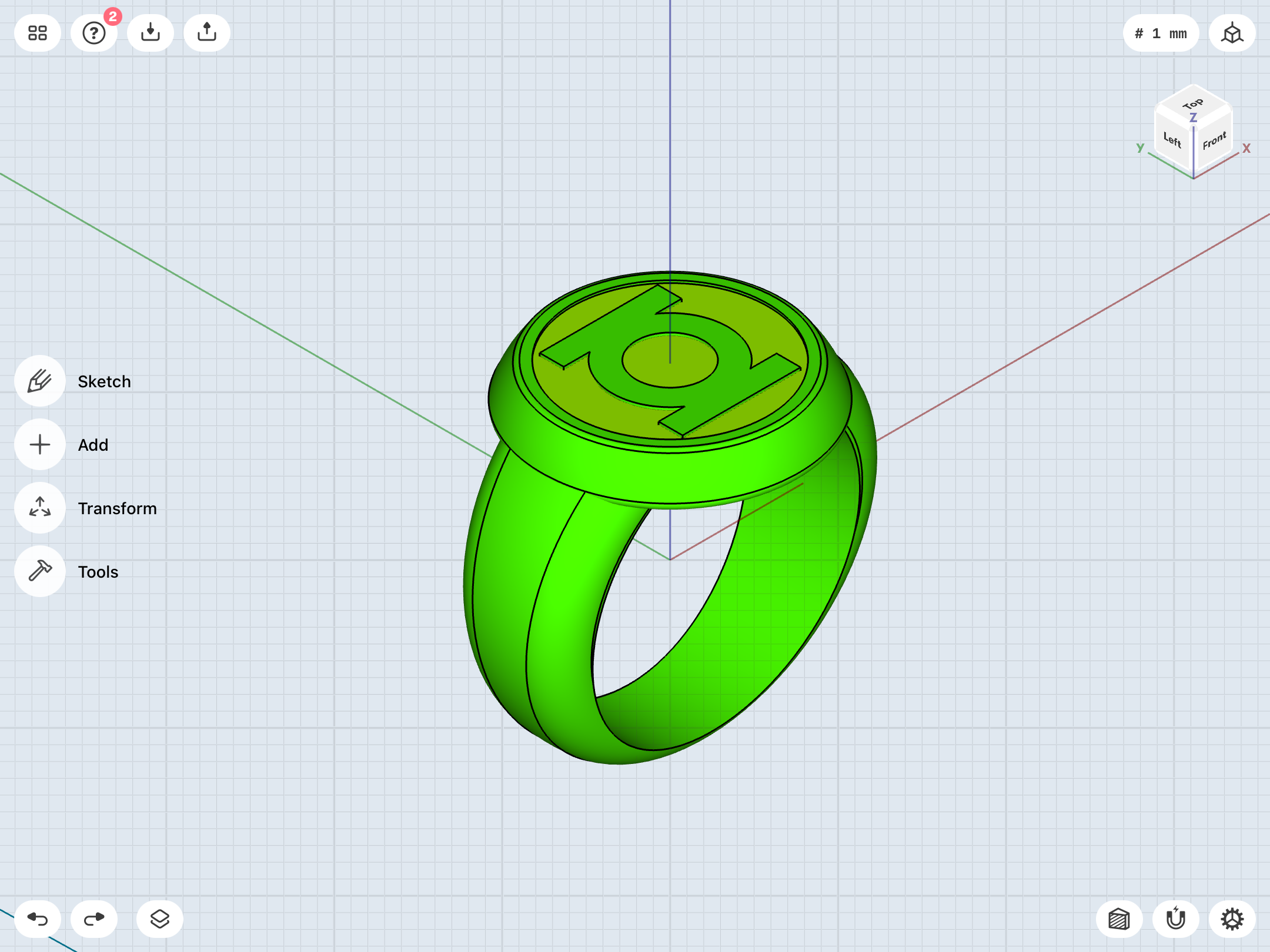
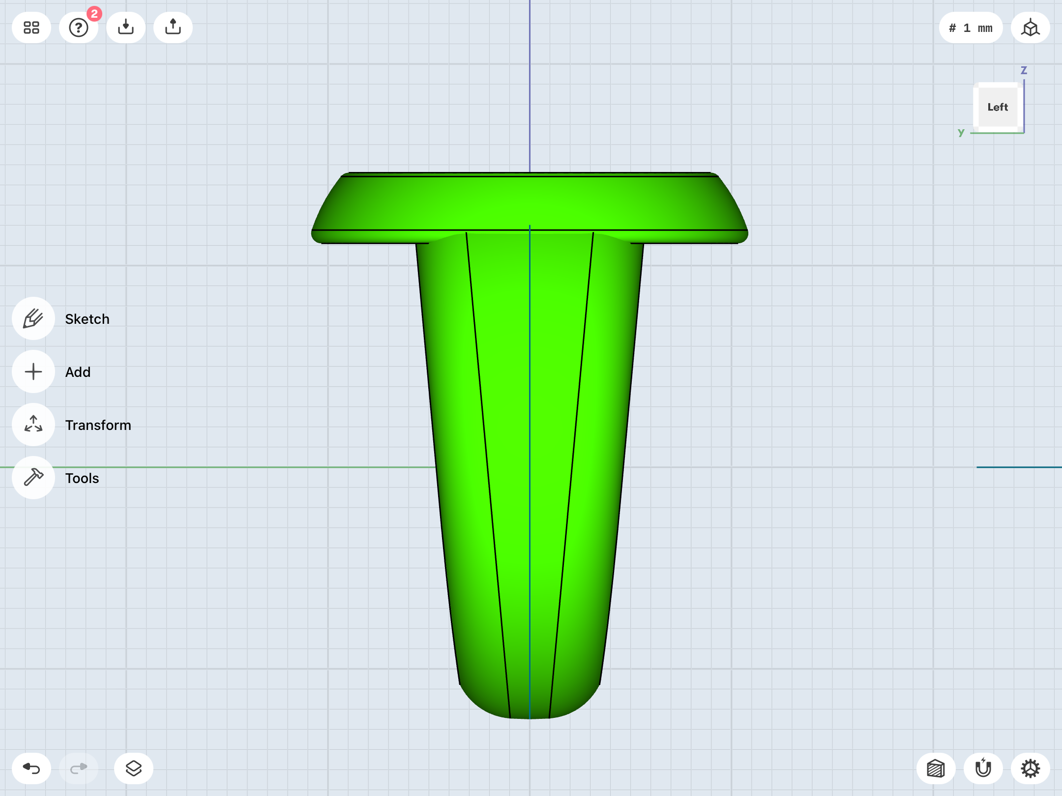
Fortunately, modeling the complex curves and intersections of this design are a lot easier. Thanks to the chamfer/fillet option, I’ve heavily rounded the front edges of the (tapered) band to create that very smooth, organic shape Mark Bright drew, with the band blending into the symbol-disc.
