You are using an out of date browser. It may not display this or other websites correctly.
You should upgrade or use an alternative browser.
You should upgrade or use an alternative browser.
Defined Green Lantern Comic Rings
- Thread starter Gregatron
- Start date
Just for funzies, and since I’ve been pushing more and more toward modeling specific artists’ styles, I decided to throw together a Dave Gibbons-style V2 ring, using the alternate official GL symbol from the 80s and 90s (with thicker sidebars, a smaller central ring, and a smaller central ring hole, which is pretty darn close to Gibbons’ version), as shown upthread. Gibbons’ version of the GL ring does not have a gem, and the ring-band is (usually) rather thin, being just a bit wider than the central hole in the GL symbol. As noted, I personally prefer the ring-band to be the same width as the central ring section of the GL symbol, but I’ve made an exception for accuracy, in this case.
My various V2 designs up until now have mainly been inspired by the artwork of Joe Staton, in terms of size and detailing. However, whereas most of my ring designs have used the official GL symbol employed for licensing (...for the sake of unity among the bulk of my designs, and as a result of my making the somewhat-illogical leap that the symbol variations from all of the artists over the decades were “really” just artistic interpretations of that official version of the symbol...which ain’t the truth, but there it is.), Staton’s version actually looks closer to this symbol variant, usually.
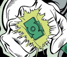
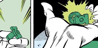
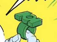
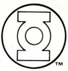
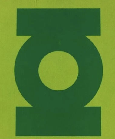
My previous straight-band V2 (with the Style Guide symbol) on left, and the new Gibbons-inspired version on right.
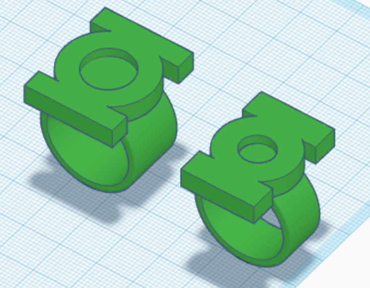
My various V2 designs up until now have mainly been inspired by the artwork of Joe Staton, in terms of size and detailing. However, whereas most of my ring designs have used the official GL symbol employed for licensing (...for the sake of unity among the bulk of my designs, and as a result of my making the somewhat-illogical leap that the symbol variations from all of the artists over the decades were “really” just artistic interpretations of that official version of the symbol...which ain’t the truth, but there it is.), Staton’s version actually looks closer to this symbol variant, usually.
My previous straight-band V2 (with the Style Guide symbol) on left, and the new Gibbons-inspired version on right.
Last edited:
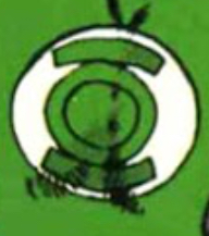
Refining the symbol as seen in the last few issues of Adams’ run. The inherent problem is that it was in flux from panel to panel, with the length, thickness, and curvature of the sidebars constantly changing. Also, the tips of the sidebars flare away from the central ring section, which means that the central ring and sidebars are not properly concentric...and yet the outer edges of the sidebars ARE pretty consistently aligned with the circle that the GL symbol sits within.
It’s a rather funky shape, that’s for sure. Adams’ modern version of the symbol corrects these problems, but I’m going for the classic 70s look.
Original:
Modern:


It’s a rather funky shape, that’s for sure. Adams’ modern version of the symbol corrects these problems, but I’m going for the classic 70s look.
Original:
Modern:
Still tinkering. Created another variant by moving away from a signet-type ring, and more toward a symbol-disc attached to a flaired ring-band, similar to the EMERALD DAWN version. This actually seems to match the reference more closely than a signet ring.
That being said, I like both styles, and may print both to compare them.
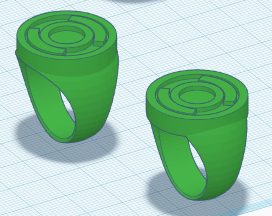
That being said, I like both styles, and may print both to compare them.
Doing a little comparison of the current versions of the three main designs, with a few variants also mixed in —the straight-band V1, the V2, the sphere-band V1, the Gibbons V2, the V3, and a new, smaller and sleeker V3 variant, with a shallower symbol-hole (to be both a little less chunky, and to represent artists who drew the design without a gem).
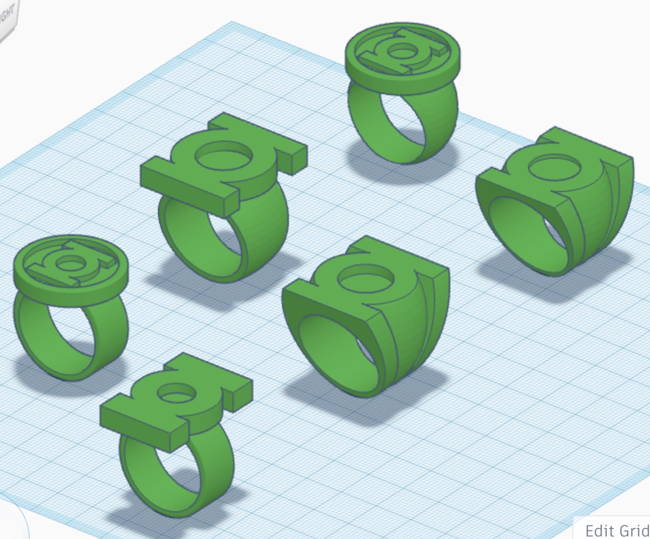
I’ve also slightly reworked the V3 to give the sidebars a slight taper as they run down the sides of the ring. Something was nagging me about the design for a long time, and that tweak seems to have scratched the itch. Having parallel sidebars just looks slightly... off. And looking at the reference does indicate many artists going for a tapered look (but not so much Mike Grell, so I’ll leave the model for his version as it is).
Meanwhile, further examination of the Dave Gibbons reference art shows some variation in the width of the ring-band, with many panels showing the band being as wide as the symbol’s central section, as opposed to the thinner band I’ve modeled. That being said, I may just leave it as it is, both to provide some contrast with my standard V2, and also because Gibbons drew the thinner band in the iconic GREEN LANTERN # 181, where Jordan quit.
While thinking about some of the finer points of the rings, I hit on an idea.
First, an overview:
Of course, when Hal Jordan was introduced in 1959, comic books were printed on pulp paper, with a limited, four-color palette.
In-universe, the Green Lantern Corps’ rings were usually described as being made from alien metal (and, to this day, are usually drawn to simulate a polished, metallic look), although they have sometimes been described as “crystalline” in composition, as well. And, usually, when charged by their batteries (or just when in use), they’re shown to glow with green power.

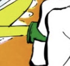
Due to the limited coloring techniques of the day, the glow was depicted as a line-art energy effect, colored a lime-ish shade of green. The ring itself was uniformly colored the same shade of dark green as Green Lantern’s uniform. Presumably, the entire ring was intended to be glowing, rather than just a portion of it.
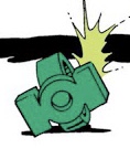
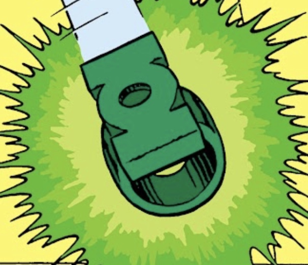
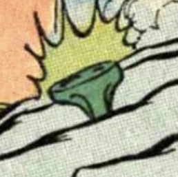
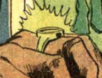
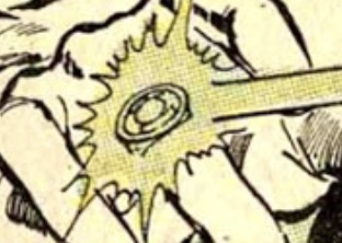
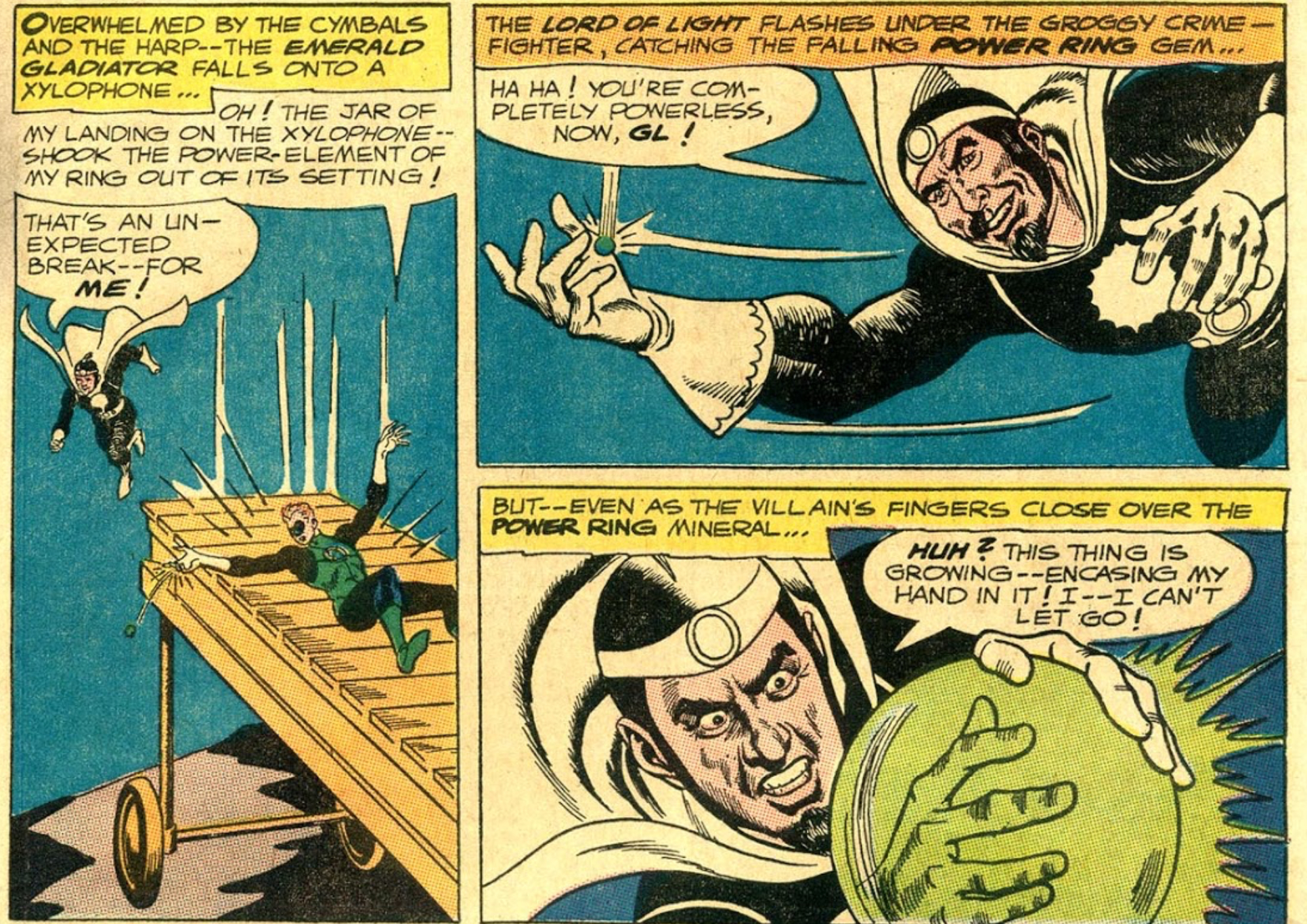
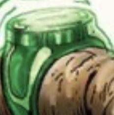
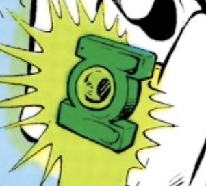
And, even in the early days, when the V1 was the only model in existence, the ring was often described in dialogue as containing a “gem” or “crystal”. Indeed, in GREEN LANTERN Vol. 2 # 33, during a battle with Doctor Light, the “power-element” or “gem” was dislodged from its setting in the ring, with the artwork depicting a generic disc or sphere (perhaps intended to represent the symbol-disc, or a portion of it).
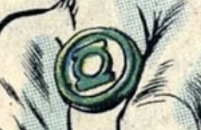
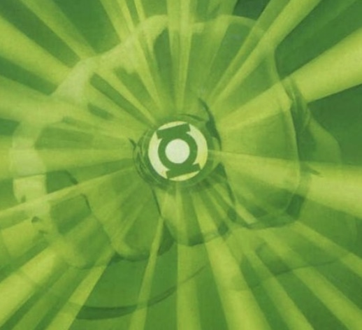
On a few occasions during the late 1960s and early 70s, we started to see the recessed areas of the symbol-disc colored either white (thus resembling the GL symbol as seen on the uniform) or the same lime-green as the ring’s energy beam. The latter coloring effect would later be interpreted by some artists (including painter Alex Ross) as a flat, glowing crystal/gem from which the ring’s emerald energy is emitted.

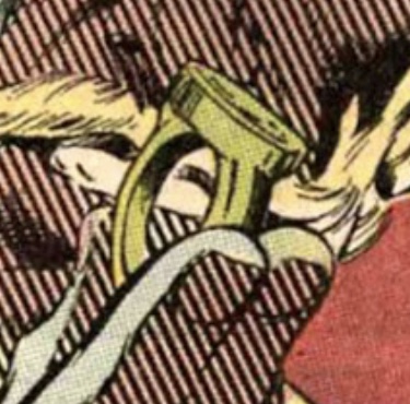
When Mike Grell redesigned the ring in 1976, and used the GL symbol itself as the shape of the ring’s face, he incorporated an actual domed gem into the center of it (sometimes colored dark green, like the rest of the ring, and sometimes the lighter, lime-green of the power beam effect). Some artists (such as Alex Saviuk and Joe Staton) would include this gem on both the V3 and V2, and others (such as Dave Gibbons, George Perez, and John Byrne) would not, although colorists would sometimes still color the empty symbol-hole the lighter, lime-green color (thus giving the impression of a gem either flush with the face or the ring, or recessed).
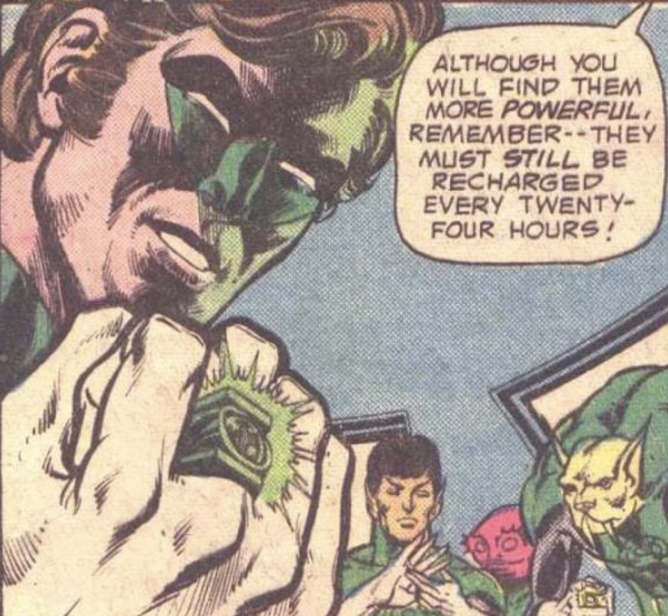

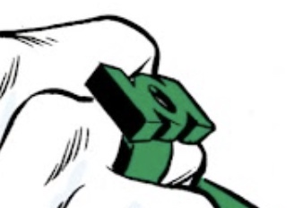
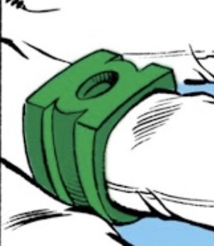
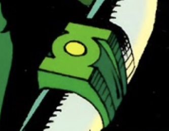
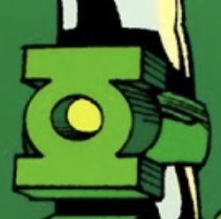
By the time of EMERALD DAWN and the GREEN LANTERN Vol. 3 relaunch, circa 1990, Hal Jordan was once again wearing a V1-style ring, and this time with a consistently two-tone color scheme, and the lime green color in the recessed areas of the symbol-disc, although this was not necessarily intended to depict a glowing center section of the ring.
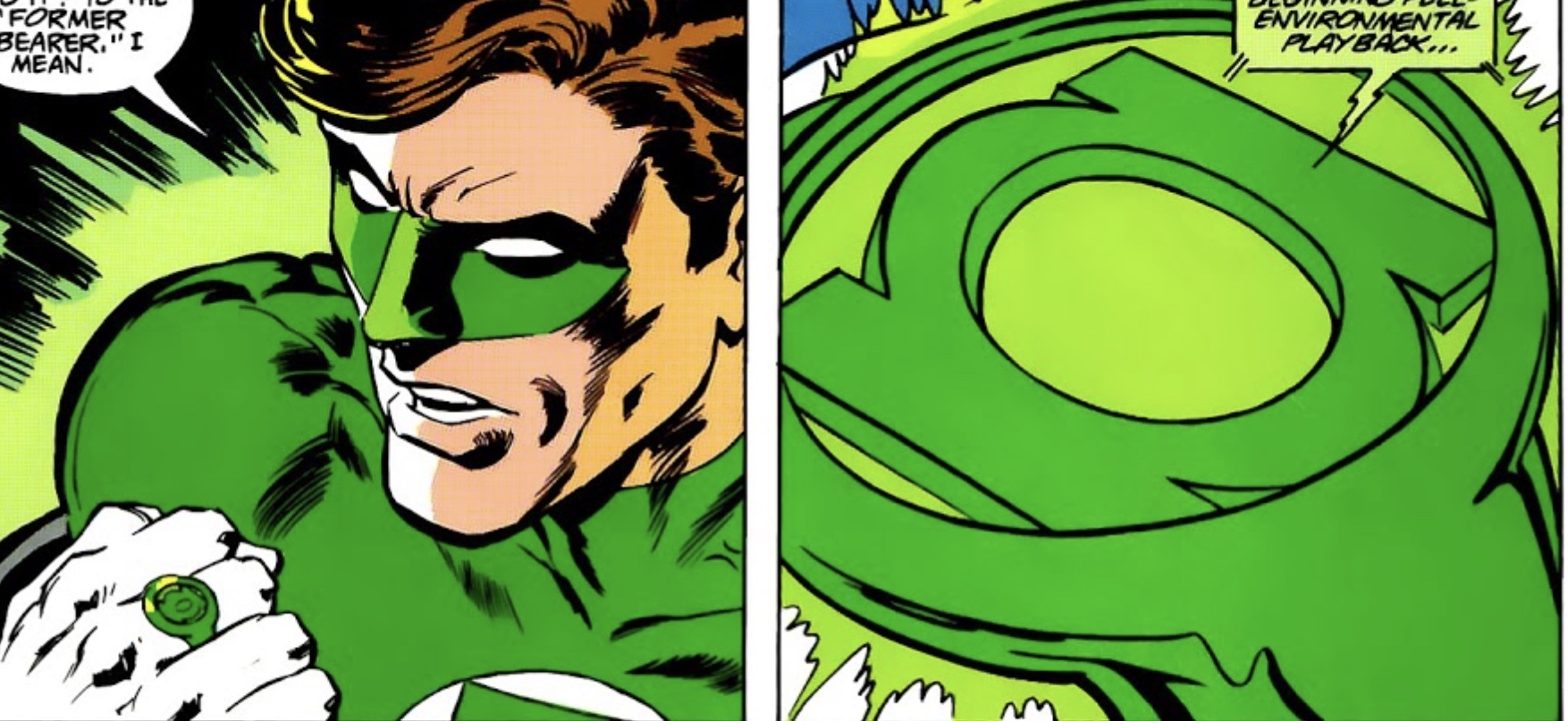
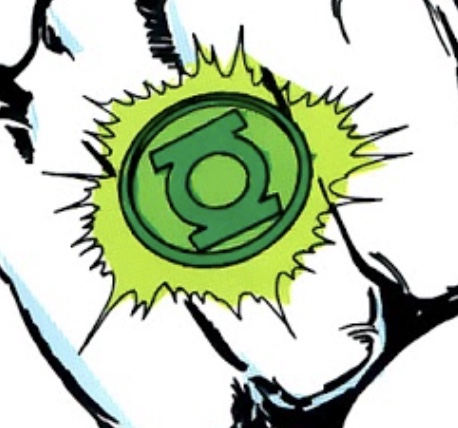

By the turn of the century, computer-coloring and higher-quality paper allowed modern creators to create more realistic and dimensional coloring and shading effects with the green plasma-energy emitted from Green Lantern’s ring, as well as showing a realistic lighting effect coming from the recessed section of the ring.
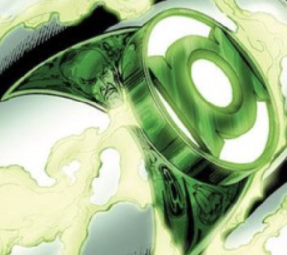
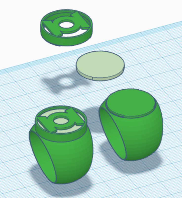
Anyway, I came up with a way to perhaps simulate the modern rings’ effect. I’ve taken my modern-era design and created a three-part variant, with the base ring, a clear (or frosted) inner disc (to be printed in plastic or cut from plexiglass), and then a cap (containing the symbol). The inner disc can be painted a clear peridot color, and backed with my go-to glow-in-the-dark paint. Still working out the tolerances (and some parts may be too thin to print), but it’s coming along. The modern design lends itself to this, but the EMERALD DAWN version would be trickier, so I’ll likely go with a painted, two-tone look. And I think I’ll leave the early rings from the 60s a monotone green, to reflect how they actually looked on the page.
First, an overview:
Of course, when Hal Jordan was introduced in 1959, comic books were printed on pulp paper, with a limited, four-color palette.
In-universe, the Green Lantern Corps’ rings were usually described as being made from alien metal (and, to this day, are usually drawn to simulate a polished, metallic look), although they have sometimes been described as “crystalline” in composition, as well. And, usually, when charged by their batteries (or just when in use), they’re shown to glow with green power.
Due to the limited coloring techniques of the day, the glow was depicted as a line-art energy effect, colored a lime-ish shade of green. The ring itself was uniformly colored the same shade of dark green as Green Lantern’s uniform. Presumably, the entire ring was intended to be glowing, rather than just a portion of it.
And, even in the early days, when the V1 was the only model in existence, the ring was often described in dialogue as containing a “gem” or “crystal”. Indeed, in GREEN LANTERN Vol. 2 # 33, during a battle with Doctor Light, the “power-element” or “gem” was dislodged from its setting in the ring, with the artwork depicting a generic disc or sphere (perhaps intended to represent the symbol-disc, or a portion of it).
On a few occasions during the late 1960s and early 70s, we started to see the recessed areas of the symbol-disc colored either white (thus resembling the GL symbol as seen on the uniform) or the same lime-green as the ring’s energy beam. The latter coloring effect would later be interpreted by some artists (including painter Alex Ross) as a flat, glowing crystal/gem from which the ring’s emerald energy is emitted.
When Mike Grell redesigned the ring in 1976, and used the GL symbol itself as the shape of the ring’s face, he incorporated an actual domed gem into the center of it (sometimes colored dark green, like the rest of the ring, and sometimes the lighter, lime-green of the power beam effect). Some artists (such as Alex Saviuk and Joe Staton) would include this gem on both the V3 and V2, and others (such as Dave Gibbons, George Perez, and John Byrne) would not, although colorists would sometimes still color the empty symbol-hole the lighter, lime-green color (thus giving the impression of a gem either flush with the face or the ring, or recessed).
By the time of EMERALD DAWN and the GREEN LANTERN Vol. 3 relaunch, circa 1990, Hal Jordan was once again wearing a V1-style ring, and this time with a consistently two-tone color scheme, and the lime green color in the recessed areas of the symbol-disc, although this was not necessarily intended to depict a glowing center section of the ring.
By the turn of the century, computer-coloring and higher-quality paper allowed modern creators to create more realistic and dimensional coloring and shading effects with the green plasma-energy emitted from Green Lantern’s ring, as well as showing a realistic lighting effect coming from the recessed section of the ring.
Anyway, I came up with a way to perhaps simulate the modern rings’ effect. I’ve taken my modern-era design and created a three-part variant, with the base ring, a clear (or frosted) inner disc (to be printed in plastic or cut from plexiglass), and then a cap (containing the symbol). The inner disc can be painted a clear peridot color, and backed with my go-to glow-in-the-dark paint. Still working out the tolerances (and some parts may be too thin to print), but it’s coming along. The modern design lends itself to this, but the EMERALD DAWN version would be trickier, so I’ll likely go with a painted, two-tone look. And I think I’ll leave the early rings from the 60s a monotone green, to reflect how they actually looked on the page.
Last edited:
I think I’ve taken this project as far as I can in Tinkercad. Also, Tinkercad doesn’t have an “export” option for file types conducive to CNC machining (such as STEP) and whatnot, and there are limitations in regards to modeling certain shapes (such as the visible grid pattern on spheres and cones and such). With another program, I think I could get better results with things like blending the band into the symbol-disc on the EMERALD DAWN ring, for example.
So, I’m gonna start looking for a more advanced 3-D modeling program to port these models into (or recreate them), in preparation for getting some of these designs done in metal.
Any suggestions?
So, I’m gonna start looking for a more advanced 3-D modeling program to port these models into (or recreate them), in preparation for getting some of these designs done in metal.
Any suggestions?
Received the latest batch of prints. A BIG batch. This batch turned out exceptionally well. Very few issues to speak of. I’m very pleased with the look and fit of the bulk of the designs.
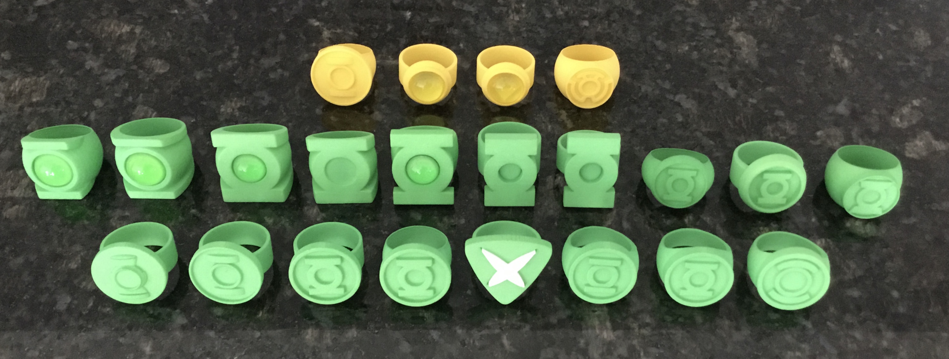
Here are a few highlights:
Going back to the bigger (25.5mm) symbol-disc on the Gil Kane design really does give it the right look. The smaller version I had printed last time looks a little nicer and more proportioned, but the bigger disc seems to be more comic-accurate. At least I have both options to choose from for the final, metal ring.
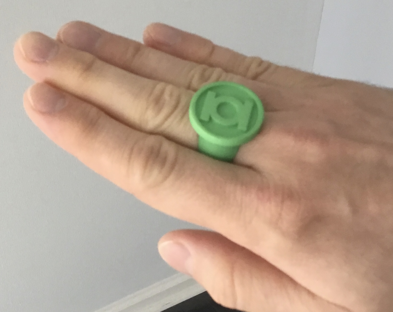
The Neal Adams designs turned out REALLY well. Definitely a favorite style, now.
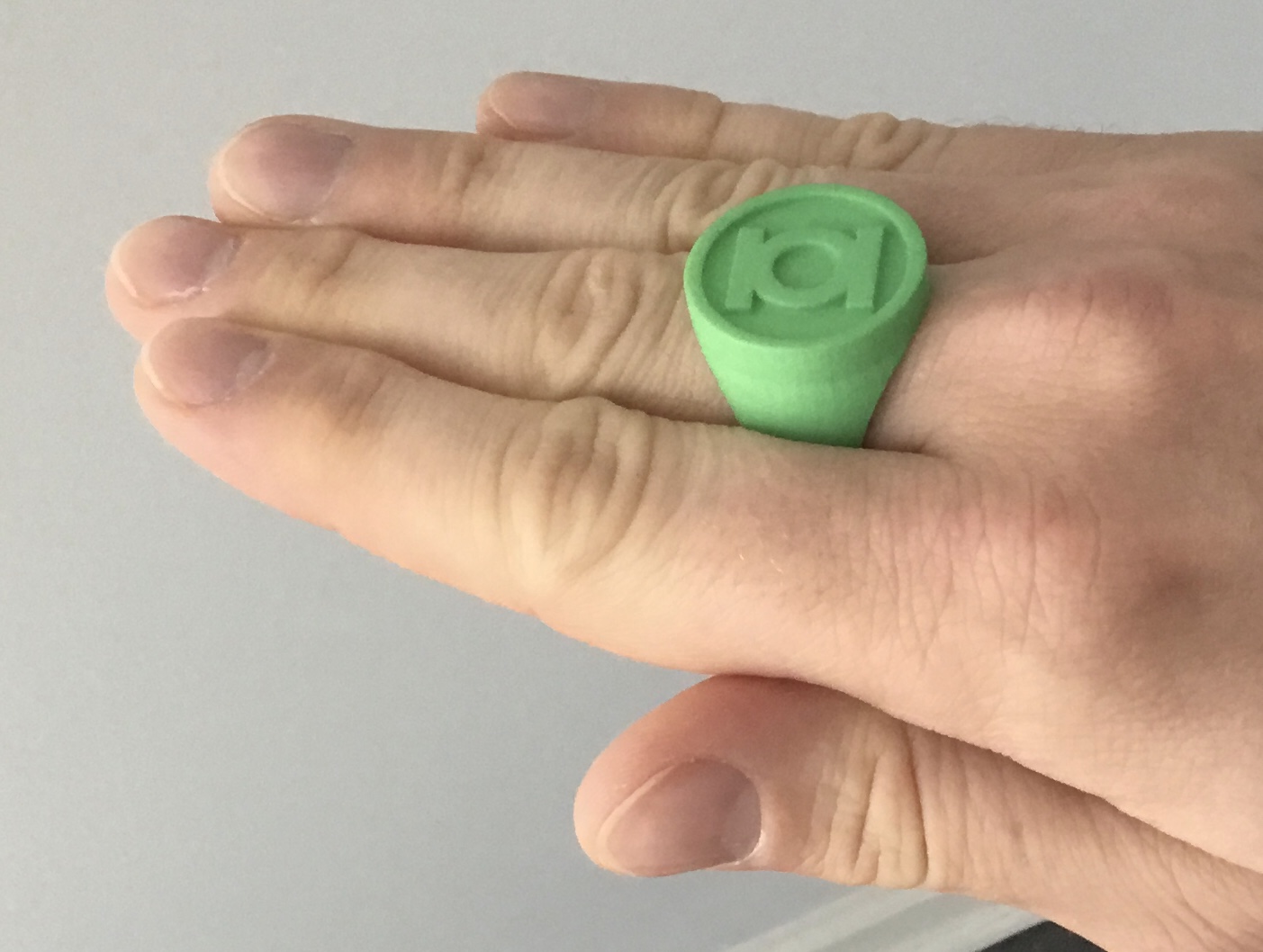
The revised version of the modern ring looks spectacular. In terms of design and fit, I’m hard-pressed to think of anything else to tweak. I might just say that this design is totally finished, aside from the previously-mentioned crystal-layer underneath the symbol.

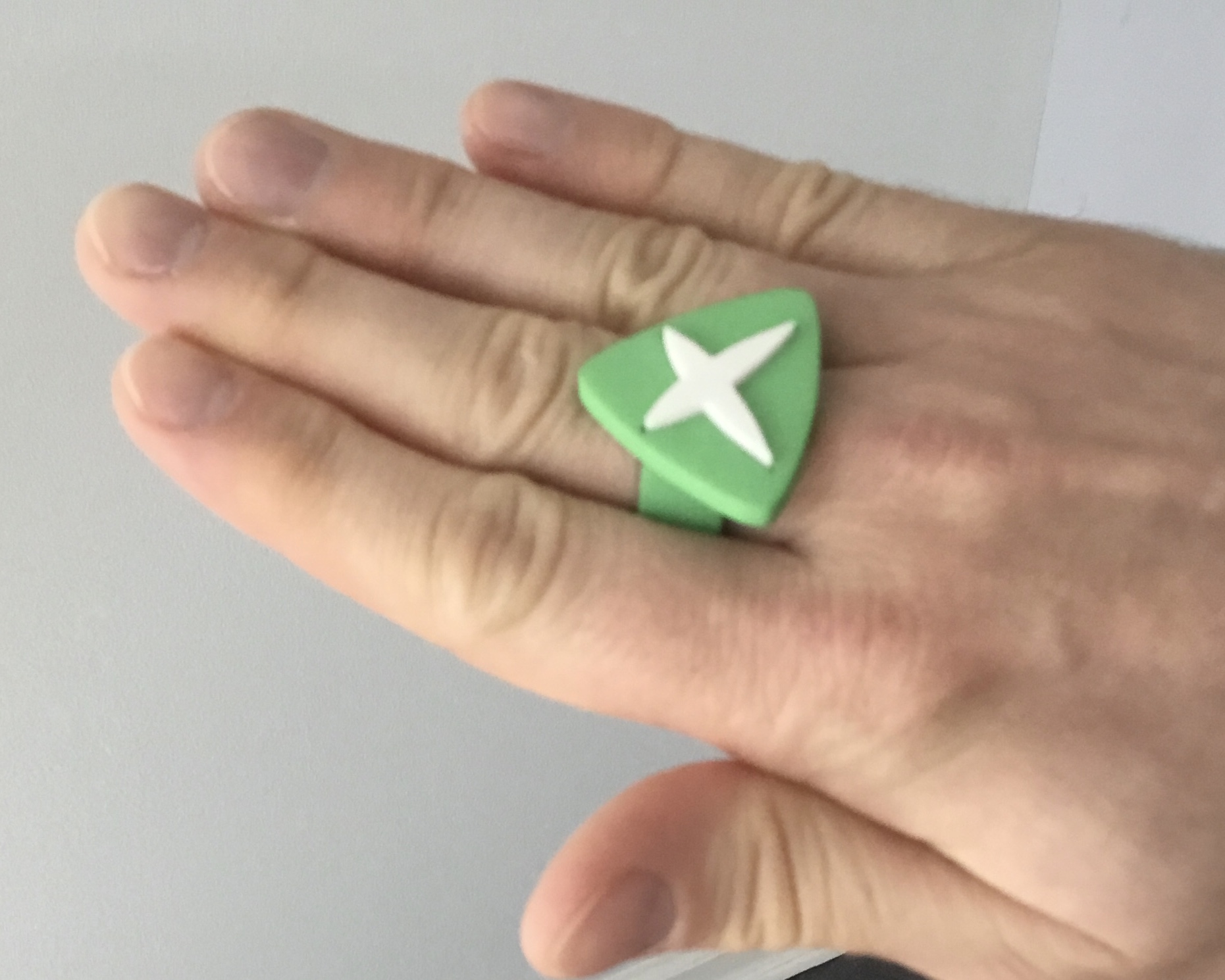
The Power Ring...um...power ring also turned out incredibly well. Some slight improvements could be made regarding the height of the raised white symbol-piece, as well as the fit of the piece into the ring, but this first attempt looks great.
The Dave Gibbons design also turned out incredibly well.
The smaller V3 has the best fit and proportions of any V3 I’ve done, and would be ideal for the final design. The problem is that the symbol-hole is far too shallow to fit a gem. That being said, I’ve experimented with raising the height of the ring, and I may actually be able to fit a 12mm gem into it. However, 12mm seems to be an uncommon size for a round, flatback cabochon. And I’m a bit leery about reducing the diameter of the 13mm glass gems I acquired for the final rings. The acrylic ones I’m using for these plastic prototypes, maybe, but not the glass. We‘ll see.
Here are a few highlights:
Going back to the bigger (25.5mm) symbol-disc on the Gil Kane design really does give it the right look. The smaller version I had printed last time looks a little nicer and more proportioned, but the bigger disc seems to be more comic-accurate. At least I have both options to choose from for the final, metal ring.
The Neal Adams designs turned out REALLY well. Definitely a favorite style, now.
The revised version of the modern ring looks spectacular. In terms of design and fit, I’m hard-pressed to think of anything else to tweak. I might just say that this design is totally finished, aside from the previously-mentioned crystal-layer underneath the symbol.
The Power Ring...um...power ring also turned out incredibly well. Some slight improvements could be made regarding the height of the raised white symbol-piece, as well as the fit of the piece into the ring, but this first attempt looks great.
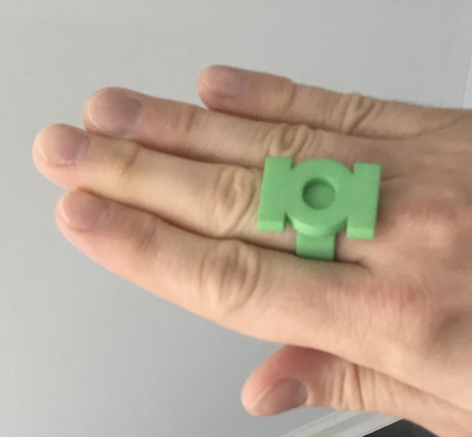
The Dave Gibbons design also turned out incredibly well.
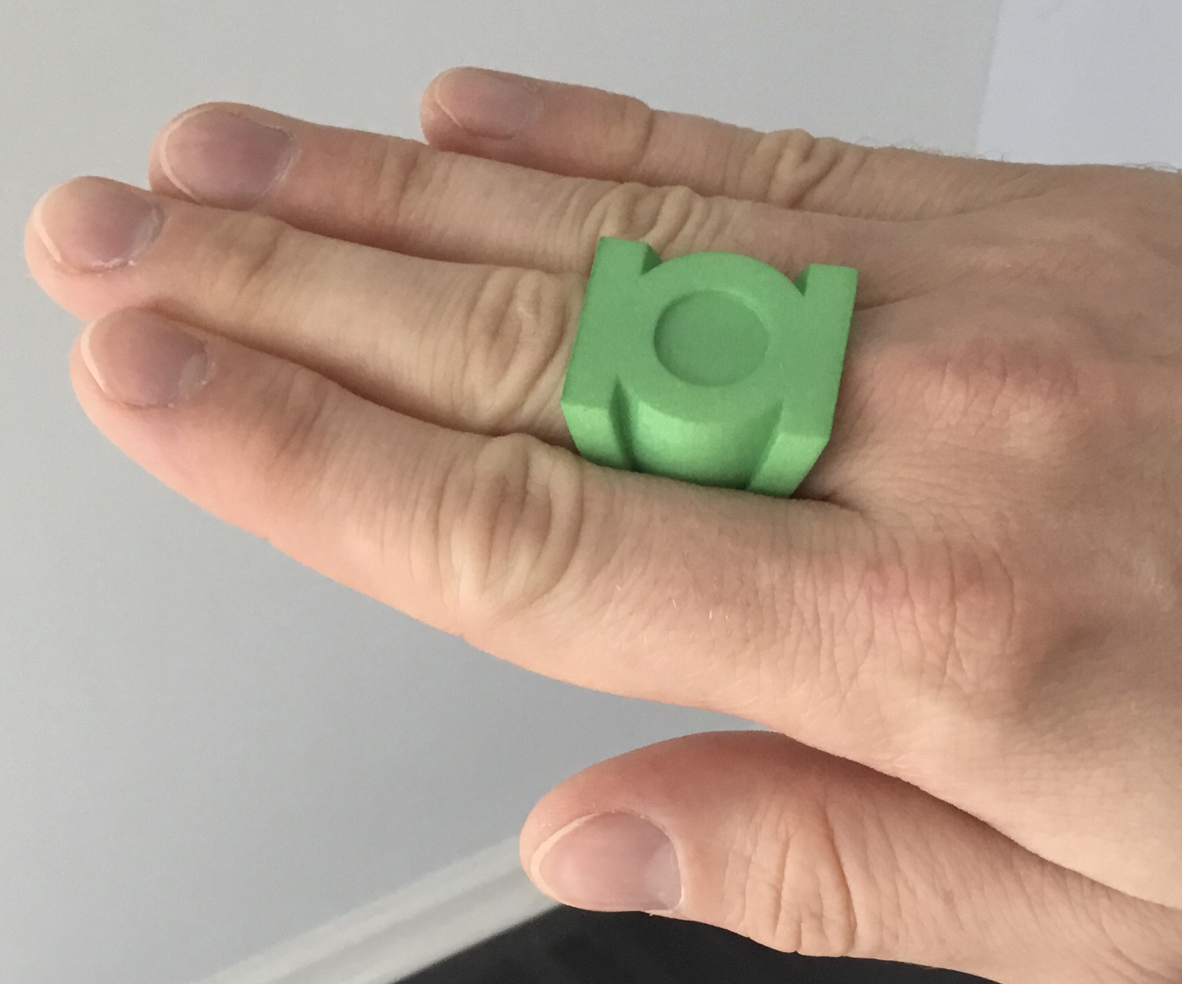
The smaller V3 has the best fit and proportions of any V3 I’ve done, and would be ideal for the final design. The problem is that the symbol-hole is far too shallow to fit a gem. That being said, I’ve experimented with raising the height of the ring, and I may actually be able to fit a 12mm gem into it. However, 12mm seems to be an uncommon size for a round, flatback cabochon. And I’m a bit leery about reducing the diameter of the 13mm glass gems I acquired for the final rings. The acrylic ones I’m using for these plastic prototypes, maybe, but not the glass. We‘ll see.
Attachments
...every time I think I’m done with the V3, I keep getting sucked back in.
I decided to sand down a 13mm acrylic gem to fit the hole on the smaller V3 I had printed. It fits very well, despite the shallow hole. I then proceeded to tweak the design by making it a little taller (thus allowing for a deeper gem-hole), and slightly re-angling and repositioning the sidebars so that their angle isn’t quite so severe, and to give them a little more definition and thickness at the bottom of the ring.
Fact of the matter is that most artists (including Mike Grell and Alex Saviuk) have drawn this design with consistently-thick, PARALLEL sidebars, which is simply not practical or comfortable to wear, when translated into a real ring. At least not at the size the ring’s design is usually drawn to be.

However, some artists, such as Darryl Banks, have indeed drawn the sidebars slightly angled in toward the bottom and with a bit of a taper, so there is a precedent for my version.

This new iteration should solve pretty much all of the size problems I’ve been having. Also, it should be noted that certain choices I’ve made with this design are a result of needing enough wall thickness for the Shapeways printed plastic to survive their polishing process. When I shift over to preparing the design for metal, I can tweak it and slim it down much more, since the strength of the walls won’t be in question. Really, the only trick now is finding an actual glass gem with the proper diameter.
From left to right: Previous V3, the smaller version I had printed in the current batch, and the new revision, which is a hybrid of the two.
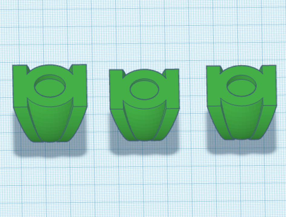
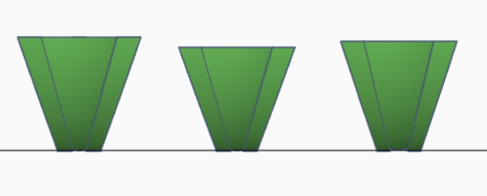
I decided to sand down a 13mm acrylic gem to fit the hole on the smaller V3 I had printed. It fits very well, despite the shallow hole. I then proceeded to tweak the design by making it a little taller (thus allowing for a deeper gem-hole), and slightly re-angling and repositioning the sidebars so that their angle isn’t quite so severe, and to give them a little more definition and thickness at the bottom of the ring.
Fact of the matter is that most artists (including Mike Grell and Alex Saviuk) have drawn this design with consistently-thick, PARALLEL sidebars, which is simply not practical or comfortable to wear, when translated into a real ring. At least not at the size the ring’s design is usually drawn to be.
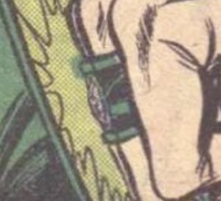
However, some artists, such as Darryl Banks, have indeed drawn the sidebars slightly angled in toward the bottom and with a bit of a taper, so there is a precedent for my version.
This new iteration should solve pretty much all of the size problems I’ve been having. Also, it should be noted that certain choices I’ve made with this design are a result of needing enough wall thickness for the Shapeways printed plastic to survive their polishing process. When I shift over to preparing the design for metal, I can tweak it and slim it down much more, since the strength of the walls won’t be in question. Really, the only trick now is finding an actual glass gem with the proper diameter.
From left to right: Previous V3, the smaller version I had printed in the current batch, and the new revision, which is a hybrid of the two.
timelordjedi777
Sr Member
This thread has been an absolute pleasure to read today. All you have done is amazing, that includes the history of the rings. Any chance you might give Alan Scott's ring a go?
This thread has been an absolute pleasure to read today. All you have done is amazing, that includes the history of the rings. Any chance you might give Alan Scott's ring a go?
I’ve considered it, as well as some of the other modern variants. We’ll see. The next logical step would be getting into the power batteries. One step at a time.
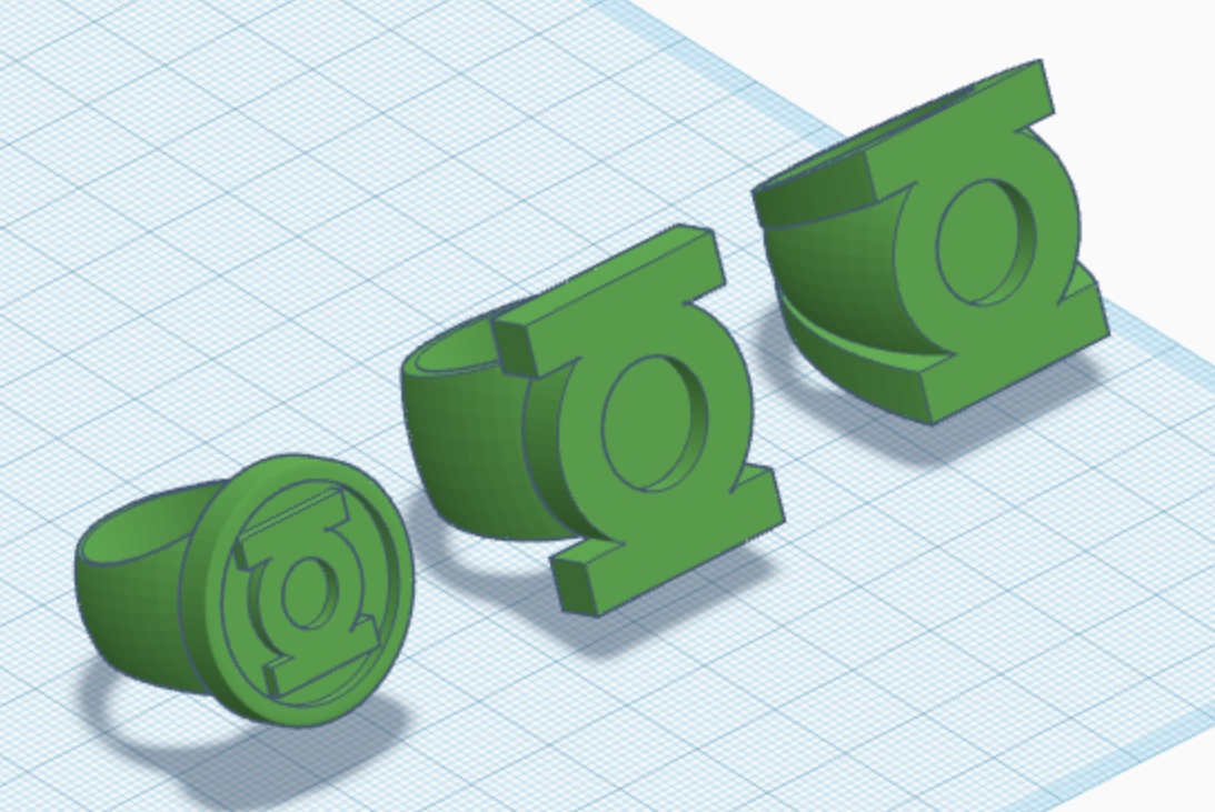
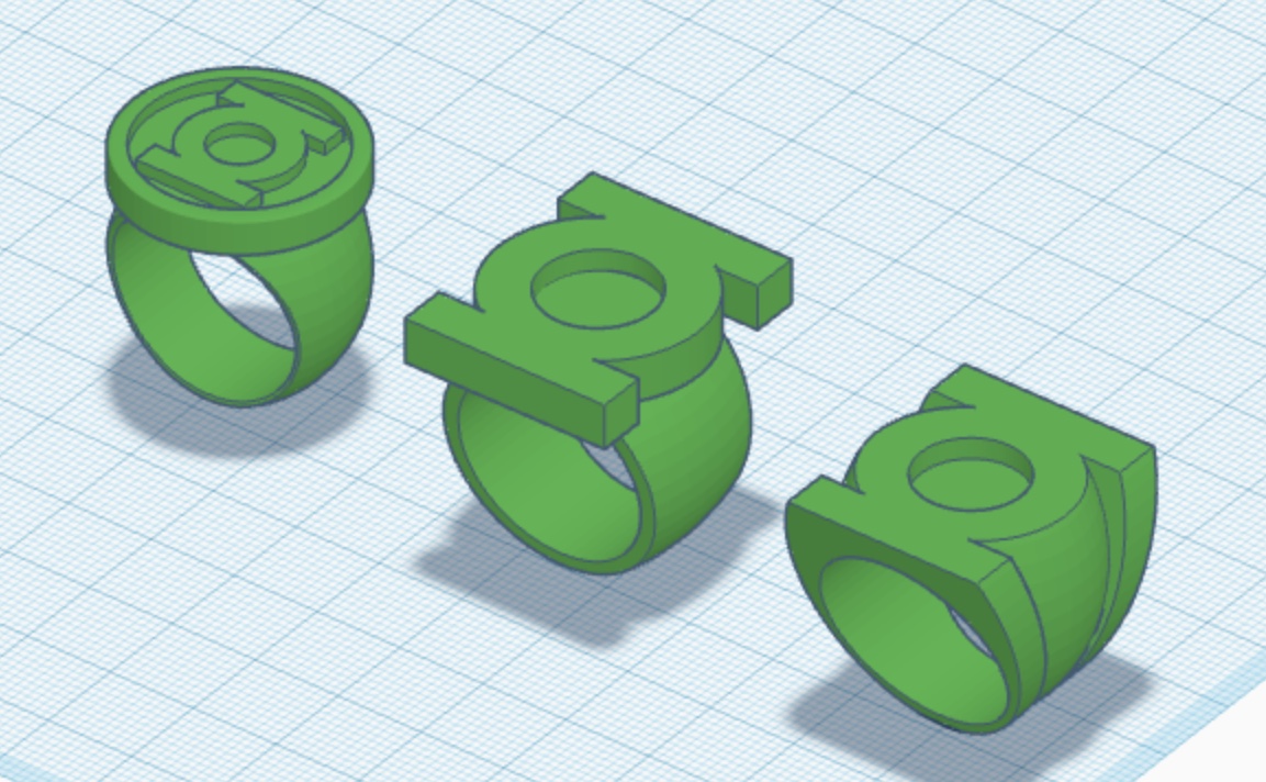
More tinkering on the V1 and V2. Really nitty-gritty stuff, at this stage. Adjusting the height of the V1 symbol-disc and V2 symbol-piece in relation to the bands by tenths of a millimeter. Giving the V1 a flat-bevel on the edge of the band and improving the overall shape and width of the band to better match the Gil Kane reference art. Tweaking the shape and width of the V2 band to make it taper a bit less sharply. Stuff like that.
All in all, these three core (Corps?) designs are very, very close to what I want them to be. And, as noted upthread, I just lucked into a smaller V3 design which actually works. I much prefer the smaller look. The symbol-face of the ring is now nearly 2mm shorter than that of the V2, whereas before, they were exactly the same size, with the only difference being the V2’s separate band vs. the V3’s integrated tri-band. With the height mod to accommodate the gem, this one might truly be THE one. We’ll see. Compromise is for quitters.
The next step is finding a new modeling program. And, after the next round of test- prints using these current models, I think I’m gonna print some in plain white, fill the print lines, polish them, and finish them with primer, then black, then metallic-green paint, as a proof-of-concept for the overall look and coloration of the eventual metal rings. The Shapeways dyed-green plastic is perfectly serviceable, and the plastic rings very wearable, but the green tends to be too light and inaccurate for my taste.
Last edited:
Upon reflection, I decided to slightly tweak the modern design to increase the size of the flat bevels around the ring-hole, slightly reduce the height of the symbol-disc, and provide a little more space between the symbol disc and the aforementioned flat bevels on either side of the ring.
New on left, old on right.
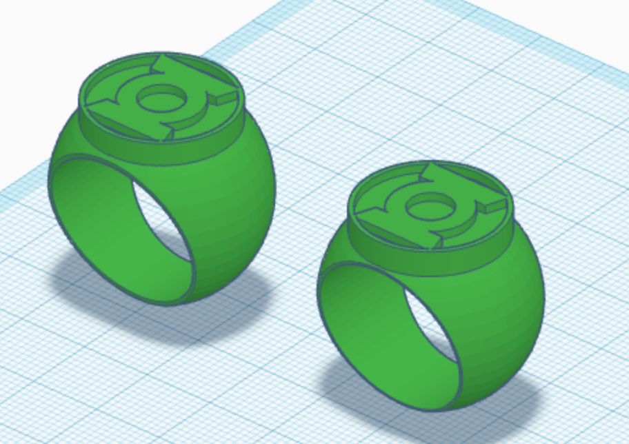
New on left, old on right.
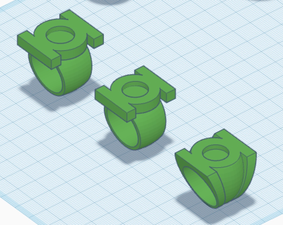
And now I’m rethinking the size of the V2. The current version seems fine, but I’m wondering if a slightly smaller (28mm instead of 30mm, like the new, smaller V3) might not work better. A bit sleeker, with a less-tapered band that’s still the width of the symbol’s central ring.
I need to go back through my reference, but the impression I’ve always had is that the V2 has a chunkier symbol than the V3, which is a bit smaller and sleeker. However, keeping the symbol the same size on both may actually work well.
Old on left, new, smaller version in center, new V3 on right.
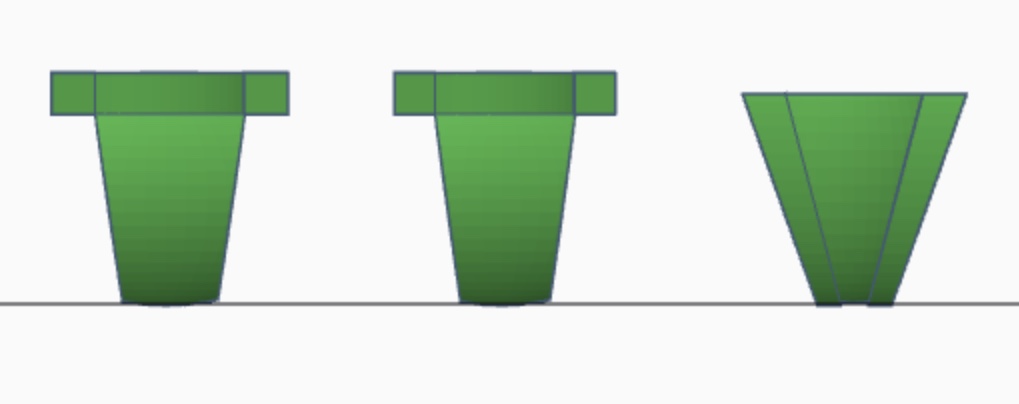
I need to go back through my reference, but the impression I’ve always had is that the V2 has a chunkier symbol than the V3, which is a bit smaller and sleeker. However, keeping the symbol the same size on both may actually work well.
Old on left, new, smaller version in center, new V3 on right.
Last edited:
Still looking into new modeling programs. Also been searching for more glass cabochons. As noted, I may end up going with the smaller V2 and V3 designs, and so would need smaller gems, but I’m also looking for low- dome gems. The ones I’ve been using are proper half- sphere flatbacks, and stand too proud from the faces of the rings. The reference definitely shows gems which are flatter and more subtle.
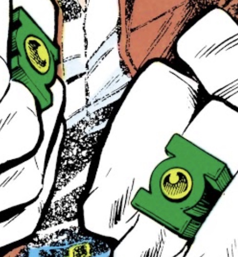
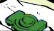
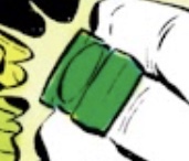
...the Guy Gardner/Sinestro design has been nagging at me. After going back and reviewing the reference, I made a few tweaks. Mainly, a larger-diameter and flatter symbol-disc/gem setting, with the disc mounted a little bit lower onto the ring-band.
Old on left, new on right.
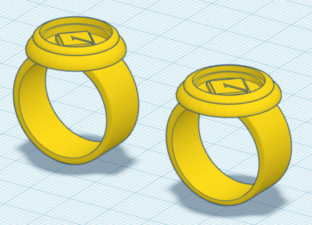
Old on left, new on right.
Last edited:
I’m thinking of having the Gardner ring printed in polished brass, once I get the design worked out. We’ll see.
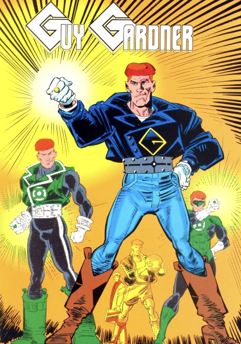
I do indeed have a fondness for Guy’s short-lived look from his solo series. A clever rethink of of his punked-out Green Lantern uniform, translated into 90s bluejeans and leather.
I do find it odd that the “G” symbol in his series’ logo was not the same as the actual symbol on his outfit. And I note that Batjeepster made the same mistake that I initially made for his run of brass Gardner rings, since he used the title logo’s “G” instead of the one Gardner actually wore.
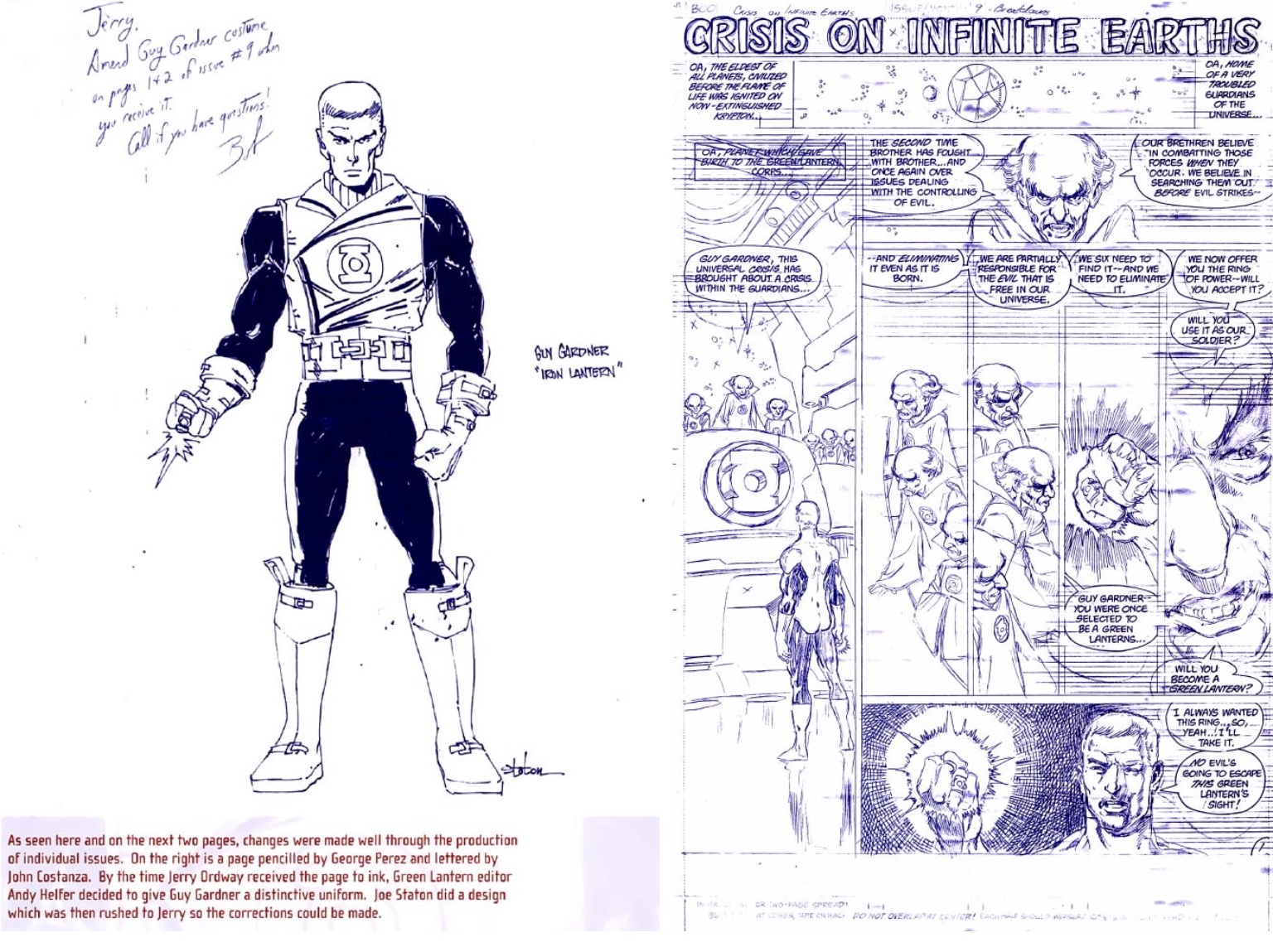
The original plan during CRISIS ON INFINITE EARTHS was to stick him in the standard uniform, but then they decided to have Staton give him a customized version, which worked really well for the character and his bowl-cut (which was intended to be a utilitarian, hospital-provided haircut, since he’d been comatose for years).
I neglected to mention that I’m currently reading pretty much everything GREEN LANTERN from 1959-1994 (the classic Jordan/Stewart/Gardner era), including GL’s backup runs in THE FLASH (1972-76) and ACTION COMICS WEEKLY (1988-89), as well as related series such as GREEN LANTERN MOSAIC, GUY GARDNER, and GREEN LANTERN CORPS QUARTERLY and DC events like CRISIS ON INFINITE EARTHS, LEGENDS, MILLENNIUM, and COSMIC ODYSSEY. I’ll finish with EMERALD TWILIGHT and then skip to GREEN LANTERN: REBIRTH to end on a high note. This is partly for research, and mostly for fun, since I’ve never sat down and read all of these stories, to say nothing of reading them in publication order. It’s been a blast. I’ve read 20 years’ worth of comics in about two months, and it’s been great. No better way to distract from the comic book industry (and entertainment in general) burning to the ground, and all the great franchises I’ve loved being utterly destroyed.
Coincidentally, I just read Gardner’s ill-fated first appearance as a GL (# 116), last night. Guy is a character whose evolution has been pretty wild, since he went from a rather bland and generic substitute GL, to the semi-villainous, brain-damaged, jingoistic/80s action-hero parody character of the CRISIS era, to the sleazy-yet-lovable jerk who was played for laughs in JUSTICE LEAGUE AMERICA and beyond.
I do indeed have a fondness for Guy’s short-lived look from his solo series. A clever rethink of of his punked-out Green Lantern uniform, translated into 90s bluejeans and leather.
I do find it odd that the “G” symbol in his series’ logo was not the same as the actual symbol on his outfit. And I note that Batjeepster made the same mistake that I initially made for his run of brass Gardner rings, since he used the title logo’s “G” instead of the one Gardner actually wore.
The original plan during CRISIS ON INFINITE EARTHS was to stick him in the standard uniform, but then they decided to have Staton give him a customized version, which worked really well for the character and his bowl-cut (which was intended to be a utilitarian, hospital-provided haircut, since he’d been comatose for years).
I neglected to mention that I’m currently reading pretty much everything GREEN LANTERN from 1959-1994 (the classic Jordan/Stewart/Gardner era), including GL’s backup runs in THE FLASH (1972-76) and ACTION COMICS WEEKLY (1988-89), as well as related series such as GREEN LANTERN MOSAIC, GUY GARDNER, and GREEN LANTERN CORPS QUARTERLY and DC events like CRISIS ON INFINITE EARTHS, LEGENDS, MILLENNIUM, and COSMIC ODYSSEY. I’ll finish with EMERALD TWILIGHT and then skip to GREEN LANTERN: REBIRTH to end on a high note. This is partly for research, and mostly for fun, since I’ve never sat down and read all of these stories, to say nothing of reading them in publication order. It’s been a blast. I’ve read 20 years’ worth of comics in about two months, and it’s been great. No better way to distract from the comic book industry (and entertainment in general) burning to the ground, and all the great franchises I’ve loved being utterly destroyed.
Coincidentally, I just read Gardner’s ill-fated first appearance as a GL (# 116), last night. Guy is a character whose evolution has been pretty wild, since he went from a rather bland and generic substitute GL, to the semi-villainous, brain-damaged, jingoistic/80s action-hero parody character of the CRISIS era, to the sleazy-yet-lovable jerk who was played for laughs in JUSTICE LEAGUE AMERICA and beyond.
Last edited:

