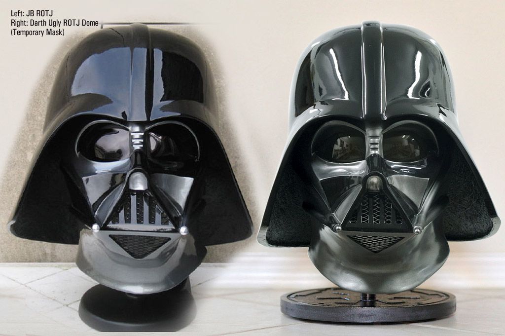
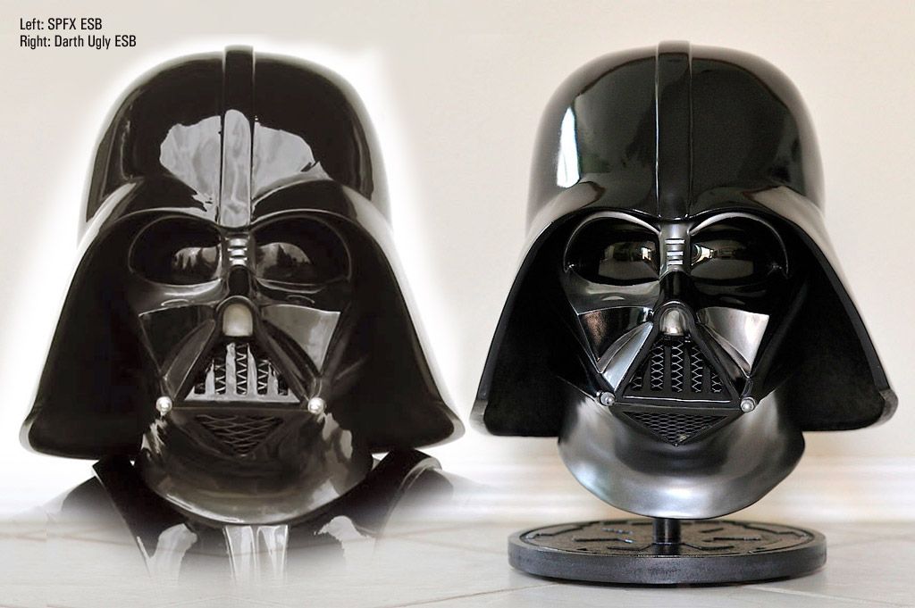
I know the silver paint is different on the ESB and ROTJ from the ANH, and different from each other.
If it's okay to ask, what color silver are you using on the ESB and ROTJ? It looks perfect.
I'm not convinced the paint was different between ESB and ROTJ. I understand that to be the belief popularized by some costumers over the years due to screen shots, but one should also consider that with metallic paint, it's about metallic particle density and how much ambient light it's reflecting. For example, when Vader steps off the shuttle into the Death Star II, the mask looks dark and the armor looks
And regarding metallic particle density, in industrial painting, I've seen metallic paints get brighter with subsequent coatings, even though it's still fundamentally the same paint. The painter explained that the more metallic particles there are in the painted area, the more reflects light, hence the brighter appearance (pro painters, please feel free to weigh in).
ANH was handbrushed, so there is definitely a textural difference.
In this shot below of the ROTJ, some may assume the metallic gray is dark. But note that the set is quite dark. The primary light sources are lateral and off to the distance, so there's not much light for the metallic gray to pick up:
http://images4.fanpop.com/image/pho...Darth-Vader-darth-vader-18356342-1050-656.jpg
Some might have assumed from this shot that the mask is a darker paint than the armor:
http://www.themonstercompany.co.uk/shopimages/products/normal/MMS0123 Darth Vader ROTJ W.jpg
... but note the armor can pick up the light above whereas the face is forward-facing and the lateral light is not as bright.
When you then look at screen shots like this one below, you can see that it now looks like the metallic gray in the face is the same color as the armor:
http://i.imgur.com/z89xJ.jpg
So the latter is what I'm going by.
The metallic gray bookface uses is:
Gunmetal -
http://www.halfords.com/webapp/wcs/..._productId_158568_langId_-1_categoryId_165505
The page lists the manufacturers code as MMN, 684
Black is simply gloss black, though the exact product is
http://www.halfords.com/webapp/wcs/..._productId_158568_langId_-1_categoryId_165505
Those are UK paints. I don't know the equivalent here in the States but I'll be getting a paint sample from bookface. I'm weird in that I actually collect cans of potential Vaderesque metallic grays, so hopefully I can determine a close match for everyone.
")