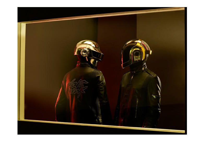
Daft Punk - Guy-Manuel de Homem Christo Build

Soooo, after a nice pristine coat of brilliant white I was able to highlight the area's for improvement/ammending.

The first obvious is the squareness of the chin and bottom of the visor, still can't believe i never spotted this myself, so again thanks to Agent RayBan, would have been severly pissed if this one had slipped thu!

5834124210_a200b074aa_z.jpg

5834124250_bdabd3a951_z.jpg


Some minor blemishes need to be sorted too. some of the seams could do with a bit more attention

5834124488_7d3e6fd6fe_z.jpg


Also some paint dusting from the multiple layers of primer has occured in some hard to reach places.
5834124534_aa19e01ec7_z.jpg


I'm not too sure if i'm happy with the curves on the front side of the chin, trying to picture what it will look like once pulled?

5834124578_a5b399bfa3_z.jpg

5834124630_f3ceec3c5a_z.jpg


and finally, this curve on both sides defo need a touch up!!

5834124694_031c05d23b_z.jpg


This will keep me busy for the next week or so!
 
Hey just something I noticed about your HAA/Discovery helmet, the back bar of yours doesnt seem to stick out very far. Only reason I point this out is because you are going for accuracy; I don't mean to try to generate more work for you than you already have!

jrbokh.jpg
 
Hey just something I noticed about your HAA/Discovery helmet, the back bar of yours doesnt seem to stick out very far. Only reason I point this out is because you are going for accuracy; I don't mean to try to generate more work for you than you already have!

jrbokh.jpg

No no, i appreciate all the comments. This image does seem to show the back bar stick out quite far. I had thought mine stuck out enough, but i'll have a look at it tomorrow, maybe mess round a bit on Photoshop, i think having the space below the bar voided might give a better representation.
 
Anymore progress on this bucket?

All my focus (which has been very little the past few weeks unfortunatly) has been directed at my Tron lid. Don't have enough space to work on them all similtaneously, once i've nailed Tron i'll start working on Thomas and Guy again.
 
i would love to see some progress on this. it has turned out so beautiful thus far. Makes me consider smashing my own and doing it all over again.
 
It's been quite a while since I last worked on my classic Guy lid, partly because I knew he need most work. Over the course of the year, from continuing research and feedback from you guys here and others, I realised that there were a few inaccuracies. The most obvious was the square of the chin,which is just about sorted.

It was also pointed out to me that the rear as a little off. I mocked up this really quick image to help identify this.

7313747080_bf517cda76_b.jpg


Quick a difference, looks like I'll be having a fun weekend :/
 
Fantastically, looks much better now. Just about got it ready for the final paint and buff before casting. Will get some pics up next week :)
 
Guy-Manuel is being wet sanded as we speak (well not this second, I'm using the computer now, that would be irresponsible to do both at the same time) will update the thread in the next 24hrs. You can get a sneak peak here
 
I like the form of yours more than the original.
Guy-Mans original? Cheers :)

I tried to make this to be as universal as possible. To me, there appeared to be very sutble difference in this Helmet over the years, Homework,Discovery,HAA and Electromo, not just with the lighting. I wanted a piece that could fit all these era rather than just one. It think I've achieve that?
 
I'd say so! Do you have any profile pics? The ones on facebook make the back end look rather distorted. I just want to see how much you increased the back end by, kinda a before and after from v1.
 
Back
Top