Palantirion
Sr Member
This is not a prop, or a replica. But I was asked to post the process here as it relates directly to my AvP queen crown repaint project. In short, the idea to extend and blend the ADI crown's blue and green paint schemes across its unfinished middle stemmed directly from my experience painting this dual-color OSL repaint of a cheap Lootcrate Aliens queen pencil sharpener. The crown thread is here, if you missed it:

 www.therpf.com
I will try to be concise, but this thread will be very picture heavy due to the steps involved and the two very different sides' palettes and lighting angles. OSL is a term used mostly by mini painters, and means painting portions of a figure so that it looks like they are illuminated by a Lighting Source within the Object's frame of reference.
Also, I'm not a mini painter. I painted a mini once, a 1/144 scale Dougram:

 www.hobbytalk.com
And I did one simple OSL before this one, a larger (1/12 scale) Leia in carbonite:
And, technically, this pencil sharpener isn't a mini. But it is roughly the same size as larger mini busts and monsters.
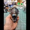
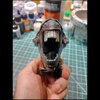
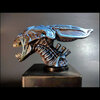
Oh, and also I wanted to play up the reflective qualities of the queen's hard carapace so I borrowed (at a very amateur level) Juan Hidalgo's awesome glazing technique for NMM (Non Metallic Metal):
This repaint took place from September to November of 2022. The visual objective was a blend of a comic's graphic contrast with realistic transitional tones. And to try to figure out how to make chunky opaque teeth and tendons appear to be translucent.
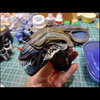
The pencil sharpener, acquired via eBay after Lootcrate's release. This pic is after I spent an hour sanding off the mold lines and defects prior to priming.
 removed mold lines.jpg")
ADI AvP Queen test casting, repair and modification
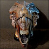
A couple years ago I purchased this paint test piece from PropStore. It is the queen's "crown", and was made by Studio ADI for AvP and has different finishes (and different sculpts) on each side. The middle was left unfinished. There was the obvious paint damage on its right side, as well as...
www.therpf.com
I will try to be concise, but this thread will be very picture heavy due to the steps involved and the two very different sides' palettes and lighting angles. OSL is a term used mostly by mini painters, and means painting portions of a figure so that it looks like they are illuminated by a Lighting Source within the Object's frame of reference.
Also, I'm not a mini painter. I painted a mini once, a 1/144 scale Dougram:
My first mini, that isn't a mini, but it's...
Hello. My first post on this forum, and my first "mini". Technically this is a plastic model kit, but in roughly 1/144 scale it's the same size as mini figs and the same painting techniques are appropriate. Is is mecha? armor? a mini figure? Yes! I most often paint on canvas (and two cars), but...
And I did one simple OSL before this one, a larger (1/12 scale) Leia in carbonite:
My first OSL
This was a cheap resin kit from eBay, roughly 1/12 scale, hollow cast with no back. I used styrene to make the back plate, otherwise not much prep but sanding and re-boring the hole for the support rod. Most of the paint is drybrushing over a black primer, with some stippling and washes also. I...
www.scalemodeladdict.com
And, technically, this pencil sharpener isn't a mini. But it is roughly the same size as larger mini busts and monsters.
Oh, and also I wanted to play up the reflective qualities of the queen's hard carapace so I borrowed (at a very amateur level) Juan Hidalgo's awesome glazing technique for NMM (Non Metallic Metal):
This repaint took place from September to November of 2022. The visual objective was a blend of a comic's graphic contrast with realistic transitional tones. And to try to figure out how to make chunky opaque teeth and tendons appear to be translucent.
The pencil sharpener, acquired via eBay after Lootcrate's release. This pic is after I spent an hour sanding off the mold lines and defects prior to priming.
") Seemed like a good size to experiment with your paint technique.
Seemed like a good size to experiment with your paint technique.