A Pumpkinhead one-off, build thread (pic HEAVY!)

Palantirion

Active Member
Hello again all! This project is a weird one, but a fun one. It started with the fact that I love Pumpkinhead and there is very little PH merch out there. And not all of what exists is really good. This older "1/4 scale" (mathematically it is closer to 1/5 or 1/6) "action figure" (it couldn't really be posed) by Sota Toys is a great example. It's a really, REALLY good sculpt - especially compared to other options. But the fly-cut joint system was ugly, created a huge gap in the waist, and there was zero articulation in the lower body. It couldn't even stand on it's own because of the weight balance.

But the sculpt was great.

Once I got it I immediately realized that I would have to make a base for it. But then I thought more about it and decided that PH would benefit from a repaint. But those joints were still terrible...and there were seam lines...and I didn't want to spend a lot of time making the paint great only to have the physical flaws undermine it.

So...maximum effort, right? I concluded that the right approach was to "un-action" him: To secure and fill all the joints, sculpt in transitions to the OG forms and textures, and then I could paint him. This is a bit of a step up for me in the sculpting department, and didn't go as badly as I feared it might.

Also this would be my first time attempting a multi-layered organic skin paint process. And (because it's me) I knew I wanted to do a dual-OSL effect on top of the details to be able to show PH in both the film's exterior key lighting (how we remember him), and how the creature actually looked (or like the film's indoor lighting).

But when it came time to paint I hit a pause right before I began. We know how PH looked in film, and we know how the suit looked...but what did he look like in the mind of the creator(s)? I've done enough creative projects to know that what one first envisions often changes between conception and completion. So I reached out to Alec Gillis via Instagram and asked him...and he was kind enough to write back!

The short version is that he envisioned PH as having more color, more irritation, more of a pestilent feel, which fits the underlying theme of the movie as a cautionary fairy tale about vengance. The suit ended up being (masterfully) painted more like a cadaver, which of course fits the literal description of the monster. In behind-the-scenes pics you can see that there is more color in the suit's head than in the body. This is a hint into Alec's vision.

As soon as I heard this I knew immediately how I wanted to paint my PH. Since this project was a one-off and not for sale I had no constraints to replicate him canonically. So I thought it would be fun to see if I could paint him in the direction of Alec's verbal description, while also incorporating the dual-OSL as a means to reference the appearance of both the film and the (now hypothetical) suit.

Like my past threads I will write a post for each day or so, writing commentary for the pics...hopefully completing them quickly...And soon I will get to post some GOOD pics, as a professional photographer friend just did a shoot of PH yesterday. Very excited to see his vision of my vision!

p.s. I posted the thread in the replica props section as the project was replicating a prop, albeit in a smaller (stop motion or maquette) scale. And with direct input from it's original creator it might be a useful resource for other PH fans.


DAY ONE
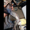
He's fallen and he can't get up! But seriously, yeah, this is the way Sota thought he should be sold. He falls over and the upper torso falls out of the super-floppy waist socket.
23,06-30, making the base (1).jpg


Got some scrap plywood and marked out his foot positions, and cut it to a benign shape.
23,06-30, making the base (3).jpg


I routed the edges and drilled holes so I could attach PH using coarse thread lag screws into the pre-existing holes in his feet. There was still a strong forward weight bias, but the base is stable. I do have some mild concern that the screws may eventually strip the PVC, but if that happens I have a few contingency ideas.
23,06-30, making the base (4).jpg


Then I mixed up some Apoxie to mold contoured foot pads to help stabilize him and blend his pose into the base materials.
23,06-30, molding to feet (2).jpg
 
DAY TWO
I started by fixing the pose. PH was poseable, to an extent. The waist, forearms and wrists all swiveled. The shoulders were ball joints, and the head could pivot slightly. One problem was that if you rotated the fly-cut joints very much then parts of his body failed to line up in a really obvious way. So my choices of pose was limited to options where I felt I could (literally) bridge the gaps to create a continuous and appropriate form.

Initially I used CA to tack the joints in place.
23,07-01, glued joints in positions (1).jpg


I also got various materials from my yard and arranged them to emulate an exterior scene. Gravel and dirt, a little muddy, with small broken sticks. I pictured the scene as being nighttime, illuminated only by a dropped flashlight in front and moonlight behind.
23,07-01, testuring base (1).jpg


DAY THREE
I used Apoxie to fill the gaps and solidify the joints. The legs, as I mentioned, had no articulation. But they were made from several parts and did have big gaps around all the toes and below the knees.
23,07-02, filling gaps (1).jpg


I filled the shoulder joints because the suit was seamless there.
23,07-02, filling gaps (7).jpg


I did my best to shape and blend the forms while the Apoxie was still soft - less to do later and it gave me a better idea of progress than simply filling the joints.
23,07-02, filling gaps (8).jpg


You will see in future pics more of this forearm joint. Given the length of the project I thought it best to streamline the thread a little by focusing progress pics on one joint.
23,07-02, filling gaps (9).jpg


Then I tacked the waist in place with Apoxie to cure overnight before filling. Given the size of that gap you can imagine it will be an extensive filling process!
23,07-02, tacking waist in position (2).jpg
 
DAYS FOUR and FIVE
That waist gap was massive. And there was a lot of leverage force on it from the forward-heavy pose. So I filled it in two steps. First, bulking out the interior to ensure it was a solid support...
23,07-03, filling waist gap.jpg


...then after that cured I finished the filling, sculpting what I could along the way. He's got a bit of a muffin top, but better to have more than less when it comes to the future reductive sculpting.
23,07-05, filling waist gaps (2).jpg


The front of the waist (especially the little gap on his right) and the back of his neck were tricky to fill because it was hard to get tools in there. My working angles were constrained by his limbs and skull.
23,07-05, filling waist gaps (4).jpg


DAY SIX
Started sanding joints! I typically use a small rotary tool designed for nail salons, and diamond burrs, for the bulk work. These tools are cheap, use a common 2.5mm press-in shank, and have great speed control. Better than a Dremel for work at this scale because the tool is very small and it can get in places a Dremel can't, and it's much less powerful which actually gives you more control in the context of rotary filing - particularly when dealing with soft materials like PVC.
23,08-19 (1).jpg


One of the lower leg seams, sanded down.
23,08-19 (4).jpg
 
DAYS SEVEN and EIGHT
I sand, I die, I sand again. Yep. Trying to be careful to maintain the raised veins.
23,08-29 (1).jpg


That forearm joint again, after I started the initial sculpting of the skin texture.
23,08-29 (2).jpg


And reverse angle.
23,08-29 (3).jpg


More work on the back, bringing primary lines across to help (hopefully) camouflage the fills.
23,08-30 (1).jpg


Transitioning the shoulders, a little trickier because the density of cracks was greater on the arm than the torso.
23,08-30 (2).jpg


DAY NINE
More work on the back and side...
23,09-16 (1).jpg


...and the neck line.
23,09-16 (6).jpg
 
DAY TEN
Approaching the end of sanding! Or not. But I was optimistic.
23,09-22 (1).jpg


The tail was tricky too. The fine lines were easy to fill and hard to recover. PVC is much softer than Apoxie putty, so a lot of care had to be taken to make sure I wasn't unexpectedly damaging the OG material.
23,09-22 (5).jpg


The first shot of him in his final pose and without joint gaps.
23,09-22 (11).jpg
 
DAY ELEVEN
Priming reveals sins. Remember when I said that PVC is softer than Apoxie? Turns out that even at lower speeds a rotary file will cause PVC to feather a little (melting and spreading on a very small scale), but it cuts Apoxie cleanly. This meant that I had to go back with a hand file and file every...single...crack in the skin to make them homogeneous or else every fill would be obvious. Thankfully it went a little quicker that I initially feared.
23,09-25 (2).jpg


And upper body shot, prior to hand filing.
23,09-25 (3).jpg


Cleaning up his toe fills. Much better than the big gap from before.
23,09-25 (6).jpg


DAY TWELVE
A series of pics of the forearm seam...here before hand filing.
23,09-26 (1).jpg


And after, including a minor reshaping of the form across the fill. That's why you can see down to the OG paint in places.
23,09-26 (4).jpg


Getting better.
23,09-26 (7).jpg


There were several back-and-forth rounds of brush priming, sanding, priming, sanding, etc. This was the basic process on every joint, but this forearm required a couple more rounds than the others.
23,09-26 (12).jpg


Close to finished. I went back in later to deepen and clean up a few lines.
23,09-26 (18).jpg


It's a load bearing desk lamp.
23,09-26 (9).jpg


One issue I ran into, and potentially a serious one, was the wrist joint bonds breaking. Those two joints were quite fine, and as such my initial CA glue didn't penetrate very far. And the Apoxie even less so. Since they stick out in front I twice bumped PH's knuckles and discovered hairline fractures through my fills.

So I tried Jue-Fish glue for the first time. Their advertising shows it working really well on flexible materials, which CA is not very good at. And I can say that it does actually work (for me) as advertised! It is also pretty thin and self-wicked much deeper into the cracks than my thin CA did. It set after 45sec and was a much stronger bond to the PVC than CA.
23,09-26 (17).jpg
 
DAY THIRTEEN
Some fine tuning of the neck transitions.
23,09-28 (5).jpg


And the waist.
23,09-28 (6).jpg


And now to final priming! First a black base coat on the base (and PH).
23,09-28 (11).jpg


Then I used white primer to create a (not technically) zenithal priming. Here is the front view, with lighting from below.
23,09-28 (17).jpg


After also spraying white from PH's upper left (for the moonlight) we get this odd series of occlusion shadows. Presumably this will make sense later...because physics.
23,09-28 (19).jpg


Looks more plausible from this angle.
23,09-28 (21).jpg


The base, after similar directional priming. The effect is subtle, but will be a great guide for painting.
23,09-28 (22).jpg
 
DAY FOURTEEN
I FINALLY get to start painting him! I had a lot of reference material for getting a sense of the textures and contrast density of the OG suit, narrowed it down to these five. In the left 3 in particular you can see how much more color there was in the head detailing than in the body. These were the visual concepts I worked from. Not to replicate, exactly, but to try to internalize the feeling and transpose that onto my smaller PH.
23,09-29 (1).jpg


I used a darker blue to emphasize areas of shadow and (around the head) subcutaneous blood pooling. I wasn't afraid of intense saturation, as my plan was to tone everything later with thin, lighter, overcoats.
23,09-29 (6).jpg


I also did some splatter painting, using a toothbrush and small stick to give me a more consistent delivery method. Not a ton of thought here, just need more implied texture.
23,09-29 (11).jpg


RED! Another darker color I used to accentuate the depth in shapes. My hope was that this would fade into a warm dark midtone after top coating later. PH did look ridiculous at this stage.
23,09-29 (14).jpg


But also, kinda looking cool from some angles.
23,09-29 (20).jpg


More splatter. The legs were big areas with little unique detail. Needed a bit more randomized clutter to keep them as interesting as the rest of PH.
23,09-29 (21).jpg


Using a dark aqua (that you might remember from my 1:1 AvP Queen projects) I started lining out the head veins. This was basically a heavy glaze consistency, similar to mini painting.
23,09-29 (22).jpg


More veining in the arms and legs.
23,09-29 (24).jpg
 
DAY FIFTEEN
I started adding a dark yellow to the mix. This was to accent areas of increased inflammation/disease/rot. This was less about creating a narrative and more about using the color to keep the eye moving around various asymmetric accents.
23,10-01 (3).jpg


On this arm and hand there were elements in the OG sculpt that read more like internal deformations. So I played those up with the coloration. Note: I did not post the reference pics, but I DID Google skin inflammation....and that was gross! And helpful.
23,10-01 (6).jpg


End-of-day pics. I discovered that these angles were repeatable, using the sides of my (on-end) DIY spray booth to prop PH up. So I shot these at the end of every day.
23,10-01 (8).jpg


23,10-01 (13).jpg


I consider this the primary pose angle, if you were curious.
23,10-01 (24).jpg


23,10-01 (25).jpg
 
DAY SIXTEEN
I started the top coats with yellow, meant to be from the off-scene dropped flashlight. Much of the painting prior to this was brushed. These top coats are airbrushed. I used a few different acrylics (brands and colors will be posted later), in this case thinned down to a glaze consistency before spraying so I could build it up very slowly.
23,10-02 (10).jpg


Then I sprayed the dark blue more volumetrically on the back to create a midtone blend to the shadow areas.
23,10-02 (15).jpg


23,10-02 (16).jpg


Then I added in a little red outside the yellow. I wanted the front light to read as incandescent (not LED!), so there would be a chromatic shift in its cast light.
23,10-02 (20).jpg


This turned more brown than I expected. Not a bad look, but darker than I envisioned.
23,10-02 (22).jpg


The range of dark-to-light through the figure is pretty interesting though.
23,10-02 (23).jpg


Started adding in the light blue-gray that would be the highlight color for the back light.
23,10-02 (26).jpg


23,10-02 (30).jpg


End of day. Pretty happy overall, really like the color tones. But it's a lot darker than PH's real suit...is that a problem? Does this read as a figure in a dark setting, or as a dark figure?
23,10-02 (33).jpg
 
DAY SEVENTEEN
Reinforced the darker areas with Payne's Gray and black. Also started drybrushing a light cream color (similar to PH's real suit color) over the highlight areas to lighten the colors overall and increase contrast.
23,10-03 (13).jpg


23,10-03 (16).jpg


Also took him out of the booth for this pic in what is a more even lighting. I'm starting to like him at this point.
23,10-03 (19).jpg


DAY EIGHTEEN
This was an extension of the prior day: More drybrushing, extending the yellow and red lighting colors further into midtone areas, lightening highlight areas, generally trying to impart PH's natural colors through the lenses of two different light sources.
23,10-08 (1).jpg


23,10-08 (2).jpg


An improvement from the prior day.
23,10-08 (8).jpg
 

Attachments

  • 23,10-09 (2).jpg
    23,10-09 (2).jpg
    408.8 KB · Views: 31
DAY NINETEEN
There was a bit more drybrushing this day, but mostly it was spent detailing. During the rounds of airbrushing and drybrushing the vein colors were mostly lost. So I went back and repainted those, using the faint remnants of the prior painting as a blending bonus.

I also went back and studied my reference material more and realized that there were FAR more veins painted on the real PH than there were sculpted/painted on my figure. So I thinned down my Dark Jade paint and added a lot more, fainter than the raised veins to hopefully give them a stronger sense of depth.
23,10-09 (2).jpg


I like the paint a lot at this stage, but hate the distraction of the yellow teeth and nails. I couldn't detail those until I nailed down the colors and values of the skin.
23,10-09 (3).jpg


Liking the visual variety from the back side, and it is starting to feel like it's lit from moon light.
23,10-09 (5).jpg


23,10-09 (9).jpg


End of day.
23,10-09 (14).jpg
 
DAY TWENTY
More detailing today, trying to call out more elements in the sculpt and increase interest.
23,10-10 (1).jpg


23,10-10 (4).jpg


23,10-10 (7).jpg


I also made a dark brown pinwash and applied that to areas on the "warm side" to deepen the fine line shadows.
23,10-10 (12).jpg


23,10-10 (26).jpg


23,10-10 (32).jpg


23,10-10 (33).jpg


23,10-10 (36).jpg


23,10-10 (37).jpg


23,10-10 (38).jpg
 
DAY TWENTY ONE
Today I remembered that there is a base! And that the "lighting" needs to be congruent across the base AND the figure or else the sense of lighting will be destroyed.

Similar to painting the figure, I started with a thin directional airbrushing of yellow.
23,10-12 (3).jpg


Not particularly visible from above. Especially after I added black pinwash!
23,10-12 (14).jpg


Airbrushed an orange (remember chromatic shift) and also another round of yellow to brighten the lit areas.
23,10-12 (16).jpg


From the side.
23,10-12 (18).jpg


I used the same light blue-gray as the highlight color from the other direction.
23,10-12 (19).jpg


Test fitting. Not bad.
23,10-12 (20).jpg


From a side angle with overhead light.
23,10-12 (30).jpg


Then it was mani-pedi time for PH! I'm really happy with how the nails turned out, and it was a pretty simple process. Using a small beat up brush I started with dark brown near the root of each nail, painted that area opaque but then randomly dragged it out toward the tip letting the paint fade naturally from reducing pressure. Then I used the same yellow ocher color I used on the skin to overlap that brown but blended it more smoothly toward the tip. This was easy because yellow is pretty translucent anyway, so it fades more smoothly. Then the light cream color as a drybrush to lighten the tip. That's it!
23,10-12 (32).jpg


23,10-12 (35).jpg


23,10-12 (37).jpg
 
DAY TWENTY TWO
The next step was to airbrush light coats of the yellow and red over the nails to unify their lighting with the rest of the figure.
23,10-14 (2).jpg


And also detailing the base by glazing colors over various little rocks and branches one at a time to further emphasize depth and variety.
23,10-14 (4).jpg


23,10-14 (6).jpg


Color test to see if they play well together.
23,10-14 (8).jpg


23,10-14 (9).jpg


Hard to see here, but I also added a little gloss coat to certain areas of the base to shine like wet mud in/around the gravel and foot depressions in certain spots.
23,10-14 (12).jpg


23,10-14 (18).jpg


End of day, pretty happy with how it's looking.
23,10-14 (21).jpg
 
DAY TWENTY THREE
AAAAAAAAAAAAAAAAAAAARRRRRGGGH! Want to make PH look like he stepped on a nail? Give him pupils!

Studio ADI was pretty brilliant in recognizing that obscuring the pupils as though through cataracts was a far creepier look than any conventional approach to eyes. It makes you look at his form, which is expressive (kudos to Tom's acting!), because you can't make eye contact.

Here I tried to replicate that...while remembering to keep the right eye warmer and the left eye cooler because of the lighting.

Teeth painting to follow...
23,10-15 (4).jpg


23,10-15 (5).jpg


23,10-15 (6).jpg


23,10-15 (7).jpg


23,10-15 (13).jpg
 
DAY TWENTY FOUR
Musou Black! Why do I not see anyone use this but for ridiculous YouTube stunts? It's a great paint that does what no other (save the imitators) paint can do...

What happens when you take a nice deep dark black and flat coat it? It turns gray! Because the light now refracts through the flat clearcoat. Which means you have a choice between a dark black that's glossy or a dark gray that's flat.

This was not acceptable to me, not for this project. PH's skin needed to be flat (well, technically matte), but areas of it also needed to be black. Not black-ish, but BLACK. This figure is in night, there is occlusion between the light sources, therefore black must exist!

So...how do you paint a shadow? What IS a shadow, really? It's not a color, it's an absence of reflected light. And the ultimate lack of reflection would therefore come from the ultimate black paint, right?

But I'm getting ahead of myself...I first used Musou to rim the base, over a coat of a very high quality mini paint black from Monument Hobbies. This mini paint is awesome, very dark and very flat - because that's what mini painters want in a paint. But look how reflective and gray it is compared to Musou!
23,10-17 (8).jpg


Next I drybrushed Musou through all the areas of occlusion. After that I thinned it down to a pinwash and used that to add depth to the skin creases toward the darker midtone areas.

As far as I can tell Musou can be used just like any other liquid acrylic. I haven't tried thinning it with straight water, I used acrylic thinner, but it does thin really well, applies well, can be airbrushed, etc. etc.
23,10-17 (12).jpg


Compare this pic to the same pose from DAY TWENTY (PH was gloss coated) and you will see how I was able to keep the same level of darkness in the shadow areas AND have a realistic matte sheen throughout the skin. Physically would not have been possible without using Musou (or equivalent competitor).
23,10-17 (18).jpg


From this angle it's more clear where the areas of occlusion are. There is almost a thin core shadow line running down his right side from where no light from either source is illuminating his skin.
23,10-17 (19).jpg


23,10-17 (23).jpg


Harder to see in pics, more obvious in person how the flat black (Musou) pinwash added depth to his skin texture.
23,10-17 (26).jpg
 
DAY TWENTY FIVE
OMG he's finally done! The end came suddenly.

Some detail shots...
23,10-18 (2).jpg


Really like this little cluster of pustules on his lower back.
23,10-18 (5).jpg


And this area near his wrist.
23,10-18 (6).jpg


More subtle inflammation spots around his knee.
23,10-18 (7).jpg


And his last time in the plastic "cage" for dailies...
23,10-18 (8).jpg


23,10-18 (11).jpg


23,10-18 (14).jpg


From a lower angle, and neutral lighting.
23,10-18 (17).jpg


23,10-18 (21).jpg


If you wondered how he looked from directly above.
23,10-18 (30).jpg


And with a warm light in front increasing the paint's effect.
23,10-18 (32).jpg


Here are the paints I used. Some from Monument, the rest were a cheap Testor's craft paint that is way better than its price point (Thanks Ninjon for the recommendation!), and Musou Black. That's it, pretty small palette.
23,10-18 (31).jpg
 
*BONUS*

Some cell pics I took after moving him to the top of my Aliens display case. They are crap quality, but will suffice until I get Kyle's pro pics. Not sure if this is PH's forever home, or if things will be rearranged at some point. He is a bit small compared to the other 1/4 scale Aliens and Predalien...leading me to think I'll need to do a little math to see what scale he really is so I can display him appropriately.

23,10-20 (1).jpg


23,10-20 (3).jpg


23,10-20 (5).jpg


23,10-20 (8).jpg


23,10-20 (9).jpg


23,10-31, on top of case (2).jpg


23,10-31, on top of case (4).jpg
 
Looks fantastic! Big paint improvement. Never noticed how transparent/veiny the head is, only seen the Movie Maniacs toy, which is rather green like this Sota was. Excellent job!
 

Your message may be considered spam for the following reasons:

If you wish to reply despite these issues, check the box below before replying.
Be aware that malicious compliance may result in more severe penalties.
Back
Top