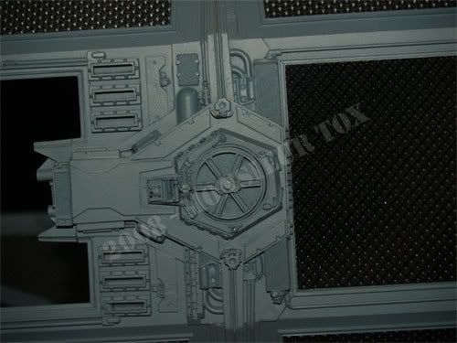
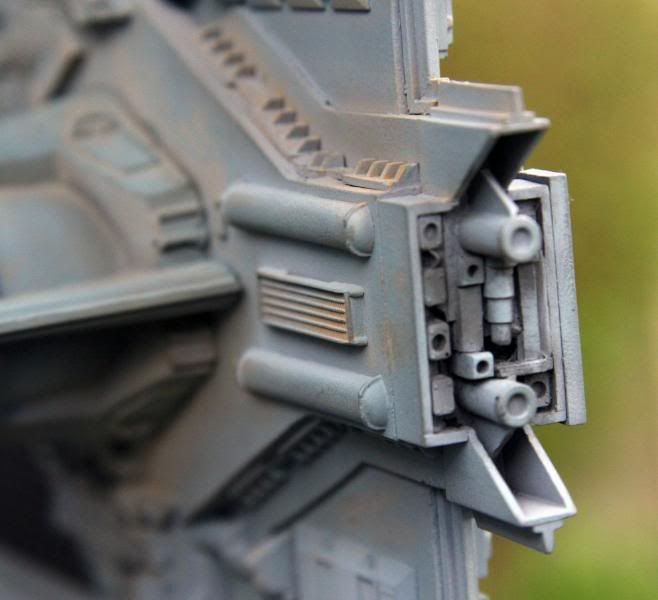
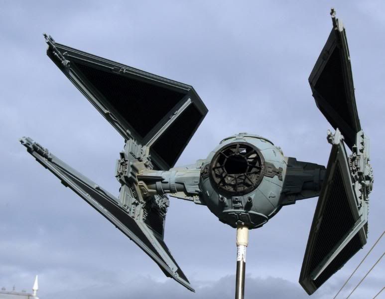
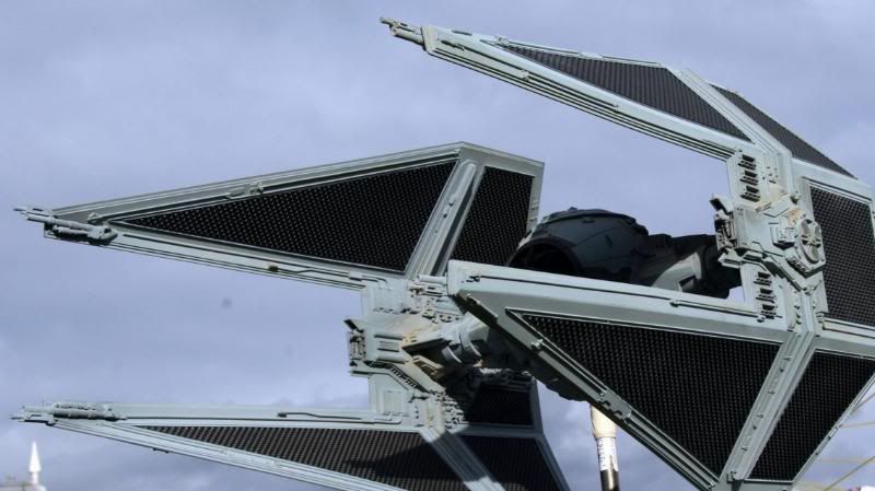
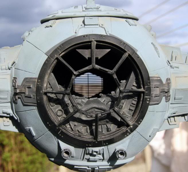
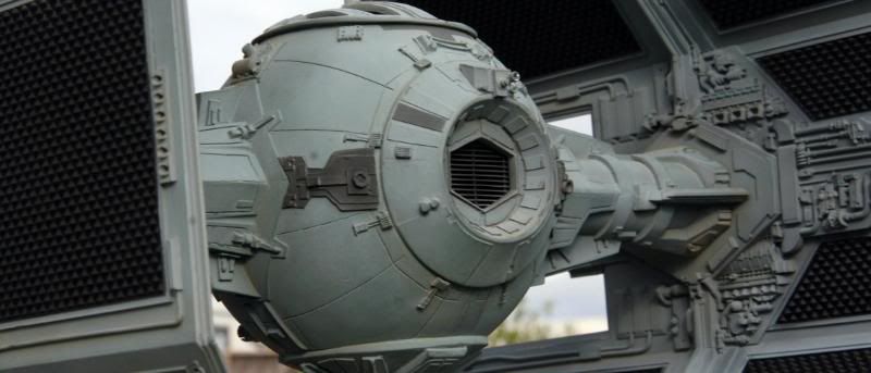
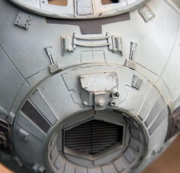
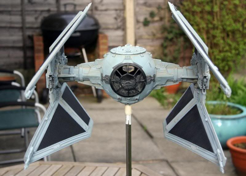
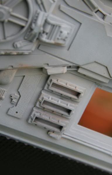
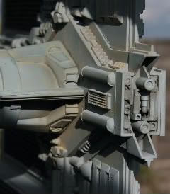
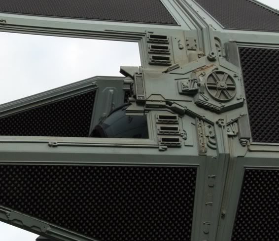
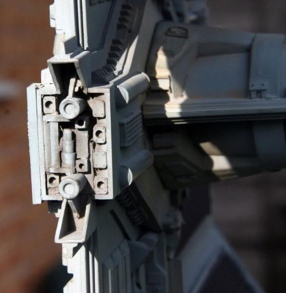
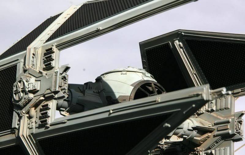
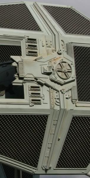
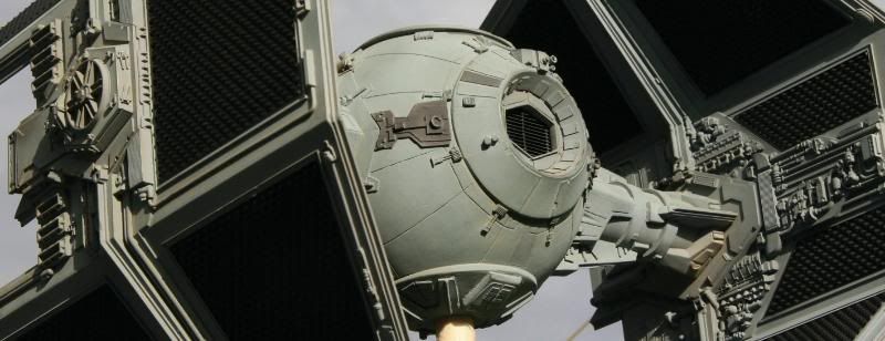
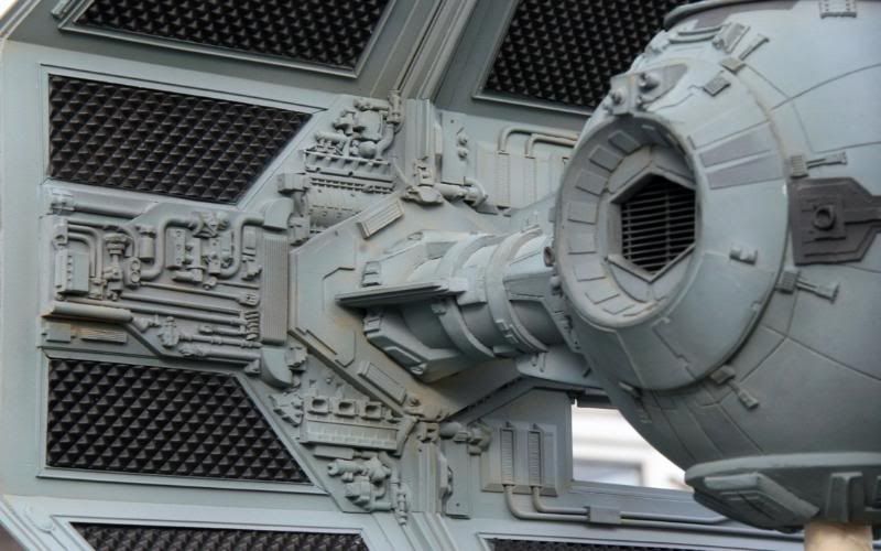
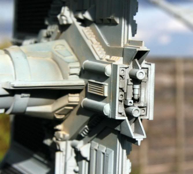
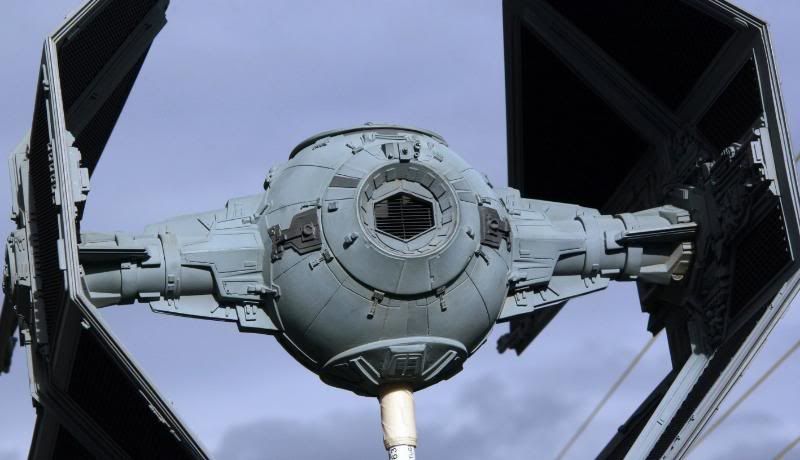
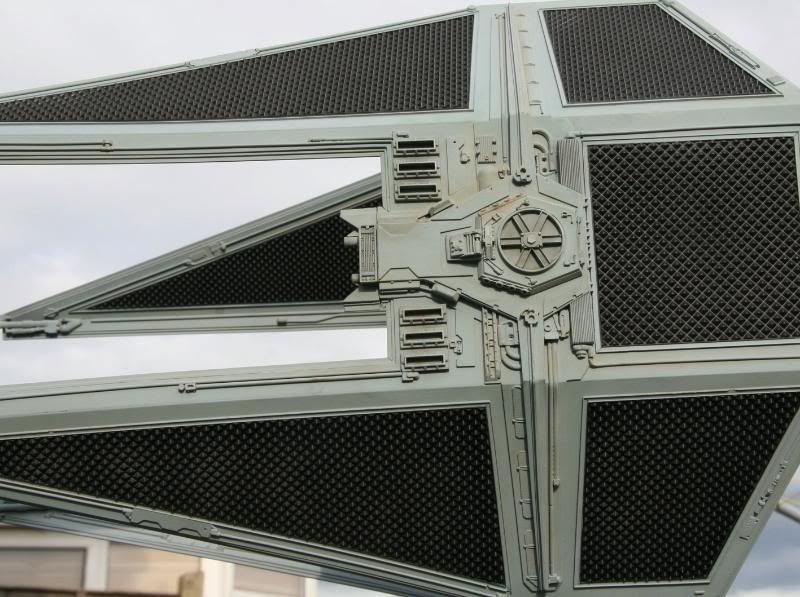
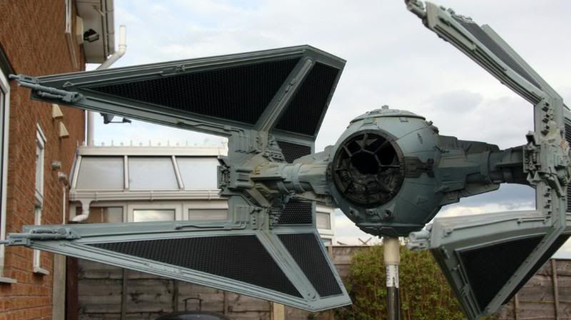
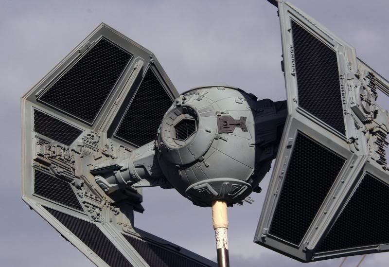
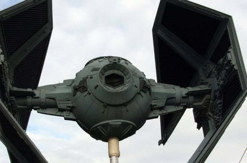
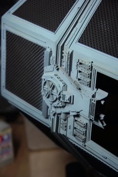
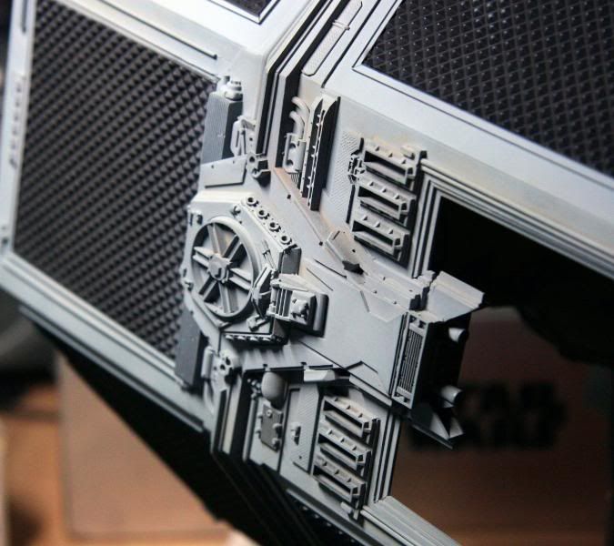
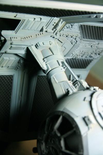
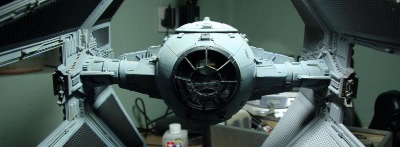
I'm back. I wasn't goint to show a mid paint on this beauty from Steve & the team, but I had to take shots under various light Temps to get the color I wanted. This was one tricky task indeed. Too blue, not enough blue so many color variants on ref pics etc etc etc I decided to try something new & worked out average (incorrect) light settings that people would've used taking the shots of the prop & mixed my color according to the new info. A lot of photoshop work to get were I wanted & many hours trying different paint mixes & different color temps!!! My conclusion was......Bollox to it! I've seen the prop in the flesh in Paris but only had a cheap camera but I clearly remember what colors it wasn't. All the photoshop stuff helped but when it came to the final color choice it was a lot of " a bit more of this & a bit more of that" type mixing. Finally I came up with a mix of Medium Blue/Grey, White, RLM green & another lighter blue. I really balls'd it up as I have only done 1 wing while I wait on some T track, I spilled the remainding mix only leaving me with very little paint to finnish the other wing & touch up work. I've thinned it down to get more out of it but it really is a case of fingers crossed. It wouldn't be me if I didn't balls something up:lol.
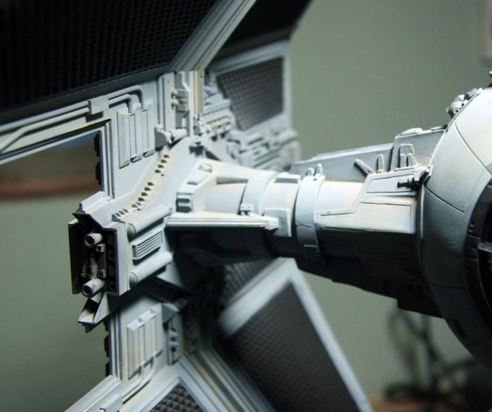
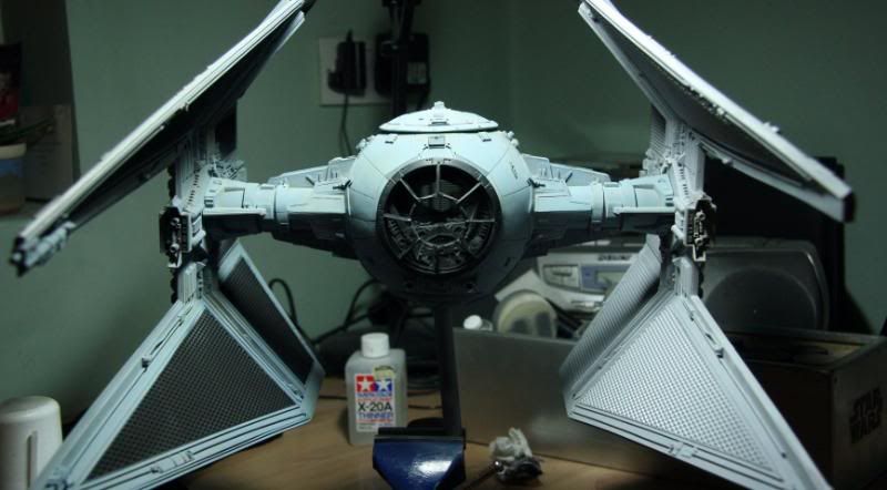
For the look of the Tie I really dont like the brand new imaculate style some people have chosen, I decided to try & make it look like the actual prop does now with Dust, Scratches, blemishes & all. Its quite a scruffy prop up close so I didn't bother with an immense amount of clean up on the body & wings. I have added weathering to the wings & the Black area's need redoing due to the touch up work I've done. This has got many layers of color to get to where I am now but in the flesh it does have a great deal of depth to it. I want it to fit into my collection & not stand out as a clean beast so some may find it a bit weathered but HEY its my Tie & like it:love. These are some of the shots I just did quickly to show where I was at, different color temps where used to show the difference it makes to the color. Hope you like it
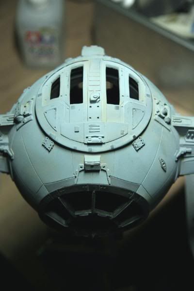
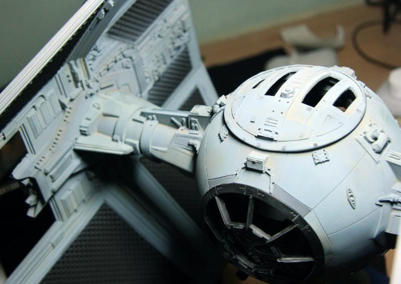
I would have posted sooner but I'm having therapy as I think I'm in Love with the Red 5 that Lee did for Chris.
For the look of the Tie I really dont like the brand new imaculate style some people have chosen, I decided to try & make it look like the actual prop does now with Dust, Scratches, blemishes & all. Its quite a scruffy prop up close so I didn't bother with an immense amount of clean up on the body & wings. I have added weathering to the wings & the Black area's need redoing due to the touch up work I've done. This has got many layers of color to get to where I am now but in the flesh it does have a great deal of depth to it. I want it to fit into my collection & not stand out as a clean beast so some may find it a bit weathered but HEY its my Tie & like it:love. These are some of the shots I just did quickly to show where I was at, different color temps where used to show the difference it makes to the color. Hope you like it


I would have posted sooner but I'm having therapy as I think I'm in Love with the Red 5 that Lee did for Chris.
Last edited:

