heyitsdan
New Member
I have seen many idols over the years - some good, some great, some not quite on the money – but none of them has ever really captured what I feel the thing should look like. Taste is obviously subjective, and everyone will have a different idea of what is right (for any design of any thing), but after seeing my fifty thousandth bodybuilder style Cthulhu with angry eyebrows, I thought I would have to set things right and make my own!
That’s not to say there haven’t been many excellent idols made – there are plenty. Part of the brilliance of this story in particular is that we know there are multiple idols from cults all around the globe, and thus there is no need to choose a definitive version – to say, “Yes, this is it”.
So, while looking for inspiration (and great ideas to steal), I came across Matt Wedel’s blog Echo Station 5-7, and his posts on the subject.
Cthulhu idylls
What I want in a Cthulhu idol
I won’t repeat what he says, but suffice to say he makes the point that reducing Cthulhu to a facsimile of Arnie with a squid on his head is to miss the fact that this is an eldritch being from beyond our world.
Of course, his posts lead me to Nick Daring’s build on the RPF HERE and, while an excellent piece, I am inclined to agree with Matt Wedel that “Nick Derington’s Cthulhu sculpt leaves me cold: it certainly looks inhuman, it just doesn’t look very bright, and therefore not very scary.” Nick is a fantastic artist, so this is a purely subjective opinion; there's no questioning the quality of his work.
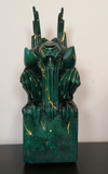
So, I set out to make my own. I tried to steer clear of bulging muscles, angry eyebrows, and perfect symmetry. I also avoided obvious asymmetry, which to me is too simple and easy a method of trying to make something look ‘weird’. I tried to create a piece which was asymmetrically symmetrical: on first glance it appears to be mirrored, but looking closer you notice a claw is off here, a shoulder droops there – everything is almost-but-not-quite matching.
I was inspired by other Cthulhu idols I have seen (many from the excellent Propnomicon blog), by marine life fauna and flora, and of course by Lovecraft’s description of the Legrasse idol.


I did a variety of quick sketches to get some ideas down, and with more of a concrete idea of what I wanted, set to work sculpting. I should also say that I wanted to avoid the look of many other Cthulhu idols, by which I mean looking too much like a sculpture. Many idols I see have spindly little wings and intricate, fine details - which would never have survived the milennia since their creation without being broken off or damaged. Many ancient sculptures I have seen in museums and in photos have been monolothic, and blocky. They are carved from a single piece of stone, and often are quite simple, without fragile appendages or cutouts. So as I worked I leaned more towards something very solid. The viewer has to be able to imagine this idol being hewn out of a great chunk of some stone.


I used mainly Milliput epoxy putty to sculpt the idol, with a base of cardboard, armature wire, aluminium and some styrene sheets. Of course, as I worked the piece changed and evolved to the medium – the 2D sketches I had done didn’t translate perfectly into a 3D Sculpture. But, eventually, I came up with something I am happy with.


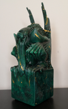
I built a rather funky mould box out of MDF, poured in the silicone and - with a few slices up the back - produced a workable mould. Having plenty of plaster from a previous lifecasting project (I believe Herculite is the particular brand), I poured some test pieces with paint to dye the plaster. These first casts were very heavy, which from a perspective of authenticity is very nice (and the plaster feels like stone, perfect for a carven idol) - but would make postage costs excessive. So, with the help of a plug, I produced lighter casts with a hollow in the centre of the piece. This hollow also means that the inscribed bottom-plate I had made could act as a sort of lid, sealing the hollow - and giving the idol dual-purpose as a hiding-spot for small trinkets.


The plaster casts had some problems with air bubbles and voids - to me this isn't really a big deal, they look in a way like natural faults in the stone - but I know some people will just see them for what they are: errors in casting. With some changes to the plaster/water ratio and some different techniques when casting, I managed to eliminate almost all of the voids.
I also experimented with tinting the plaster with paints and dyes, and with painting the casts after they leave the mould. The plaster has the useful quality of soaking up the paint when it is applied wet with a brush, and this enables a sort of layering effect with paint, and can give some nice marbled textures. This, combined with gold acrylic ink flicked into the mould and traced onto the finished cast, gives the look I was hoping to achieve.


I had some leftover Smoothcast 321 from another project, so I also rotocast a much-lighter-than-plaster version of the idol, which - while it doesn't have the nice weight or stone feel to it - is a lot easier to transport (such as to spooky board game nights with friends). Plus, the wings on the plaster versions are very fragile, even with an inner wire, while the resin is more resilient. I did have the idea that I could cast copies of the idol hollow, and then could fill them with plaster/sand/earth/whatever, to give them some real heft.


So there we go. I'm quite happy with the finished piece; it's strange after all this time working on it to finally have in front of me what I had vaguely pictured in my mind. I'd like to try casting a copy with a layer of transparent resin as a first coat, with green translucent resin behind that. But that's a job for future me.

I am happy to answer any questions, thanks for reading!
That’s not to say there haven’t been many excellent idols made – there are plenty. Part of the brilliance of this story in particular is that we know there are multiple idols from cults all around the globe, and thus there is no need to choose a definitive version – to say, “Yes, this is it”.
So, while looking for inspiration (and great ideas to steal), I came across Matt Wedel’s blog Echo Station 5-7, and his posts on the subject.
Cthulhu idylls
What I want in a Cthulhu idol
I won’t repeat what he says, but suffice to say he makes the point that reducing Cthulhu to a facsimile of Arnie with a squid on his head is to miss the fact that this is an eldritch being from beyond our world.
Of course, his posts lead me to Nick Daring’s build on the RPF HERE and, while an excellent piece, I am inclined to agree with Matt Wedel that “Nick Derington’s Cthulhu sculpt leaves me cold: it certainly looks inhuman, it just doesn’t look very bright, and therefore not very scary.” Nick is a fantastic artist, so this is a purely subjective opinion; there's no questioning the quality of his work.
So, I set out to make my own. I tried to steer clear of bulging muscles, angry eyebrows, and perfect symmetry. I also avoided obvious asymmetry, which to me is too simple and easy a method of trying to make something look ‘weird’. I tried to create a piece which was asymmetrically symmetrical: on first glance it appears to be mirrored, but looking closer you notice a claw is off here, a shoulder droops there – everything is almost-but-not-quite matching.
I was inspired by other Cthulhu idols I have seen (many from the excellent Propnomicon blog), by marine life fauna and flora, and of course by Lovecraft’s description of the Legrasse idol.
I did a variety of quick sketches to get some ideas down, and with more of a concrete idea of what I wanted, set to work sculpting. I should also say that I wanted to avoid the look of many other Cthulhu idols, by which I mean looking too much like a sculpture. Many idols I see have spindly little wings and intricate, fine details - which would never have survived the milennia since their creation without being broken off or damaged. Many ancient sculptures I have seen in museums and in photos have been monolothic, and blocky. They are carved from a single piece of stone, and often are quite simple, without fragile appendages or cutouts. So as I worked I leaned more towards something very solid. The viewer has to be able to imagine this idol being hewn out of a great chunk of some stone.
I used mainly Milliput epoxy putty to sculpt the idol, with a base of cardboard, armature wire, aluminium and some styrene sheets. Of course, as I worked the piece changed and evolved to the medium – the 2D sketches I had done didn’t translate perfectly into a 3D Sculpture. But, eventually, I came up with something I am happy with.
I built a rather funky mould box out of MDF, poured in the silicone and - with a few slices up the back - produced a workable mould. Having plenty of plaster from a previous lifecasting project (I believe Herculite is the particular brand), I poured some test pieces with paint to dye the plaster. These first casts were very heavy, which from a perspective of authenticity is very nice (and the plaster feels like stone, perfect for a carven idol) - but would make postage costs excessive. So, with the help of a plug, I produced lighter casts with a hollow in the centre of the piece. This hollow also means that the inscribed bottom-plate I had made could act as a sort of lid, sealing the hollow - and giving the idol dual-purpose as a hiding-spot for small trinkets.
The plaster casts had some problems with air bubbles and voids - to me this isn't really a big deal, they look in a way like natural faults in the stone - but I know some people will just see them for what they are: errors in casting. With some changes to the plaster/water ratio and some different techniques when casting, I managed to eliminate almost all of the voids.
I also experimented with tinting the plaster with paints and dyes, and with painting the casts after they leave the mould. The plaster has the useful quality of soaking up the paint when it is applied wet with a brush, and this enables a sort of layering effect with paint, and can give some nice marbled textures. This, combined with gold acrylic ink flicked into the mould and traced onto the finished cast, gives the look I was hoping to achieve.
I had some leftover Smoothcast 321 from another project, so I also rotocast a much-lighter-than-plaster version of the idol, which - while it doesn't have the nice weight or stone feel to it - is a lot easier to transport (such as to spooky board game nights with friends). Plus, the wings on the plaster versions are very fragile, even with an inner wire, while the resin is more resilient. I did have the idea that I could cast copies of the idol hollow, and then could fill them with plaster/sand/earth/whatever, to give them some real heft.
So there we go. I'm quite happy with the finished piece; it's strange after all this time working on it to finally have in front of me what I had vaguely pictured in my mind. I'd like to try casting a copy with a layer of transparent resin as a first coat, with green translucent resin behind that. But that's a job for future me.
I am happy to answer any questions, thanks for reading!