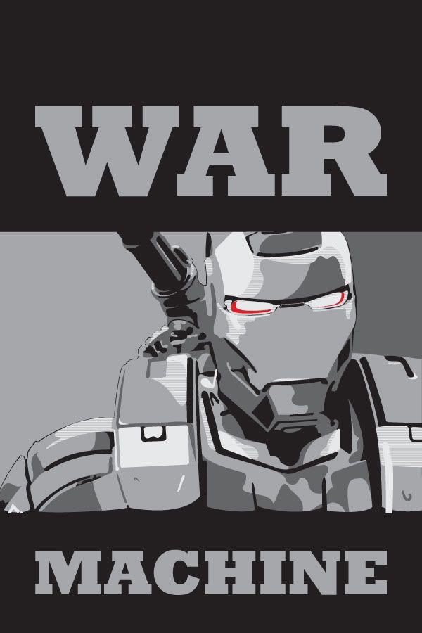
Revised Pictures - Obama Abstract War Machine Poster

Graphic Jordan

Sr Member
RPF PREMIUM MEMBER
Hey guys,

So I decided to do another stab. A more Obama-esque version this time.

Just thought I'd share. Hope you guys dig it.

warmachine-obama-poster.jpg
 
Last edited:
Re: Custom Obama-esque Abstract War Machine Poster

I made the photo a bit bigger. I wonder if I should incorporate any color?
 
Re: Custom Obama-esque Abstract War Machine Poster

I'm the designer that recreated that Iron Man poster.

Try adding a hint of red glow to the eye.

There's a whole lot of negative space in the design, so i think it makes it difficult to understand what's going on. Did you use LiveTrace in Illustrator?

If it were me, i would shift more of WarMachine into frame, add some detailing to the shoulder, and maybe pull some of the layers of grey off the negative space. The obama poster has all it's detail in the face, and no detail in the surrounding area.

Just my 2 cents. it's kind of cool. :)
 
Re: Custom Obama-esque Abstract War Machine Poster

Hey Ironmaniac,

I too am a professional graphic designer. I work for a smaller firm in St. Petersburg, FL

I would NEVER use live trace. That is actually insulting.

The source ai file contains 5 layers. All containing the different levels of black.

I can prove this too you if you'd like. Just seems insulting to the time it took for me to create this..

As I said before it is supposed to be loose and fast.

More of my loose and fast type digital portraits as well as my hand drawn stuff, logo design, etc.. can be see at...

Jordan Chapman - Krop Creative Database

Plus I used the word Abstract. It is in no way suposd to replicate the Obama poster exactly. Plus the style of the Obama poster originates from the "OBEY" posters that featured Andre the Giant.
I'm the designer that recreated that Iron Man poster.

Try adding a hint of red glow to the eye.

There's a whole lot of negative space in the design, so i think it makes it difficult to understand what's going on. Did you use LiveTrace in Illustrator?

If it were me, i would shift more of WarMachine into frame, add some detailing to the shoulder, and maybe pull some of the layers of grey off the negative space. The obama poster has all it's detail in the face, and no detail in the surrounding area.

Just my 2 cents. it's kind of cool. :)
 
Re: Custom Obama-esque Abstract War Machine Poster

I would NEVER use live trace. That is actually insulting.

No, it's not; not yet.

I hate to get in the middle of your mighty graphic designer swinging dick pissing match, but this sort of thing seriously impacts my enjoyment of the RPF. If I had one wish, it wouldn't be to teach the world to sing in perfect harmony; it wouldn't even be to buy the world a Coke; it'd be for everyone on the Internet to consider context and then take one deep breath before they post.

That is, just because you were insulted by a comment doesn't mean that OP meant to be insulting.

All of you guys are biting Shephard Fairey's style, anyhow, and look what happened to him, there. You're stealing from a guy who got sued for appropriation.
 
Re: Custom Obama-esque Abstract War Machine Poster

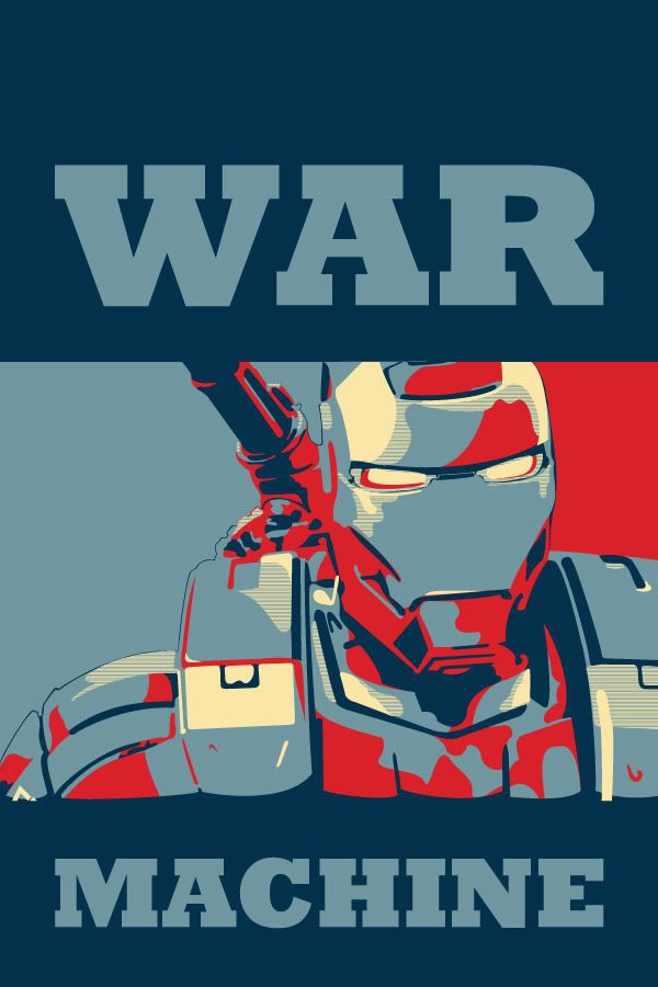
hey DarkNerd, did you try what it looks like with that same color palette as the Obama poster?
 
Re: Custom Obama-esque Abstract War Machine Poster

Hey Ironmaniac,

I too am a professional graphic designer. I work for a smaller firm in St. Petersburg, FL

I would NEVER use live trace. That is actually insulting.

The source ai file contains 5 layers. All containing the different levels of black.

I can prove this too you if you'd like. Just seems insulting to the time it took for me to create this..

As I said before it is supposed to be loose and fast.

More of my loose and fast type digital portraits as well as my hand drawn stuff, logo design, etc.. can be see at...

Jordan Chapman - Krop Creative Database

Plus I used the word Abstract. It is in no way suposd to replicate the Obama poster exactly. Plus the style of the Obama poster originates from the "OBEY" posters that featured Andre the Giant.


Hey Dark,

I wasn't flaming you or your work...No disrespect was intended. I'm not knocking your work, or saying it has to match the original Fairey design, i was just give you my opinion on your piece.

Constructive criticism, that's all. Sorry.
 
Re: Custom Obama-esque Abstract War Machine Poster

No, it's not; not yet.

I hate to get in the middle of your mighty graphic designer swinging dick pissing match, but this sort of thing seriously impacts my enjoyment of the RPF. If I had one wish, it wouldn't be to teach the world to sing in perfect harmony; it wouldn't even be to buy the world a Coke; it'd be for everyone on the Internet to consider context and then take one deep breath before they post.

That is, just because you were insulted by a comment doesn't mean that OP meant to be insulting.

All of you guys are biting Shephard Fairey's style, anyhow, and look what happened to him, there. You're stealing from a guy who got sued for appropriation.

You got it. I recreated that poster because i loved the way it looked in the film, and I just wanted to have one to hang up for myself. I sold a few more prints of it to other members, but I don't think my recreation holds a candle to Fairey's work...he's a very innovative designer.

Sorry i pissed in Dark Nerd's cheerios. He doesn't have to prove anything to me, i believe he did the work.
 
Uploaded a completely different poster idea. Picture is in first post. Thanks for the advised IronManiac.

Plus I'll post it here so you don't need to scroll up.

warmachine-obama-poster.jpg
 
Last edited:
That layout reminds me of a book cover. I like it.

Just so we're clear...i liked the original piece you did, too. You should put it back up. :)

-A-
 
I'll pop it up later. I am going to add more contrasting colors to the mix so the elements don't get so lost in the grays.

That layout reminds me of a book cover. I like it.

Just so we're clear...i liked the original piece you did, too. You should put it back up. :)

-A-
 
I'll pop it up later. I am going to add more contrasting colors to the mix so the elements don't get so lost in the grays.

I like this one as well. But the first one, to me stands out more because its not in that color scheme that the Ironman one has. Looking forward to seeing the grey scale
 
Pretty cool, not to bust chops but any particular reason this is in the costuming section? and not the OT?
 
Back
Top