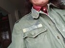
I finally have my eyes on the coat. The few who have researched it, seem to agree on the m1951, aka m51. I have a few leads in the under 100 category. We shall see. Gives me time to work out the boat situation. My shoe laces turned a bit blue on my last dye job so I need to get another true black alcohol marker and do this again.

20231027_164601.jpg
 
I finally purchased an m1951 but now we wait for shipping. This is my last piece so when it arrives it will be time to drive to the marina and beg an allowance on some fishing boats for pics. I need to make the name tape but will work on that while waiting for the coat.
 
Last edited:
I have a friend at the coast who will be looking for a good boat for pics but I am still waiting for my coat. Good thing I hadn't intended this for Halloween.
 
I am working on the name tape today and would like to share another rpf thread source for these great closeups.

Post in thread 'Quint's Jacket From Jaws' Quint's Jacket From Jaws

43745545364_ec8ac0c91b_k.jpg


Although the suggested final font was very close, I am still plugging away at a match.
 
First the measurements based on a real, in my hands, jacket. The pockets are 5 1/2 inch wide. The name tape is 5 inches wide, one inch tall with slightly smaller than 3/4 inch tall letters at a total name width of 3 1/4 inches for "QUINT". The attached name file I hand crafted in Adobe illustrator and is not a font. I did not agree with the extremely rounded versions and felt the on-screen letters were far boxier but not quite square.

Screenshot_20231113-220101_ImageMeter.jpg
Screenshot_20231113-215335_ImageMeter.jpg
20231113_224455.jpg


QuintNameTapeFinal.jpg


Feel free to use for printing, screen printing or cutting. For a perfect spray paint version, it can be used as a cut pattern on a true stencil. Print on stiffer cardstock and razor cut or send to a cutter/printer. My offset on the gaps in the Q are intentional and represent what I see in several screen appearances of the Q. The file should print at 3.25 inches in width but double check your output before finalizing your nametape.
 
I printed my image on my home printer using card stock. I then razor cut it and popped out the pieces:

20231113_235149.jpg


Then I placed my name tape across the back of the paper. I placed my fabric strip on packing tape so the tape stuck out past both top and bottom edge. My fabric is 1 inch cotton fabric ribbon tape, gaberdine weave, I think. I placed one end well past the end of the name and slowly lowered the fabric onto the name from end to end. The paper was face down at this point. By slowly going from one side to the other, you can center each letter in the fabric while pressing down on the tape a little at a time. This centered the name. It makes a huge difference as 3/4 letters in a 1 inch space MUST be centered vertically to look correct. I had made the fabric about 4 inches longer than needed because it would be hard to perfectly center lengthwise as well. I cut it to the appropriate 5 inches afterward. The I is exact center so marking 2.5 inches to either end of the center of the "I" is perfect for length. I used a grey marker and did NOT saturate the image. I only dabbed down and purposely left some fabric still showing grain. This was in hopes of making it look weathered. It is certainly not dark on his coat and is like a tan gray on a dirty tan background. Like moldy hay on slightly less moldy hay. When done, I could see I need to really age the fabric tape as well. But the print is really impressive compared to screen images.

20231114_000857.jpg
20231114_001626.jpg
20231114_002256.jpg


I will play with weathering and aging tomorrow. My print is alcohol markers so I will need to dirty it up with water based staining, to avoid bleeds.
 
Last edited:
Aging is progressing but I need some sunlight to see true colors. My fabric is still wet and my dye has not set but I am pretty certain I will need to dab up some of my first layer alcohol inks from the letters. They are currently too well defined.

20231114_165239.jpg
20231114_173419.jpg
 
Calling it done on the aging. Here is a side by side for color comp only. The onscreen shot is seriously zoomed so letters are not clear but overall color can be compared.

20231114_210556.jpg


Tomorrow is trial fit for the full build and some possible coat tightening.
 
It may just be the indoor lighting but my name tape seems to be getting darker. I may need to do some last minute touchup before final pics. Today, I test fit to see how my sleeves turned out. Following BossThreads advice on trimming right behind the cuff, I cut just behind and then again at 1.5 inches down. After removing this section and any webbing attaching the button side to the button hole side (it is intended as harsh environment wear so has no open cuff unless you cut it out), I then resewed the cuffs back on so they would align with the onscreen picture. Note the position of cuff opening facing up in the following pictures. I also sewed the gap between to stop fraying. I did not do hair, makeup of prosthetics as this was test fit and color testing.

20231116_225534.jpg


I see the fit as a complete success thanks to BossThreads build instructions. I am going to lighten my name tape if this darker shade persists in full sun.

20231116_225203.jpg


Color of the hat is not so much a major concern (until I can get full sun pixs) but scuzziness level needs to be upped as noted earlier by joberg.

I also see the major color difference between my military issue shirt and his levi orange tag original but this aspect I do not intend to pursue in the final details.
 
Pretty sure my color change on the name tape was some kind of chemical reaction with something in the ribbon fabric. I saturated it with alcohol to remove the dark green that had emerged overnight and started again. This time it seems to be holding.


20231117_202751.jpg


and Quint's

20231113_224029.jpg

After the initial alcohol wash, that random green color surfaced farther away from the name tag and had to be alcohol and water cleansed again. Maybe it was a dye that was in the underlying fabric but that seemed so unlikely for its age. Here, you can see the stains coming up...

20231117_112310.jpg
 
Final additions were: 1) hair color to black on sideburns with white added streaks

2) Two facial moles- dermaflage color matched silicone, powdered to remove the shine and then highlighted in darker melanin shade

3) Color to dark auburn on brows and mustache with additional grey streaks.

4) Fill hair on center of mustache and above ears

5) color contacts to add blue tint

IMG_0217.JPG
20231122_155906.jpg
20231122_161316.jpg


This last pose came out at 75% facial match. A number I can be happy with since I did not have my usual projection monitor (my home setup) to assist in getting the last minute facial tweaks correct.

20231122_155255.jpg


And, my name tag color matching looked great in daylight, natural lighting. I posed at the local store next to my Bill and Ted's phone booth project.
 

Your message may be considered spam for the following reasons:

If you wish to reply despite these issues, check the box below before replying.
Be aware that malicious compliance may result in more severe penalties.
Back
Top