You are using an out of date browser. It may not display this or other websites correctly.
You should upgrade or use an alternative browser.
You should upgrade or use an alternative browser.
Jurassic Park
- Thread starter Onkelpsycho
- Start date
-
- Tags
- jurassic park
MAKE BELIEVE
Master Member
Thanks and keep up the good work :thumbsup
Rymo
Sr Member
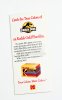
Here's the Kodak one.
View attachment 579322
I'm glad to see someone getting use out of the Kodak box graphic I made a few years ago: http://www.therpf.com/showthread.php?t=68579&p=1564024&viewfull=1#post1564024
If you'd like to make it more accurate, you'll need to change the part on the top of the box that says "Develop Before..." to something different. I believe that area is supposed to have the Olympic rings logo in red, and something like "Official Sponsor" written above it. When I created that graphic, I wasn't sure what belonged there, so I just made something up as a placeholder. I can give you the full-res version of the image if you'd like.
It's looking good so far. Keep up the good work.
Mike J.
Master Member
This one from the Prop Store seems to have the rings on it (attached).
Here are some refs for this era of box.
http://collections.museumvictoria.com.au/items/2087830
https://www.flickr.com/photos/friendlydragon/6725260499/
https://www.flickr.com/photos/52013582@N07/7752626336/
https://www.flickr.com/photos/marschaladamphotography/13184575453/
https://www.flickr.com/photos/50026670@N05/5491274162/
Attachments
AZSneed
Sr Member
Mike, I missed seeing the white differences.
The brochure I saw is here, https://www.screenused.com/?sectionID=item-detail&subsectionID=index.cfm&item_id=17604
The brochure I saw is here, https://www.screenused.com/?sectionID=item-detail&subsectionID=index.cfm&item_id=17604
In the pictures of the screen used ones, the border of the front page isn't perfect yellow. But in many other pictures they are yellow. So when you alter the the colors of the screen used picture, the kodak white turns almost pure white. So I think I can go with white, or I can make both versions. ")
Mike J.
Master Member
I'm not sure if the real ones have a pure CYMK yellow for the front border or if they're using a 'warm yellow' with a small amount of magenta in it. I suspect it's a 'warm yellow' with like 5% magenta. A quick look at my "Making of Jurassic Park" book seems to show a tiny amount of magenta in the yellow of the JP logo, so I'd lean in that direction for the front panel border.
I'm not sure if the real ones have a pure CYMK yellow for the front border or if they're using a 'warm yellow' with a small amount of magenta in it. I suspect it's a 'warm yellow' with like 5% magenta. A quick look at my "Making of Jurassic Park" book seems to show a tiny amount of magenta in the yellow of the JP logo, so I'd lean in that direction for the front panel border.
That makes the Kodak page a bit darker.
HULKSMASH1120
Active Member
keep up the good work Raptor98. These renders are AMAZING! looking forward to seeing them all
HULKSMASH1120
Active Member
quick question to you raptor. or anyone that may have a suggestion. I need a decent photo editor that will allow me to scab these images all together. I have the individual files for each "panel" of the brochure but no way to arrange them in order as one pic to be printed. I only have minimal photo editing and it makes me shrink down the pics which defeats the purpose of hd renders. any advice is greatly appreciated
Well Adobe Illustrator/Photoshop both are good. I learned photoshop. Now I'm learning illustrator. Illustrator is good for creating geometric artworks while photoshop is great for digital painting.
BTW, can anyone help me with the japanese text on the brochure? I'm in so much problem with them.
BTW, can anyone help me with the japanese text on the brochure? I'm in so much problem with them.
quick question to you raptor. or anyone that may have a suggestion. I need a decent photo editor that will allow me to scab these images all together. I have the individual files for each "panel" of the brochure but no way to arrange them in order as one pic to be printed. I only have minimal photo editing and it makes me shrink down the pics which defeats the purpose of hd renders. any advice is greatly appreciated
As Raptor98 said Illustrator and Photoshop are good drawing type tools, if you want a layout tool Adobe also has their InDesign product. I'm a Creative Cloud subscriber so I am most familiar with Adobe tools, but I do know that GIMP is an open source alternative to Photoshop and InkSkape is a free alternative to Illustrator (I used to use it before I had my CC sub and it's pretty good). I've not had to look for an alternate layout program, but there's probably one out there somewhere.

Hallow everyone. I found something on the net. It's the wine from the 1st film in the Grants trailer scene. Can any one help recreating the label please?
That's not a very expensive champagne (barely qualifies for the term in my eyes, but that's a different rant
), you can pick up very similar bottles for around £15-£30. The main label's changed a little in the last 20 odd years but the rest of the bottle appears to be virtually identical, even down to the star on the foil.That's not a very expensive champagne (barely qualifies for the term in my eyes, but that's a different rant
I intend to collect the label only. I'm currently busy with the brochure. So I hope someone will look into it.
Similar threads
- Replies
- 2
- Views
- 1,978