If it didn't say 'Graflex', what would it say?

And here again is the visual translation to Aurabesh at top, and FB's neo-aurabesh version of the English letters:

clamp2.gif

The bottom one here is my personal favorite.

I agree both with that it should be a company name and that it be visually similar to the original lettering. If you just slap some weird font on there is looks like you slapped some weird font on it.
 
Star Wars alphabets and fonts are an area of particular interest to me. I've been studying them for years. So here's some info that may hopefully be helpful (and not too boring).

"Aurebesh" does not appear in the original versions of any of the Original Trilogy movies. It was created by West End Games in the 1990s. It's very similar to the font that appears in Return of the Jedi (when the shuttle approaches the Death Star), but it's not the same, and many letters are different. (If you're interested in a screen-accurate font that replicates the one in Return of the Jedi, I've created the Galactic Basic font.)

Aurebesh has only really become popular because of the Expanded Universe. And it was the first Star Wars font for computers, so everyone kind of went crazy with it. Now most people think that any alien alphabet that's from Star Wars is Aurebesh. It's essentially the universal fan font for Star Wars.

Here are some ofther things to consider:
  • Real Aurebesh appears in II, III, and the Special Edition of IV (the tractor beam control).
  • A modified version of Aurebesh appears in Episode I, in the cockpit display of Anakin's Naboo fighter when R2 is talking. Make of this what you will, but it at least proves that Aurebesh is not an exclusively imperial alphabet.
  • There's no Jedi alphabet. The rounded font with lots of circles and lines is actually a Naboo font created for Episode I (it's on the Naboo fighters).
  • There's actually an alien alphabet that appears in Episode IV (ANH). It's the lettering on the TIE pilot helmets. This is its own alphabet.
  • There are at least 2 fonts in the Empire Strikes Back (one of which appears in Luke's X-Wing cockpit). Neither of them is Aurebesh or the ROTJ font.
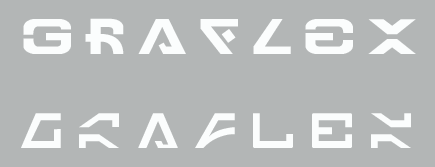
If you're looking for something that's readable but's still "Aurebesh-looking", you could go with one of these:

graflex_labels.png


The top one is my Engli-Besh font.
The bottom one is Dan Zadorozny's "Imperial Code" font from Iconian Fonts.
 
A very interesting and informative post - many thanks erikstromtrooper!

As for the wording - I can't come up with anything interesting that matches the number of letters, but if it were me I'd go for 'Peace and Justice.' The sheer number of letters would make a nice pattern around the band in an otherworldly SW font.
Oh - and if it were Indy's saber - 'Fortune and Glory.' :lol
 
No problem. I'm always happy to pass on some of my useless knowledge to others :)

I'll make a (wordy) wording suggestion:
"An elegant weapon for
a more civilized time"

maybe 2 lines on top of each other like this, with a smaller point size, would take up about as much space as "Graflex"
 
Last edited:
You know, instead of lettering on the clamp, id love a clamp that was textured like the Anakin ROTS saber. No silver tape over the lettering needed, its built in...
 
How about "ACME"

or

"Not for Internal Use" (you know, for those lonely jedi)

or

"Warning: Looking directly into the light beam may cause permanent eye damage"

Or like american C4

"This side faces the enemy" with an arrow pointing towards the emitter

"This is not a toy"

"Surgeon General's Warning: Use of this item has been known to lead to dismemberment and/or death"

-Fred
 
That is a good question. I really tried for a screen accurate saber, but just couldn't stand the word GRAFLEX on the clamp, so I covered it with chrome tape just like the Luke saber. I know, I know; BLASPHEMY! I just didn't like the look of it, you know? So I guess what I am saying is, if I had to choose, there would be nothing there on the clamp, just like the Ep 3 'good try' saber. :angel
Now that, thanks to YOU and others, I am getting new parts so I can tweak my saber. I think I'll leave the chrome tape on. It will be the only thing wrong with my saber after the last pieces are made and bought by me.
I also think that maybe Aurebesh is like English or 'standard', and that everything else we see is other languages like Huttese or whatever.
 
When I matched "GRAFLEX" to what I find as the closest-looking letters in Aurebesh I got "PFysihs", but that doesn't really make any sense..
..Unless you interpret it as, either:
- "PFysics" - short for "Psi-Physics", which you could call Jedi special powers... (far-fetched, I know).
- A company name: "P-Fysics". The company specializes in nuonic physics and related equipment. Off-the-shelf components from them were used in the construction of the lightsaber.

Just a few ideas...

Better to put this one on the endcap, I think.
 
Erikstormtrooper--thanks for the info!

I guess it's pretty clear that everyone's got their own preference on this one. ;)

Brinn--I think a strong argument can be made for 'nothing', but so far the ways of doing that I've seen don't give it the sense of realism I'm looking for. I want my version to look very very plausible but also a bit alien.

Maybe I need to have one made with pattern-welded steel and lightly acid-etched. ;)
 
Although it would be fun to do a bunch of these in different configurations, what I'm thinking of is a custom idealized clamp assembly that's not a real clamp but rather a tube, engraved by someone who normally does guns and jewelry and so on. Pricey and not likely to have mass appeal.

However, if someone can turn up an engraving service which can work on a round piece for cheap, or if someone's got any other ideas, I'm all ears. :)
 
What would it say if not Graflex?
"Serious Bidders Only"
"PayPal Only"
"Buy It Now"

I could keep going, but... eh. :)
 
  • Like
Reactions: ecl
Back
Top