You are using an out of date browser. It may not display this or other websites correctly.
You should upgrade or use an alternative browser.
You should upgrade or use an alternative browser.
Defined Green Lantern Comic Rings
- Thread starter Gregatron
- Start date
Received the Mark Bright/EMERALD DAWN-style test print, today (which I’d ordered separately, right after I ordered the last batch of rings). Overall, I’m pleased with it.
Just needs a bigger symbol-disc, and I’m still trying to figure out a way to eliminate the gap seen in the areas circled in red. The orange circle represents the finger-hole size, but getting the ring-band to blend into the symbol-disc properly leaves that gap, which causes a looser fit, and looks unsightly. There’s gotta be some trick in Tinkercad to shimming it, or something.
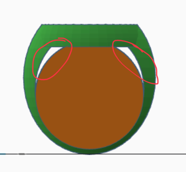
Just needs a bigger symbol-disc, and I’m still trying to figure out a way to eliminate the gap seen in the areas circled in red. The orange circle represents the finger-hole size, but getting the ring-band to blend into the symbol-disc properly leaves that gap, which causes a looser fit, and looks unsightly. There’s gotta be some trick in Tinkercad to shimming it, or something.
Working on solving this problem. The issue is that the Bright design has a tapered band which blends into the symbol- disc...but reshaping the band to surround the finger-hole (and eliminate that gap) causes the band to get wider at the top and blend less cleanly into the band.
That being said, here are the current variations.
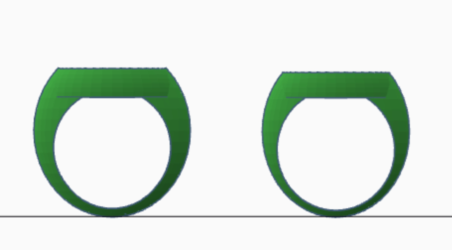
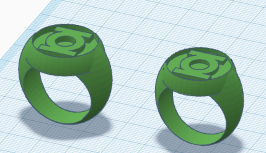
That being said, here are the current variations.
Finally arrived at a Bright/EMERALD DAWN-style design that should work. Created a two-piece version which will make it easy to paint the lighter green color inside the symbol-disc. I just ordered a plastic print, as well as prints for the revisions of the Abin Sur and V1 (sphere-based band), along with the Mike Grell V3 design.
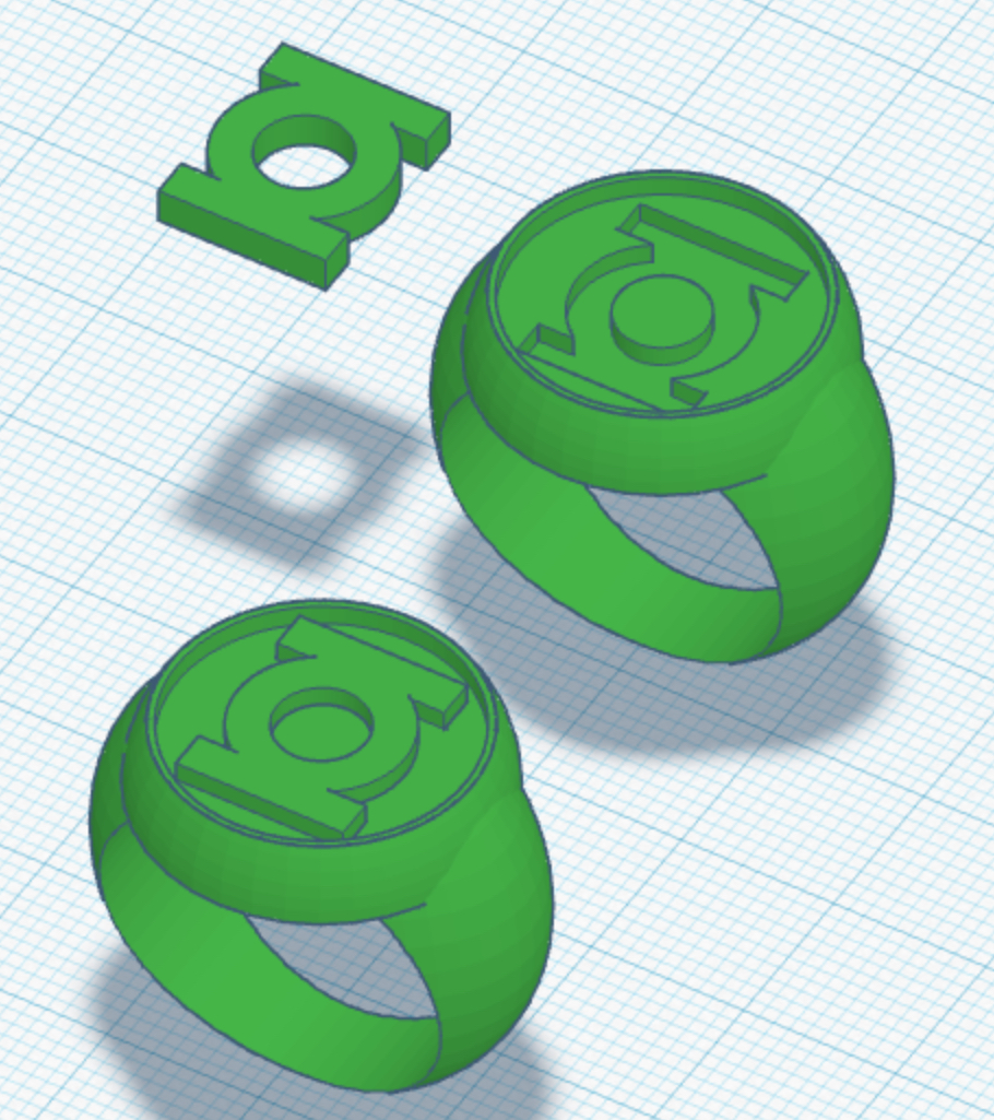
Managed to rework the V3 yet again and shave off another 2mm from the length of the bottom of the band by re-angling the sidebars (while still maintaining the proper and exacting dimensions of the GL symbol on the flat face of the ring), which will allow for a more comfy fit. Tricky and time- consuming work, but worthwhile. I’ll order a print with the next batch in a week or two, after I finish tweaking some of the other models.
Old on left, new on right.
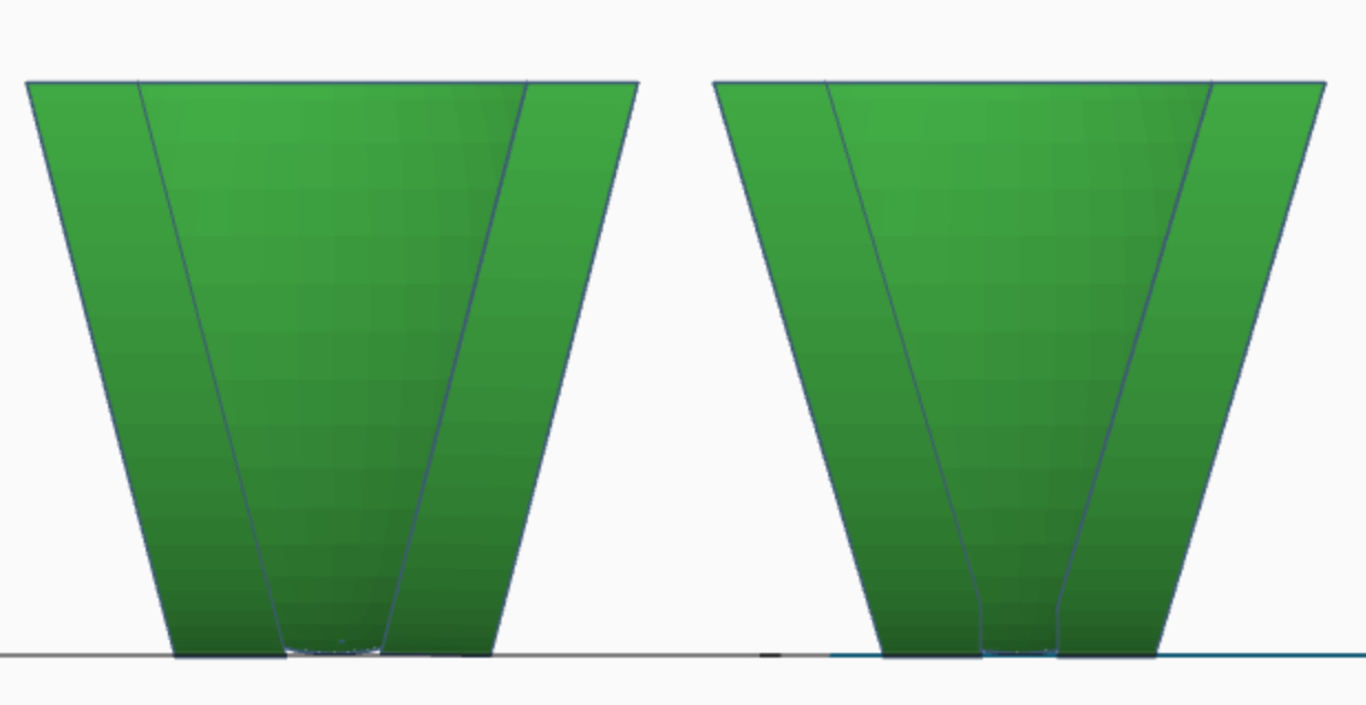
Old on left, new on right.
Still tweaking. The band style and width for the V2 continues to annoy me. The current version is perfectly comfy, but I’d still prefer the band to be as wide as the symbol’s central ring. I printed one which is wide enough to meet that desire in the last batch, but it overall comes across as TOO wide, and isn’t as comfy as it could be. I think I may have finally come up with something that’ll work: a sphere based band which is slightly tapered, with a flat-beveled edge (matching most of the reference).



Sphere-based, tapered band on left, cylinder-based, parallel band on right.
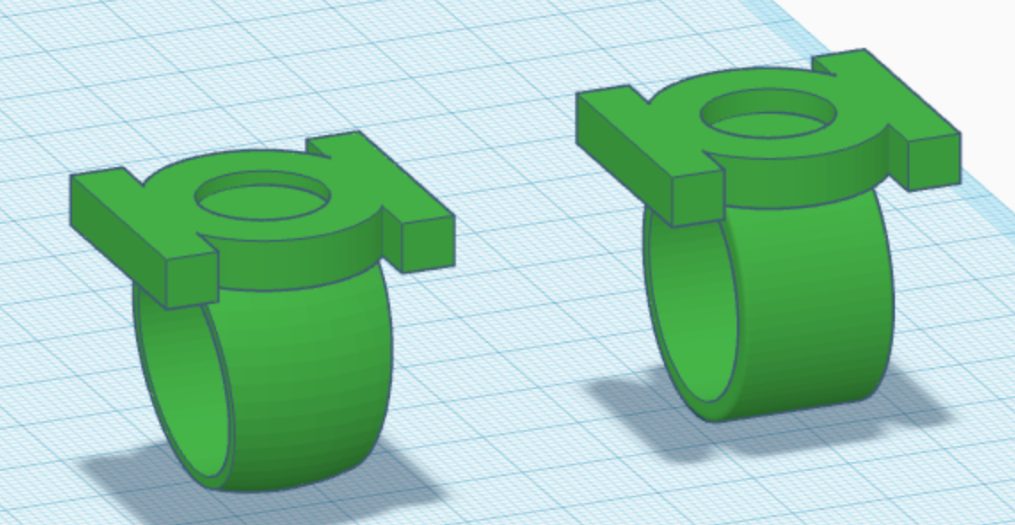
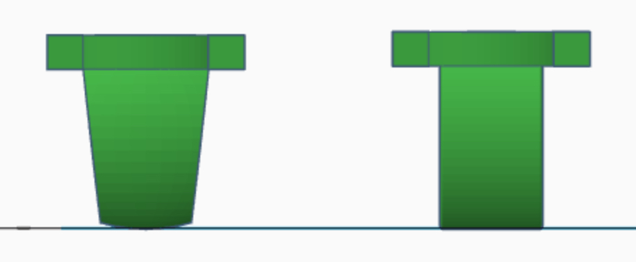
Sphere-based, tapered band on left, cylinder-based, parallel band on right.
Last edited:
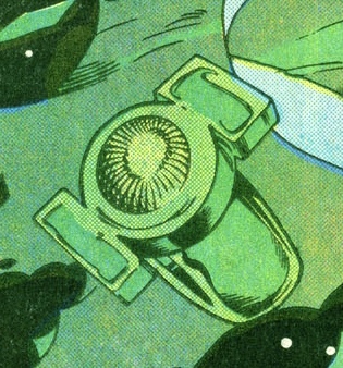
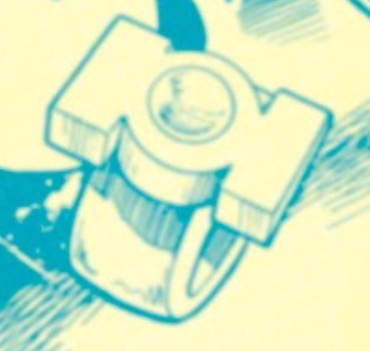
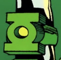
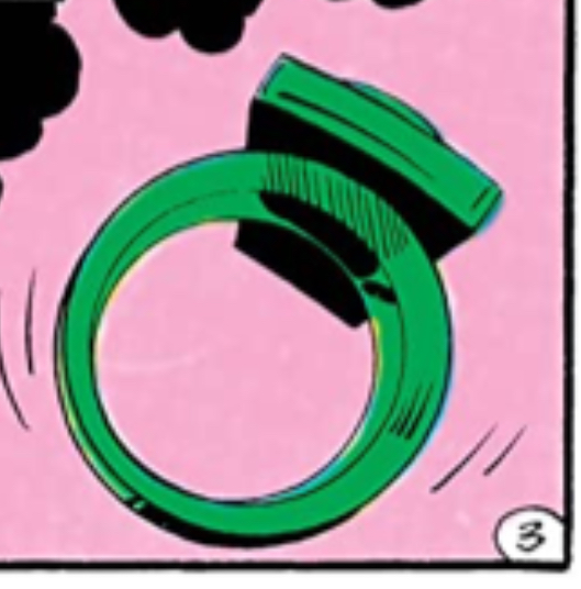
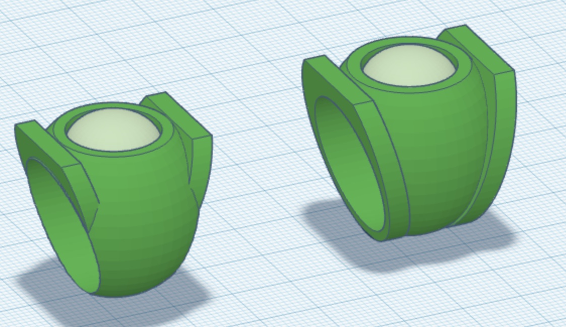
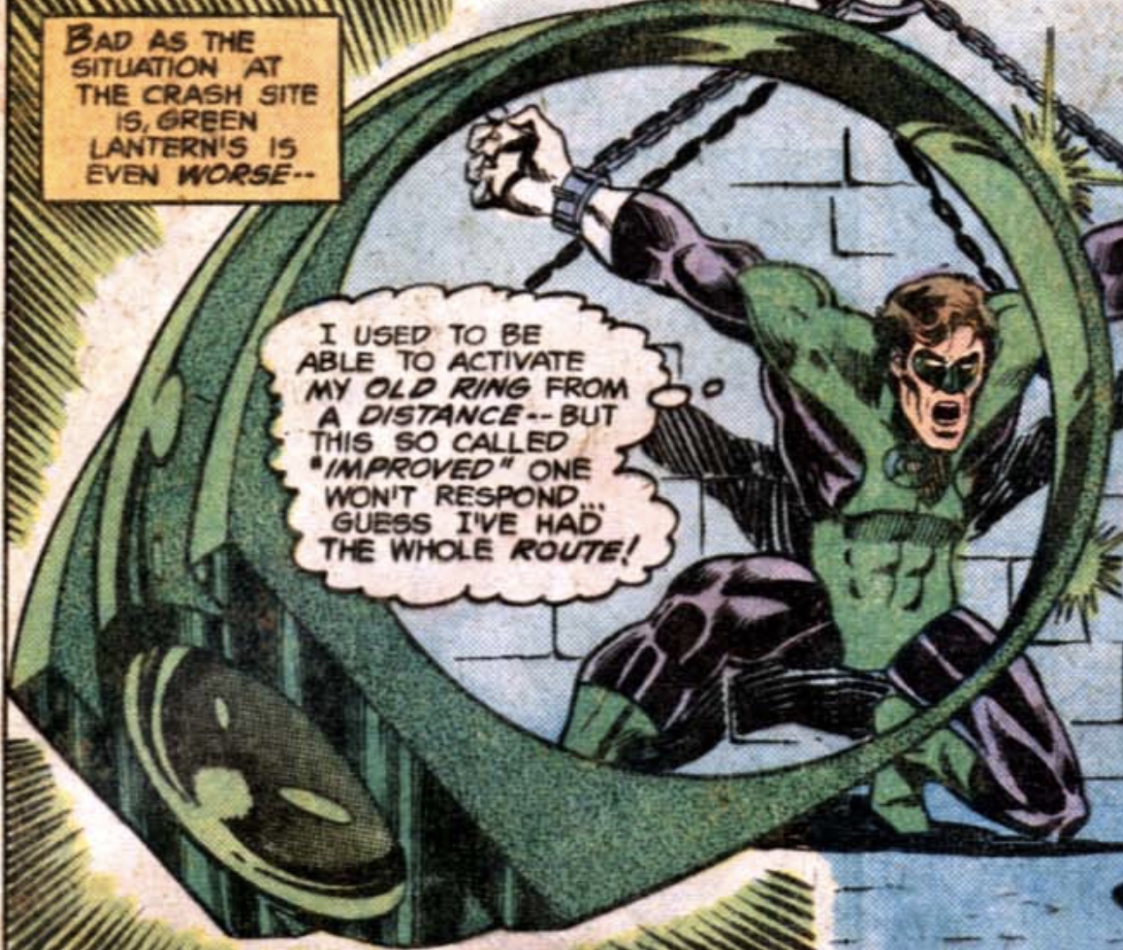
...I’ve found myself second-guessing the Mike Grell design. I’m very pleased with it (and the test-print is on its way), but I’m not entirely sure that the comic design featured the sidebars going all the way around the main body of the ring, creating the tri-band look. Some of the reference indicates that Grell was drawing a single band, with the sidebars coming up out of the central section at angles. Three pieces at the top (sidebars and central parabola) which blend into one shape as you move to the bottom of the band.
To scratch this itch I’ve modeled another variant which depicts this idea. New on left, old on right.
It really is hard to tell from the reference. Some art indicates the tri-band look...
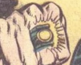
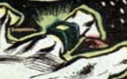
...and some the blended band.
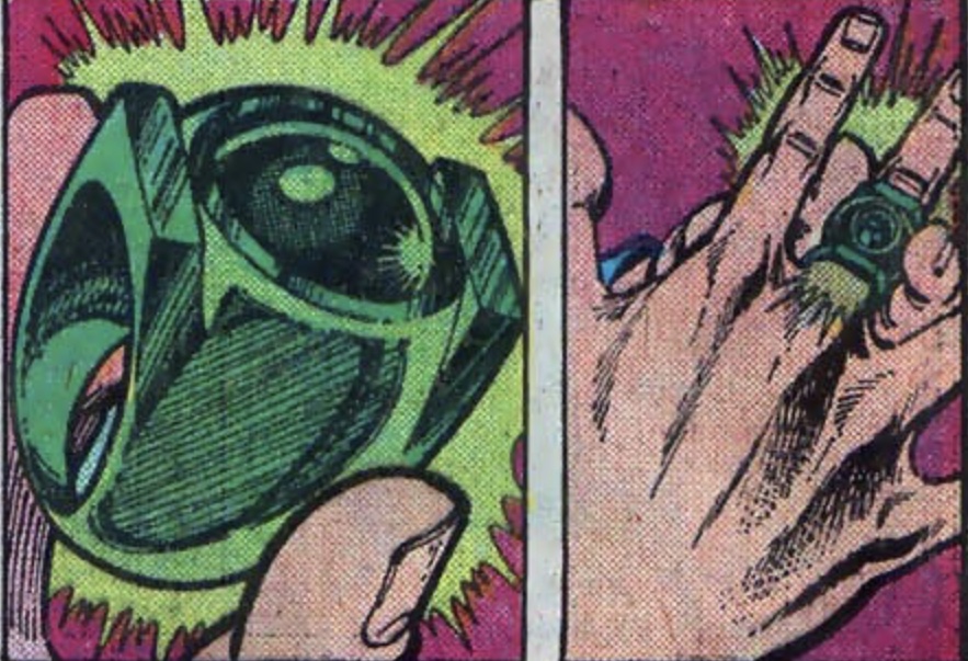
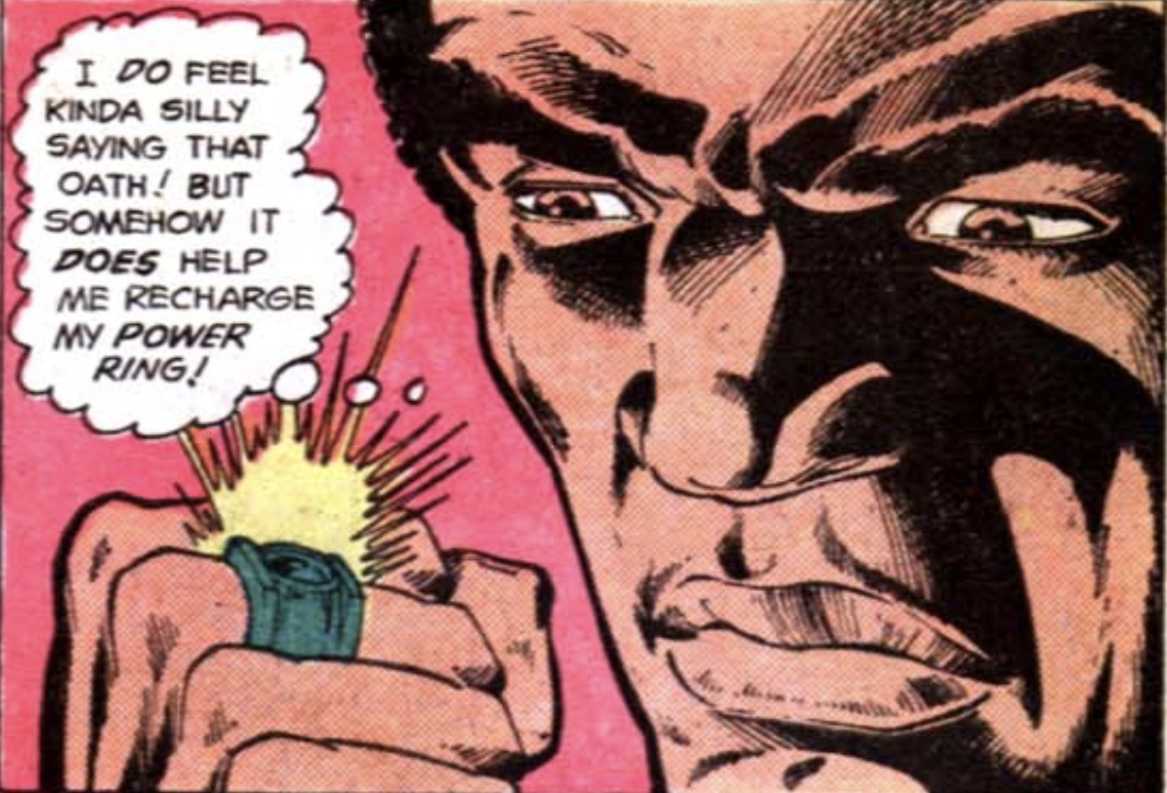
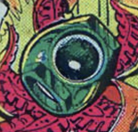
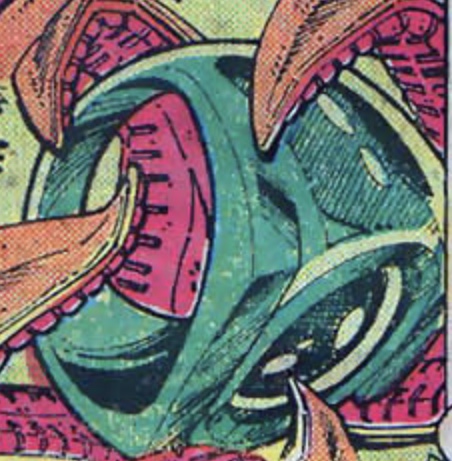
As previously noted, after only a few issues with this more complex design, Grell flattened the face of the ring to resemble the GL symbol proper. And his subsequent artwork of the refined design definitely gave us the familiar tri-band look of the V3 as we commonly know it.
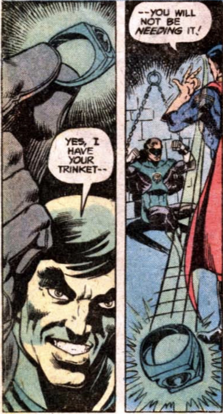
To scratch this itch I’ve modeled another variant which depicts this idea. New on left, old on right.
It really is hard to tell from the reference. Some art indicates the tri-band look...
...and some the blended band.
As previously noted, after only a few issues with this more complex design, Grell flattened the face of the ring to resemble the GL symbol proper. And his subsequent artwork of the refined design definitely gave us the familiar tri-band look of the V3 as we commonly know it.
Last edited:
So, just for funzies, I finally got around to studying and sourcing images for the evolution of the GL insignia itself.
As with the Golden Age (Alan Scott) insignia, the Silver Age Green Lantern symbol would be a stylized representation of the power battery from whence the character drew his power, contained within a circle.
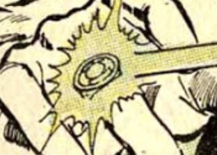
The very first appearance of the symbol was in this Gil Kane panel from SHOWCASE # 22 (1959).
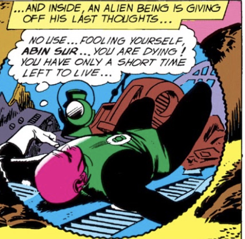
This early symbol was fairly complex, and surely a pain to draw again and again on page after page. Standing in mute testimony to this is the fact that the symbol was in constant flux.
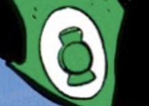
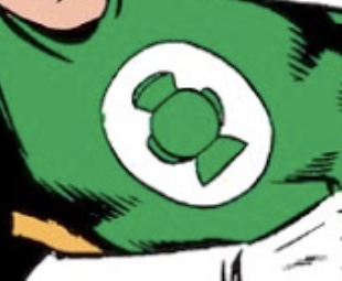
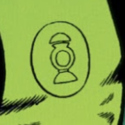
After the new version of Green Lantern was awarded his own ongoing series, the symbol was still in constant flux from issue to issue, and even panel to panel.
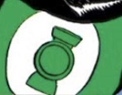
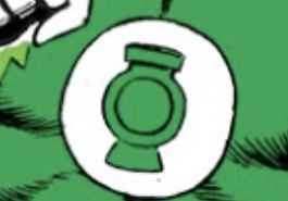
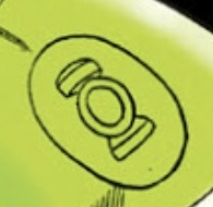
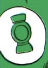
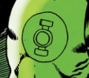
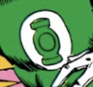
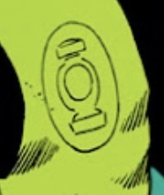
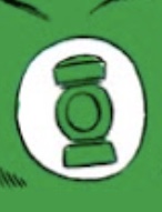
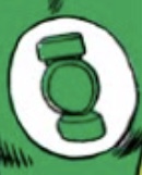
At some points, the symbol started to become very simplified and abstract, resembling a simple ring sitting between two bars, but with the domed top of the original power battery design still visible. This gradual simplifying of the design clearly allowed Gil Kane and his inkers to waste less time drawing the symbol.
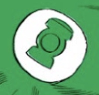
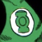
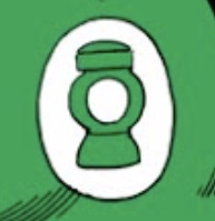
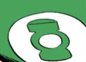
Circa GREEN LANTERN Vol. 2 # 8, we finally started to see the iconic version of the symbol...but only in the occasional panel or two.
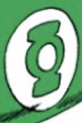
More often during this early period, the symbol tended to be depicted as a very thin ring with two distinctly-separate bars on top and bottom.
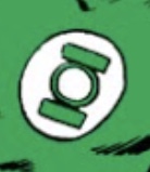
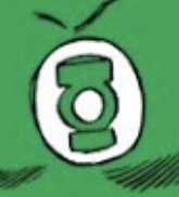
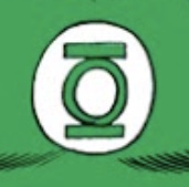
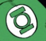
Finally, circa GREEN LANTERN Vol. 2 # 13, the iconic version of the symbol became a mainstay...
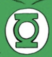
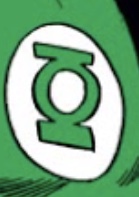
...but not always, as the “separate sidebars” version would often pop up in random panels and on covers.
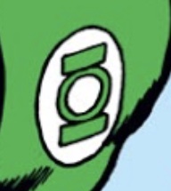
During this period, Gil Kane would also occasionally draw the (ever-changing) symbol as a decorative visual accent for captions and/or panel-to-panel transitions, And, in one instance, as a ring-generated mutual greeting between Hal Jordan and Alan Scott, the Golden Age Green Lantern.
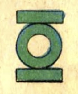
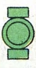
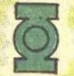
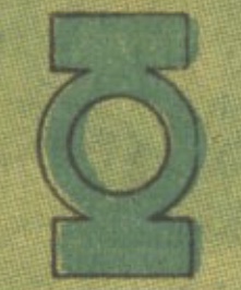
It should also be noted that modern reprints of these early stories recolor the symbol to leave the center circle white (as it is in all modern comics and licensed products). In reality, the original printings of these stories consistently colored the entire symbol green...
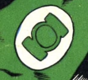
...right up through Gil Kane’s final regular issue, # 75.
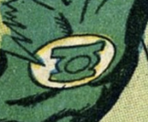
Beginning with (the now-retitled) GREEN LANTERN/GREEN ARROW # 76, the incomparable Neal Adams took over the art chores, and quite consistently stuck with the “separate sidebars” design...
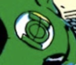
...although, toward the end of his run, he began to experiment with curving the sidebars so that they matched the shape of the circle that the symbol was set within. Judging by the variations seen in Adams’ later comic/commission/sketch art, this seems to be his preferred style.
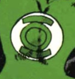
After the cancellation and relaunch of GL/GA, Mike Grell took over as artist, and it was at this point that the iconic symbol reasserted itself, but was now also colored (inconsistently, of course, though mostly just on covers) with a white central circle. The “separate sidebars” design would also continue to make occasional appearances, depending on the artist and the issue.
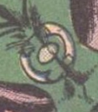
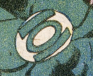
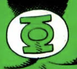
Joe Staton would also occasionally give the symbol a little bit of a vertical joint between the central ring and the sidebars...
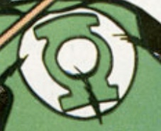
...but, by this point, the iconic version of the symbol had finally become locked down pretty firmly.
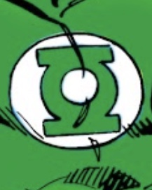
In 1982, the official DC Comics Style Guide would provide the official symbol used for the vast bulk of merchandising and whatnot over the next few decades...
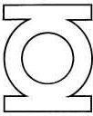
...but this variant with taller sidebars would often also be used for licensing and UPC boxes on covers, and seemed to be the one artists were most often referencing in their artwork. I’m still not sure if this version was designed before or after the Style Guide version, or when/where it first appeared.

As a general rule of thumb, the sidebars are usually the same width as the central ring, and, personally, I find the versions with those particular proportions to be the most aesthetically-pleasing. The Style Guide symbol has sidebars which are thinner than the central ring, which looks a bit “off”.
Of course, the Kyle Rayner era (beginning in 1994) gave us his unique Yin/Yang-style symbol...

...and then there would be other variants across different media (such as John Stewart’s symbol from the JUSTICE LEAGUE cartoons, which was basically a monotone-green version of Rayner’s). Eventually, the post-GREEN LANTERN: REBIRTH (2004) era gave us the modern version of the symbol as we see it today, with the tips of the (now-slanted) sidebars blending into the circle surrounding the symbol.

As with the Golden Age (Alan Scott) insignia, the Silver Age Green Lantern symbol would be a stylized representation of the power battery from whence the character drew his power, contained within a circle.
The very first appearance of the symbol was in this Gil Kane panel from SHOWCASE # 22 (1959).
This early symbol was fairly complex, and surely a pain to draw again and again on page after page. Standing in mute testimony to this is the fact that the symbol was in constant flux.
After the new version of Green Lantern was awarded his own ongoing series, the symbol was still in constant flux from issue to issue, and even panel to panel.
At some points, the symbol started to become very simplified and abstract, resembling a simple ring sitting between two bars, but with the domed top of the original power battery design still visible. This gradual simplifying of the design clearly allowed Gil Kane and his inkers to waste less time drawing the symbol.
Circa GREEN LANTERN Vol. 2 # 8, we finally started to see the iconic version of the symbol...but only in the occasional panel or two.
More often during this early period, the symbol tended to be depicted as a very thin ring with two distinctly-separate bars on top and bottom.
Finally, circa GREEN LANTERN Vol. 2 # 13, the iconic version of the symbol became a mainstay...
...but not always, as the “separate sidebars” version would often pop up in random panels and on covers.
During this period, Gil Kane would also occasionally draw the (ever-changing) symbol as a decorative visual accent for captions and/or panel-to-panel transitions, And, in one instance, as a ring-generated mutual greeting between Hal Jordan and Alan Scott, the Golden Age Green Lantern.
It should also be noted that modern reprints of these early stories recolor the symbol to leave the center circle white (as it is in all modern comics and licensed products). In reality, the original printings of these stories consistently colored the entire symbol green...
...right up through Gil Kane’s final regular issue, # 75.
Beginning with (the now-retitled) GREEN LANTERN/GREEN ARROW # 76, the incomparable Neal Adams took over the art chores, and quite consistently stuck with the “separate sidebars” design...
...although, toward the end of his run, he began to experiment with curving the sidebars so that they matched the shape of the circle that the symbol was set within. Judging by the variations seen in Adams’ later comic/commission/sketch art, this seems to be his preferred style.
After the cancellation and relaunch of GL/GA, Mike Grell took over as artist, and it was at this point that the iconic symbol reasserted itself, but was now also colored (inconsistently, of course, though mostly just on covers) with a white central circle. The “separate sidebars” design would also continue to make occasional appearances, depending on the artist and the issue.
Joe Staton would also occasionally give the symbol a little bit of a vertical joint between the central ring and the sidebars...
...but, by this point, the iconic version of the symbol had finally become locked down pretty firmly.
In 1982, the official DC Comics Style Guide would provide the official symbol used for the vast bulk of merchandising and whatnot over the next few decades...
...but this variant with taller sidebars would often also be used for licensing and UPC boxes on covers, and seemed to be the one artists were most often referencing in their artwork. I’m still not sure if this version was designed before or after the Style Guide version, or when/where it first appeared.
As a general rule of thumb, the sidebars are usually the same width as the central ring, and, personally, I find the versions with those particular proportions to be the most aesthetically-pleasing. The Style Guide symbol has sidebars which are thinner than the central ring, which looks a bit “off”.
Of course, the Kyle Rayner era (beginning in 1994) gave us his unique Yin/Yang-style symbol...
...and then there would be other variants across different media (such as John Stewart’s symbol from the JUSTICE LEAGUE cartoons, which was basically a monotone-green version of Rayner’s). Eventually, the post-GREEN LANTERN: REBIRTH (2004) era gave us the modern version of the symbol as we see it today, with the tips of the (now-slanted) sidebars blending into the circle surrounding the symbol.
Last edited:
Latest batch of test prints came in. Three out of the four (Abin Sur, V1, Mark Bright) were troublesome, since the finger holes were too small. The last batch was a bit too loose, and these skewed in the opposite direction. Clearly, the middleground between the two should be the right fit.
That all being said, the one success is the Mike Grell design. Great look, great fit. Might need a tweak or two, but I’m very pleased with it.
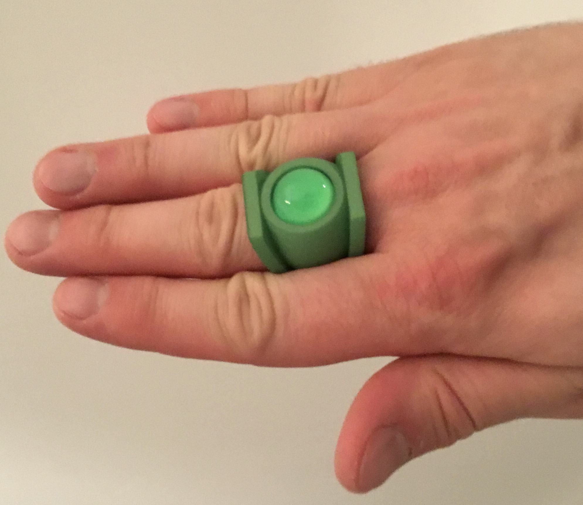
That all being said, the one success is the Mike Grell design. Great look, great fit. Might need a tweak or two, but I’m very pleased with it.
More tweaking. I’m working on the proportions of the V1 (and will pass along the changes to the other V1-type rings when I finish) to make the design more compact and aesthetically-pleasing. A slightly-smaller and thinner symbol-disc, a wider band, and the disc mounted lower on the band (for a sleeker profile).
Originally, I was going with the same diameter (25.5mm) for both the disc and the band, but a smaller and thinner disc seems to look a bit better (although sometimes it’s drawn to look rather chunky in the comics), and doesn’t “overpower” the band quite so much. It looks more balanced, in other words,
As I’ve noted, it’s tricky work taking 2-D drawings (which can wildly vary from artist to artist and drawing to drawing) and distilling them into 3-D objects which manage to capture the right look AND are proportioned both correctly and practically for real-world use.
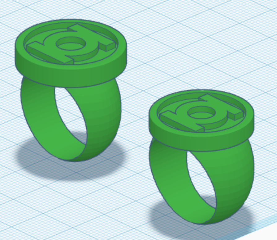
Something had been nagging me about the modern-style ring for quite some time, but I couldn’t quite put my finger on it. Carefully comparing my model to the current official GL symbol, I discovered that the proportions were slightly off. The center ring between the sidebars was too thin, even at first glance. And the sidebars themselves were too short.
I’ve now created accurate versions of the GL and Sinestro symbols and modified the models. They’ll be printed in the next batch. Looks much better!
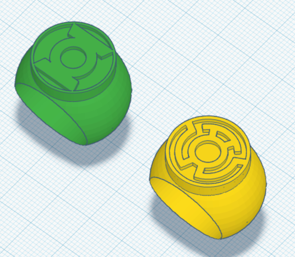
I’ve now created accurate versions of the GL and Sinestro symbols and modified the models. They’ll be printed in the next batch. Looks much better!
After a good number of weeks, I’ve returned to the Power Ring (Earth-3) design, and finally have something which I’m reasonably happy with. Since the character only appeared a handful of times before perishing in CRISIS ON INFINITE EARTHS, and since the reference for his symbol and ring design varies pretty notably in both look and color scheme, I’ve come up with three versions: A fully-green ring, and then twin, two-piece versions to be printed in two colors, then glued together. Still deciding which to go with.
In his initial JUSTICE LEAGUE OF AMERICA appearances, the coloring of the ring depicted both a version that matched the chest symbol ( green “X” on white triangle) and an all-green version. By his final appearance, in CRISIS, the ring was colored green with a white “X” (which is what the DC Direct replica and other modern versions tend to go with).
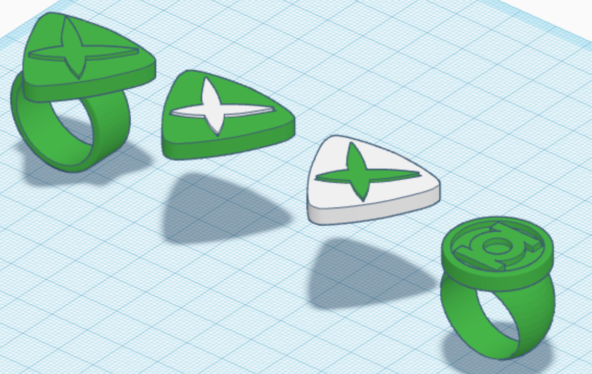
In his initial JUSTICE LEAGUE OF AMERICA appearances, the coloring of the ring depicted both a version that matched the chest symbol ( green “X” on white triangle) and an all-green version. By his final appearance, in CRISIS, the ring was colored green with a white “X” (which is what the DC Direct replica and other modern versions tend to go with).
Received a big batch of new test rings. Overall, I’m very pleased. FINALLY got the V3 to a point where it’s nice and comfy, without the band being too wide. It might just be finally locked down, now, because I can’t think of any more adjustments which are needed. The V2 with sphere-based band also looks great. Maybe just a few minor tweaks. The revised V1 designs look great, although now I’m thinking that 24mm for the symbol-disc might be just a tad too SMALL. Might try 25mm, next time. As noted, the artwork varies wildly. Some panels show a ring which looks the size of this new iteration, and others depict a bigger chunkier disc. It’s just a matter of finding the right middleground between inconsistent comic art and real-world, three-dimensional aesthetics.
The early Gil Kane and Sinestro designs need a few tweaks. The EMERALD DAWN design is just about right, now. The finger-hole needs a slight reduction in size, because the ring fits a bit too loose. The Darryl Banks ring could maybe use a bigger symbol-disc. The modern/EVS-style ring is virtually perfect, but for the inaccurate GL symbol (which, as noted upthread, I’d noticed and revised just after ordering this latest print).
Tweak, tweak, tweak.
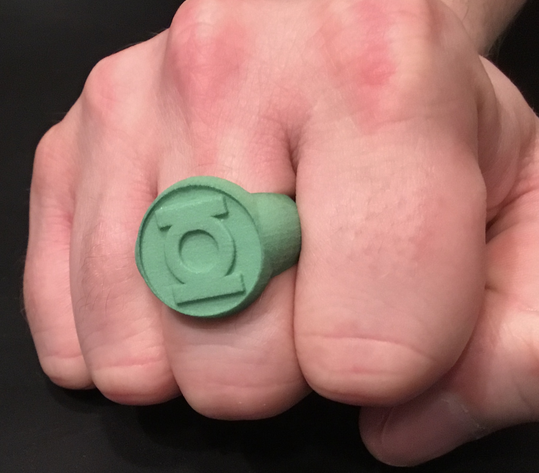
Here are a few photos.
V1 (sphere-band):
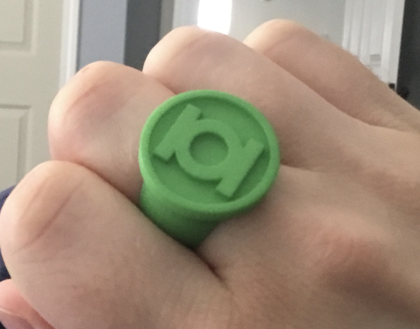
V2:
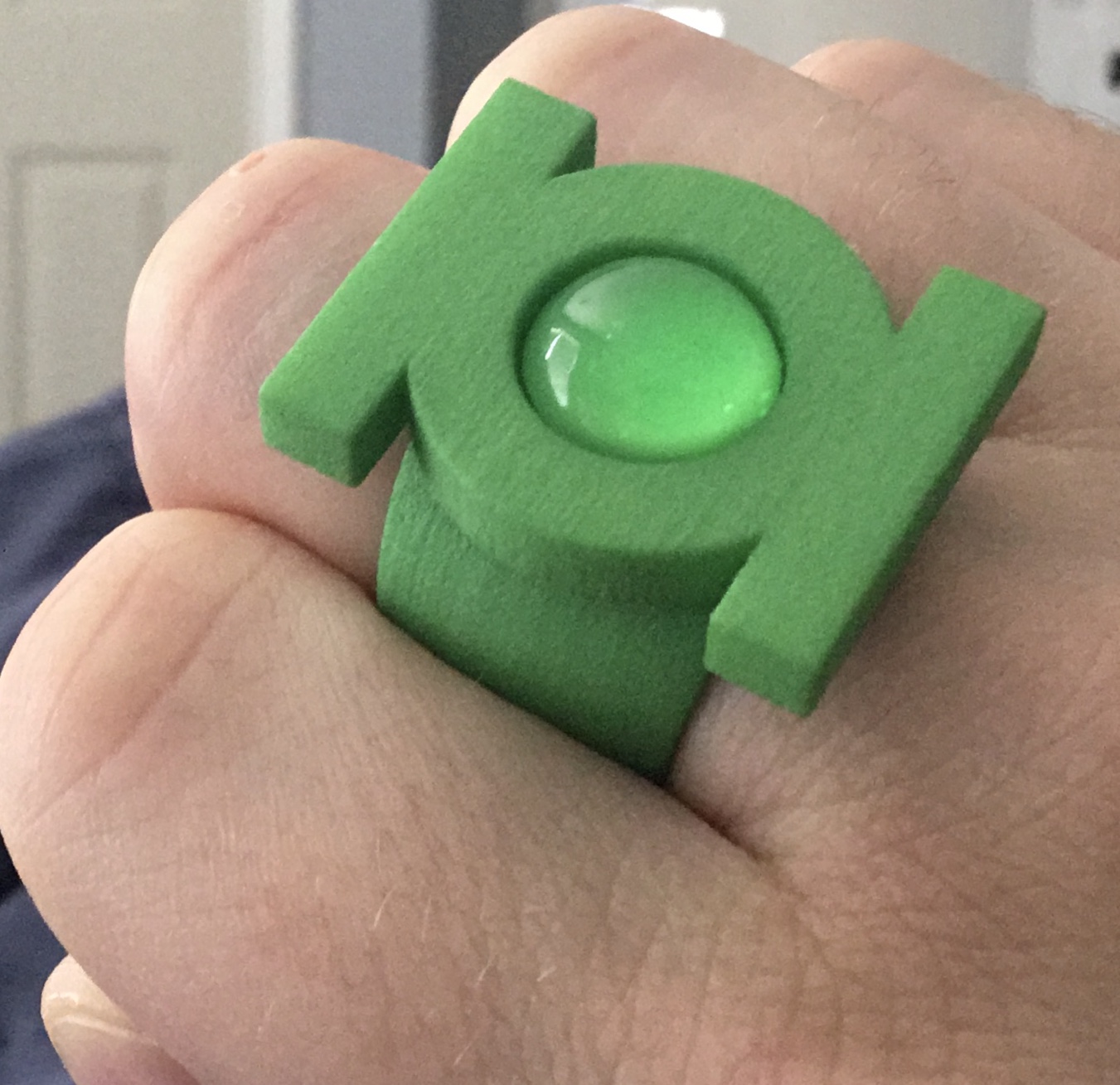
V3:
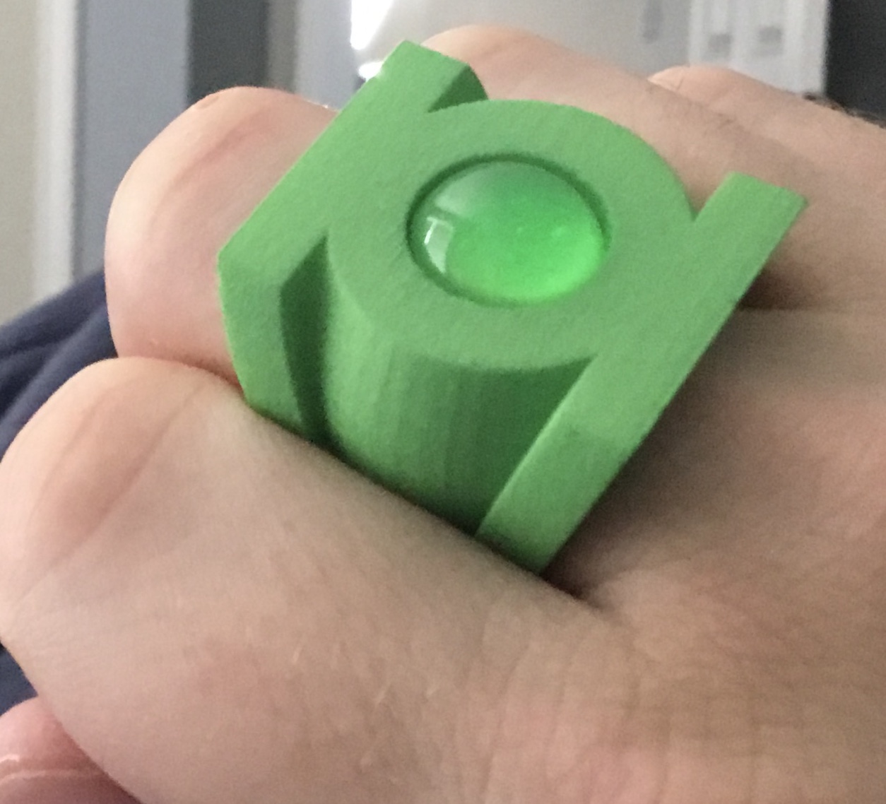
EMERALD DAWN:
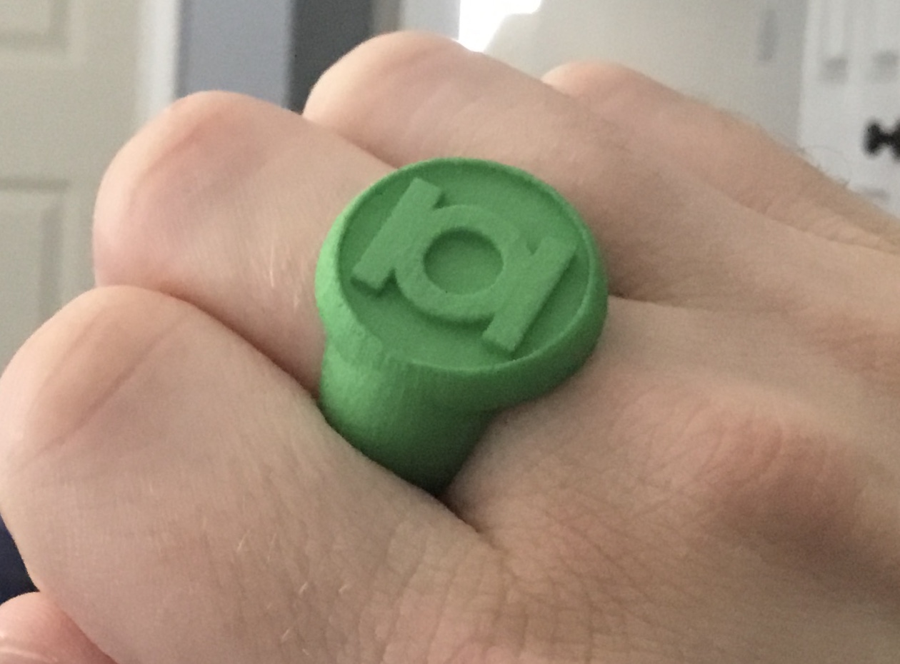
Modern:
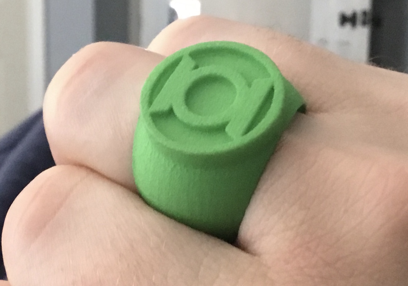
The early Gil Kane and Sinestro designs need a few tweaks. The EMERALD DAWN design is just about right, now. The finger-hole needs a slight reduction in size, because the ring fits a bit too loose. The Darryl Banks ring could maybe use a bigger symbol-disc. The modern/EVS-style ring is virtually perfect, but for the inaccurate GL symbol (which, as noted upthread, I’d noticed and revised just after ordering this latest print).
Tweak, tweak, tweak.
Here are a few photos.
V1 (sphere-band):
V2:
V3:
EMERALD DAWN:
Modern:
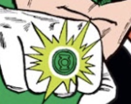
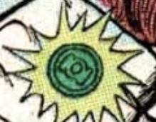
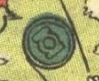
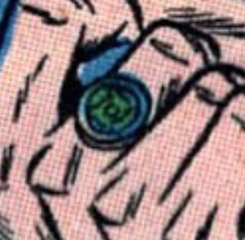
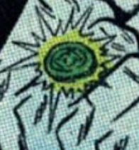
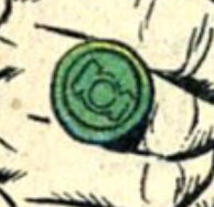
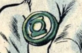
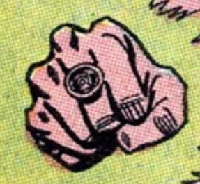
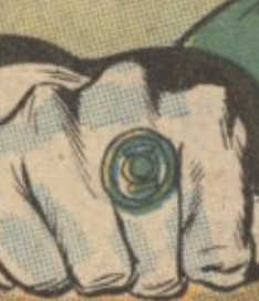
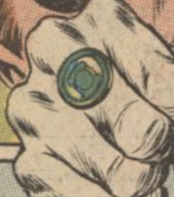
Tinkering. Slimming down the band on the V2 and working out the size/proportions of the V1. Finding that perfect symbol- disc diameter is tricky. As noted, the source material varies quite a bit. Looks to me like Kane generally went with a bigger disc. 25.5mm may well be the magic number. 24mm actually looks quite nice, but the band peeks out from behind the disc when viewed head-on (because it’s wider) which doesn’t look as good, and doesn’t match the comic art.
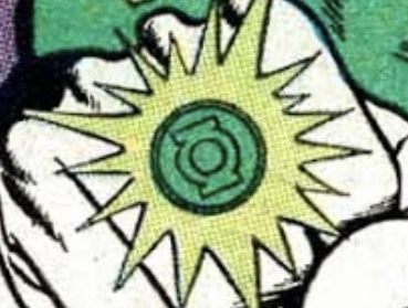
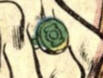
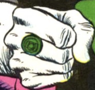
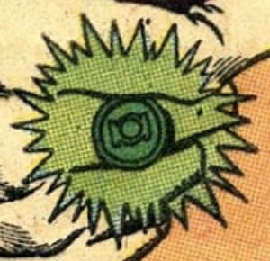
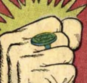
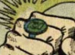
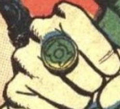
Last edited:
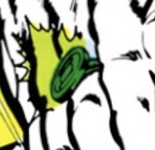
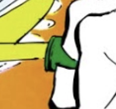
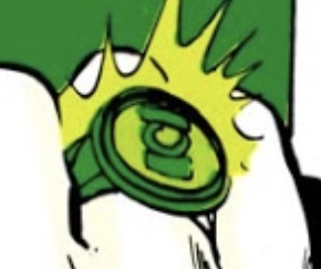
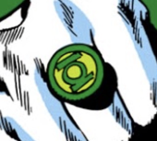
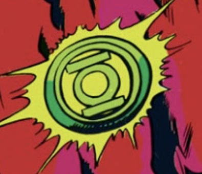
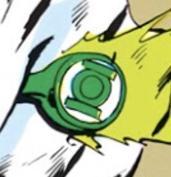
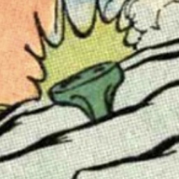
Continuing work on a Neal Adams-style ring. This is a tricky one to pin down, since it varies pretty notably from issue to issue. Initially, it starts (in GREEN LANTERN/GREEN ARROW # 76) as essentially the standard V1, albeit with the “separate sidebars” version of the GL symbol. As the run continues, it turns into something more closely resembling the Mark Bright/EMERALD DAWN ring, with a thin band blending into a symbol-bowl. Toward the end of the run, it more closely resembles a proper signet ring (but still with a thin band that flares out into the symbol-bowl), and that signet-style tends to pop up in Adams’ later professional comic art, as well as sketches and customer commissions. And, as noted upthread, Adams’ version of the GL symbol was also often in flux. Currently, he seems to favor a version with curved sidebars which hug the edge of the circle that the symbol sits within.
For this model, I went with the signet ring design and the “separate sidebars” version of the standard symbol.
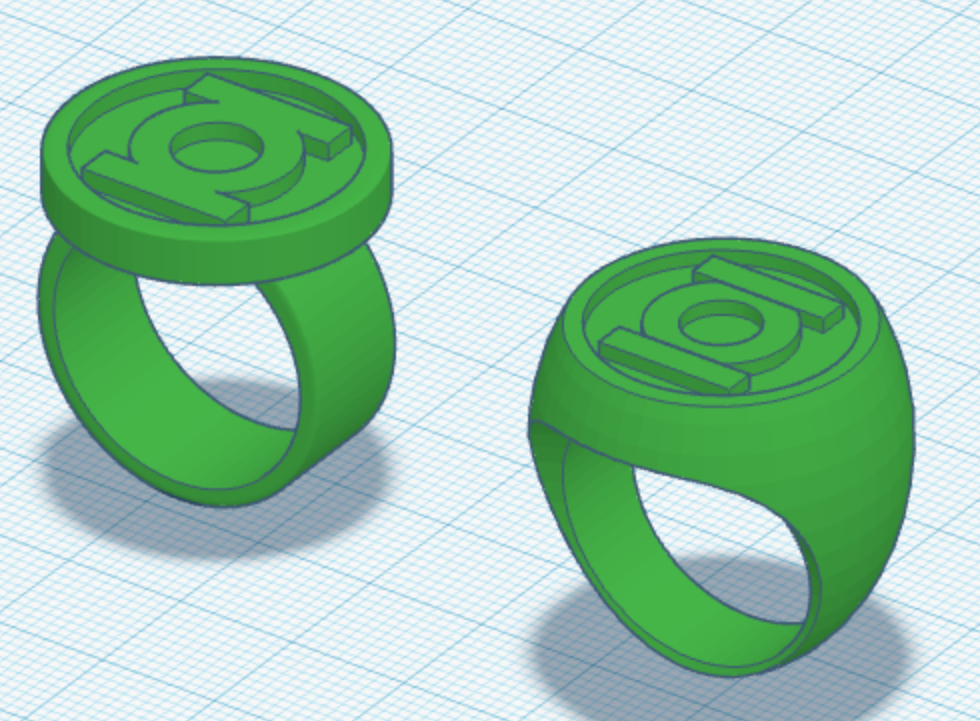
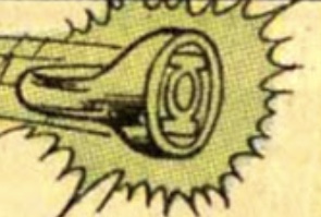
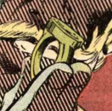
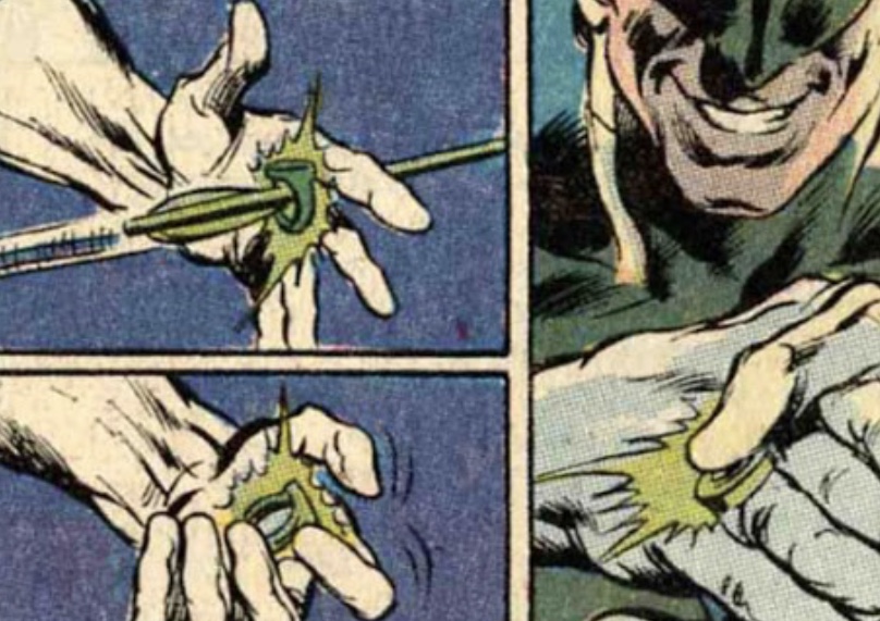
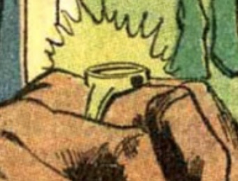
For this model, I went with the signet ring design and the “separate sidebars” version of the standard symbol.
