Cute Little Enterprise (TOS)

Coll - will keep that in mind...

Would like to see your builds.


Here are a few:


I’ve built almost all of the TOS Constitutions (with only the Excalibur, Mirror Universe Enterprise, and production version Enterprise left to go), along with several of the Franz Joseph ships, a TOS-style Reliant, and an Endeavour class ship that’s currently in progress. I’m also currently reconditioning my PHASE II Enterprise, and keeping the color scheme in the same ballpark as the TOS ships.


So, yeah, I’ve bought and built this kit and/or used it for kitbashing no less than 15 times, with a few more currently in progress. Each model has provided valuable experience and room to experiment, and I’ve also been working on 3D modeling more accurate inner nacelle domes, with the tapered fan-blades and (simulated) Christmas tree lights inside the dome.

By far the biggest headaches with the kit are that massive seam along the secondary hull spine, and the tight tolerance of the outer nacelle domes. I’ve also developed a number of techniques to add or modify details for more accuracy, although the base kit is already excellent. Prior to the release of the 1/350 kit (which is what all of my builds are preparation for), the 1/1000 kit was absolutely the best and most accurate kit of the Enterprise out there. With a little elbow grease, you can make the kit even more accurate, and proper paint and weathering really help to make it look like it’s a larger scale than it actually is.

You’re doing well, so far. Have fun with it! Like I said, I find Flat Gull Gray to work well at this scale (it looks greener in some lighting conditions, grayer in others, which is just about right), but it’s probably not worth too much stress at this scale. You just have to get the basic (“Does it look right from a few feet away?”) effect correct. I find that pastel chalk weathering really helps with both that and the scale effect. It can also help with the overall color scheme. My builds vary from a little more green to a little more gray thanks to deliberate variations in pastel weathering. Pencil and chalks also work well at simulating the saucer gridlines, if so desired.
 
As I said in your private message to me, there are no correct Rattle Can color for the TOS Enterprise. You have to mix and air brush. Sorry, I exhausted ANY and all possibilities. That's if you want it to reflect the 11' Filming miniature...as close as possible! To me(and milage may vary for others), That's the fun. I used an extensive amount of reference material I have collected over the years as well as information gleaned from Gary Kerr.
Here is an example...The original before ANY "restorations"and my personal build. I will be doing comprehensive build video on YOUTUBE once I have the time.

The Pilot versions are a different animal all together...two examples of mine... First Pilot and Second Pilot...

ndoWvj.jpg

f4cI7N.jpg


exFFqj.jpg


x3ofKl.jpg


AND the lighting affects the color...as evidenced by this shot on my Table in front of a Blue screen.

4izkrx.jpg


You have to adjust your painting to reflect scale. This isn't the 11' miniature. Best of luck. I'll go through my painting notes and find my formulas if interested.Gary Kerr has already given us the best info on the ship(Google Gary Kerr Enterprise).
 
Last edited:
Always a joy seeing your builds...

Another pisser is that I tried to find the Krylon Clear Amber, but seems that is pretty much no longer available.


For the hull color, as mentioned, I'm using this site:


Have narrowed down 109 candidates, and will trim further...


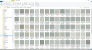
Here's a glimpse at the results (and a hint at the process).

Bear in mind that in scrolling through 116 pages of 40 samples per page, each of this looked within the ballpark, though seeing them all together in Windows Explorer makes it much easier to chip away at the batch.

Picture2.jpg
 
Always a joy seeing your builds...

Another pisser is that I tried to find the Krylon Clear Amber, but seems that is pretty much no longer available.


For the hull color, as mentioned, I'm using this site:


Have narrowed down 109 candidates, and will trim further...


Here's a glimpse at the results (and a hint at the process).

Bear in mind that in scrolling through 116 pages of 40 samples per page, each of this looked within the ballpark, though seeing them all together in Windows Explorer makes it much easier to chip away at the batch.

View attachment 1545692
BEST OF LUCK! And as I already told you...HAVE FUN!
 
Always a joy seeing your builds...

Another pisser is that I tried to find the Krylon Clear Amber, but seems that is pretty much no longer available.


For the hull color, as mentioned, I'm using this site:


Have narrowed down 109 candidates, and will trim further...


Here's a glimpse at the results (and a hint at the process).

Bear in mind that in scrolling through 116 pages of 40 samples per page, each of this looked within the ballpark, though seeing them all together in Windows Explorer makes it much easier to chip away at the batch.

View attachment 1545692


I find Tamiya clear orange (with clear stoplight red inner domes) to work perfectly well at 1/1000 scale. At that scale, the overall effect succeeds without one having to obsess over exact color matches. Flat gull gray for the hull, a slightly lightened gunship gray for the trim colors, a blue-green for the dorsal stripe, and so on.

The 1/350 kit would be less forgiving, so I'll be more discerning when I get around to choosing colors for it.

I was going to go clear orange on the inner domes then red and green dots; outer domes would be a combo of clear red and clear orange.

But...

Your way is easier and quicker.

Did (do) you add the "stripes" inside the domes for 1:1000 builds? If so, do you apply them to the outside of the inner domes, or the INside of the OUTER domes...?


I’ve done it a number of ways, over the years. Tiny strips of black or silver tape laid over the raised ribs of the inner domes, and/or dry brushing of the ribs.

Trying to paint or add tape to the insides of the outer domes would be a fool’s errand. That space is just too small to get good, precise, results. Using the kit’s ribbed inner dome parts works just fine (although, as noted, I’m working on making my own), and also helps give a sense of depth, since there’s a bit of a gap between the inside of the outer domes and the inner domes, just like the real model.


Looks good! Remember, the scale effect is all you need. Being sharp and clean and detailed is a bonus if you really want to get up close to the model, but it really only needs to pass the three-foot-away test. You can get away with an effect rather than actual superdetailing.

…although I say that despite my always striving to superdetail these things!


Here are the greys I have it narrowed to (from 109 selections):

Picture3.jpg
 

Attachments

  • Picture2.jpg
    Picture2.jpg
    151 KB · Views: 43
Just be careful trying to match colors via compute screens etc...That's why I said Google Gary Kerr Enterprise. The word expert gets thrown around a lot, but in his case, Gary knows what he's talking about. Again, best of luck and have Fun...that's ultimately what it's all about!
 
Just be careful trying to match colors via compute screens etc...That's why I said Google Gary Kerr Enterprise. The word expert gets thrown around a lot, but in his case, Gary knows what he's talking about. Again, best of luck and have Fun...that's ultimately what it's all about!

Totally agree... Part of the process for the on-line matching was comparing the color chips to the image of the original.

I have a two monitor setup, and made sure all images were on the same monitor.


Regardless, if I go this route, I'm taking a $40.00 gamble. But in the end, $40.00 isn't that much...
 
Here's an irritant - the entire bridge is cast in clear (not the dome only), and the separation line between the bridge wall and the dome is not clear.

Masking off the dome will be a bitch.

IMG_4782.JPG
 
Here is a video I shot in my work area/ storage of my 1:350 to help illustrate how the color shifts and also what the Power domes/engines look like with the lights on. Hope it helps a little!


Your message may be considered spam for the following reasons:

If you wish to reply despite these issues, check the box below before replying.
Be aware that malicious compliance may result in more severe penalties.
Back
Top