-
Welcome to the Project Runs Forum!
This forum is intended for interest gauging and active runs. Due to the transient nature of this forum, please keep all research and ongoing discussion in one of our main forums so your information is not lost.
Only Premium Members can start a new run.
You are using an out of date browser. It may not display this or other websites correctly.
You should upgrade or use an alternative browser.
You should upgrade or use an alternative browser.
Unlimited Run Bookhouse Boys (Twin Peaks) embroidered patch
- Thread starter Patattack
- Start date
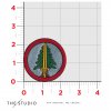
So, they've sent me another photo, this one evidently taken without flash. First photo on the left, new photo on the right.

I was hoping for a variety of photos from additional angles or with different selections of lighting...this one just seems dimly-lit. However, even though it's not ideal, I think it might still confirm that the yellow thread needs to be tinted slightly more orange. Would you agree, or do you think I should ask for yet another additional reference photo before requesting a new sample?
For reference, here are the colors that we've looked at previously:
SquidMan
Sr Member
However, even though it's not ideal, I think it might still confirm that the yellow thread needs to be tinted slightly more orange. Would you agree, or do you think I should ask for yet another additional reference photo before requesting a new sample?
I think it's safe to assume from those two photos that the sword thread should be just a slight hint more orange. What I would do is find out the Pantone # of the yellow they used and split the difference between that color and the Pantone orange you originally requested. The middle ground would hopefully be just about perfect.
Cant wait to see the finished product!
In the order form in the "Where did you hear about this" is has McElroy FB Group(s)
Is that in reference to our good good brothers?
Oh you KNOW it's about those perfect boys! :lol McElroy Facebook has become kind of a crazy sprawling thing with all kinds of sub-groups where like-minded fans can enjoy various unrelated interests--including a David Lynch-themed group called "Fire Walk With (My Brother, My Brother, and) Me"
I think it's safe to assume from those two photos that the sword thread should be just a slight hint more orange. What I would do is find out the Pantone # of the yellow they used and split the difference between that color and the Pantone orange you originally requested. The middle ground would hopefully be just about perfect.
This seems like a reasonable assumption. It's still weird to me though, since the Pantone they suggested in the revised-color mockup looks way more orange than the thread they've used. Unfortunately, their system for revising or accepting mockups/samples doesn't lend itself well to actual conversation, otherwise I'd just be asking questions all the time...technically, you need to "reject" the sample if you want to send a message or feedback or question regarding the latest version. I might just try getting in touch with a customer service rep instead, see if that's a little easier to pin down this whole thread color issue.
SquidMan
Sr Member
This seems like a reasonable assumption. It's still weird to me though, since the Pantone they suggested in the revised-color mockup looks way more orange than the thread they've used. Unfortunately, their system for revising or accepting mockups/samples doesn't lend itself well to actual conversation, otherwise I'd just be asking questions all the time...technically, you need to "reject" the sample if you want to send a message or feedback or question regarding the latest version. I might just try getting in touch with a customer service rep instead, see if that's a little easier to pin down this whole thread color issue.
Yeah, I realize this whole thing is taking shots in the dark and waiting to hear back if you hit the target, haha. But it's super close now! I think the sweet spot in between the two Pantone colors is the way to go. Would reaching out to customer service have a different result from rejecting this sample and requesting the new Pantone color?
Yeah, I realize this whole thing is taking shots in the dark and waiting to hear back if you hit the target, haha. But it's super close now! I think the sweet spot in between the two Pantone colors is the way to go. Would reaching out to customer service have a different result from rejecting this sample and requesting the new Pantone color?
I'm just hoping it'll be more straightforward to explain the situation and ask "can you send me a range of Pantone options to choose from, so that I can request the right one from the feedback form?" rather than rejecting this sample outright and saying "we need it somewhere in the middle" and hoping they nail it....we'll see.
SquidMan
Sr Member
I'm just hoping it'll be more straightforward to explain the situation and ask "can you send me a range of Pantone options to choose from, so that I can request the right one from the feedback form?" rather than rejecting this sample outright and saying "we need it somewhere in the middle" and hoping they nail it....we'll see.
Makes sense. But like you said, the Pantone colors as swatches look different from the thread color in the samples, so how helpful would seeing a range of swatches actually be?
But whatever works best!
Here are the thread samples that the vendor sent me:


I asked for sample photos of their range of "yellow and orange threads"--I think it goes without saying that the red-orange range in the third and fourth images are not what we're looking for. I'll want to review these images on my photographer GF's color-calibrated monitor, but right now I would lean towards T 2834-2835 or S 8537.
Any thoughts?
SquidMan
Sr Member
View attachment 821395View attachment 821396
I asked for sample photos of their range of "yellow and orange threads"--I think it goes without saying that the red-orange range in the third and fourth images are not what we're looking for. I'll want to review these images on my photographer GF's color-calibrated monitor, but right now I would lean towards T 2834-2835 or S 8537.
Any thoughts?
It's very difficult to tell because the ends of these samples are frayed and that creates shadows all over them, but I agree that the ones you mentioned look closest. T 2834 and T 2835 might be a tad too brown so maybe S 8537 is the best choice? Looking forward to hearing your thoughts after you check again on a color-calibrated monitor.
It's very difficult to tell because the ends of these samples are frayed and that creates shadows all over them, but I agree that the ones you mentioned look closest. T 2834 and T 2835 might be a tad too brown so maybe S 8537 is the best choice? Looking forward to hearing your thoughts after you check again on a color-calibrated monitor.
See, I actually think the loose threads are crucial here, because it allows you to see a fuller range of colors that each thread might appear as, depending on whether it's in direct light, or indirect light, or from a different angle.
SquidMan
Sr Member
See, I actually think the loose threads are crucial here, because it allows you to see a fuller range of colors that each thread might appear as, depending on whether it's in direct light, or indirect light, or from a different angle.
Aah, very good point. Now that I'm comparing the light and dark points of the threads, S 8537 might be slightly too light/not orangey enough? It's difficult to tell.
Any update on which thread color you chose, @Patattack?
After a lot of back-and-forth and asking folks their opinions, I actually ended up suggesting 2833 - on the basis that 2834 and 2835 were, as you say, a little too dark (skewing towards brown) while 8537 was just a touch too desaturated (i.e., it reads almost like a tan with a yellow tint). But in addition to the thread choice, I did describe how we're looking for something between the two samples--and I provided 8537 as a secondary option, in case I've misjudged the photos and 2833 is not in the middle between the yellow thread in Sample 1 and Sample 2.
Fingers crossed.
SquidMan
Sr Member
After a lot of back-and-forth and asking folks their opinions, I actually ended up suggesting 2833 - on the basis that 2834 and 2835 were, as you say, a little too dark (skewing towards brown) while 8537 was just a touch too desaturated (i.e., it reads almost like a tan with a yellow tint). But in addition to the thread choice, I did describe how we're looking for something between the two samples--and I provided 8537 as a secondary option, in case I've misjudged the photos and 2833 is not in the middle between the yellow thread in Sample 1 and Sample 2.
Fingers crossed.
Thank you for the thorough work! I think we're right on the cusp now.
I also mentioned straightening the horizontal lines in the grip, and suggested that the right side of the tip of the sword could be a bit more angled outward, but acknowledged that they might not have that level of fine control over details at such a small scale.
The vendor confirmed that my design tweak requests (re: the grip lines and the sword point) are such small-scale details that they can't really refine it any further than they already have; design elements that small will always have some minor divergence from the original artwork, and each patch will have its own subtle differences as well. Which is hard to hear, but understandable for a product that isn't going to be handmade one-by-one.
In either case, here's a new sample photo they sent, compared to the last sample:


Am I crazy, or does this look like the same thread color as the previous sample? Perhaps there was a misunderstanding, and they only paid attention to the design feedback and ignored the color feedback...
In either case, here's a new sample photo they sent, compared to the last sample:
Am I crazy, or does this look like the same thread color as the previous sample? Perhaps there was a misunderstanding, and they only paid attention to the design feedback and ignored the color feedback...
Attachments
Similar threads
- Replies
- 6
- Views
- 917
- Replies
- 46
- Views
- 4,078
- Replies
- 64
- Views
- 7,098
- Replies
- 3
- Views
- 2,145