Blade Runner Prop Replicas

<div class='quotetop'>(phase pistol @ Aug 30 2006, 11:29 PM) [snapback]1309829[/snapback]</div>
Who reads Japanese? :D[/b]
:love

<div class='quotetop'>(AnsonJames @ Aug 30 2006, 05:06 PM) [snapback]1309706[/snapback]</div>
DSC05781IDback.jpg
[/b]

The four lines of Japanese on the back of the ID card, Romanized, reading from top to bottom:

Touyou Bijutsu Gakkou 3505B. Chiyoda
Nippon Kougakuin Senmon Gakkou Geijutsu Katei
Nippon Desain Senmon Gakkou Senmon Gaku
Toukyou Shasshin

Translated into English:

Toyo Institute of Art and Design 3505B. Chiyoda [place name]
Nippon Engineering College Art Program
Nippon Design College Vocational Studies
Tokyo Photograph

And, just for fun, links to the homepages of the first three schools above:

Toyo Institute of Art and Design
Nippon Engineering College
Nippon Design College

The fourth name, “Tokyo Photograph,” proved to be too ambiguous to get a definitive hit.


Knowing what the back of the card says sorta takes the charm out of it, don't it? :p
 
Last edited by a moderator:
:lol

Awesome. Thanks.

Tho you have to love how they put the section number "3505 B" in there anyway to make it at least appear to have the same meaning. :D

- k
 
<div class='quotetop'>(phase pistol @ Aug 30 2006, 10:57 AM) [snapback]1309859[/snapback]</div>
Which brings me to another issue: the "8" in a diamond. There's no way to make it yellow/orange like that. So perhaps they used amberlith on the "8", and rubylith for the "X". [/b]

Using amber or rubylith requires you to "cut" the design out. The only reason specifically to use the lith material is because it's transparent (or it's normal use, the creation of transparent masks for color plates in offset printing). Otherwise, you could cut the design from any kind of colored paper, vinyl etc. if you are doing it via cut/paste. I don't see the orange tri-8 as being transparent, so it would be my guess that it's not amberlith.

Also, I'm voting amberlith on the X. When it's up against white, the color is it's natural orangish hue. When the transparent color is against black (or whatever the base color of the background is) it appears darker - more reddish. This to me represents the way amberlith would normally look under those situations as I remember it. I tried to find some of our old stock stashed away here today, but came up empty. :(
 
<div class='quotetop'>(SFPROPS @ Aug 30 2006, 11:53 AM) [snapback]1309907[/snapback]</div>
I don't see the orange tri-8 as being transparent, so it would be my guess that it's not amberlith.
[/b]

What I mean is, you could easily cut a diamond-shape out of amberlth and cover the whole "8" thing pretty easily.

From MEMORY of my own experiences with amber and ruby lith, it seems like that's what they did here. The "X" doesn't read as red as it really is in person. It seems lighter in the pix but I could believe that it was actually rubylith.

Also there were different brands that had different densities, it wasn't like bluescreen material where it has to be exactly precisely one particular shade of blue. The amberlith/rubylith was just used to "black in" large areas, since the black-and-white copy camera sees red as black. The amberlith is easier to see though but it too photographs as black.

- k
 
I am thinking that the lined area above the photo is an old RF antenna grid, probably applied on the card. Back in that era they used non-powered rf grids for tracking, inventory and even preventing theft of such things as library books (they would put the rf antenna sticker in the spine of the book or under the dewey decimal label) and they would be that size. So...perhaps the lines are actually a printed circuit sticker. Just my 2 cents on that.

Looking at the ID card, is it possible it was laminated and then re-laminated (2 layers)? Also, does the photo of the man with the funny wig look as if it is placed on top of another photo? I don't think it is on top of an area marked on the card for photo placement because whatever is under the picture is irregular in shape.

Whoever did the back of the card needed to check a dictionary. :$

Great find.
 
<div class='quotetop'>(phase pistol @ Aug 30 2006, 12:00 PM) [snapback]1309913[/snapback]</div>
<div class='quotetop'>(SFPROPS @ Aug 30 2006, 11:53 AM) [snapback]1309907[/snapback]
I don't see the orange tri-8 as being transparent, so it would be my guess that it's not amberlith.
[/b]

What I mean is, you could easily cut a diamond-shape out of amberlth and cover the whole "8" thing pretty easily.[/b][/quote]

True, but I'm not sure it would look to be a color anywhere near as opaque an orange as it does in the photographs...but (see below).

<div class='quotetop'></div>
The "X" doesn't read as red as it really is in person. It seems lighter in the pix but I could believe that it was actually rubylith.[/b]

...I'd trust your eye in front of the real deal much more than my own eye looking at a photo, FWIW.
 
<div class='quotetop'>(AnsonJames @ Aug 30 2006, 01:06 AM) [snapback]1309706[/snapback]</div>
So who's going to do the back of the I.D. then?
I think there should definately be a space in the numbering as suggested too - as in;
B 260~354


Notice how the word 'code' is misspelled - penal coed sounds like a porno film...
[/b]

Two things, the ID card has a "J" in the number, the officer is Jacobson. Could it be POSSIBLE (long shot, I know) that it was D 26354 and not B? Does anyone have a copy of the script who can check the dialog? I know there has been some debate as to a 0 (zero) in Deckard's number when Ford says it (so, could he have also said D and not B?), and I'm just guessing that maybe they included your initial in your serial #.

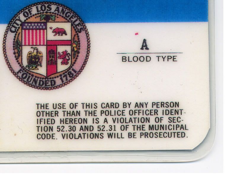
Also, here is the admonition from the back of a current, real LAPD ID card:

LAPDadmonition.jpg


Regarding the Japanese text on the back.

"Toyo Institute of Art and Design 3505B. Chiyoda [place name]
Nippon Engineering College Art Program
Nippon Design College Vocational Studies
Tokyo Photograph"


Could it be that the card was designed by one of the art organizations shown?
 
<div class='quotetop'>(eltee @ Aug 31 2006, 01:35 AM) [snapback]1309942[/snapback]</div>
Does anyone have a copy of the script who can check the dialog? I know there has been some debate as to a 0 (zero) in Deckard's number when Ford says it (so, could he have also said D and not B?), and I'm just guessing that maybe they included your initial in your serial #.[/b]
This is a good thought.

I don't have the script handy, but I did check the DVD.

Just after he retires Zhora, Deckard flashes his ID to a Patrolman and identifies himself as "B Two Sixty-Three Fifty-Four." His lips touch each other as he pronounces the letter "B." The subtitles say "B," too.

Later, when Deckard is in his car and Bryant is telling him about the murders of Tyrell and Sebastian, a Police Spinner swoops down with the idea of arresting him. Deckard identifies himself to the pilot as "Blade Runner Two Sixty-Three Fifty-Four."

Could the "B" stand for "'Blade Runner"? If so, then might the "J" in the other officer's ID stand for something other than his initial?


<div class='quotetop'>(eltee @ Aug 31 2006, 01:35 AM) [snapback]1309942[/snapback]</div>
Could it be that the card was designed by one of the art organizations shown?[/b]
That was my first thought, too.

What do we know about the origin of this particular card?

Thanks for sharing the back of the authentic LAPD ID card. In the midst of all this discussion of prop police IDs, it's interesting to see the real thing.
 
My take on the Japanese....

Given that the guy who was responsible for the cards was an ART director, it would seem likely that he'd have various international art magazines, journals and design catalogs on hand. It's likely another "cut and paste" from a readily available source.
 
<div class='quotetop'>(SFPROPS @ Aug 30 2006, 10:09 AM) [snapback]1309976[/snapback]</div>
My take on the Japanese....

Given that the guy who was responsible for the cards was an ART director, it would seem likely that he'd have various international art magazines, journals and design catalogs on hand. It's likely another "cut and paste" from a readily available source.
[/b]

I agree, again we have to look at Southwell (I cant wait for John to talk about this) as the illustrator for the movie, he has influences from all around the world and it would make sense that he would have these things around the shop, around the office.

<div class='quotetop'>(spinner44.com @ Aug 30 2006, 06:49 AM) [snapback]1309800[/snapback]</div>
Regarding the red X. I have been in contact with Blade Runner production illustrator, Tom Southwell over the past few weeks. We discussed the Vid-Phon card and a little about the ID. He stated that the ID that he had created DID NOT have a red X. It was added later on after he sent it to Ridley. I didn't ask how it was appied but on would assume a transparent sheet film of some sort like Amberlith. He mentioned that the ID was laminated. I should also note that he stated there was no badge in the wallet unless it was added later. This is totally likely as the red X was added later.
[/b]

This ID that Karl photographed is a roadmap to the design and construction of the Deckard ID and preconceived notions of this replica regardless of a claim of providence may not be what we thought it was. Here we have the best example of a screen used ID that WE have ever seen. We know the general providence of this ID, so lets dissect it and see what can be applied to the Deckard ID.

-Bryan
 
I may be incorrect, but are there dots in the center of all the circles in this detail from the id?

detail1dp7.jpg

detail2zj1.jpg


Also, it does look like the pattern here was lifted or attached rather. You can see a slight edge on the right side of the pattern. Because of the glare it is hard to trace it all the way around.

detail3cx2.jpg


I am still amazed at this entire thing. I am also floored to see the back of the card as well.
 
I had an RF merchandise security tag in my wallet for months before figuring out what was setting off the store security alarms everywhere I went. Ugh...

However once I did pull it out it looked very similar in design to the grid seen on the ID.

This was a few years ago but the shape was pretty distinct.

Nick
 
Did they have RFID tags in 1981? I thought those were in use only starting a couple years ago. Even that foil thing they put in DVD cases only started maybe 10 years ago.

Both the "diamond thing" and the "round thing" looked to me to be integrated parts of the card, like they were designs that were printed, not something separate that was glued on. Only the photo looked pasted on.

- k
 
I made this so far.

If anyone know's the other 2 fonts, please let me know.

I think the main text font is RONDA but I can't find the right version. It's a Bauhaus style font.


BUDGEJPN.gif


FB
 
Your title font looks a lot better..

FB

edit--------------------

Oooops. I just re read that you hand drew the title. Looks better than the font version.
 
Yeah the rounded letters on the "real" prop makes it look way too casual and informal. The whole thing in fact looks kind of "mod" and not "official" at all.

It's an ID card for "swingin' seventies" cops. :lol

- k
 
It looks like everything is well in hand here and too many cooks you know. I was going to bother with the back of the card but it looks like my schedule is too busy and this is a bit too anal for me.

However if I find out more from Southwell, I will certainly share it. It all looks great.
 
This thread is more than 17 years old.

Your message may be considered spam for the following reasons:

  1. This thread hasn't been active in some time. A new post in this thread might not contribute constructively to this discussion after so long.
If you wish to reply despite these issues, check the box below before replying.
Be aware that malicious compliance may result in more severe penalties.
Back
Top