QuinnPrime
New Member
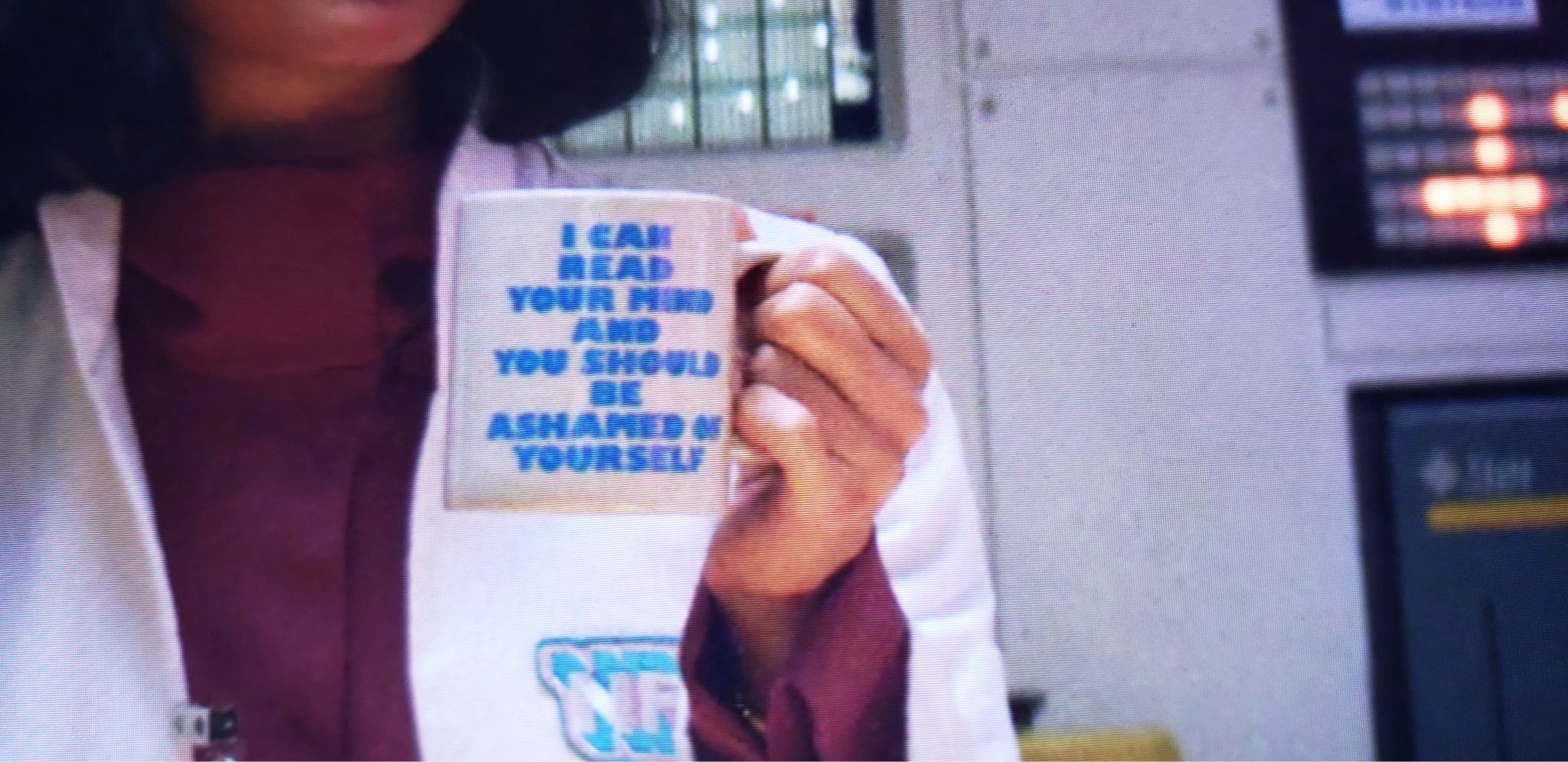
I searched pretty extensively here, and haven’t seen any results, so thought I would ask for help. I’m trying to identify the font used on Azumi’s mug in Netflix’s Maniac, that reads, “I can read your mind and you should be ashamed of yourself”. It’s not a complicated or particularly esoteric font, but no one has gotten it right, and possibly because it’s so simple, it’s difficult to identify exactly the right one. There’s some discussion of the mug on Reddit, and elsewhere online. Of course there are a couple of versions of the mug available on sites like etsy, but none of them is really screen accurate, and some of them are frankly terrible. As an aside, she’s also holding the mug in her left hand, and every single version one can buy has the text (in innacurate font) on the side facing out when held in the right hand.
A friend of mine suggested that the font is similar to Impact, but it’s similar to a lot of fonts. It isn’t Impact, because it’s slightly wider/flatter, the center point on the M doesn’t meet the bottom of the legs, and the right leg of the R is not curved. I believe it’s a monospace font.
Are there any typography gurus who can identify this elusive font? If I can’t track it down, or it turns out to be custom, I’ll just replicate it in Illustrator. But I would rather just have the true, actual font used for the design if I can find it. I realize this is an extreme attention to detail, bordering on absurd, but I want my mug to be as absolutely screen-accurate as humanly possible, haha!")
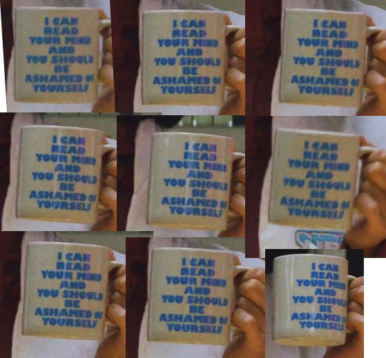
I took some screen-caps and did a very quick, very rough enhancement in photoshop to make it just a bit clearer. It’s so small on screen, that even at 1080p, a photo of my ipad screen ends up being higher resolution than an actual screen-cap, so I did that as well.
If anyone has any leads, please let me know!
Thanks!
A friend of mine suggested that the font is similar to Impact, but it’s similar to a lot of fonts. It isn’t Impact, because it’s slightly wider/flatter, the center point on the M doesn’t meet the bottom of the legs, and the right leg of the R is not curved. I believe it’s a monospace font.
Are there any typography gurus who can identify this elusive font? If I can’t track it down, or it turns out to be custom, I’ll just replicate it in Illustrator. But I would rather just have the true, actual font used for the design if I can find it. I realize this is an extreme attention to detail, bordering on absurd, but I want my mug to be as absolutely screen-accurate as humanly possible, haha!
I took some screen-caps and did a very quick, very rough enhancement in photoshop to make it just a bit clearer. It’s so small on screen, that even at 1080p, a photo of my ipad screen ends up being higher resolution than an actual screen-cap, so I did that as well.
If anyone has any leads, please let me know!
Thanks!