ataru72ita
Sr Member
Ok are You sure You're not rushing because someone asked for it do be delivered In UK on time for the new episode shooting start!???:rolleyes
What's that flashing?!
Ok are You sure You're not rushing because someone asked for it do be delivered In UK on time for the new episode shooting start!???:rolleyes
What's that flashing?!


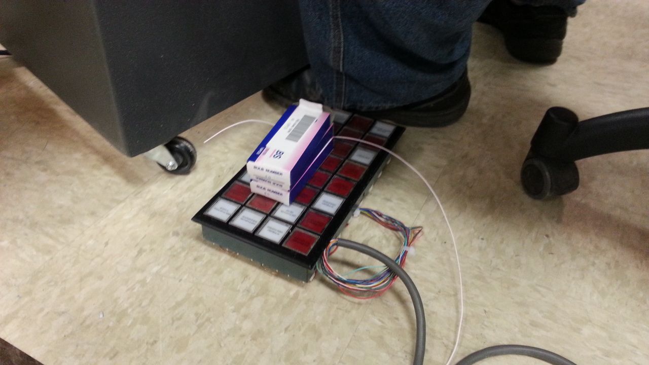

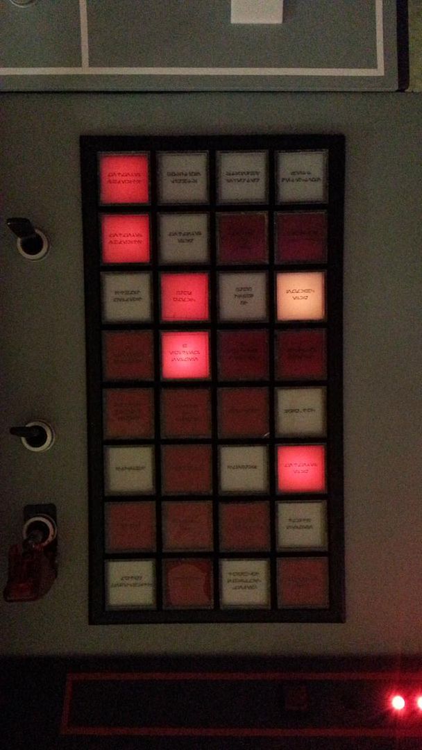

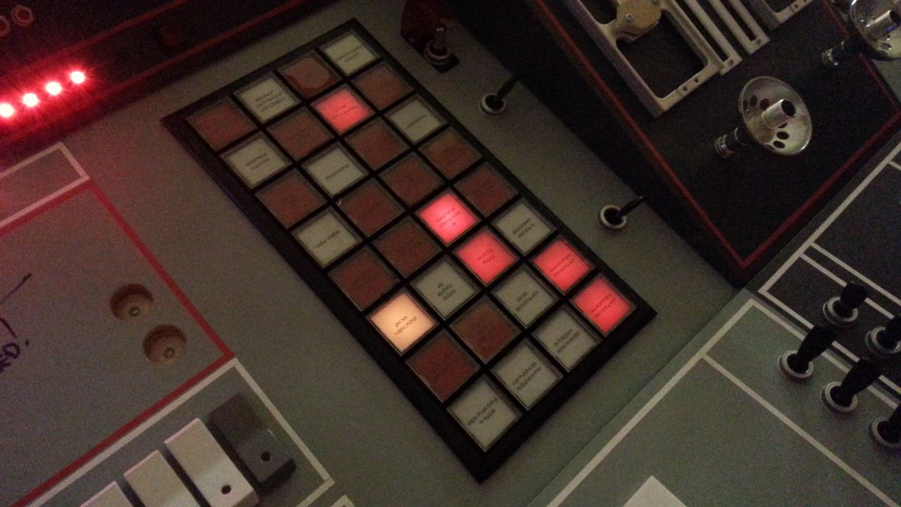

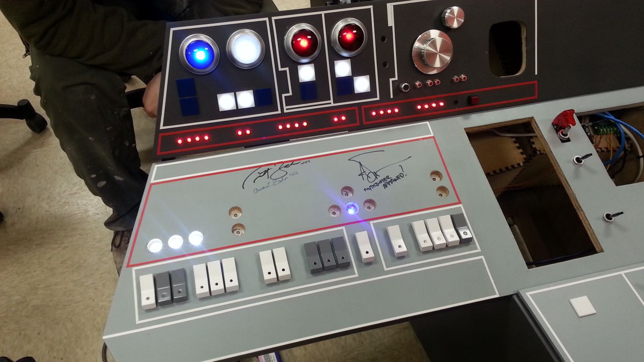
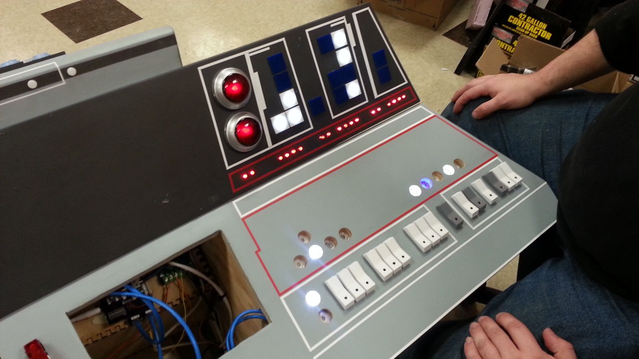

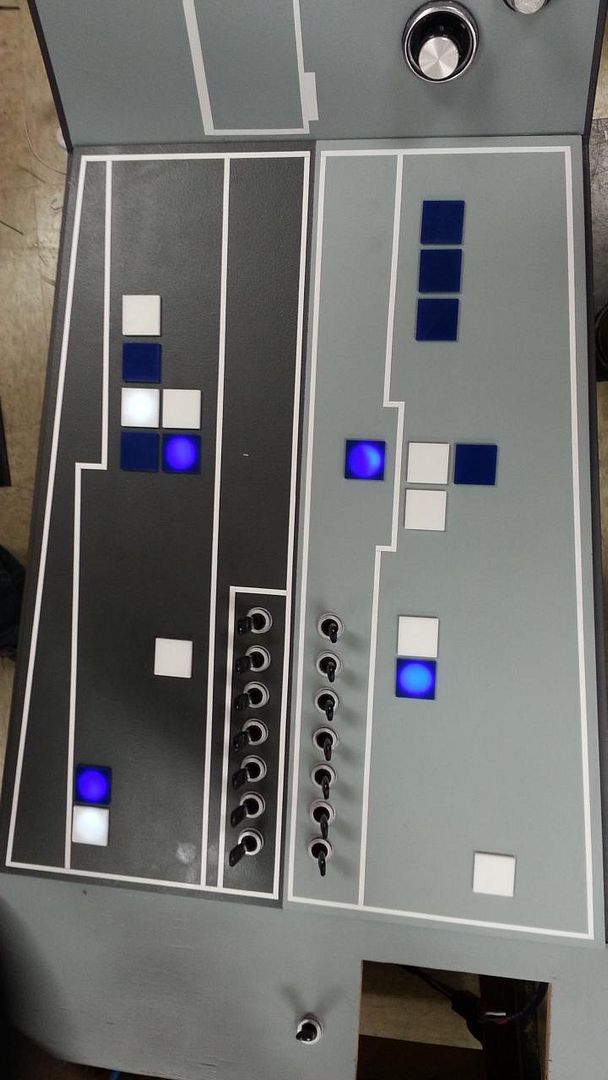
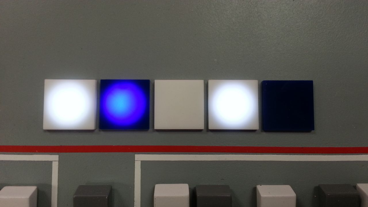
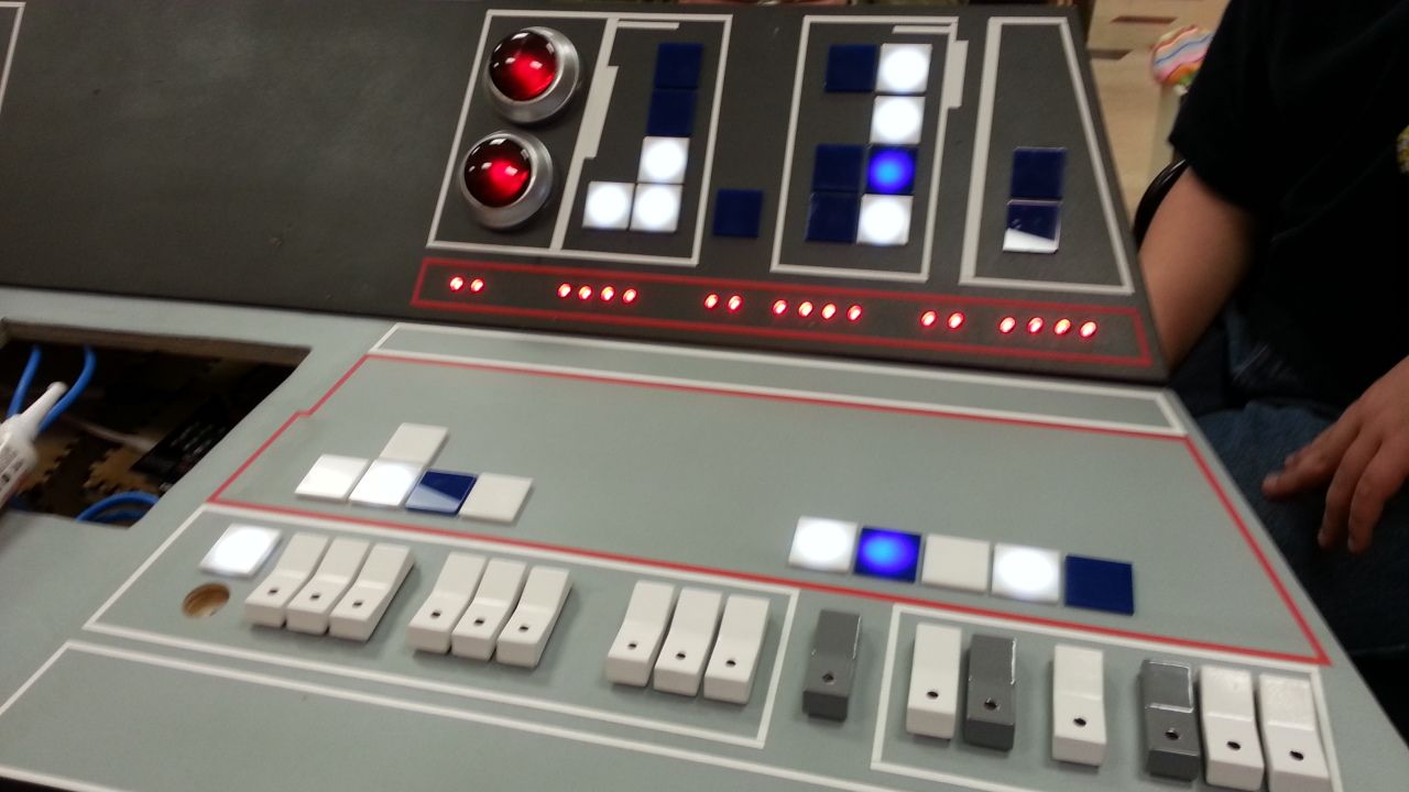
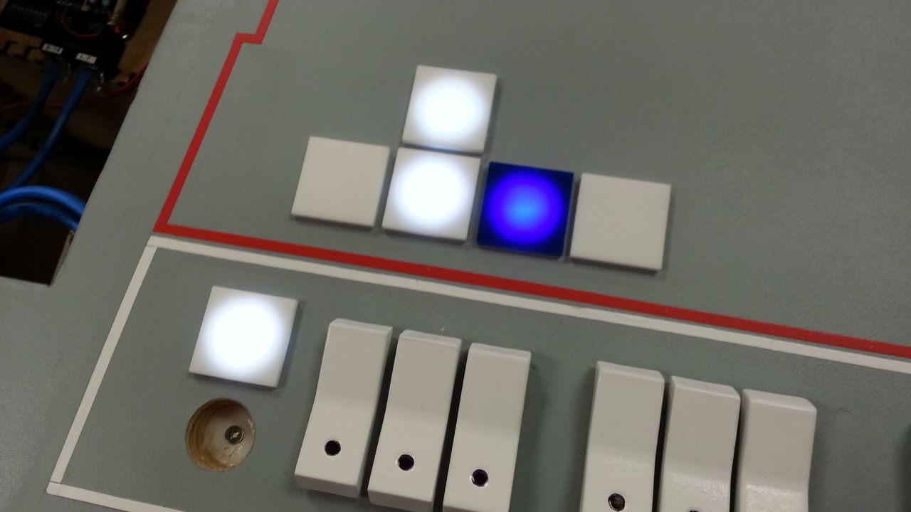

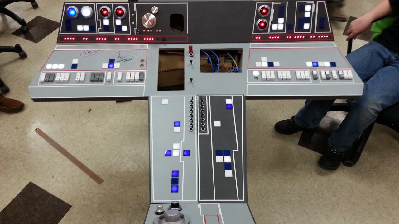

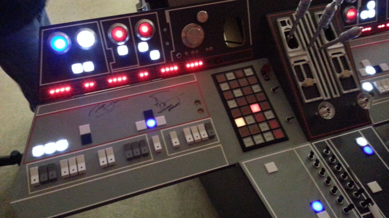
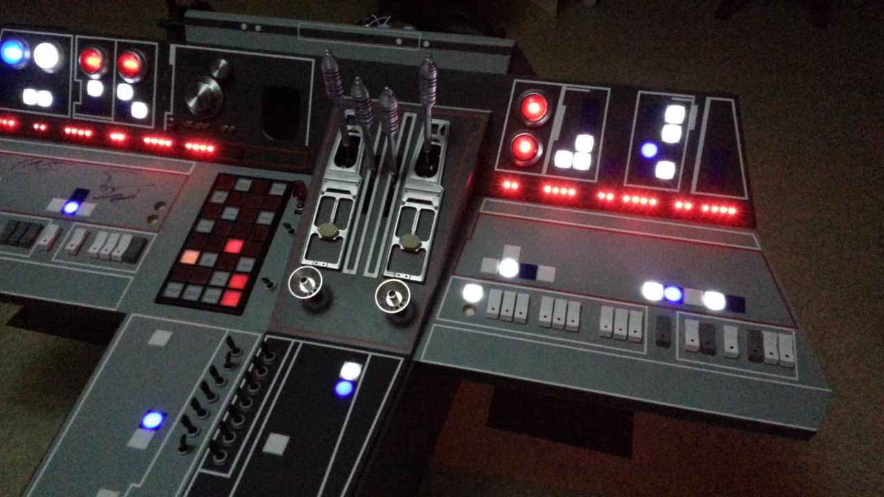

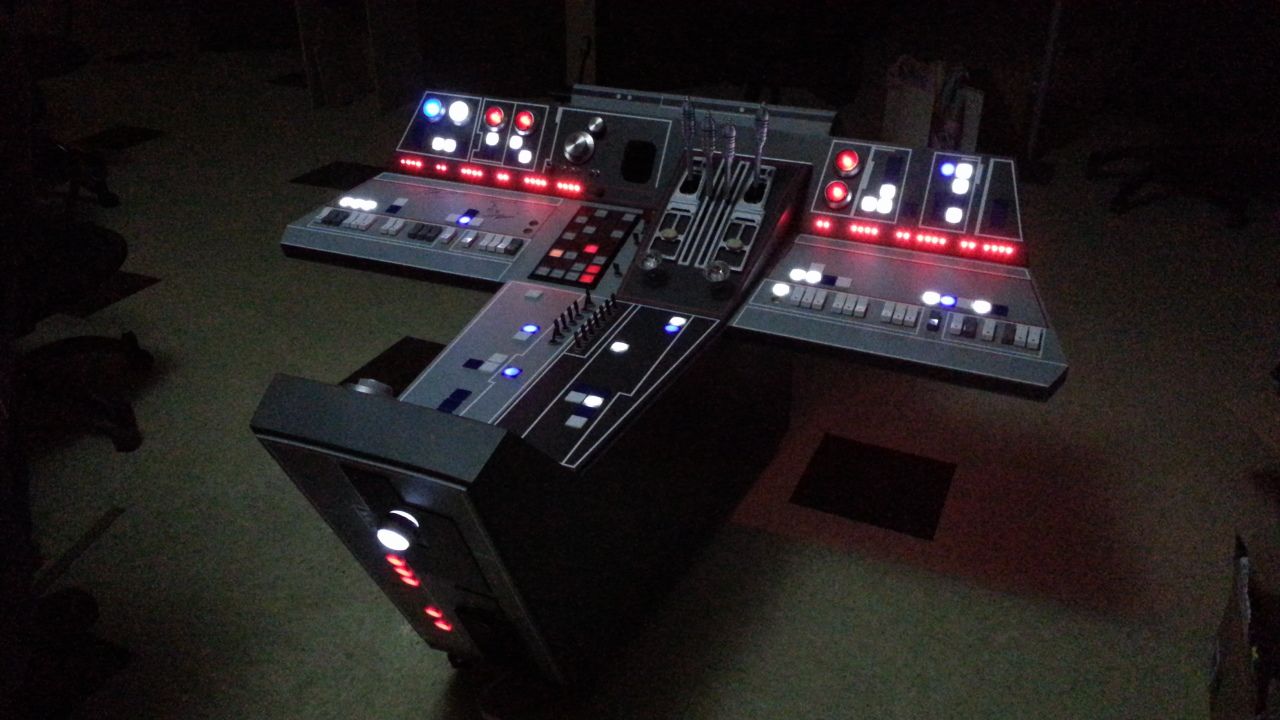

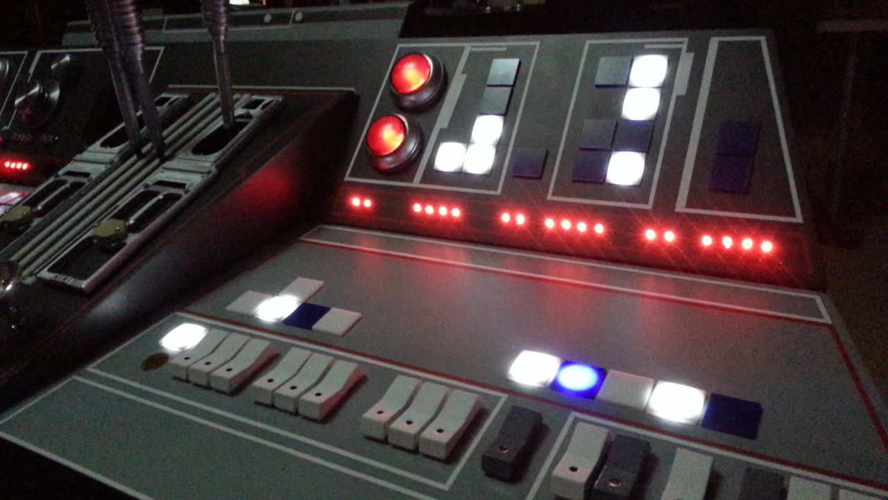
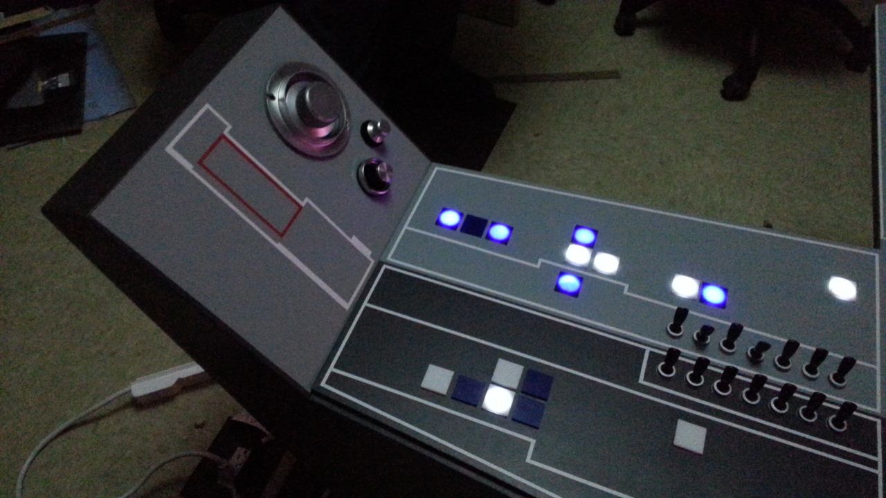
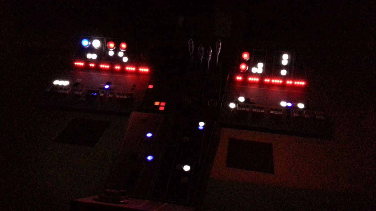
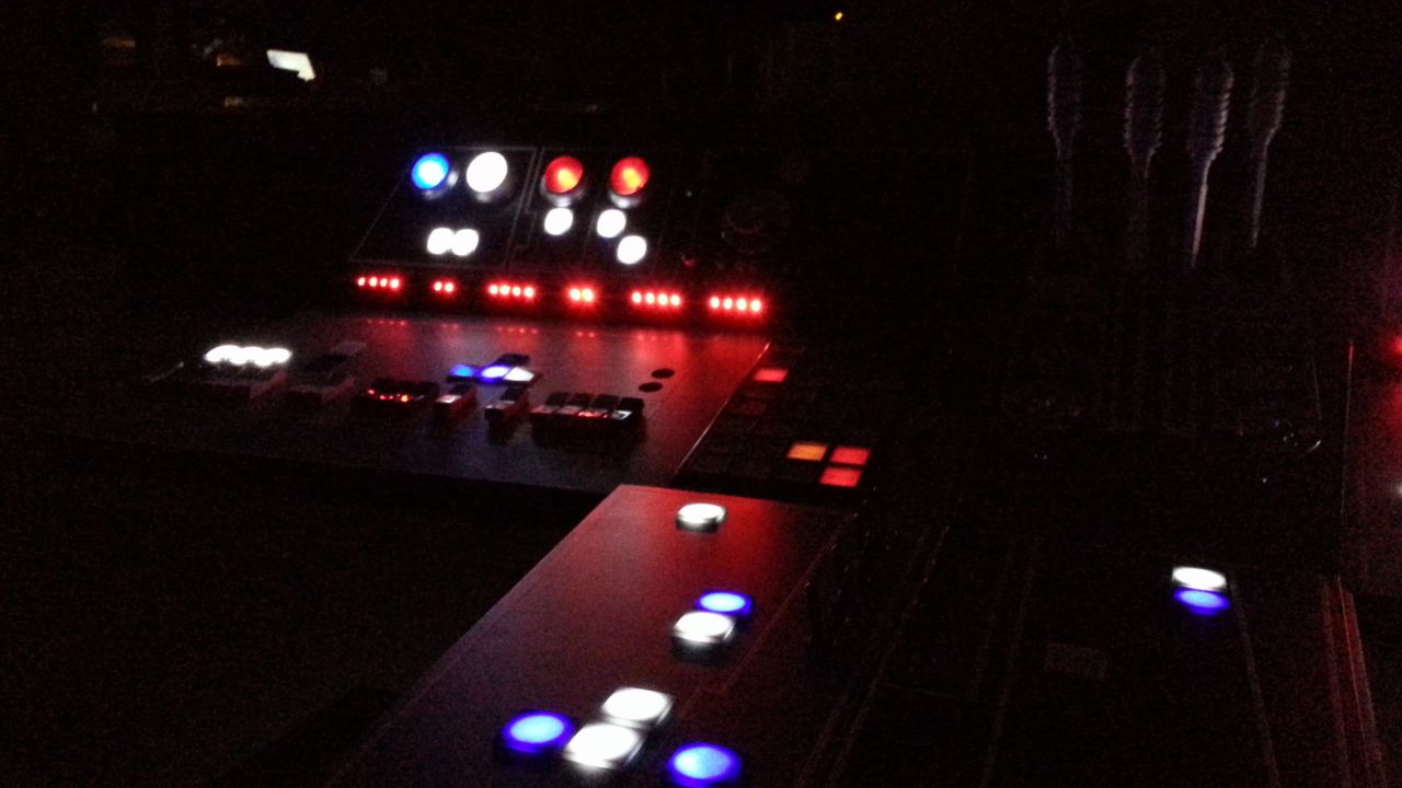
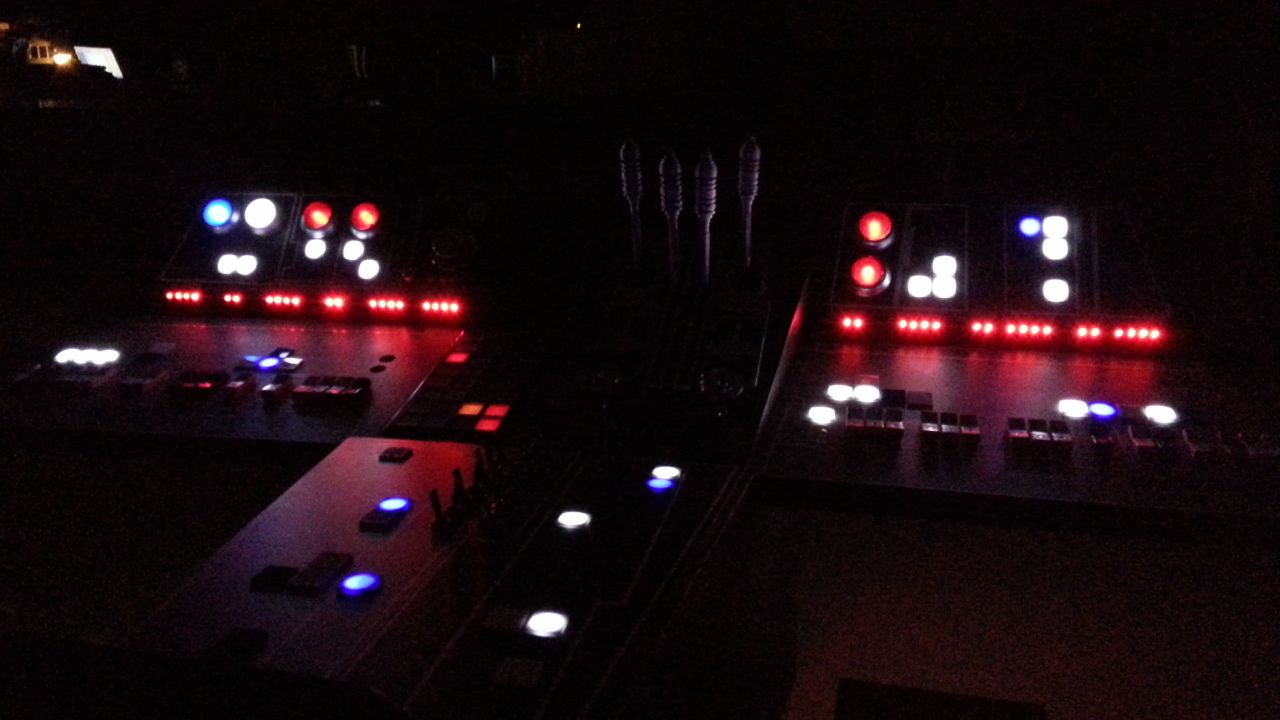


A job well done! You guys done good, my man!... The white 1" tiles really look good lit up, a lot better than I thought they would. They seem to diffuse the light enough to make almost the entire square light up. Awesome! I'm not quite as big a fan for the blue and red tiles though. They basically look like I was thinking they might, like round lights shining through square tiles. But you know, it's still good enough for me, it's WAY better than no lit tiles at all, and as long as it's good enough for you, then we're all good. The only way to make the reds and blues more square would seem to be to laser cut square holes behind them, but seeing as you have a good system down right now as far as how you do it, it may be a hassle to change it now, so as Ben would say, "You must do what you feel is right of course". It will look good either way, IMO.
Knock 'em out at the show! You should be proud.
Sofa is actually going for the "round hole behind square tile" look; after carefully studying several screencaps, he (and others) concluded that there were round holes behind the tiles. So he is doing this to make it screen accurate, not due to the difference in difficulty.
Or am I remembering the thread wrong?
I love it the way it is! Lol I've been following this thread from its inception. I see it but I still can't believe it!! AMAZING WORK MAN!!
Greg,
I like that ambient sound. A lot. I think I have just lost a deflector shield...
Sofaking awesome!
PURE AWESOME SAUCE! :love
A job well done! You guys done good, my man!... The white 1" tiles really look good lit up, a lot better than I thought they would. They seem to diffuse the light enough to make almost the entire square light up. Awesome! I'm not quite as big a fan for the blue and red tiles though. They basically look like I was thinking they might, like round lights shining through square tiles. But you know, it's still good enough for me, it's WAY better than no lit tiles at all, and as long as it's good enough for you, then we're all good. The only way to make the reds and blues more square would seem to be to laser cut square holes behind them, but seeing as you have a good system down right now as far as how you do it, it may be a hassle to change it now, so as Ben would say, "You must do what you feel is right of course". It will look good either way, IMO.
Knock 'em out at the show! You should be proud.
Absolutely outstanding. Amazing to think where the console started from. I alway look forward to your updates.
Hey T,
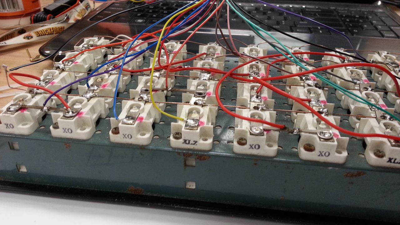
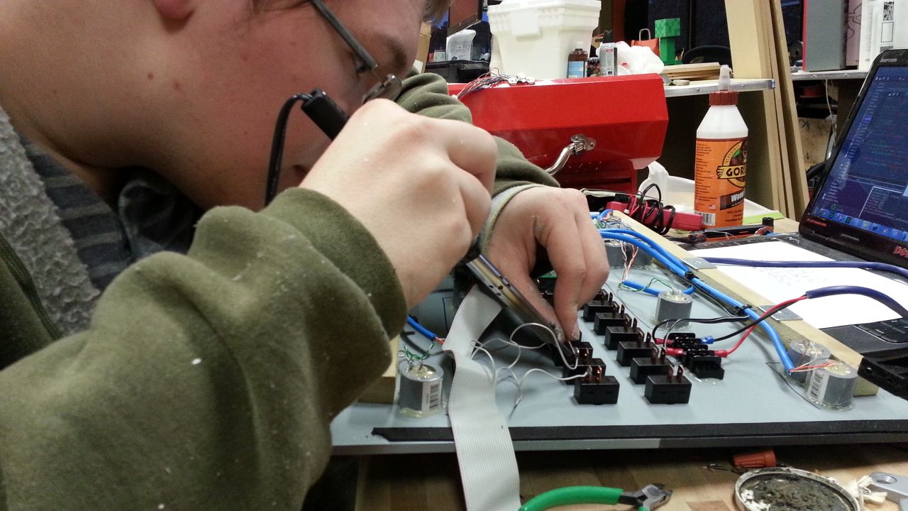
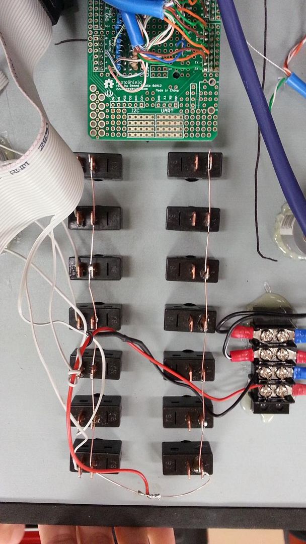
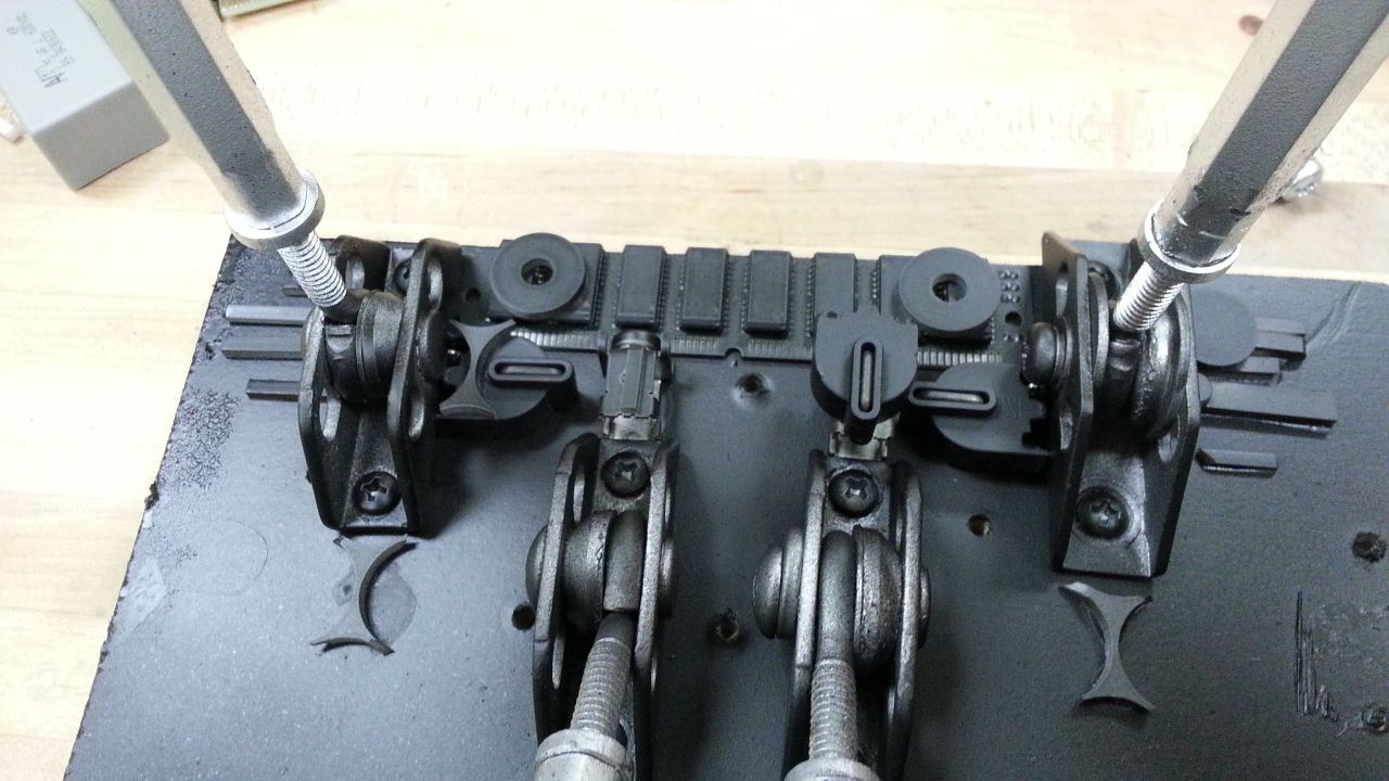
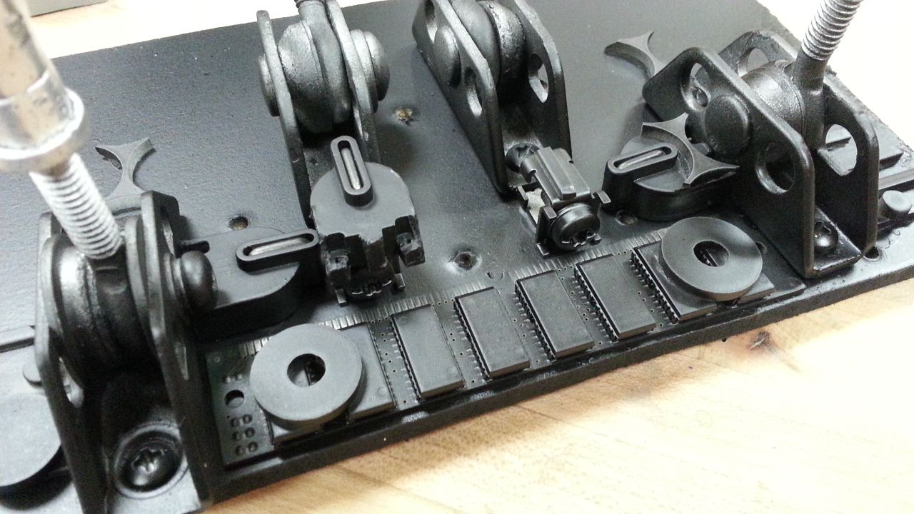
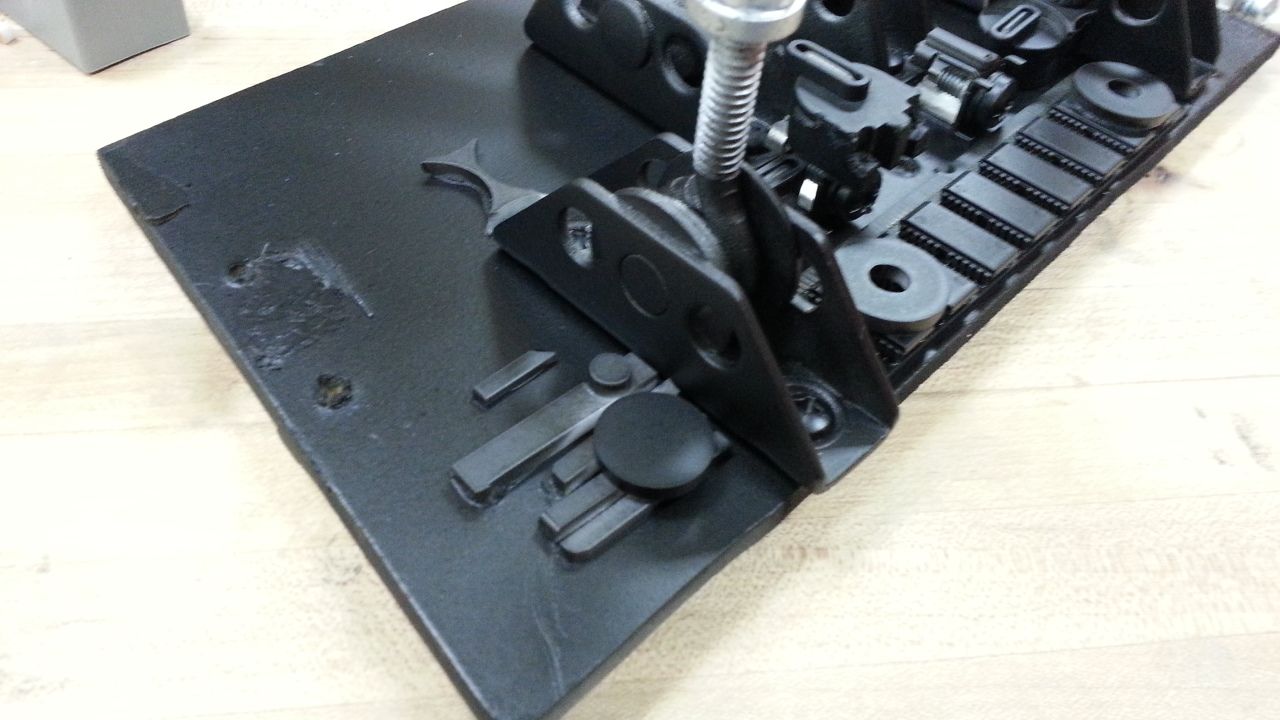
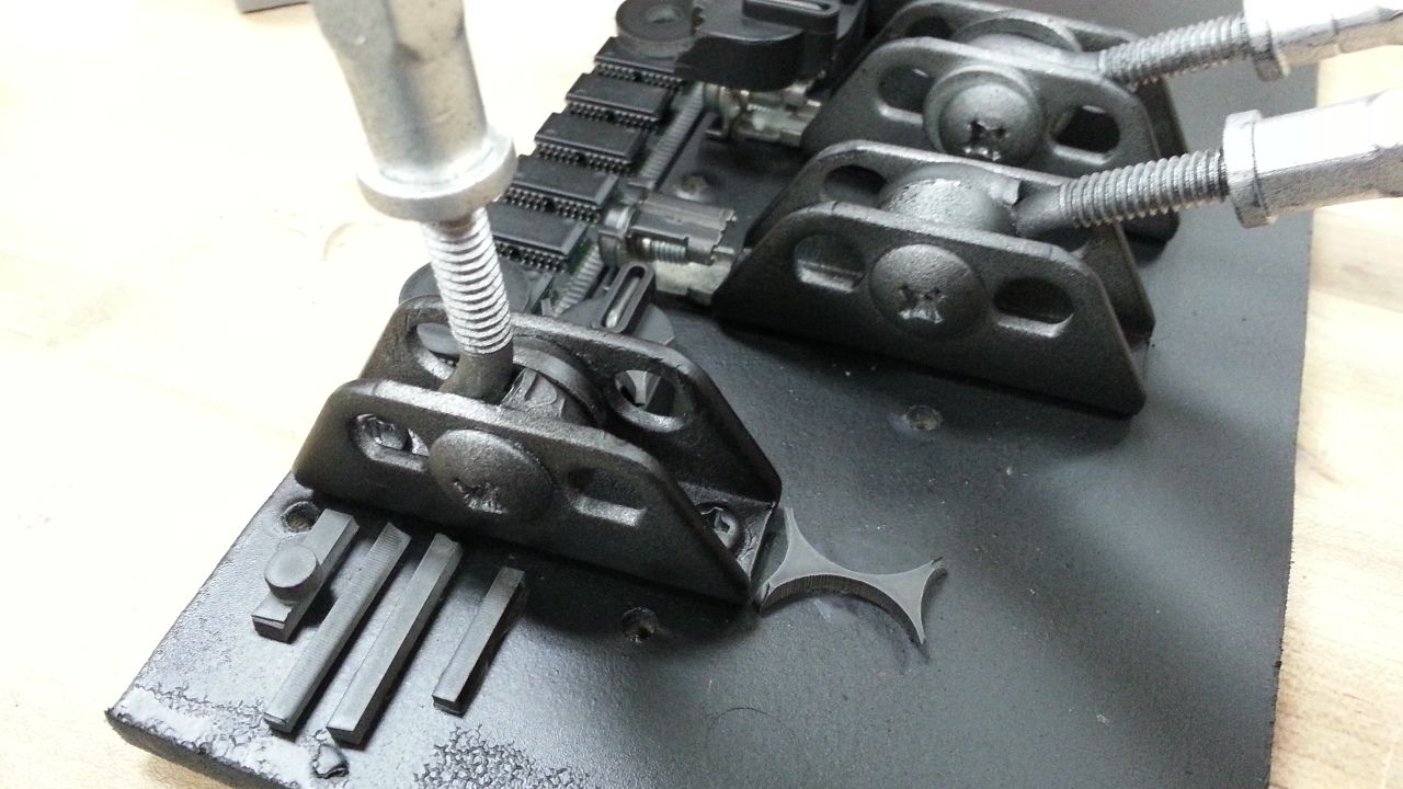
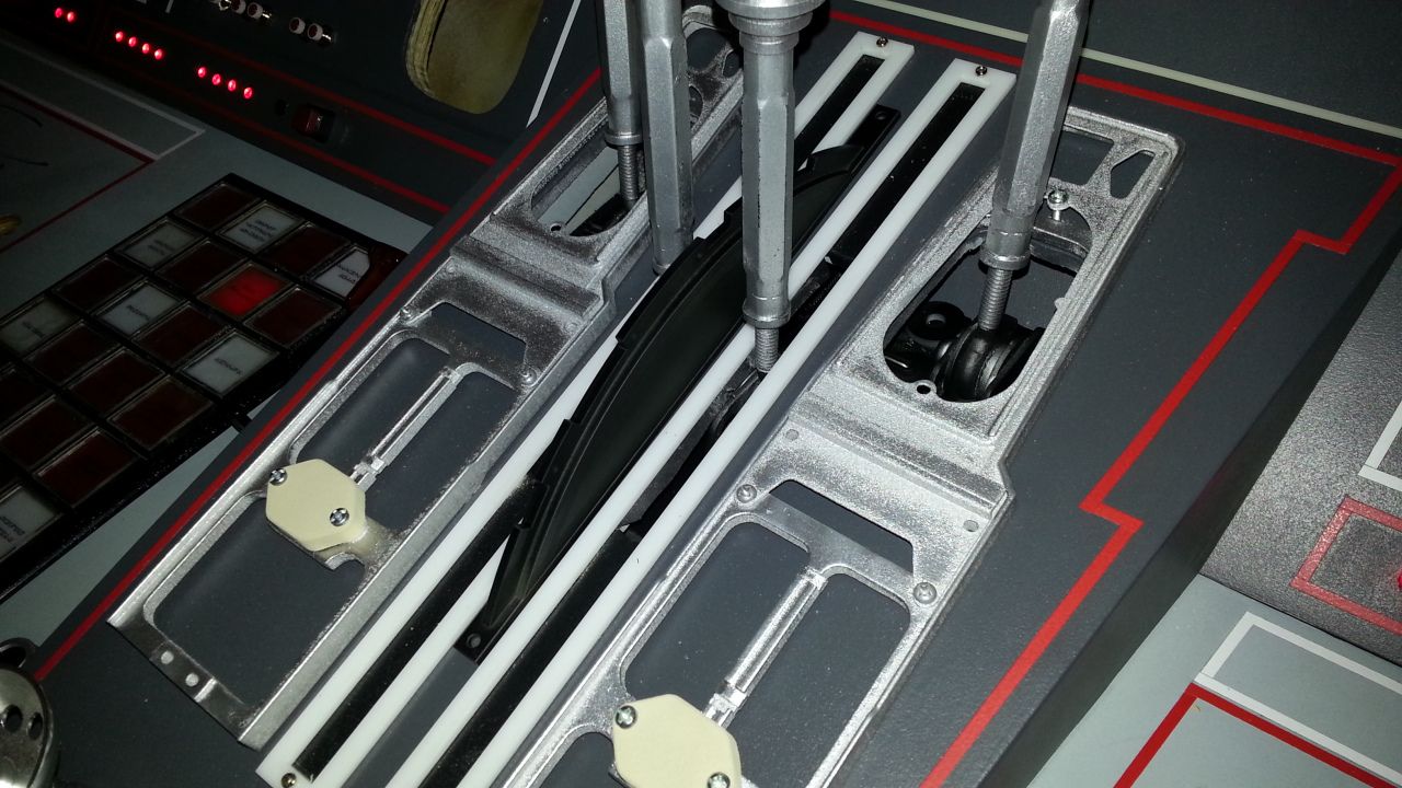
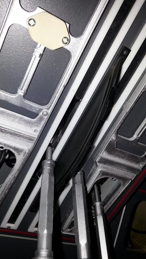
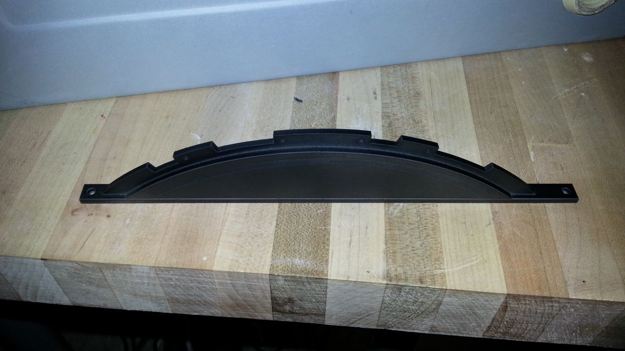
When adhereing the tiles I quickly realized the white and blue acrylic were slightly different from each other - the diffuse pattern wasn't exactly the same. It doesn't bother me at all but we'll definitely address this with the new console. The next order of acrylic will take care of that.
Yeah, I totally get that. Maybe they did it that way for the console, but MAYBE differently for the side walls and back wall (see link below, where the blues are fully lit squares). If it's not that, then those two colors are just diffusing the light differently for some reason, because the white tiles look great. There's technical screen accuracy, and then there's visual screen accuracy. Both are judgement calls, based on what you're aiming for, and how you want it to look. ...but regardless, if Sofa's happy, I'm happy.
http://wallpoper.com/images/00/42/81/07/star-wars_00428107.jpg