The Amazing Spider-Man 2

I really hope Electro and Rhino have fleshed out story-lines.

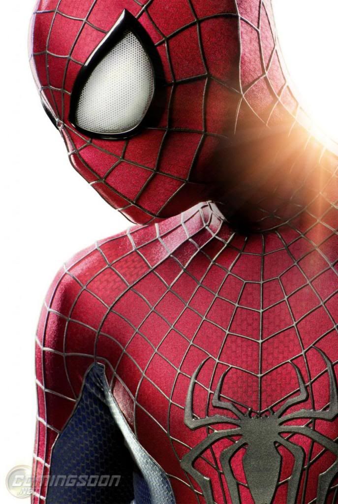
Spidey's new eyes look pretty good, but if they are turned black and white it going to be too many changes, IMO.
 
New costume design:
hr_The_Amazing_Spider-Man_2_1_zps3380e4d5.jpg


Exclusive First Look at the New Spider-Man Costume! | Superhero Hype
 
I may be in the minority but i've never been a fan of those raised webs on the costume. I could believe the costume from the first movie but this Acheson throwback just looks TOO professional.
 
The Amazing Spider-Man 2 costume has bigger eyes like in the comics, with better webbing design and colors like the 2002 Spider-Man film costume. Such a great improvement over last year's costume.
 
Looks very good from whats visible. Its nice to see the larger eyes work on a the suit.

BUT... i want to see the lower half. I hope there's a belt design and a lack of crazy racing stripes or other unnecessary fanciness.

Sent from my DROID RAZR using Tapatalk 2
 
What a huge change...they went right back to Raimi's version...:facepalm

I preferred the elongated spider that stretched over a wider area...And what about all the puffiness? The eyes are good though.
 
Odd that they would back-peddle now, even bringing back the same brick pattern fabric and everything. Its almost 100% the Raimi suit.
 
Does seem like a photoshop job as the brickwork pattern looks identical to the Raimi version as does the raised web...

Plus he tweeted the link to the video right? Not the image?
 
Has to be legit, there's to many "suttle" things different about it like thinner webs, thinner red v down the chest, lower spider, etc
 
Has to be legit, there's to many "suttle" things different about it like thinner webs, thinner red v down the chest, lower spider, etc

I just don't see this fitting the same universe they established in TASM. The eyes are legit, we already know that, and those definitely don't fit the universe so who knows...maybe legit.
 
I just don't see this fitting the same universe they established in TASM. The eyes are legit, we already know that, and those definitely don't fit the universe so who knows...maybe legit.

Whatever the case is, I can't wait to see a McL34N version ;)
 
Wow! They went back to the classic costume and brought it even closer to the comic!

At least he doesn't look like a wet basketball anymore.

And face webs are shaped like webs rather than intersecting circles.

And I'm glad to see the gold eyes gone.

The silver lines looks darker than the Raimi version and thinner too. I approve!

I guess you can't improve on perfection.
Marvel_Treasury_Edition_Vol_1_1.jpg
 
This thread is more than 9 years old.

Your message may be considered spam for the following reasons:

  1. This thread hasn't been active in some time. A new post in this thread might not contribute constructively to this discussion after so long.
If you wish to reply despite these issues, check the box below before replying.
Be aware that malicious compliance may result in more severe penalties.
Back
Top