Markus
Sr Member
It's Friday - and Friday is ... yes, right:

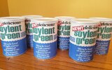
Yes, I know, there have been quite a few posts of the "Soylent Green" label in these forums. And most of these are great. So, why would I make another one? Because I can and I want to. I just love playing with typography, so I wanted to give this a try, and maybe I am able to make some minor improvements.
I posted this on my blog - and I'm sharing this below.
In another forum, Cmd.Kerner just gave me some advice on the fonts, which I use as a starting point.
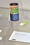
As a reference, I used this link to an old auction.

I have read that the original can was 4 3/4" high by 2 1/2" wide, and some people use a Nestle Nutriment can, which had these sizes. I still had a Rumford Baking Power can that is also 2 1/2" wide, but only 3 3/4" high. This is what I will use - and for which I will make the label.

On the fonts:
For "NEW!", I used Future Press, which is not perfect, but it comes rather close to the reference.

For "delicious", I used Monotype Baskerville Bold Italic (as suggested by Cmdr.Kerner - thanks again!) which is perfect.
For "soylent green", the "Haettenschweiler" font is pretty good when the height is scaled to 83%. There is just one detail that bothered me: the "t". In the original prop, the top of the "t" is tilted. But I was not able to find any font with such a "t" that looks close enough. So I decided to fix this by hand (by overlaying a box over the top).

The lower part on the blue background is set in a "Times-like" roman typeface. However, there is one detail, that no other replica has captured: the tilt in the "M". Here are the words "Miracle food" for four different fonts (all bold or semi-bold):

In Bitstream Charter and Time New Roman, the outer lines of the "M" are vertical - and different from the original prop. While searching for a better font, I found "Junicode" (which was already installed on my Linux system), but some of its letters looked a little different (e.g. the "a"). After some searching, I found the Semi-Bold version of "New Alster", which is overall closest to the original.
Here is the final result: a png file at 300dpi for printing on letter-size.


Yes, I know, there have been quite a few posts of the "Soylent Green" label in these forums. And most of these are great. So, why would I make another one? Because I can and I want to.
I posted this on my blog - and I'm sharing this below.
In another forum, Cmd.Kerner just gave me some advice on the fonts, which I use as a starting point.
As a reference, I used this link to an old auction.

I have read that the original can was 4 3/4" high by 2 1/2" wide, and some people use a Nestle Nutriment can, which had these sizes. I still had a Rumford Baking Power can that is also 2 1/2" wide, but only 3 3/4" high. This is what I will use - and for which I will make the label.

On the fonts:
For "NEW!", I used Future Press, which is not perfect, but it comes rather close to the reference.
For "delicious", I used Monotype Baskerville Bold Italic (as suggested by Cmdr.Kerner - thanks again!) which is perfect.
For "soylent green", the "Haettenschweiler" font is pretty good when the height is scaled to 83%. There is just one detail that bothered me: the "t". In the original prop, the top of the "t" is tilted. But I was not able to find any font with such a "t" that looks close enough. So I decided to fix this by hand (by overlaying a box over the top).
The lower part on the blue background is set in a "Times-like" roman typeface. However, there is one detail, that no other replica has captured: the tilt in the "M". Here are the words "Miracle food" for four different fonts (all bold or semi-bold):

In Bitstream Charter and Time New Roman, the outer lines of the "M" are vertical - and different from the original prop. While searching for a better font, I found "Junicode" (which was already installed on my Linux system), but some of its letters looked a little different (e.g. the "a"). After some searching, I found the Semi-Bold version of "New Alster", which is overall closest to the original.
Here is the final result: a png file at 300dpi for printing on letter-size.


