Hobo Wan Kenobi
Sr Member
That is a good question. Just tested the email functionality and it appears to be working fine. Send me a PM and let's see if I get the notification.
Pm sent
That is a good question. Just tested the email functionality and it appears to be working fine. Send me a PM and let's see if I get the notification.
Yes, I'm seeing that too. Win7/IE10.


Ditto, with Firefox.
toa,
You can immediately go to the last post by clicking the date under the last poster's name in the thread list.
I like the gray/off-white background. Very Comfortable.
-Rylo
Text on registration page a bit hard to read.
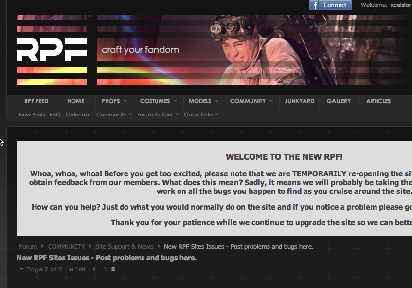
View attachment 173716
Is there still a preview post option?
Can't say I care for that, nor is it particularly intuitive.
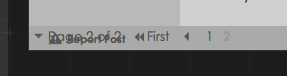
For those who are experiencing the overlap issue at the bottom of the page, can you take a screencap of the top of the page with the "post your fandom" and pagination area?

I like the gray/off-white background. Very Comfortable.
-Rylo