Larry Young
Master Member
That's just plain nuts!
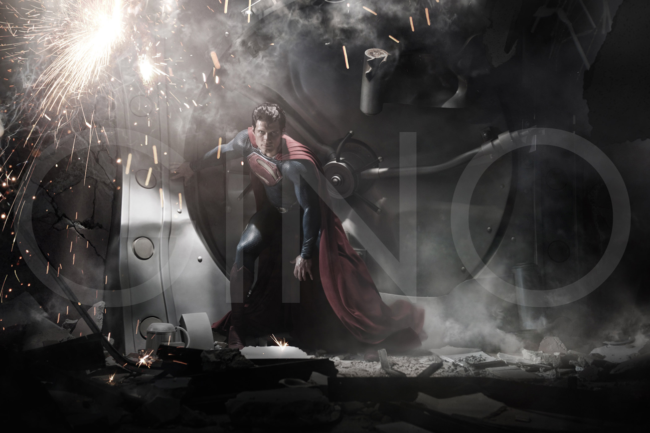
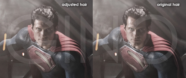
What is going on in the top right of it?!! The bottom of that shape should NOT touch the right border.
Its one promo shot for crying out loud and people are freakin out. The photo of him walking through the streets as Clark has the spit curl, do you think they are going to leave that out? Its one promo shot. *sigh*
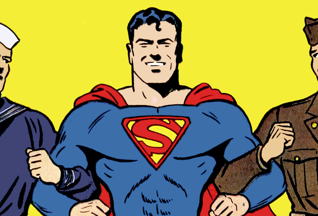
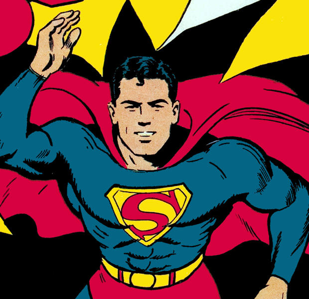
... but despite it being featured for a time in the old serial comics (with a yellow border, no less) ...