You are using an out of date browser. It may not display this or other websites correctly.
You should upgrade or use an alternative browser.
You should upgrade or use an alternative browser.
Ly's Raimi Spider-Man Build (KenLandrum Pattern)
- Thread starter LyMovieDude1
- Start date
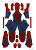
Your colors look WAY too dark. Those blues will come out nearly black.
Ken's colors will print fairly accurately as is. That's not to say you can't still fool around with the contrast of the muscles and bricks, but if you're dead set on achieving your dream of having a good version of this costume, the colors can make or break it.
Good luck.
-Nick
Ken's colors will print fairly accurately as is. That's not to say you can't still fool around with the contrast of the muscles and bricks, but if you're dead set on achieving your dream of having a good version of this costume, the colors can make or break it.
Good luck.
-Nick
LyMovieDude1
Active Member
Your colors look WAY too dark. Those blues will come out nearly black.
Ken's colors will print fairly accurately as is. That's not to say you can't still fool around with the contrast of the muscles and bricks, but if you're dead set on achieving your dream of having a good version of this costume, the colors can make or break it.
Good luck.
-Nick
Thanks alot Nick!
I definately agree on the colors and I know the general rule is that the pattern will print darker than it looks on the monitor. However, I use ZentaiZone for my dye sub suits (broke 16yr old), and from my experience they tend to print lighter rather than darker. You could say I modded the pattern specifically to be printed and sewn by ZentaiZone. I might lighten the blue up a tad, though.
")
Last edited:
LyMovieDude1
Active Member
Are you going with spider symbols from the first movie or second?
Funny, I actually started this project out trying to create the 2002 style movie pattern.
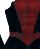
There are some obvious differences from the first movie to the second one. Aside from different spider emblems and colors, the web pattern seems to be quite different aswell. The bricks on the blue were alot more visible in the first movie, and there was no webbing on the palms. The red was alot more flat and plain with less muscle shading. The raised webbing didn't have the black edges like in the later fims either. Oh and the soles were black.
There are probably more differences but these are the ones I was able to eye out. It's actually really hard to find good reference for the SM1 suit. But I did throw a pattern together using the files Ken provided in his Raimi thread.

Might tweak the blue a bit but it should be good to go. I am actually considering doing the 2002 version instead for two reasons. The first one being it will save me the hassle of making a mold for the back spider, since the SM1 back spider is flat. Second reason is I haven't seen many people do it. Yeah, I think it's settled.
LyMovieDude1
Active Member
Forgot to add, I'm a skinny 16yr old at 5'9 140, so something had to be done:lol
I found a venom muscle shirt for like 20 bucks at H&M a while ago.
As crappy as it looks I tried it under an old Spidey suit that didn't come out right and the results are pretty darn impressive in my opinion. The venom symbol can be seen through fabric since the suit I'm wearing is too small for me even without the muscle shirt, but I will paint the symbol black so it won't be seen through the lycra.
I only have this crappy pic, and I was too lazy to take a better one haha.
View attachment 618045
It really beefs my shoulders and arms up, making me look more superheroish.
Doesen't do anything for lats though, so might have to add some padding or something.
I have made a mold with the kenlandrum 3d Spiders. If you're interested for a urethane Spider just let me know
LyMovieDude1
Active Member
I have made a mold with the kenlandrum 3d Spiders. If you're interested for a urethane Spider just let me know
Thanks alot! Will definately keep it in mind.
Last edited:
LyMovieDude1
Active Member
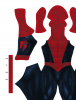
So, Spider-Man 1 Suit it is. After exporting my file to jpeg, it almost looks a bit orange as a thumbnail, but I'm pretty positive it will print good since I used the same red color for another suit I had made.
Found this really nice reference pic of the 2002 suit.

I'm actually going to attempt sculpting my own eye frames, make a mold and then cast in urethane rubber. The SM1 suit really has whiter eyes than the 2004-2007 version, so that's something I want to achieve.
I only have red puffpaint atm, but I did a test on a piece of scrap lycra to get an idea of the thickness. I want the puffpaint to be really thick and pop out. Decided on using silver puffpaint despite not being perfectly accurate to the movie suit. Metallic Black looks too dark in my opinion.
Webbing test piece:


Note: I rushed the test piece, the webs on the suit will be alot smoother.
Found this really nice reference pic of the 2002 suit.
I'm actually going to attempt sculpting my own eye frames, make a mold and then cast in urethane rubber. The SM1 suit really has whiter eyes than the 2004-2007 version, so that's something I want to achieve.
I only have red puffpaint atm, but I did a test on a piece of scrap lycra to get an idea of the thickness. I want the puffpaint to be really thick and pop out. Decided on using silver puffpaint despite not being perfectly accurate to the movie suit. Metallic Black looks too dark in my opinion.
Webbing test piece:
Note: I rushed the test piece, the webs on the suit will be alot smoother.
SpideyYancey
New Member
I use ZentaiZone as well, would you mind giving a download to your darkened pattern?
Obesedtofit
Member
Can I get that 2002 patternThread closed
Obesedtofit
Member
Can I get it without webing and just web guid so ik where to glue my webing down toCan I get that 2002 pattern
Obesedtofit
Member
Got more reference photos of spider 2002 suit Spider man 2002 behind the scenes - Google Drive
spideykid
New Member
Many try doing it on fabric and the blue would not be so darkYour colors look WAY too dark. Those blues will come out nearly black.
Ken's colors will print fairly accurately as is. That's not to say you can't still fool around with the contrast of the muscles and bricks, but if you're dead set on achieving your dream of having a good version of this costume, the colors can make or break it.
Good luck.
-Nick
It’s a 6 year old post. Printers didn’t calibrate as well back then for spidey prints.Many try doing it on fabric and the blue would not be so dark
Similar threads
- Replies
- 1
- Views
- 1,171
- Replies
- 0
- Views
- 551
- Replies
- 7
- Views
- 722
- Replies
- 2
- Views
- 988
- Replies
- 13
- Views
- 1,275