-
Welcome to the Project Runs Forum!
This forum is intended for interest gauging and active runs. Due to the transient nature of this forum, please keep all research and ongoing discussion in one of our main forums so your information is not lost.
Only Premium Members can start a new run.
You are using an out of date browser. It may not display this or other websites correctly.
You should upgrade or use an alternative browser.
You should upgrade or use an alternative browser.
Limited Run IRON MAN MARK II , III , IV , VI finished helmet 3D printed . NEW MARCH 2017
- Thread starter masked rider
- Start date
Re: IRON MAN MARK II , III , IV , VI finished helmet 3D printed Chrome Face plate
Hey guys , received lots of request about this finished helmet . Ive done few helmets and few already SOLD . I will post some pics of few version that ive finished , even the ONLY one battle damage version that i complete on this time .")
Pls post here or send PM if u still want as i still have few cast of helmet and ready to paint .
Hey guys , received lots of request about this finished helmet . Ive done few helmets and few already SOLD . I will post some pics of few version that ive finished , even the ONLY one battle damage version that i complete on this time .
Pls post here or send PM if u still want as i still have few cast of helmet and ready to paint .
Re: IRON MAN MARK II , III , IV , VI finished helmet 3D printed Chrome Face plate
Heres some pics of the battle damage helmet W.I.P . I will call this a stage 2 battle damaged . I would love to make it as REAL damaged instead of just with weathering paint work , so i used the nail file and make my own sand paper stick to damaged it .


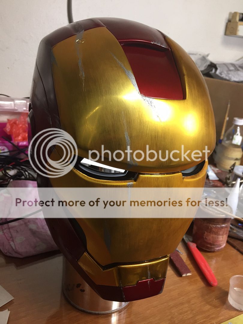
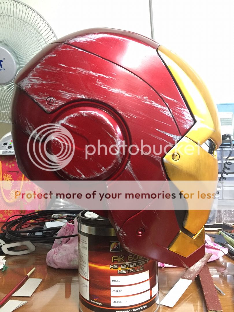


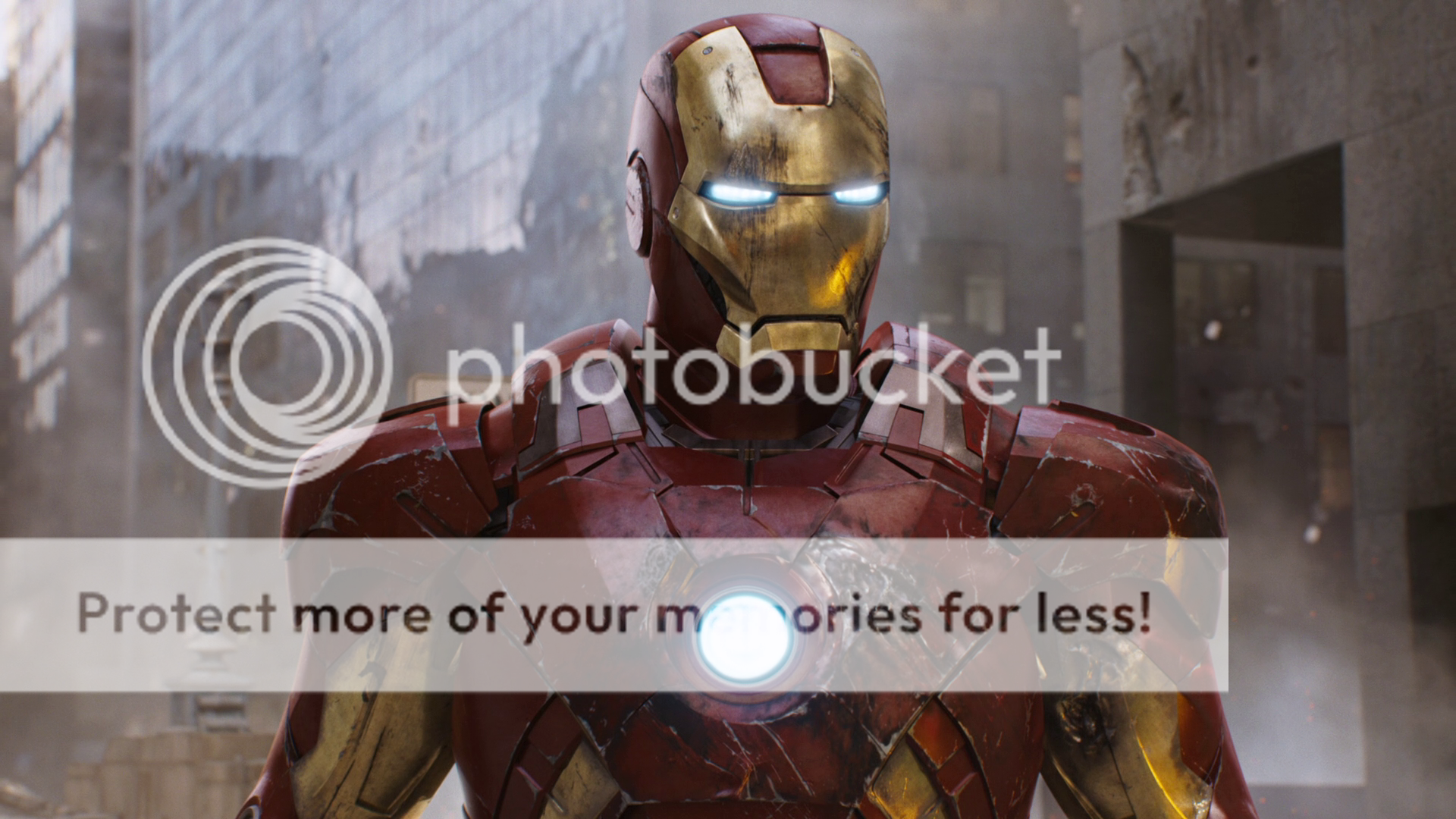
Let me know what do u think , and im actually like to make it to look like this MARK VII helmet , will add some oily effect on the face plate and all over the helmet ,i think u will love it .
Heres some pics of the battle damage helmet W.I.P . I will call this a stage 2 battle damaged . I would love to make it as REAL damaged instead of just with weathering paint work , so i used the nail file and make my own sand paper stick to damaged it .
Let me know what do u think , and im actually like to make it to look like this MARK VII helmet , will add some oily effect on the face plate and all over the helmet ,i think u will love it .
Last edited:
dontfeedmyego
Sr Member
Re: IRON MAN MARK II , III , IV , VI finished helmet 3D printed Chrome Face plate
Tried to continue our PMs but your inbox is full...
Sent from my iPhone using Tapatalk
Heres some pics of the battle damage helmet W.I.P . I will call this a stage 2 battle damaged . I would love to make it as REAL damaged instead of just with weathering paint work , so i used the nail file and make my own sand paper stick to damaged it .
http://i402.photobucket.com/albums/pp103/masked-rider2008/IM Custom order/IMG-20151111-WA0004.jpg
http://i402.photobucket.com/albums/pp103/masked-rider2008/IM Custom order/IMG-20151111-WA0006.jpg
http://i402.photobucket.com/albums/pp103/masked-rider2008/IM Custom order/IMG-20151111-WA0009.jpg
http://i402.photobucket.com/albums/pp103/masked-rider2008/IM Custom order/IMG-20151111-WA0012.jpg
http://i402.photobucket.com/albums/pp103/masked-rider2008/IM Custom order/IMG-20151111-WA0010.jpg
http://i402.photobucket.com/albums/pp103/masked-rider2008/IM Custom order/IMG-20151111-WA0008.jpg
http://i402.photobucket.com/albums/pp103/masked-rider2008/IM Custom order/IMG-20151111-WA0007.jpg
Let me know what do u think , and im actually like to make it to look like this MARK VII helmet , will add some oily effect on the face plate and all over the helmet ,i think u will love it .
http://i402.photobucket.com/albums/pp103/masked-rider2008/IM Custom order/Iron_Man_Assembled.png
Tried to continue our PMs but your inbox is full...
Sent from my iPhone using Tapatalk
Re: IRON MAN MARK II , III , IV , VI finished helmet 3D printed Chrome Face plate
OK.. clear my inbox.
OK.. clear my inbox.
Re: IRON MAN MARK II , III , IV , VI finished helmet 3D printed Chrome Face plate
Hey Guys ,
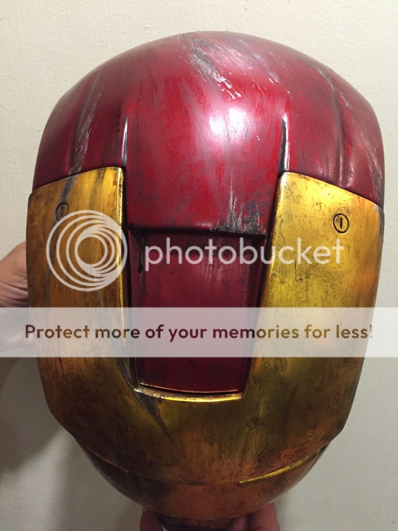
Heres the Battle Damaged version that ive done so far , make it looks like the MARK VII damaged in pic .


Oh... and this one is SOLD , pending on Payment .
I can make more if this version if anyone still interested .
Hey Guys ,
Heres the Battle Damaged version that ive done so far , make it looks like the MARK VII damaged in pic .
Oh... and this one is SOLD , pending on Payment .
I can make more if this version if anyone still interested .
Re: IRON MAN MARK II , III , IV , VI finished helmet 3D printed Chrome Face plate
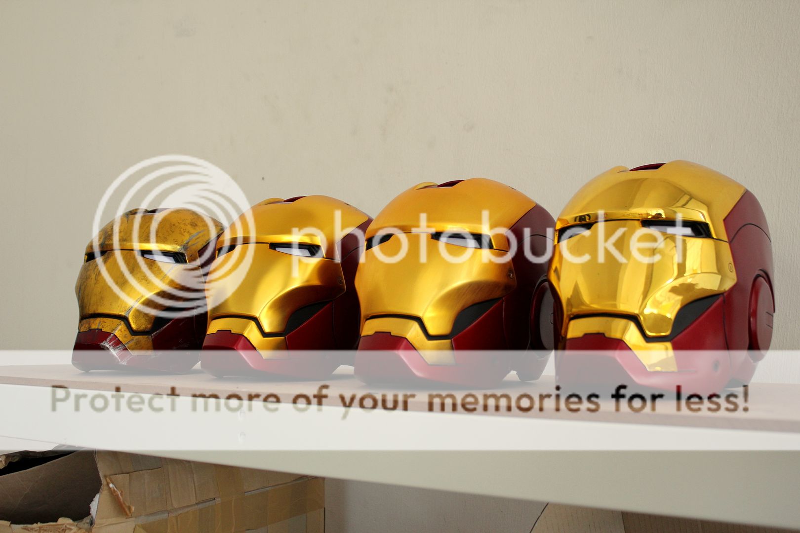
hey guys , finally i have times to take more pics of 4 types of different finishing of the chrome face plate MARK III . IV . VI helmet . All are available for orders , and just post here which one do u like and PM me for order .


For More pics and info of different finishing ...... PLS see in the FIRST PAGE .
hey guys , finally i have times to take more pics of 4 types of different finishing of the chrome face plate MARK III . IV . VI helmet . All are available for orders , and just post here which one do u like and PM me for order .
For More pics and info of different finishing ...... PLS see in the FIRST PAGE .
Re: IRON MAN MARK II , III , IV , VI finished helmet 3D printed . TONS OF PICS UPDATE
Yes bro , i will PM u .
- - - Updated - - -
Yes , im working on it ... and update with pics soon .
Leslee the helmets look great! Is mine shipping soon?
Yes bro , i will PM u .
- - - Updated - - -
Really nice job Leslee! Are you planning on doing the same with MKII?
Yes , im working on it ...
and update with pics soon .Re: IRON MAN MARK II , III , IV , VI finished helmet 3D printed . TONS OF PICS UPDATE
By the way , just clear my INBOX and kindly send your PM again and i will get back to u .
By the way , just clear my INBOX and kindly send your PM again and i will get back to u .
The5thElement
Active Member
Re: IRON MAN MARK II , III , IV , VI finished helmet 3D printed . TONS OF PICS UPDATE
They all look great but I like number 2 (second from left) the best. Could you tell us what is the treatment difference between 2 and 3?
Your work is amazing and I am a big fan. So I hope you don't mind the feedback that your eye lenses could look better if they were curved and filled the eye-slits more...they look too angular and recessed IMO.
Would be great if you could add some pics of the helmets being worn also.
Bigturc
Sr Member
Re: IRON MAN MARK II , III , IV , VI finished helmet 3D printed . TONS OF PICS UPDATE
I will agree that second helmet from left is really a piece of art!! The closest finish to the movie helmet!
I also agree that making the eyes curved would do a huge difference on the look! We instantly recognize your helmet from those eyes and making them curved instead of flat would be even better!!
Also for me, the gold should be a little less yellow, but I've already said that before!
Amazing work, you are the Ironman master on this board for sure!
Re: IRON MAN MARK II , III , IV , VI finished helmet 3D printed . TONS OF PICS UPDATE
No problem , u can always share your opinion and i would love to hear more . The different between both are the same with chromed gold face plate , only the finishing are different , the 2nd from the left , face plate with a layer of coating , so u can see it much shinny . and the third one will be chromed and brushed to have steel finishing .
As for the eyes , i made the straight line cause i used my previous helmet lenses to modify .... hmm.. i will try to make the eye lenses with curve .
- - - Updated - - -
Thanks for the kind words mate , i will try to fix the eyes , and may will try to install it with my War Machine lenses and see if its works, cause i made my War Machine eyes with curved .
Yea , may also try to darker the gold .... more brown gold right ?
And i will be working on the MARK II as well , so stay tuned .
They all look great but I like number 2 (second from left) the best. Could you tell us what is the treatment difference between 2 and 3?
Your work is amazing and I am a big fan. So I hope you don't mind the feedback that your eye lenses could look better if they were curved and filled the eye-slits more...they look too angular and recessed IMO.
Would be great if you could add some pics of the helmets being worn also.
No problem , u can always share your opinion and i would love to hear more . The different between both are the same with chromed gold face plate , only the finishing are different , the 2nd from the left , face plate with a layer of coating , so u can see it much shinny . and the third one will be chromed and brushed to have steel finishing .
As for the eyes , i made the straight line cause i used my previous helmet lenses to modify .... hmm.. i will try to make the eye lenses with curve .
- - - Updated - - -
I will agree that second helmet from left is really a piece of art!! The closest finish to the movie helmet!
I also agree that making the eyes curved would do a huge difference on the look! We instantly recognize your helmet from those eyes and making them curved instead of flat would be even better!!
Also for me, the gold should be a little less yellow, but I've already said that before!
Amazing work, you are the Ironman master on this board for sure!
Thanks for the kind words mate , i will try to fix the eyes , and may will try to install it with my War Machine lenses and see if its works, cause i made my War Machine eyes with curved .
Yea , may also try to darker the gold .... more brown gold right ?
And i will be working on the MARK II as well , so stay tuned .
Bigturc
Sr Member
Re: IRON MAN MARK II , III , IV , VI finished helmet 3D printed . TONS OF PICS UPDATE
Curved lenses!! Mmmmmm Can't wait to see it!
And yeah Leslee, I'm not the best with CMYK expert out there, but it definitely needs to be a little more sable. Along time ago, the Duplicolor Champagne Gold was suggested and agreed by lots of people. Look it up on google, you'll see what I mean .. Another was Pacific Gold which looks like the previous color too.
But maybe I'm the only one seeing this so don't take my word for it!
Re: IRON MAN MARK II , III , IV , VI finished helmet 3D printed . TONS OF PICS UPDATE
No problem bro and thanks for your suggestion and it will help alot , although its quite hard to look for some material in my place ..lol.. but i will see what i can do ...
Will keep u update soon .
Curved lenses!! Mmmmmm Can't wait to see it!
And yeah Leslee, I'm not the best with CMYK expert out there, but it definitely needs to be a little more sable. Along time ago, the Duplicolor Champagne Gold was suggested and agreed by lots of people. Look it up on google, you'll see what I mean .. Another was Pacific Gold which looks like the previous color too.
But maybe I'm the only one seeing this so don't take my word for it!
No problem bro and thanks for your suggestion and it will help alot , although its quite hard to look for some material in my place ..lol.. but i will see what i can do ...
Will keep u update soon .
Infernotrooper4
New Member
Re: IRON MAN MARK II , III , IV , VI finished helmet 3D printed . TONS OF PICS UPDATE
hay great work your helmets,
what cost a war machine mk1 raw cast with shipping to germany?
thx and greetings
hay great work your helmets,
what cost a war machine mk1 raw cast with shipping to germany?
thx and greetings
Similar threads
- Replies
- 2
- Views
- 282
- Replies
- 249
- Views
- 38,917
- Replies
- 1
- Views
- 1,162
- Replies
- 4
- Views
- 2,700
- Replies
- 14
- Views
- 12,738