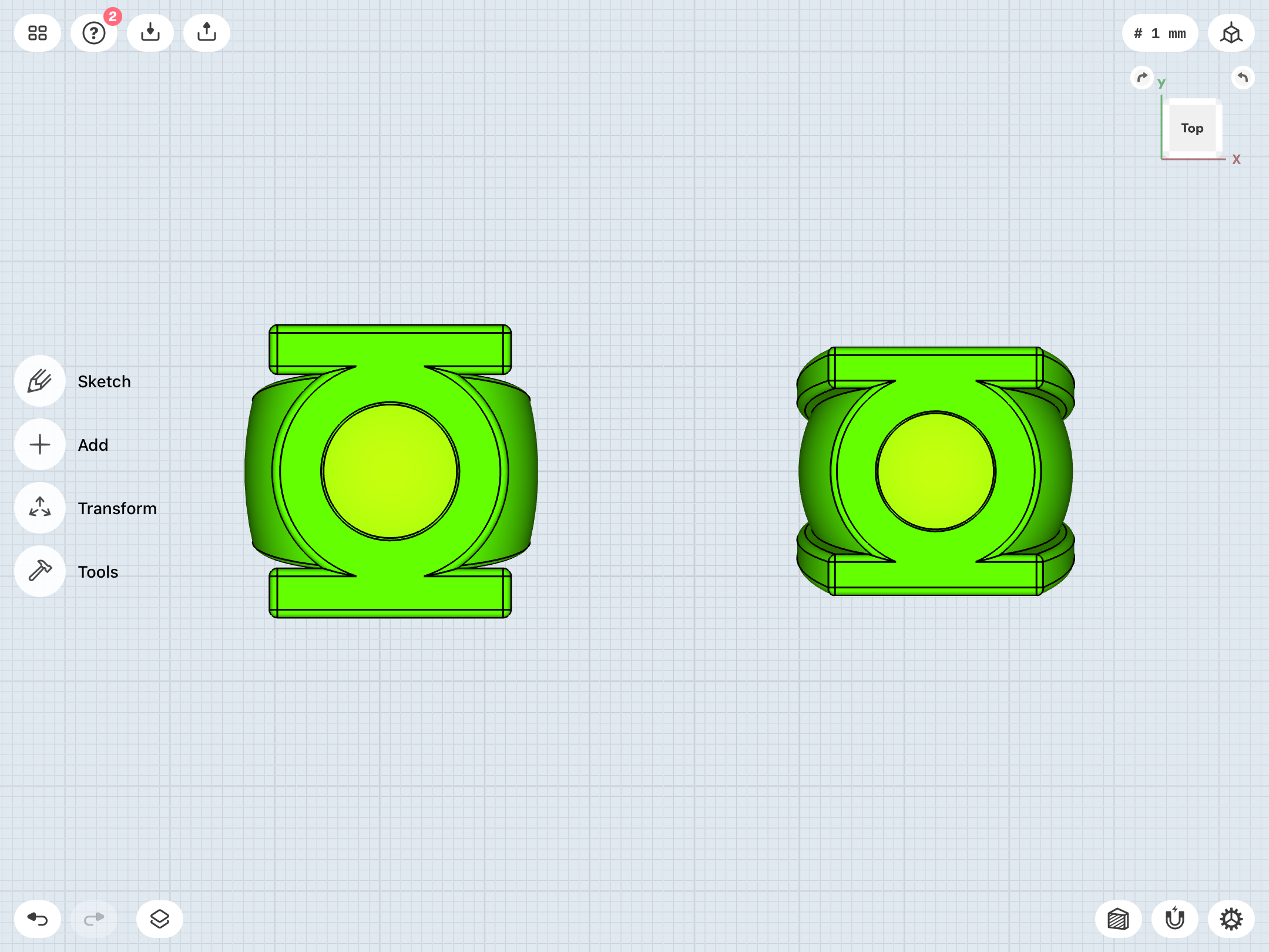
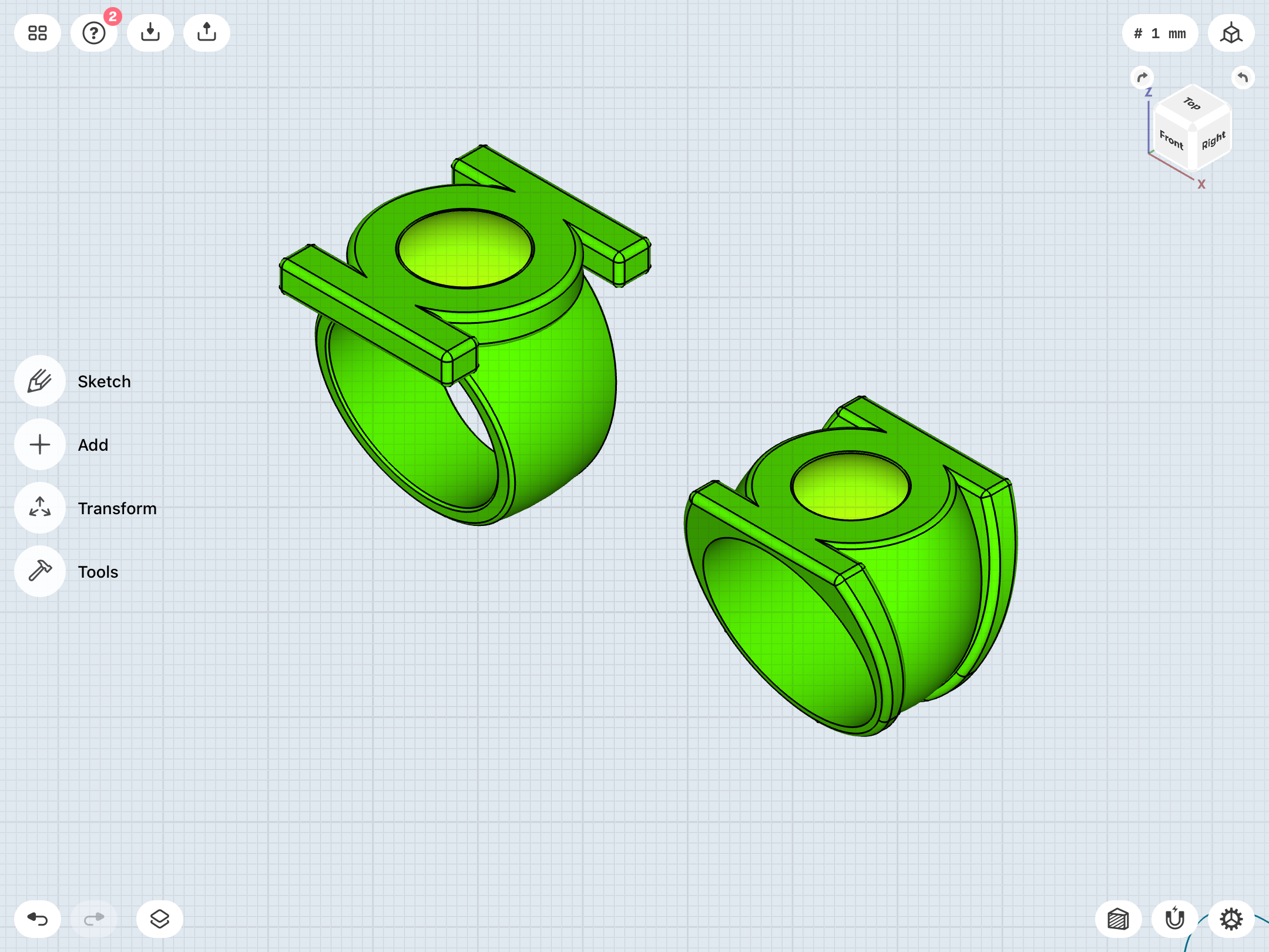
Defined Green Lantern Comic Rings

So, um...I accidentally deleted my V3 model. I was working on tinkering with it, then decided to scrap it...but had mistakenly thought that I’d created a duplicate to tinker with, when, in fact, I’d just deleted the original (and only). Fortunately, I still have the STL file for reference, but all of the calculations and sketches I’d made went “poof”.

Whoops!

So, I’ve recreated it entirely from scratch, and managed to make it a bit cleaner and more efficient, as a result.

This current version is about 24mm across the face, lengthwise. Nice and compact. I may yet make another variant or two that’s a bit larger. We’ll see.

15218370-82C8-46E8-B0CE-7FC6F6D5F9F1.png
F27E58B9-8EEB-4356-BA0F-93DF6B0975C5.png
 
Hi there. Long time lurker, first time poster. I love what you've done in this thread over the last decade, especially over the last year. Outstanding stuff.

So, um...I accidentally deleted my V3 model.

Yikes!

This made me consider another potential value of your research, since it's moved into uncharted territory. As far as I know no one has gone so far into detail on the subject and DC probably never will. You said you weren't sure which versions to make, or whether to base the decision on aesthetic preference, influence of individual artists, etc. Further, there are points where the documentation seems to get unmanageably fuzzy, such as rings varying in appearance even in consecutive panels.

I had the idea of assembling all the data into a master catalog, perhaps like a spreadsheet. Basically it would be one table that could be referenced a number of ways simultaneously; through color coding, chronology by arrangement on an axis, version type, what have you. Whatever the form it takes the data looks ready to be collated.

I don't know what you have in mind at this point in regard to realizing the rings and making them available, but to the purpose of defining GL rings this would be an easy way of showing interested parties what could be built on their end, and also of safely filing STL documents and other work in your records.

Anyway, just throwing that out there.
 
Thanks!

I have been thinking about some kind of more comprehensive, real-world publishing history, as well as in-universe flowcharts, although the footwork has largely been done already in the pages of this very thread. The linear progression of the designs and how they were spread amongst the various characters is fairly straightforward, and most of that has already been documented here. This is more about locking down how and why the designs evolved, and what the various artists were actually trying to depict, so as to create truly faithful models. I don’t see a need to get into nitty-gritty, page-by-page variants and discrepancies, although there are a number of interesting one-offs and variants yet to be discussed (such as Dave Cockrum’s very unique version from GL Vol. 2 # 128, reprinted in # 177).

A31FF100-5A72-4F0C-A524-A03ED7881720.jpeg


Aside from, well, defining the designs and their histories, my end goal is of course building accurate reproductions to scratch my own personal itch. Just how many and which designs remains to be seen, pending cost and difficulty. Just a nice little ring display for my own enjoyment (and I’ll eventually get back to working on that display base design I began many months ago), with duplicates for casual wear.

For the moment, my tentative choices are Abin Sur/SHOWCASE # 22, V1, V2, V3, EMERALD DAWN, and post-REBIRTH/modern. Those are what I consider the key designs which represent the key eras for Hal Jordan, in particular (aside, perhaps, from the one-off, Abin Sur original, but its inclusion is an more of an acknowledgement of the very first Silver Age design from that very first GL story).

Again, this is all flexible, pending cost and difficulty. I’d also be very keen to include the Mike Grell and Neal Adams, but I don’t consider them quite as essential, since they’re lesser-known variants of the more iconic designs.


I should also note—and I do hope not to break any hearts, here—that these designs will not be mass-produced or made publicly available, since:

A) Green Lantern is the property of DC Comics (...at least until the company crashes and burns completely, but that’s another conversation entirely), and selling replicas would be legally questionable, to say the least. Not the sort of game I want to play.

B) I’m just one hobbyist with limited time, money, and resources, and this is more about love of the hobby and the material than anything else. The research and learning of new skills has been lots of fun, and that’s what this hobby is all about. I’ve kept an eye on sellers like The Ring Foundry, and they seem to do a good job of making various designs (but not hyper-accurate ones) available for sale. Before this project began, I was tempted to pick up one of theirs,but for the lack of availability in my size and the lack of comic-accuracy.

That all being said, the trail has been blazed for anyone wishing to follow in my footsteps. And, if DC wants to work out some kind of licensing/work for hire deal, I wouldn’t be opposed...

Meanwhile, the first actual metal ring will likely be the Guy Gardner. I just need a little more time to tweak the design, then get another test print. If I’m finally happy with that, I may just get a polished brass version ordered from Shapeways (since it uses lost-wax casting and cast brass rather than machining, and this design also doesn’t need colored anodizing, unlike the GL rings). Still doing research. We’ll see. If that all goes well, then the modern Sinestro Corps ring would be the next logical choice. These two yellow rings are offshoots of the main project, and I’d also like them in metal.

I also need to continue researching material and methodology for molding and casting the gems, too.
 
I guess I was thinking of those pictures where you've got a bunch of different rings in a row, but with captions, links, etc; something condensed.

I have bought a Hal ring from The Ring Foundry. It's fine work. I more recently had an off-model, silver Alan Scott ring printed by Shapeways, based only on a few pictures that I gave to their affiliate, Zverse. This was after I downloaded some CAD programs that I managed, over a long period of time, to not learn how to use.

I really love the Staton ring. I have to admit I never cared for the Grell design until I saw the renderings here, but now I appreciate its greater similarity in form to the power battery. I think my next projects may fall along those lines.

An infographic featuring the designs in chronological order (with relevant data points attached) IS something I’ve been planning on, but I’d like to finalize the designs, first. All in good time.


Glad to hear your like your Ring Foundry purchase. They seem to do good work.

And I, too, have learned to greatly appreciate the Grell ring after actually studying and modeling it.
 
I should also note—and I do hope not to break any hearts, here—that these designs will not be mass-produced or made publicly available, since:

That all being said, the trail has been blazed for anyone wishing to follow in my footsteps. And, if DC wants to work out some kind of licensing/work for hire deal, I wouldn’t be opposed...
Too late. Heart is officially broken. ;)

As you said above, thanks to all of your hard work and research, starting to make a couple rings to add to my own collection has become significantly more easy. Thank you very much for sharing your work and your process.
 
Thanks!

Meanwhile, I continue to tinker with the EMERALD DAWN ring. The band (and its connection with the symbol-disc) is tricky, since...

A) It’s very organic and rounded, AND...

B) It’s tapered In profile, AND...

C) It very smoothly blends into the bottom of the disc.


C484C3D4-306B-48CD-AAF5-B4E3E96A932C.jpeg
AF974C84-020F-4B07-8BCD-2DE7092343BF.jpeg
02BD126E-A28A-4CCF-B39C-F86B5760F69B.jpeg
52CBB6F1-8668-4CA4-AA7E-F58D150E615F.jpeg
A1C332FF-B7A7-47AE-857A-88763CAFF608.jpeg
E95C3549-7330-4CB6-B974-68FCACABB6AC.png
 
Playing around with the Gardner ring. Going for more of that look where the disc is embedded within the band, rather than being a separate piece stuck on top. The preliminary results are actually rather promising. I can maintain a pretty large disc without having a band that’s excessively thick.

As previously noted, this look seems to be what Staton was going for, at least in the GUY GARDNER REBORN miniseries. The actual GUY GARDNER series tends to feature much looser and sketchier art of the ring, so much so that it can often be interpreted either way.

Thoughts?

DA4F4541-1000-4630-8FCC-D7BAD5ADDE3C.png
3E19D95A-B929-4088-BC01-D66D83CCC8C6.png
 
Playing around with the Gardner ring. Going for more of that look where the disc is embedded within the band, rather than being a separate piece stuck on top. The preliminary results are actually rather promising. I can maintain a pretty large disc without having a band that’s excessively thick.

As previously noted, this look seems to be what Staton was going for, at least in the GUY GARDNER REBORN miniseries. The actual GUY GARDNER series tends to feature much looser and sketchier art of the ring, so much so that it can often be interpreted either way.

Thoughts?

View attachment 1424984View attachment 1424985

By far my favorite so far. But I’m a sucker for 90’s Guy Gardner
 
I look forward to re-reading Guy’s solo series as part my mega-GL-read-through. I’m currently still in the JUSTICE LEAGUE INTERNATIONAL (Head injury makes Guy act...*gasp*...nice!) and ACTION COMICS WEEKLY era.

Meanwhile, I finally created a dedicated album of reference shots for Guy’s ring, as I have with the GL rings. This’ll make things easier as I continue to tweak.

Gotta say that I’m disappointed that his yellow ring-era look and style didn’t last all that long before getting into the...sigh...WARRIOR era. I think that whole 1990-94 era of rebuilding the GL mythos (well-written by the now-disgraced Gerard Jones)—and giving Jordan, Stewart, and Gardner their own individual solo series—is underrated. While I like Kyle Rayner, the editorial left-turn to boost sales by trashing the past few years’ work in EMERALD TWILIGHT was unfortunate.
 
Ordered a bunch of supplies—silicone rubber molding kit, release spray, crystal-clear epoxy casting resin, green and yellow ink for tinting resin, and green and yellow glow powders.


Once I nail down the current revisions on some of the models, I’ll get test prints made. Then, I’ll fill and smooth out the print lines on the gems, mold them in silicone, and experiment with casting. My goal is to have translucent gems which have the right coloration (lime green for the GL rings, yellow for the Gardner/Sinestro) and also have the glow-in-the- dark effect.

Mixing glow powder into the resin may be enough to accomplish both goals, but I worry about accurate coloration and visible grains of powder floating in the gems. Plan B would be to cast and color clear gems, then back them on the underside with another layer of resin suffused with glow powder (similar to my current method of painting the undersides of stock craft gems with glow paint).

I also ordered a syringe to inject colored/glow resin into the negative spaces surrounding the symbols on the EMERALD DAWN, REBIRTH, and Sinestro Corps rings.
 
Back to the EMERALD DAWN ring. I find that working on one design and then bouncing back to another yields better results, since certain methods and problem-solving can be applied across numerous designs.

Thanks to my recent work on the Gardner ring, I now have a better integration of disc and band on the ED ring, as well as a rounder and more organic band.

9DA5EAF4-3C5B-45C2-BAEE-605CAF99A0EF.png
08595ADB-C36D-46CC-83F4-CAB37DF27D0C.png
 
More V3 tweaks. Something that’s been nagging me is the thinness of the sidebar extensions where they wrap around the bottom of the ring band. They looked fine, initially, but, after the chamfering slightly narrowed them, they seemed scrawny, with a bit too much space between them. I modified and rebuilt parts of the existing model to beef them up a bit. The overall “V”-tapering of the ring in profile looks stronger, now, while the tapering of the sidebars is a bit more subtle, and more in-line with the comics (which tend to feature uniform/parallel sidebars across the entire body of the ring).


New on top, old on bottom.

CCF8F119-73BC-4BB3-AB65-111232DADD63.png


Old on left, new on right.

71B79698-7304-434C-A0E6-0129C855A366.png


Revised model next to its STL version.

B6F362E8-166A-40D1-A325-160F699FEF68.png
 
Came back to the REBIRTH-era ring, and completely rethought it using some of the methods I’ve picked up over the past few weeks.

The previous iterations (in both Tinkercad and Shapr3D) were essentially spheres cut into “V” shapes (when viewed in profile), with the symbol-discs stuck on top.

However, the source material (and I’m going with Ethan Van Sciver’s art, specifically) depicts more of a proper signet ring with the symbol-disc stuck on top. So, the upper half of the band slightly flares out and up into that “crown”/platform for the symbol-disc to sit atop. In other words, the slope of the band beneath the symbol-disc should be a bit steeper and slightly more vertical (which also allows for a slightly bigger symbol-disc, and a more balanced look, overall).


New on left, old on right.

758028E7-4006-4628-92AB-CF5EA4871DE1.png
095CD6B6-942F-4A0F-904F-A7FE575B4B34.png


And with the STL.

B0FEEF98-A9A6-4788-B768-B5701C2EA946.png
E5F03349-3812-4BBE-8383-9CA2659278D1.png
 
Last edited:
Back to tinkering with the V1, and experimenting with some new techniques. I’m reasonably pleased with the previous iteration, but I still feel like that ideal combination of band width/size/shape and symbol-disc size and height is eluding me.

1075E3C3-6AB9-42C7-AA48-FBA426919314.png
4B3CCBF2-B069-4053-A039-188D61EAE239.png
 
Been thinking and rethinking the V1.

One inherent problem is that the design was constantly in flux, and so I have to choose what specific details to go with. Sometimes, it seems that Gil Kane and his inkers were referencing real-world rings, and, at other times, they went very plain and simple. A little Googling for real-world rings shows the sort of designs which probably inspired some of these variations.


Early on, the ring was very simple. An “o” or “u” shape attached to the bottom of a flat disc, or occasionally with the sides of the disc blending into the band.


EA8FA961-1F35-4D60-840A-C4536AF81B2D.jpeg
8FBC0DE9-668D-42BD-A653-C5C7AF5791D6.jpeg
9CB42ACD-3FC1-43DF-8D99-F0FBCF613EA8.jpeg

Other times, it was more of a signet ring, but always depicted with some kind of disc/gem setting/bezel/separation line on the face/at the base of it.

BAB82B21-3638-4405-B098-17C7DB6BE024.jpeg
58B833B3-2FA0-406F-8C76-AF97864A37CF.jpeg
C5418D3D-EBE3-4B2F-BC13-C34D500AEA6E.jpeg


E36A99A2-D42B-4D15-82E9-A15C96322DED.jpeg

4CC6357D-05F1-4CA4-AB0A-CACFCA099238.jpeg
0B5094E6-F6B7-47B9-9543-DC305A335E54.jpeg


And, at other times, it appeared to be more of a signet ring with a band which tapered into a thin, very organic/rounded shape toward the bottom, and a gem bezel/setting with a hollow underside (presumably for access to remove the gem).

84B2D862-1108-4FD8-B677-B223ACB4BFD3.jpeg
24B4A4A5-F0C2-49ED-BF14-37864F12DCFF.jpeg
4F7723C4-71FA-4515-928F-935BCEC70839.jpeg


0542D4DE-F262-4BE9-8536-AA4EC5E73143.jpeg
C2D62B4F-CC9D-4385-A026-0824CBF25013.jpeg
46665927-93DD-49EB-A1C1-0C89012F8F53.jpeg


Trying to find the right style and balance has been tricky. Up until now, I’ve mostly been going with the “disc stuck atop a curved/signet band” look, but there’s clearly a lot of room for interpretation.
 
Last edited:

Your message may be considered spam for the following reasons:

If you wish to reply despite these issues, check the box below before replying.
Be aware that malicious compliance may result in more severe penalties.
Back
Top