Defined Green Lantern Comic Rings

While the current V3 design is perfectly serviceable (and is off being test-printed as we speak ), there’s room for improvement. I wanted to see if I could make it a wee bit smaller and less chunky, as well as improving the curvature on the sides. Up until now, in Tinkercad, I’ve had to use ellipses to form the sidebars, with the results being that the bottom of the ring-band droops down a bit in the center (and is not concentric with the finger-hole), and that the upper third of the ring/symbol bows out a bit. I’ve carried that methodology over into Shapr3D...but now I’m thinking outside the box.

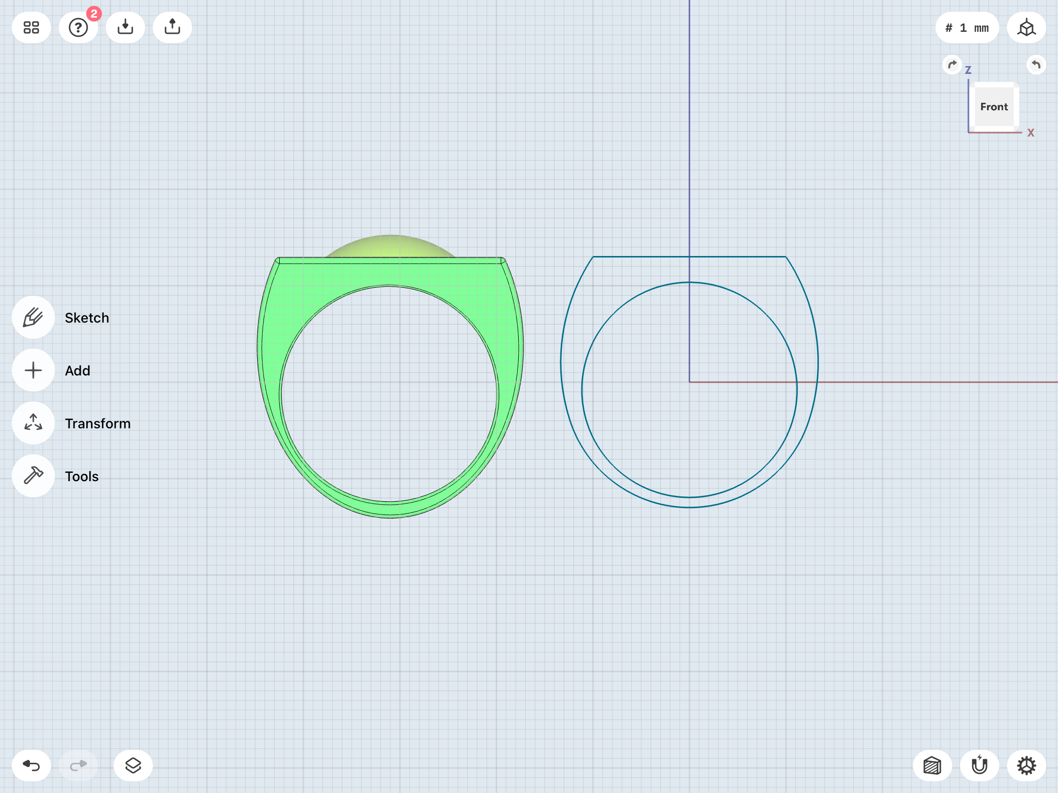
The limitations of using elipses for the sidebars and the central section are the main cause of my having to make the ring relatively large (around 28mm lengthwise down the face of the symbol). But, by sketching a half-circle on the bottom (concentric with the bottom of the finger-hole) and then using arcs to connect it with the top/flat-face of the symbol, I can hopefully get a more precise design.

Been playing around all day with this sleeker version. We’ll see how it goes.


Old on left, in-progress sketch on right.
80CA44B6-0EB0-4B12-B717-B568B2C8620B.png
 
Last edited:
...well, after many hours of labor, I’ve finally devised a smaller and sleeker V3, which has been a goal for many months. This version is about 20% smaller (coming in at about 24mm long) and has the proportional revisions I mentioned above. Not too shabby!

I’ll likely test print it with the next batch. Also, I’ve designed it in such a way that it can be rescaled if I decide it’s TOO small. I may create a few variants to give myself options.


BC1450B6-7529-4C6B-87BA-551B90F60106.png
B3A447C4-F627-4C4B-90C0-44E52F528D1B.png
BEE19A1E-8A41-404D-B933-E3E4149D9469.png
 
...and, just to get an idea of what the model looks like without the filleting and construction lines, I exported it as an STL file, then imported it back into the workspace.

FCFFB64A-D11B-4EE1-A84B-FCA170700652.png
 
Been tinkering with a D-shaped cross-section for the ring-band on the Guy Gardner ring, as opposed to the flat-sided bands I’ve been using for rings of that type. May port it over to the straight-band V1, as well.
8F30C7DF-2AEC-4753-A6CA-B7C4841D7A52.png
99C009DC-88CB-43CD-8D6F-3A591EB79F42.png
 
Thanks! There’s still a lot of work to be done, though.

For starters, I’ve begun tweaking the V2. The test print turned out well, but there are a few issues. The gem tolerance is tight, but that’s an easy fix.

On the other hand, getting the band right is a problem. The test print’s band is a little too bulbous and thick to be comfortable.


There are two key accuracy points I’m determined to hit:

1. A tapered band which doesn’t appear too slim in the top view (that is, it visually fills the gaps between the sidebars and the central ring section of the symbol piece when viewed head-on).

2. A thin, flat bevel surrounding the finger-hole.


Achieving both of these at the same time has been...difficult.


Been playing around with scaling the existing band (and the symbol-piece), as well as being more subtle with the chamfering/filleting.

Here’s the current revision (in gray).

5E16FA03-981F-4B56-9933-E2592A5BFC7C.png
98F30342-0C0C-46BC-818D-7D34992069FE.png


If I can successfully shave down the V2 band while maintaining my stated criteria, then perhaps I can apply the same methodology to the V1. As it stands, the test print’s symbol-disc is just too darn big, and the band a bit too thin in profile. It looks a bit unbalanced, and is a step back from the previous (Tinkercad) test prints.

If I can slim the width of the band down a bit, perhaps I can get the disc down to a more manageable size, too. Somewhere around 24.5-25.5mm would be ideal. And the rim/lip surrounding the symbol should be thicker. Going with the proportions of the official symbol doesn’t look right, in terms of that ring surrounding the symbol, although it does match some of the Gil Kane reference.

Although, upon comparison, the new print is actually pretty close to the last one. It’s just the bigger symbol and thinner lip surrounding it which make it look bigger, I think. Either way, I still need to play with the proportions.


And I have to to decide whether or not to have the bottoms of the discs/symbol-pieces intersect with the beveled edges surrounding the finger-holes on the V1, V2, and Gardner rings. If they don’t intersect the bevels, then they tend to sit rather high atop the bands, with a gap of several mm between the discs and my finger when the rings are worn. I prefer a lower-profile, more compact look, but I also don’t necessarily want to break up the clean line of the bevel going all the way around the finger- hole.

Of course, the early comic art depicted the band as more of a “U” shape, with the top edges attaching to the bottom of the symbol-disc, as opposed to the “disc stuck on top of band” look I’ve been going with.

15270431-5A08-45E4-9863-805706DE6D99.jpeg


I also need to make some decisions about the Gardner ring’s band. Specifically, which style to go with—parallel/flat-sided, parallel/d-section, or tapered/d-section.
 
Last edited:
And now I’m starting to experiment with sketching out band shapes and extruding them, then cutting them to shape, rather than starting with an ellipse or circle to create a spheroid shape to cut into. That way, I can at least control the curvature of the sides of the band, so they don‘t bulge out, as on the sphere-based bands.


E2EEB397-2CB9-473D-975B-AE16DF254510.png
 
Alright, after some more work, I have a design I’m happy with. Might do some more tweaking. Gonna be awhile before I do more test prints, so there’s plenty of time.

This new version has a smaller gem (and therefore better tolerance), a slimmer band, that flat edge around the finger-hole, and more aggressive chamfering on the edges of the symbol (the test print is still a wee bit pointy).


New on left, old on right.

3A0228CA-CE45-4196-8C24-6662C3C9B941.png
F5FC8C35-4098-4BCA-A02B-C14971D96A2F.png
E637D417-2245-497C-A86B-1383DF57BA3F.png


And here’s the STL for comparison.

7F243A85-8589-46DB-AFA7-93AFC4E7E4C2.png
 
Tweaking and scaling the V3.

In the image below, the current V2 revision is sandwiched between two versions of the V3. On the left is a smaller version (24mm from top to bottom) with a less-wide face, and on the right a slightly larger one (25mm) with a slightly wider symbol-face.

As previously noted, I’d prefer the V3 to be a bit smaller and less chunky than the V2 (which is currently at 27mm).

3EDE5081-EA39-492F-AE46-8A7AB79DA894.png
 
Been struggling ALL DAY with the V1.

I ended up deleting my previous model entirely and rethinking it from the ground up. Tried numerous different modeling techniques to create a band/disc assembly meeting my specific criteria.

I think I finally hit on something. In keeping with the back-to-basics approach, I’ve eschewed work on the symbol and fine detailing, and focused just on the size and shape of the band and the disc.

The two STLs pictured below are variants of the same basic sketch geometric. The key difference is the amount of chamfering on the edges surrounding the finger hole. More chamfering (the model seen on the right in the image below) results in a thicker lip surrounding the hole (Good!), but a thinner band when viewed in profile (Not so good!).

The good news is that these models both feature a symbol disc that’s only 25.5mm across. That’s the same size as the previous (Tinkercad) test prints. 26mm, as seen on the most recent test print, is just TOO big. Even better, however, is that the band does NOT peek out from behind the disc in the top view, which has been one of my goals with this design. I’ve essentially come back around to an improved version of the Tinkercad dimensions I’d settled on, previously.

Note that the band, as with many of my previous V1 iterations, is essentially that of a proper signet ring (which flares out into a circular “crown” at the top, with the surrounding area being wider in radius than the bottom half of the band) rather than a symmetrical ring. This is similar to the look of the DC Direct toy rings (the ones which came packaged with action figures beginning in 2000, with the “Hard-Traveling Heroes” Green Lantern/Green Arrow figures), the Planet Krypton set’s Hal Jordan replica ring, and the Blackest Night promotional rings.

I’m still playing with the proportions. A symmetrical ring-band would leave huge gaps between the bottom of the symbol-disc and the top of the band, of course. Having less of a gap is certainly more aesthetically-pleasing.


Any thoughts/suggestions/opinions are welcome!

0515EE86-6FE1-45D5-AA67-DFAF63A0F64D.png
9E52EA9D-4E7C-474D-9CB8-C1B893400813.png
84960117-6E8D-4611-A407-5A38399B1BCE.png
80A31861-CF31-4635-B7B5-6B4B9AB27555.png
 
Last edited:
Tinkering with the disc, now. Added the more prominent chamfering of the new V2 and V3. For now, I’ve kept the outer circle/lip thin, as on the official symbol used for licensing. Still wondering about how raised/thick the symbol itself should be. It’s currently at 0.75mm thick.

Shapr3D art and STL side-by-side.

5D4842F2-D7E2-4C7E-BC5E-BD831920BBB1.png
43CAF322-AC72-4070-8FBD-2C98460826C2.png
EEFA4A14-7807-441C-B274-867587DFCD21.png
 
...and here are some symbol thickness/disc depth tests. From left to right: 0.25mm, 0.5mm, 0.75mm, and 1mm. The 0.25mm version is what I went with for the last test print, and it’s barely visible, so it’s only included here for study purposes. I may end up printing some of these discs by themselves just for an in-hand comparison.


60C460D4-9572-40C9-81B2-C6B277F17858.png
 
Tweaking and rethinking the Gardner ring.

Looking back at the GUY GARDNER REBORN miniseries, which has the best “hero” panels of the ring, Joe Staton clearly drew it with a thick, curvy band, and a very small setting and gem. So small, in fact, that the setting sits atop (and emerges from) the band without the sort of undercuts on the sides that you’d see in a design with a separate disc stuck atop the band (as mine have been, up until now).

7D992BE8-FFE7-44F0-89C2-C964F231D1B0.jpeg
DB7606FD-BFFB-4CFC-B981-11275B649A3F.jpeg


Once we get into the ongoing GUY GARDNER series, however, Staton began playing fast and loose with the ring. The band tended to look very thin and simple. Usually tapered, sometimes straight. And the settting/gem constantly grew and shrank in size. Most of the time, it was pretty darn big.


64C4515C-8CBA-409E-9BBB-E03A407FD9CB.jpeg
CA65B21E-4834-44A0-9225-BD97BA9E1B80.jpeg
FFEC3CAC-651D-4D29-A81E-F5DEB24BFD20.jpeg


And, as previously noted, that stylized “G” symbol only appeared very rarely.

Anyway, I prefer the bigger look of the setting disc and gem, but there’s really no way to give it a substantial diameter AND have the sides of the disc blend into the band. At least, not without having pretty wacky proportions. I’ll likely stick with the “disc on top of band” look, I think.

Here are two STLs of my current revisions. The one on the right is the one I’ve been fine-tuning. The one on the left is a quick and dirty experiment to replicate the early look, with the small setting/disc blending into the thick band.

333D3F9E-5BF6-4DB9-B86A-CC2395E4FF2B.png
1B328DAD-E58F-41EE-B5D3-EC0CE8961F01.png


It should also be noted that the DC Direct replica of Sinestro’s ring (initially released with a mini-bust of the character and then again in the Planet Krypton Green Lantern ring set) features the “disc on straight band” look, with the gaps in-between the bottom of the disc and the top of the band on either side of the center point (where the disc is actually attached to the band).


B2CB940E-FE20-41E6-8465-F2BCF5A1CC27.jpeg
 
Last edited:
Thanks!


Meanwhile, I’ve been working for weeks on the Abin Sur/SHOWCASE # 22 ring. Unlike Tinkercad, Shapr3D does not allow one to model a 3D shape, then flatten it, so I’ve been struggling to design a version of the early power battery/symbol which LOOKS like a flattened version, in order to keep it from it standing too proud from the symbol-disc.

I suppose I could also sketch the top view, then extrude each shape at different heights for an actual flat symbol, but I like the 3D-relief look.

18FB0FF8-6CDA-443D-8F87-F639F1A3D6AB.png
 

Your message may be considered spam for the following reasons:

If you wish to reply despite these issues, check the box below before replying.
Be aware that malicious compliance may result in more severe penalties.
Back
Top