-
Welcome to the Project Runs Forum!
This forum is intended for interest gauging and active runs. Due to the transient nature of this forum, please keep all research and ongoing discussion in one of our main forums so your information is not lost.
Only Premium Members can start a new run.
You are using an out of date browser. It may not display this or other websites correctly.
You should upgrade or use an alternative browser.
You should upgrade or use an alternative browser.
Limited Run Breaking Bad WALTER WHITE GLASSES by Magnoli Clothiers
- Thread starter Indy Magnoli
- Start date
Carlo Lubatti
New Member
I would be extremely happy to buy a pair, even two. Those glasses are my favorite. Can't wait to see them finished!ok. That new base curve looks to be it!
There is one thing that was reverted back to an old version. The bridge. It's no longer welded directly on top of the frame as it was in version 2 of the schematic, which was more accurate. Sorry to mention it, but it's already so close!
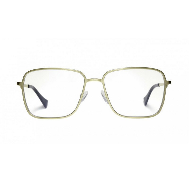
View attachment 845240View attachment 845241
The sg301, despite being a fantastic frame, does have inaccuracies other than the double bridge and the bridge style itself. The frame side corners are 1mm wider, the lens width is smaller by 2mm, and the top outer corners are not as round as they are on Walt's frame. These lens differences make the sg301 appear to be straighter than it is. It may not seem like much, but it does make a difference. Not only that, but there seem to be quality control issues with Hilco frames, not major ones but odd ones. Hilco has them listed as a non spring frame (with a 17mm bridge in the 53mm size) - with photos of a frame with non spring hinges on their website - but you received one with spring hinges. And the bridge, again, can either be 17mm or 18mm despite what's advertised. Out of what currently exists, the sg301 is still the closest. Every other frame has a lens that is not as wide as the lenses are on Walt's glasses, making them look too rectangular or oval-like in comparison. The Kenmark W021 would make a good match for its simplicity, but in its smallest size, the lens length is 1mm longer and the width is smaller by 4mm. 2 more than the sg301.
Anyway, I am glad you found this thread, Carlo Lubatti! You should consider purchasing one of Indy Magnoli's Walt glasses. Once they come to be, they really will be the most accurate glasses to Walt's that anyone can buy beside an original from a safety eyewear line that ceased to exist 15 years ago.
That said, I remember what one user said about Walt's glasses being a Sears purchase. Yeah, I doubt that now. By the time BB was in production, Hilco's onguard and a2 metal frames were already dominating in the north American safety eyewear industry. Aden frames don't meet 2003 American safety eyewear standards. I recall what another rpf user said about them being vintage and likely having been found in a box. While not vintage, it is likelier they were found in said box.
Keep me informed.
Cheers from Italy,
Carlo.
Inviato dal mio BBB100-2 utilizzando Tapatalk
Carlo Lubatti
New Member
I also forgot to tell you that here in Italy somebody attempted to make a "tribute" to Walt and made a similar frame.
http://www.saturninoeyewear.com/metal-age/137-walter-2.html
I would say they are 100% incorrect and overpriced.

Inviato dal mio BBB100-2 utilizzando Tapatalk
http://www.saturninoeyewear.com/metal-age/137-walter-2.html
I would say they are 100% incorrect and overpriced.
Inviato dal mio BBB100-2 utilizzando Tapatalk
Westies14
Master Member
:lol The work has been done for us! Why bother, Indy, knowing these are available already?
I also forgot to tell you that here in Italy somebody attempted to make a "tribute" to Walt and made a similar frame.
http://www.saturninoeyewear.com/metal-age/137-walter-2.html
I would say they are 100% incorrect and overpriced.
https://uploads.tapatalk-cdn.com/20180928/0088c71307b55569724ce32b8ed59178.jpg
Inviato dal mio BBB100-2 utilizzando Tapatalk
Wow... only $225 bucks too.
7thWheel
New Member
Yes! Thank You good sir.We're now starting the design work on these and will post updates as we can. The current "official" name for this new item will be "Heisenberg Glasses".
We'll pick the metal color first, then make the prototype in that color. Stay tuned...
7thWheel
New Member
We'll pick the metal color first, then make the prototype in that color. Stay tuned...
Fantastic! I can't wait to see the final product.
Count me in for three at least (a backup for me and a friend who I know would love it).
I take it that the final product will be available for retail purchase at http://www.magnoliclothiers.com ?
Fruity
I take it that the final product will be available for retail purchase at http://www.magnoliclothiers.com ?
Fruity
I take it that the final product will be available for retail purchase at http://www.magnoliclothiers.com ?
Yes, I'll post a link here once it is available.
SquidMan
Sr Member
Yes, I'll post a link here once it is available.
How's the progress on these going, Indy? Any luck sourcing the metal?
No news yet... will post as soon as I have something to share. 
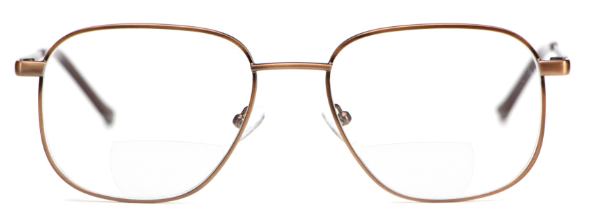
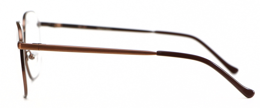
Prototypes finished, complete with bifocal effect:


SquidMan
Sr Member
Prototypes finished, complete with bifocal effect:
Indy, these prototypes look great.
Prior to inspecting them more thoroughly, a couple things stand out to me as incorrect:
The bridge should be ever so slightly thicker, with maybe a slight bit more of a curve:
I think the bifocal portions are the wrong shape, or it might be their placement that's incorrect. I don't believe that Walt's bifocal portions actually touch the outside frame rims, but I may be wrong about that. By the way, will you be offering an option for lenses without the bifocal portions, Indy Magnoli ?
The grooves along the outside edges of the frames appear to be too shallow, should be deeper.
The color of the metal frames appears to be too reddish/amber, should be a little bit paler, closer to a yellowish-bronze patina.
Any thoughts, J EM and Westies14 ? Particularly about the overall shape of the frames; I am unable to thoroughly check myself, at the moment.
Westies14
Master Member
So cool to see progress! Indy, are you able to take more photos, or were these sent to you by the manufacturer? It’d be great to see more angles - even different tilts from the front - and focal lengths.
I actually think the color may be pretty good. In the last reference image above, they appear more pale/yellow, but that shot is heavily graded and desaturated. In most of the clear natural light shots, they have more of a bronze look. If there’s an option which dulls this color just a touch it could be perfect, but light and oxygen might get the patina there over time starting with the current color.
I agree with the bridge comment. If it’s made thicker to match the reference visually, would that alleviate your engineer’s concerns about attaching the bridge to the lenses in the same way as the original? There’d be more meat to hold on to. I think the wire frame holding the lenses may also be slightly thinner than Walt’s.
The biggest issue I’m seeing is that the eyes angle down towards the bridge rather than up. The effect loses that unique “sad puppy dog” look, makes them more angry/aggressive.
That’s all I’ve got after a quick look on my phone! Can’t wait to get to my comp and take a closer look. I’ll let you guys know if anything else jumps out at me.
THANK YOU, Indy!!!
J EM
Well-Known Member
I just want to say that the prototype is at a great start. 
There are a few things that can be improved for a more accurate frame shape, if it's not late. Anyhow, the bridge does look a bit thinner from the front, about half a millimeter I'd say. And the color - I'd like saying it's fine because bronze changes color depending on lighting. In a room with an average amount of natural light not directly hitting the frame, it'll look brown, otherwise it looks yellow-bronze. Under some artificial lighting or sunsets, it looks more orange like copper. If the prototype's color looks brown most of the time, I'd say it's correct. "Hilco" has different names for bronze, but they're really all the same color. I don't know if there actually are different versions of bronze.
There are a few things that can be improved for a more accurate frame shape, if it's not late. Anyhow, the bridge does look a bit thinner from the front, about half a millimeter I'd say. And the color - I'd like saying it's fine because bronze changes color depending on lighting. In a room with an average amount of natural light not directly hitting the frame, it'll look brown, otherwise it looks yellow-bronze. Under some artificial lighting or sunsets, it looks more orange like copper. If the prototype's color looks brown most of the time, I'd say it's correct. "Hilco" has different names for bronze, but they're really all the same color. I don't know if there actually are different versions of bronze.
SquidMan
Sr Member
I actually think the color may be pretty good. In the last reference image above, they appear more pale/yellow, but that shot is heavily graded and desaturated. In most of the clear natural light shots, they have more of a bronze look. If there’s an option which dulls this color just a touch it could be perfect, but light and oxygen might get the patina there over time starting with the current color.
I wasn't comparing the color to the photo I posted above, that one is clearly desaturated. I do recognize that the color of Walt's glasses changes depending on the environment and lighting, but I've never seen them be quite that orangeish. I could be wrong though.
There are a few things that can be improved for a more accurate frame shape, if it's not late.
What would you change about the frame shape, J EM?
J EM
Well-Known Member
Mostly the upper-outer corners. The shape can be drawn better.What would you change about the frame shape, J EM?
I attempted another drawing yesterday and got as closest to tracing the shape as I have yet, and even this shape can still be improved. (mostly the upper-outer and lower-inner corners, by shifting the anchor points at those corners about half a millimeter)
Interesting thing to note is the frame corner pieces. The length from the edge (at the center of the curve) to the top point (where the corner meets the lens), is an exact 8mm. And 6.5mm on the bottom. That droopy look Walt's glasses have depends on the anchor point that is on the top edge of the lens. It is no longer at the center as it was in all my previous attempts; 4mm shifted from the center toward the nose.
Anyway, what Westies14 pointed out, regarding the lack of droopy eyes on the prototype - I wonder if the lenses were rotated slightly when the frame was put together. (From the front view, left lens appears to have been rotated clockwise, right lens counter clockwise.) The shape appears to be the shape that was on v3 of the schematic, which was very close to up-scaled images of the season 1 poster, but the upper outer corners do stick out on this prototype which gives it a different looking shape. This wouldn't be a problem if we could just bent the sides downward, but if the lenses were rotated, then that would mean that the corner pieces were welded at the wrong place. I think we need photos showing the complete shape of the lenses - a direct shot of the frame, frame tilt accounted for. Just to be sure.
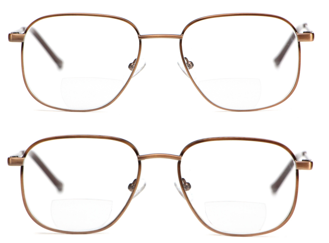
Ok, so based on your comments, I've photoshopped the prototype photo to include slightly thicker frames, thicker bridge, bending both frames downward to "droop" them a bit and, thereby, curving the bridge:

Oh, and moved the bifocals futher apart (not sure if the factory can do this yet though).
Oh, and moved the bifocals futher apart (not sure if the factory can do this yet though).
Similar threads
- Replies
- 269
- Views
- 26,431
- Replies
- 174
- Views
- 22,291
