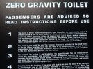
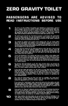
2001's zero gravity toilet sign; more accurate typography!

Do you think that one could somehow compensate for the different weights by slightly reducing the horizontal width of the characters while increasing the tracking? ... or would that be a stupid idea? :D

Yeah, that doesn't really work, sadly.

So I've found that if you use Monotype Grotesque Display Bold Condensed for the body text, it's pretty close to the shape, weight, and metrics of the original sign. However, that font is missing certain key character shapes that are so obvious in Agel. So I manually replaced those characters with their equivalents from Headline Bold. And that looks pretty good.

Obviously mixing typefaces is not something they would have done for the original sign. So perhaps the digitization of Monotype Grotesque eliminated some of those features? Or Headline Bold was lighter in its original form? Maybe they used a different, third font?

Without a Monotype hot metal type catalogue it's hard to know for sure.
 
This is Monotype Grotesque Display Bold Condensed for the body, with Monotype Headline Bold for the numerals, the parentheses, and certain letters. Manual ligatures and kerning. There are a number of minor differences, but it's not bad.

I think it's a pretty decent digital match for a 50 year old bit of typesetting!

font-comparison-2.jpg
 
Last edited:
I wish I'd seen this thread sooner, since I tackled this very same project a few years back:

2001: A Space Odyssey - Zero Gravity Toilet Instructions

I'm afraid Monotype Grotesque Display Bold Condensed isn't quite right. Many of the letterforms don't quite match, especially the lower case "y". I really think you had it right the first time with Monotype Headline Bold. I found that typeface was a near-perfect match to the body text in the Agel image, without any issues matching the weight. The other typefaces I used were Adobe's Eurostile LT Bold (probably a mislabeling of Eurostile Black) and DTC's Eurostile Extended Black, both of which also fit nearly perfectly.

I think the problem might stem from the scan of Jerome Agel's book that you're using as a template. It looks like yours might be a low-resolution copy a few generations removed from the original, while I was able to use a high-resolution image scanned directly from Agel's book.

Incidentally, another excellent reference is Piers Bizony's The Making of Stanley Kubrick's 2001: A Space Odyssey from Taschen Press, which features a great close-up of the final prop on set.
 
Monotype Headline Bold certainly has a number of key letterforms correct. In the end I used a mixture of the typefaces to get the weight where I wanted it. I think it turned out pretty well, though I agree that the lowercase Y descender is wrong.

This is a print experiment - having the print reversed and on the top of the acrylic, rather than on the underside.
 

Attachments

  • zero-gee.jpg
    zero-gee.jpg
    416.5 KB · Views: 140
Very nice Neil...I like it very much! Are you going to make a run like the other panel in the Junkyard?

Well, that wasn't really a project run as such. I only intended to make a couple of HAL brain room signs, and ended up with a big stack of seconds that I figured others might be interested in and that I didn't want to throw out.

Though speaking of those, I ended up doing a couple reprints to improve my design, and now have the ones I formerly intended to keep lying around, so...
 
you had it right the first time with Monotype Headline Bold. I found that typeface was a near-perfect match to the body text in the Agel image, without any issues matching the weight. The other typefaces I used were Adobe's Eurostile LT Bold (probably a mislabeling of Eurostile Black) and DTC's Eurostile Extended Black, both of which also fit nearly perfectly.
Okay - I've gone over a higher-rez of a scan of the Agel image, and I agree with you. The apparent lighter weight of Agel was an artefact of the scan, and thus the reason the unusual shapes of some of the characters match Monotype Headline Bold fully are because that's what they used! There are some minor issues with punctuation and kerning, but that's hardly a problem.

So there we go. I think we can say with confidence that the three faces used to produce the Zero Gravity Toilet sign have now been properly identified! Thanks for that. :)

In a way it's a shame, since Headline Bold is pretty heavy and prints rather thickly using the sign production process I'm using. It does, however, result in a pretty heavy set of white glowing blocks, though!
 
I used an imagesetter to print mine, which produces a large photographic transparency (basically a giant piece of slide film). Quite affordable, and the final result is virtually indistinguishable from the original prop.
 
Yeah, I’ll probably try that next. Problem is so many affordable places do inkjet output nowadays, which just lacks the black density of true film output!
 

Your message may be considered spam for the following reasons:

If you wish to reply despite these issues, check the box below before replying.
Be aware that malicious compliance may result in more severe penalties.
Back
Top