Hey, folks!
So I thought I'd post about this in case it's of interest. Having made a HAL 9000 brain room sign I thought it might be fun to do a zero gravity toilet sign from 2001. Turns out a lot of people have had the same idea! I did a bit of web searching, but I was surprised that the typography was pretty well universally wrong. People were even using fonts like Helvetica Bold and Eurostile Extended for the top header lines! (it was Eurostile Black)
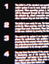
Of course, the body text is a real problem, since the best resource in the public eye (Jerome Agel's 1970 making-of book) doesn't really show the body with much clarity. So it's not surprising that there's been a lot of guessing about what it was.
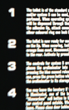
Well, I can't say with complete certainty what it was. But I think I've got fairly close to the look of the original sign. I used Monotype Headline Bold in the end.

 sites.google.com
Thoughts?")
First, here's the Agel image.

And this is my version:

So I thought I'd post about this in case it's of interest. Having made a HAL 9000 brain room sign I thought it might be fun to do a zero gravity toilet sign from 2001. Turns out a lot of people have had the same idea! I did a bit of web searching, but I was surprised that the typography was pretty well universally wrong. People were even using fonts like Helvetica Bold and Eurostile Extended for the top header lines! (it was Eurostile Black)
Of course, the body text is a real problem, since the best resource in the public eye (Jerome Agel's 1970 making-of book) doesn't really show the body with much clarity. So it's not surprising that there's been a lot of guessing about what it was.
Well, I can't say with complete certainty what it was. But I think I've got fairly close to the look of the original sign. I used Monotype Headline Bold in the end.
2001’s Zero Gravity Toilet Sign and its Typography - The Age of Plastic
The Age of Plastic 3D printed parts
Thoughts?
First, here's the Agel image.
And this is my version:
Last edited: