firesprite
Master Member
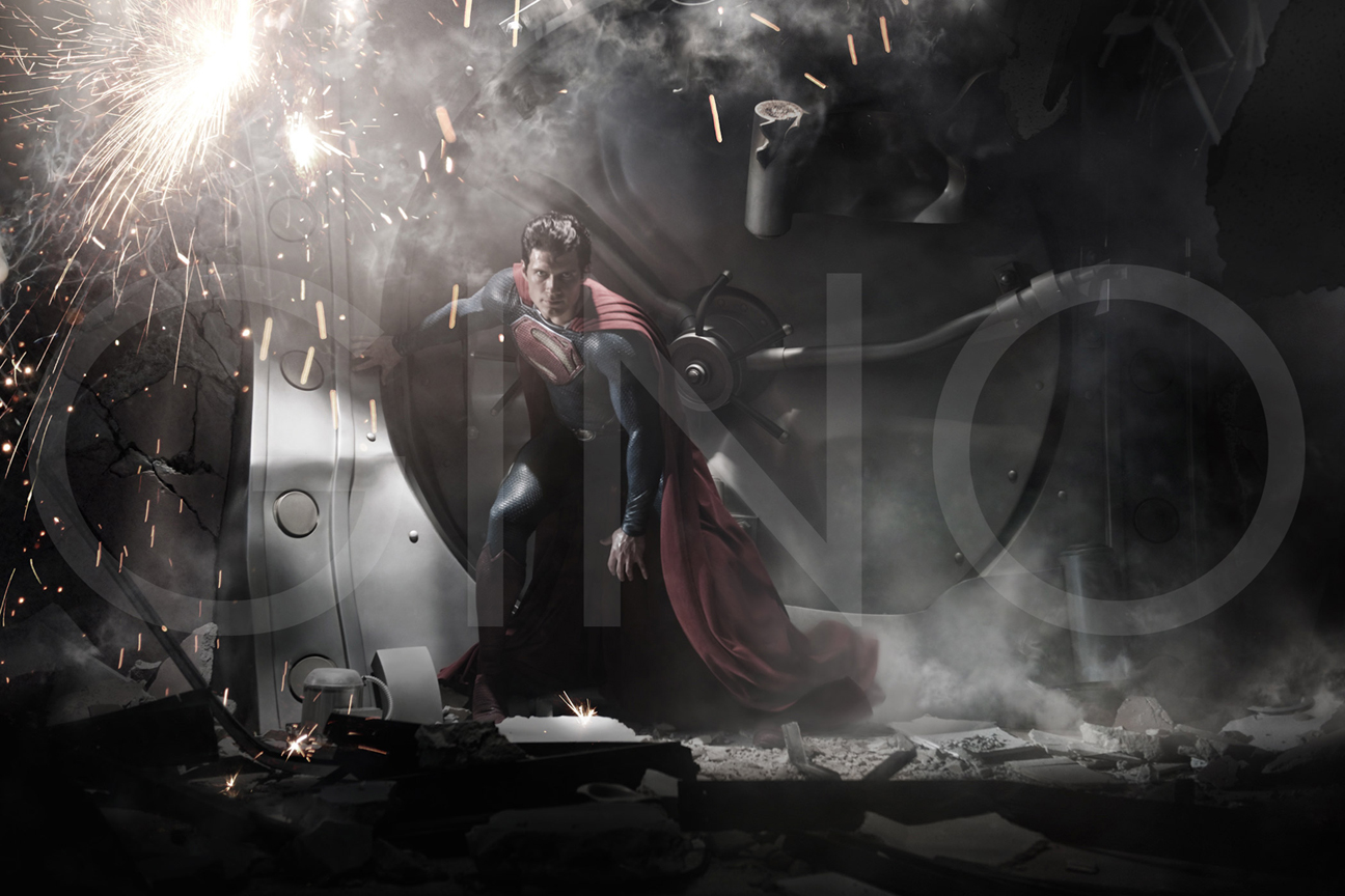
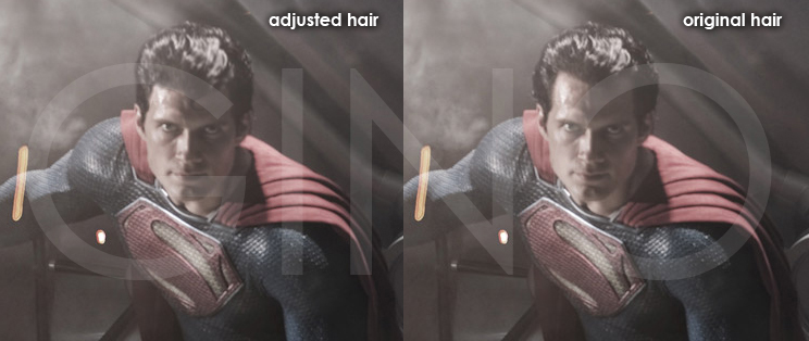
I think Henry, himself, looks pretty good, but I'm not sure I like the ultra-heavy texturing of the suit.
It totally blows. Too dark, I despise the texture, and why, oh, WHY do they feel they have to make his chest shield a big, plastic monstrosity??? And they wonder why the Reeve suit grows more and more beloved as the years pass. I miss the good ol' days when movie makers had common sense.
I can't wait until the Siegel-and-Shusters do their period piece Supes,
I can't wait until the Siegel-and-Shusters do their period piece Supes, because this making-Superman-relevant to-modern-times thing is recockulous. If there's one superhero that needs no context, it's Superman. Of course he's out-of-step with the times. He has always been out of step; he should always be out of step. That's the point of the character and the story.
He's Moses raised by corn folk; how is that "relevant" to modernity? Except, you know, to emphasize moral codes? Truth, Justice, and the American Way, everyone! Superman's the one superhero who gets cats out of trees for kids with no sense of irony whatsoever.
I dunno; I know the people at DC do their best being stewards of an iconic pantheon of characters of myth and fable. I know you have to break Batman's back every once in a while, and there's going to be a million Green Lanterns, and I can never remember if Aquaman has his hand now or not, but Jim Croce said it best.

And where did you hear that they are doing a Supes movie?
Through the earpiece of my telephone.
I would figure if that were true, that would be pretty big news and other people would have heard about it. What a friend told you they were doing that or something? I highly doubt a different Superman movie will be made.